Editorial Serif Anchor

Quarella Jardin + Papillon Serif – Elegant Modern Luxury
Anchors Quarella Jardin's fluid strokes with crisp Roman proportions on wedding suites, headers and packaging.
Inspect Papillon Serif – Elegant Modern Luxury specimenDisclosure: MakerFileHub may earn a commission from qualifying purchases via paid links on this page. How our links work.
Rough edged botanical script
Quarella Jardin is a vintage inked script in cream on a meadow of small white flowers: fat slanted letters, rough ink edges and a drawn bow between the two words.
Paid link
Get this fontProject & layout blueprintsAt-a-glance maker compatibility
Weld or Unite overlapping script joins into one continuous vector path before sending to the blade.
Visual anatomy & craft review
Quarella sits above Jardin, and the lettering is a heavy connected script: the Q opens with a large loop and a straight tail, the a and the r are compressed, the l lifts into a tall loop, and the whole line leans forward with an inked, slightly rough edge. Between the two words a bow is drawn as a line ornament, which is the one decorative element on the card. The ground is a photograph of a wildflower meadow in soft focus, so the cream lettering sits over texture rather than a flat colour, and two small captions at the top and bottom name the face and the studio. The face is a vintage script for packaging, labels and invitations: the rough edge is its character, so it needs a large size to show it, and the cream on a busy ground needs contrast checking.
A heavy script on a flower meadow
Two-font hierarchy recipes
Tested contrast partners — pairing Quarella Jardin with grounded secondary typography.
Quarella Jardin + Papillon Serif – Elegant Modern Luxury
Anchors Quarella Jardin's fluid strokes with crisp Roman proportions on wedding suites, headers and packaging.
Inspect Papillon Serif – Elegant Modern Luxury specimen
Quarella Jardin + Nyxar
Keeps small-scale dates, URLs, nutrition facts and care instructions crisp and legible below script titles.
Inspect Nyxar specimenPractical applications
Concrete hierarchy, scale and production guidance tailored to Quarella Jardin’s stroke geometry.
A vintage inked script on a botanical ground reads as an apothecary label, and one cream ink on a dark label keeps the print simple.
Hierarchy & layout recipe
Print a 50 by 75 mm label: set the product at 15 pt on one row, keep 6 mm of clear ground beneath before the volume at 4.5 pt, and hold 4 mm from the bow to the die line.
Pre-production check
The ink edge closes up on a small label; print one at the real size and check the Q and the r before the order.
A heavy script with a drawn bow suits a ceremony in a garden, and one cream on a dark board reads against foliage in daylight or at dusk.
Hierarchy & layout recipe
Print a 500 by 350 mm board: set the greeting at 100 pt across two rows, keep 24 mm of clear ground beneath before the names at 24 pt, and hold 22 mm of border on all sides.
Pre-production check
Cream on a board can yellow in sunlight; print one on the intended material and check the tone before the set.
A vintage script over a meadow photograph sets a garden issue without a headline block, and the rough edge keeps it from looking digital.
Hierarchy & layout recipe
Print a 230 by 300 mm cover: set the cover word at 96 pt on one row, keep 28 mm of clear ground beneath before the cover lines at 12 pt, and hold 20 mm of margin on all sides.
Pre-production check
Light script over a light photograph loses contrast; print one cover and check the words stand clear of the flowers before the run.
Technical & licence verification
Confirm included OTF/TTF/WOFF formats, full glyph tables and licence coverage on the live store page before batch production.
Closest visual alternatives
Matched across letterform anatomy, stroke behaviour and craft applications.
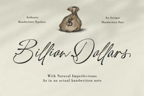
Fine sloping antique handwriting with visible pen texture
Billion Dollars is fine sloping handwriting drawn to look like ink on old paper, with irregular stroke edges, uneven joins and letters that lean together at a consistent angle.
Ideas for this font
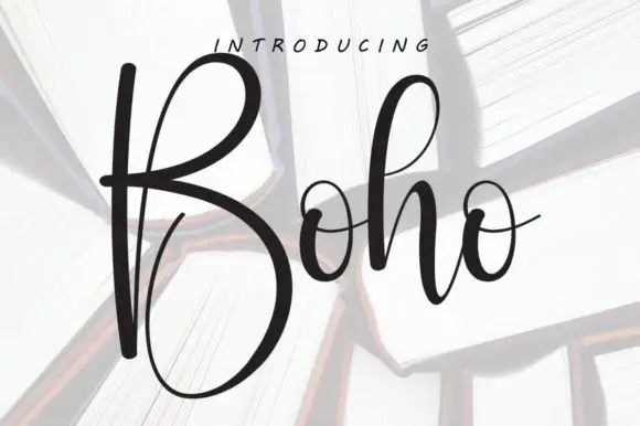
Tall high-contrast script with an oversized B
Boho opens with an oversized narrow B that drops a deep lower bowl, the h lifts a tall loop and the two small o forms join through fine crossing connectors, so a single short name reads as a tall written line.
Ideas for this font
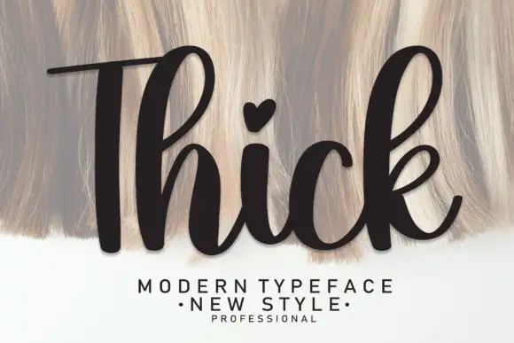
Heavy upright script with a heart dot
Thick is a heavy upright script in black over a pale textured ground: very fat even strokes, a tall narrow capital T drawn with a long bar, a heart in place of the dot on the i and a heavy leg on the k.
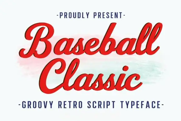
Thick retro sports script with high contrast and a lean
Baseball Classic is a thick retro sports script that leans forward, its downstrokes heavy and its joins thin, with looped capitals on both words and a small ball terminal at the exits.
Ideas for this font
Same independent foundry
Allow optional Google Analytics to measure visits and catalogue actions. Your search words and notes are not included. Privacy & storage