High-Contrast Display Serif

Fatzero + Vanielst Elegant Serif Display Stylistic
Pairs sculptural editorial warmth with Fatzero's clean modern geometry.
Inspect Vanielst Elegant Serif Display Stylistic specimenDisclosure: MakerFileHub may earn a commission from qualifying purchases via paid links on this page. How our links work.
Bold condensed reverse-contrast sans with heavy bars and thin counters
Fatzero is a bold condensed reverse-contrast sans in which the horizontals run thick, the verticals thin and the counters close to slots, so a single word reads as a fashion poster rather than as a headline.
Paid link
Get this fontProject & layout blueprintsAt-a-glance maker compatibility
Sturdy stroke walls and open counters weed cleanly on adhesive vinyl, HTV apparel film, and cut cardstock.
Visual anatomy & craft review
The F carries a heavy top bar on a thin stem, the A holds a wide bar across two thin stems, the T spreads a thick arm, the Z sets two heavy horizontals, the E stacks three thick bars and the O closes to a tall slot, all at a reverse contrast with flat terminals and a compressed fit. The inversion is the character: the weight sits where the eye does not expect it, which is why the sample sets one word at poster size on a coloured ground. Because the verticals are thin, the face needs 50 pt upward and a smooth stock, and it should never carry any other type. The pink ground, the small yellow stars and the caption below are presentation; the black display word is the face.
Condensed · Reverse contrast · Bold
Two-font hierarchy recipes
Tested contrast partners — pairing Fatzero with grounded secondary typography.
Fatzero + Vanielst Elegant Serif Display Stylistic
Pairs sculptural editorial warmth with Fatzero's clean modern geometry.
Inspect Vanielst Elegant Serif Display Stylistic specimen
Fatzero + Autography
Introduces organic movement on pull-quotes, signatures and gift tags.
Inspect Autography specimenPractical applications
Concrete hierarchy, scale and production guidance tailored to Fatzero’s stroke geometry.
The reverse contrast sets a single word as an image, and the thin vertical stems stay open and airy at 110 pt in one flat ink.
Hierarchy & layout recipe
Print an A4 cover: set the title at 110 pt on one line, keep 25 mm of margin, and set the issue line in a 9 pt sans 26 mm beneath so the thin stems are not crowded.
Pre-production check
Thin verticals under 0.2 mm drop out at 110 pt on uncoated stock; check the proof and keep the word on a coated sheet.
The poster face carries a studio name as a graphic rather than a logotype, and the heavy bars hold at 90 pt on a plain sheet.
Hierarchy & layout recipe
Print an A2 poster: set the studio name at 90 pt across the upper third, keep a 40 mm border, and set the contact line in a 10 pt sans at the foot of the sheet.
Pre-production check
A condensed reverse-contrast word set tight to the trim looks accidental; check the poster and centre the word on its optical mass.
The face marks a section without any illustration at all, and the thin stems keep a short divider word airy at 64 pt on a plain sheet.
Hierarchy & layout recipe
Print an A4 divider: set the section number at 64 pt centred, set the title in a 12 pt sans beneath, and keep 60 mm of clear space above and below so the word stands alone.
Pre-production check
A divider word printed among body text loses its effect; check the page and keep the surrounding area empty.
Technical & licence verification
Confirm included OTF/TTF/WOFF formats, full glyph tables and licence coverage on the live store page before batch production.
Closest visual alternatives
Matched across letterform anatomy, stroke behaviour and craft applications.
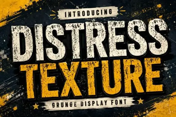
Tall heavy capitals with dense chipped texture and flat terminals
Distress Texture is a heavy tall sans in capitals only, its strokes eaten by dense irregular chips and its terminals cut flat, so a word looks stencilled, weathered and printed through a mask.
Ideas for this font
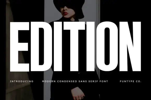
Very heavy condensed capitals with squared stems and narrow oval counters
Edition shows white capital lettering spanning most of a dark portrait cover: thick vertical strokes and broad flat arms build a rectangular title, the O keeps rounded outer sides around a small vertically elongated counter and the I stands as a plain bar.
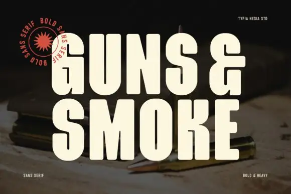
Heavy condensed capitals with rounded corners and a compact squared ampersand
Guns and Smoke is an ultra-bold condensed sans: stems nearly rectangular, counters cut to tall slots, and flat terminals that give a word the weight of a stencil on a crate.
Ideas for this font

Tall distressed vintage capitals with speckled edges and tight fit
Modern Vintage is a tall capital alphabet with a distressed print texture, tight letterfit and vertical proportions, so a word reads as letterpress that has been used a hundred times.
Ideas for this font
Same independent foundry
Allow optional Google Analytics to measure visits and catalogue actions. Your search words and notes are not included. Privacy & storage