High-Contrast Display Serif

Goatjump + Bulgary
Pairs sculptural editorial warmth with Goatjump's clean modern geometry.
Inspect Bulgary specimenDisclosure: MakerFileHub may earn a commission from qualifying purchases via paid links on this page. How our links work.
Tall condensed dry-roller & woodblock distressed sans (100+ glyphs, Multilingual)
Goatjump is a commanding, tall condensed distressed sans (100+ glyphs, Multilingual) stamped with vertical woodgrain & dry-roller grit!
Paid link
Get this fontProject & layout blueprintsAt-a-glance maker compatibility
Fine grain and micro-texture excel in 300 DPI print, sublimation, and screen print rather than small vinyl weeding.
Visual anatomy & craft review
Goatjump is a tall condensed sans with a vertical woodgrain and dry-roller texture baked into the strokes, so each stem carries streaks that read as worn ink rather than an applied grunge layer. The condensed proportions push the counters narrow, which lets long expedition names sit on one line of a bib or a magazine spine, while the distressed edge hides slight misregistration on a two-colour print. Capitals dominate; the texture is strongest on thick verticals and nearly disappears on thin horizontals, which is useful when the same face has to work both as a hoodie print and as a small caption.
Dry-roller-grit · Alpine-expedition · 100-plus-glyphs
Two-font hierarchy recipes
Tested contrast partners — pairing Goatjump with grounded secondary typography.
Goatjump + Bulgary
Pairs sculptural editorial warmth with Goatjump's clean modern geometry.
Inspect Bulgary specimen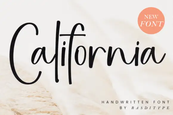
Goatjump + California
Introduces organic movement on pull-quotes, signatures and gift tags.
Inspect California specimenPractical applications
Concrete hierarchy, scale and production guidance tailored to Goatjump’s stroke geometry.
Vertical ink streaks inside the letterforms read as weathered equipment rather than applied texture, which is the register outdoor apparel uses. The condensed width fits a long race name on a bib where a normal-width sans would force an abbreviation, and the narrow counters stay open enough to be read at running speed.
Hierarchy & layout recipe
Hoodie back print 300 x 380 mm, name 90 mm cap-height on two lines, 0.95 leading, 35 mm side margins. Bib 200 x 280 mm, number 120 mm in the face, name 12 mm above it, event line 6 mm. Roast bag 100 x 250 x 60 mm gusset, varietal 18 mm, weight data 7 pt neutral sans.
Pre-production check
Plastisol on a dark hoodie fills narrow counters below 4 mm. Measure the tightened 'e' and 'a' in the final size; if the gap is under 4 mm, open tracking by 15 units or the letters will close into blobs after the first wash.
Distressed condensed capitals give a title card the authority of an expedition stencil while the baked-in texture survives video compression better than a crisp geometric face, which turns to mush at low bitrates. Tall proportions stack as a masthead in a narrow column without hyphenation.
Hierarchy & layout recipe
Title card 1920 x 1080, title 160 pt, safe area 5 percent, subtitle 28 pt. Podcast cover 3000 x 3000 px, masthead 420 px cap-height, episode label 90 px. Zine 148 x 210 mm, masthead 62 pt on a 12 mm baseline from the head trim, three-column 42 mm grid with 5 mm gutters.
Pre-production check
Fine texture detail can shimmer on a title card rendered at low bitrate, and thin diagonal streaks alias into mosquito noise around the letters. Export a 10-second test at the delivery bitrate and look at the edges on a phone before locking the master.
Woodgrain streaks suggest timber signage on a mountain, which is the visual language a resort uses for wayfinding, and the condensed caps fit a long trail name on a narrow plank. The distressed edge also absorbs the dropouts that happen when a face is lasered or embroidered small.
Hierarchy & layout recipe
Trail sign 900 x 200 mm, name 60 mm cap-height, arrow block 40 mm clear right. Patch 80 mm circle, resort name 9 mm, 5 mm border, 2 mm stitched keyline. Rental sticker 100 x 60 mm, word 20 mm, 4 mm trim margin, 3 mm gloss laminate overlap.
Pre-production check
Embroidered patches lose strokes under 1.2 mm. At 9 mm cap-height the distressed hairlines in this face will vanish or turn into loops, so request a sew-out and simplify the smallest line of type to a plain sans if the proof reads as a smudge.
Technical & licence verification
Confirm included OTF/TTF/WOFF formats, full glyph tables and licence coverage on the live store page before batch production.
Closest visual alternatives
Matched across letterform anatomy, stroke behaviour and craft applications.
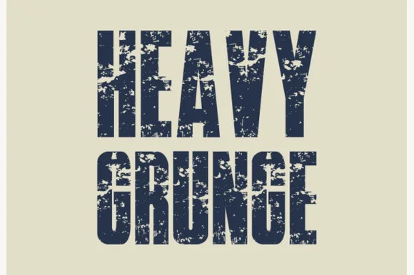
Tall condensed asphalt-scuffed grunge grotesk
Heavy Grunge is a tall, condensed distressed sans-serif font stamped with authentic scratched-asphalt and worn-paint texture.
Ideas for this font
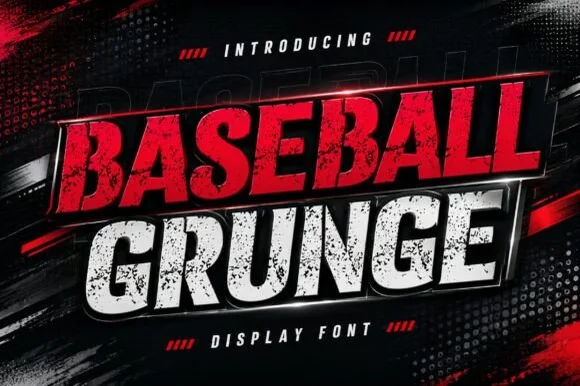
Slanted heavy distressed athletic & racing sans
Baseball Grunge (by Dreamspace.studio) is a forward-slanted, heavy athletic sans scarred with gritty chalk-and-asphalt distress streaks.
Ideas for this font
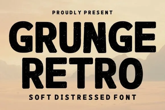
Bold soft-distressed vintage geometric sans display
Grunge Retro is a wide, bold geometric sans display font carrying rounded corners and light, tasteful vintage speckle wear.
Ideas for this font
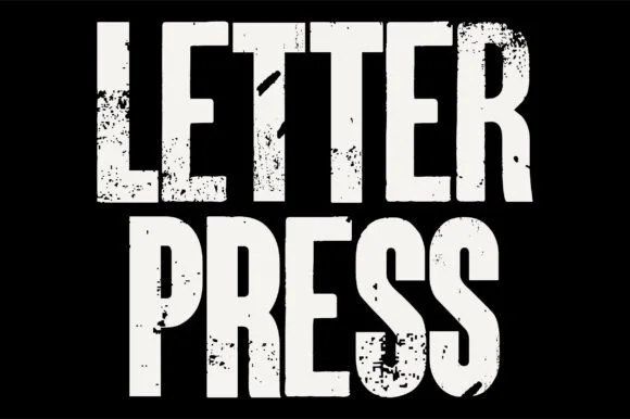
Heavy woodblock-grunge condensed poster grotesk
Letterpress is a tall, heavy condensed sans-display font stamped with authentic wood-type ink voids, chipped edges, and poster-press grit.
Ideas for this font
Same independent foundry
Allow optional Google Analytics to measure visits and catalogue actions. Your search words and notes are not included. Privacy & storage