Neutral Sans Workhorse

Antifight + Cultivo
Lets Antifight own the focal silhouette while handling secondary copy, sizing and subheads cleanly.
Inspect Cultivo specimenDisclosure: MakerFileHub may earn a commission from qualifying purchases via paid links on this page. How our links work.
Wide angular lowercase with a long f and descending g
Antifight shows red lowercase over a dark colonnade, where large straight-sided bodies meet sharp diagonal shoulders and the i carries a solid diamond dot, while the f descends below the baseline and the g hangs beside it.
Paid link
Get this fontProject & layout blueprintsAt-a-glance maker compatibility
Sturdy stroke walls and open counters weed cleanly on adhesive vinyl, HTV apparel film, and cut cardstock.
Visual anatomy & craft review
The bodies stay wide and straight, the shoulders cut diagonal, the dot squares to a diamond and two descenders drop. That diamond dot is the character: a wide lowercase word gains one geometric marker, which is why the sample keeps a short word on architecture. The colonnade and red colour belong to the cover, so keep 24 mm beneath the descenders, set 40 pt and check the f and g against your own baseline. The two descenders set the room below: the g drops further than the f, so a 24 mm margin under the baseline is what keeps it off the trim, and the diamond dot plugs under 40 pt.
Wide angular lowercase with a long f and descending g
Two-font hierarchy recipes
Tested contrast partners — pairing Antifight with grounded secondary typography.
Antifight + Cultivo
Lets Antifight own the focal silhouette while handling secondary copy, sizing and subheads cleanly.
Inspect Cultivo specimen
Antifight + Flowsky Editorial
Grounds bold display lettering with classic typographic authority on posters, badges and apparel.
Inspect Flowsky Editorial specimenPractical applications
Concrete hierarchy, scale and production guidance tailored to Antifight’s stroke geometry.
The angular lowercase sets a night poster, and the wide bodies hold a two-word title at 56 pt on an A2 sheet, where the diamond dot anchors the row.
Hierarchy & layout recipe
Print an A2 poster: set the title at 56 pt on one row, keep 26 mm of clear ground beneath for the f and g descenders, and keep the ground dark so the pale lettering reads.
Pre-production check
The descenders need clearance; check the poster and keep 26 mm below the baseline before the lineup.
The straight bodies give a bag a modern mark, and the wide forms hold a two-word name at 22 pt on a 60 by 45 mm label, where the diamond dot survives a small plate.
Hierarchy & layout recipe
Print a 60 by 45 mm label: set the name at 22 pt on one row, keep 10 mm of clear ground beneath for the descending f, and keep the label pale so the red reads.
Pre-production check
The diamond dot fills at label size; check the plate proof and hold the name at 20 pt or above.
The angular forms suit a bold heading, and the wide shapes hold a two-word title at 50 pt on a page, where the descending f fills the space below the line.
Hierarchy & layout recipe
Print a 210 mm page: set the heading at 50 pt on one row, keep 24 mm of clear ground beneath for the descenders, and keep the body in a plain roman so the heading stays singular.
Pre-production check
Two angular rows on one spread compete; check the layout and keep the deck in a plain face.
Technical & licence verification
Confirm included OTF/TTF/WOFF formats, full glyph tables and licence coverage on the live store page before batch production.
Closest visual alternatives
Matched across letterform anatomy, stroke behaviour and craft applications.
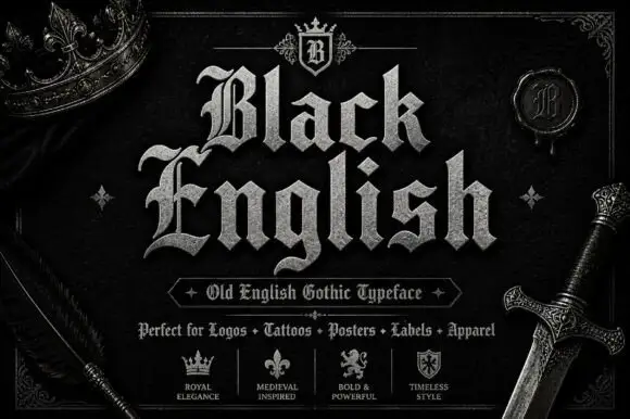
Angular blackletter with diamond-ended strokes and ornate initials
Black English shows pale Gothic mixed case on black, where angular broken bowls, pointed joins and diamond stroke endings give the lowercase a dense rhythm, the large B and E carry extra entry flourishes and a grey hatched treatment adds surface detail to the shown title.
Ideas for this font
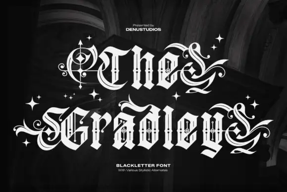
Ornate blackletter with hairline inner strokes and long curling swashes
The Gradley is an ornate blackletter display face: heavy letters with a fine inline running through the stems, long swashes on several capitals, and stars scattered between the words.
Ideas for this font
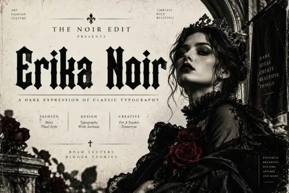
Heavy upright blackletter with blunt notches and diamond dots
Erika Noir is a wide blackletter display face with heavy stems, flat feet and a dense texture, set here in a fashion editorial where the lettering takes half the page.
Ideas for this font
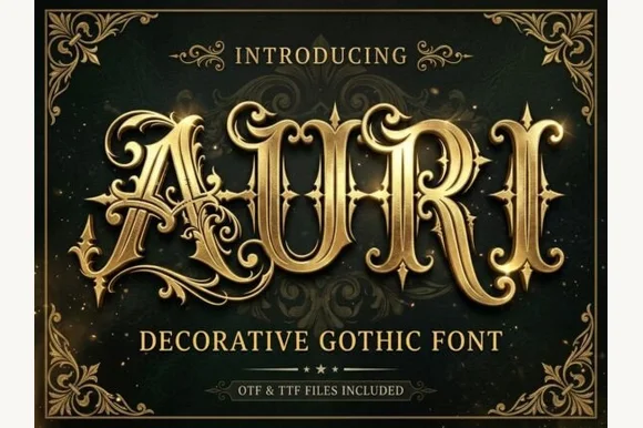
Filigree-swashed Victorian gothic capitals
Auri crowns bold Victorian gothic capitals with mid-stem spurs and scrolling filigree tendrils, built for dark-fantasy covers, emblems and luxury labels, where broad main stems anchor delicate curling side flourishes and turn three to six letter titles or single initials into ornate crests.
Ideas for this font
Same independent foundry
Allow optional Google Analytics to measure visits and catalogue actions. Your search words and notes are not included. Privacy & storage