MakerFileHub · Fonts4,091 curated & craft fonts · 93 curated collections · Original previews
MakerFileHubSaved 0

Foundry portfolio · Serif · Decorative · Display

Colourful Fonts
(25 typefaces).

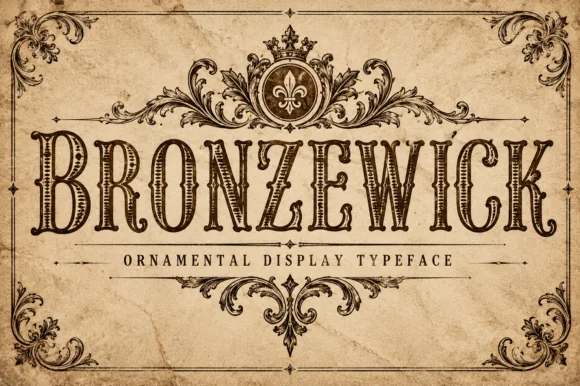
Colourful lives up to the name through contrast rather than through novelty. Orvelia is a soft serif with a romantic slant, Bronzewick a sharper decorative cut, and the 25 releases move between stationery, packaging and seasonal display work with the same warm palette of shapes.

Before you buy from this studio

Two decorative faces from this studio will compete if used together. Assign one to the headline and set everything else in a neutral roman or sans.

Typefaces by Colourful

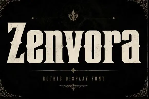
Original Zenvora preview by Colourful

Heavy gothic display with waist notches

Zenvora

Zenvora is a heavy gothic display in bone cream on a dark mottled ground: narrow letter bodies with waist notches cut into the sides, a slanted Z that starts the word, sharp spurs and a stone texture, framed by a thin ruled border with fleur-de-lis corners, a small line beneath and a plain caption.

Explore
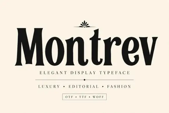
Original Montrev preview by Colourful

High-contrast condensed display serif

Montrev

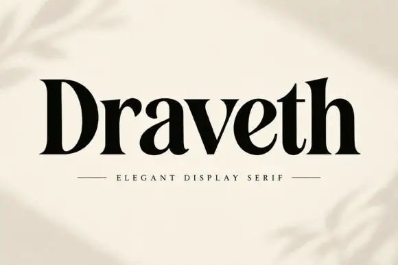
Montrev is an elegant display serif in black on cream: condensed caps and lowercase with very high contrast, narrow bracketed serifs, a tight waist on the stems and a small fleuron ornament above the word, so the name reads as a fashion masthead rather than a text serif.

Explore
Original Evellune preview by Colourful

Tall high-contrast mixed case with sharp top cuts and slender curved joins

Evellune

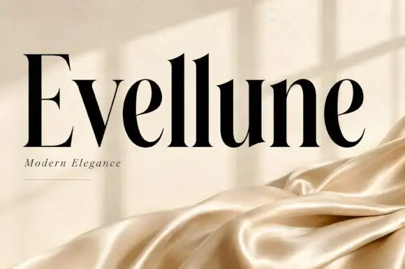
Evellune shows a black name across warm cream: the capital E carries fine projecting ends, the tall l stems finish in sharp angled tops and the lowercase e bowls narrow through very thin curved joins so the uprights read dense against fine edges.

Explore
Original Virellore preview by Colourful

Rugged ornamental display serif

Virellore

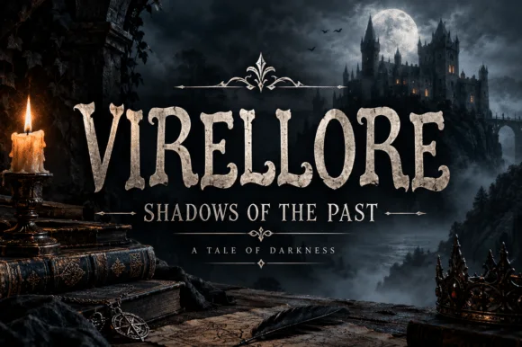
Virellore is an ornate display serif in weathered cream on a dark gothic scene: heavy bracketed serifs, split terminals, small thorns along the strokes, and rules with diamond finials between the lines, so the plate reads as a fantasy title card rather than as an editorial serif.

Explore

Help improve the font catalogue?

Allow optional Google Analytics to measure visits and catalogue actions. Your search words and notes are not included. Privacy & storage

Original preview

Clear review data?