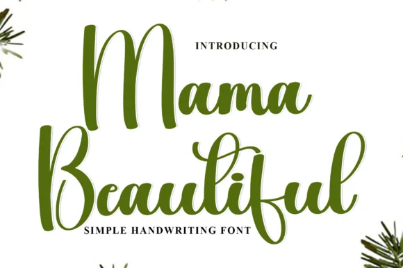
 #1 · Best Overall
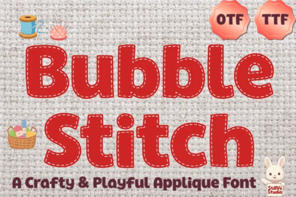
Bubble Stitch
Sewn fabric-appliqué bubble font with interior running stitches
Get fontPaid link
Read review ↓Disclosure: MakerFileHub may earn a commission from qualifying purchases via paid links on this page. How our links work.
Running stitch, applique & hoop lettering
A stitched look comes from two things: a dash pattern that follows the stroke like running stitch, and a shape heavy enough for applique fabric to sit inside. Bubble Stitch and Chunky Stitch draw the stitch line inside the letter, Celtic Stitches carries it through uncial forms, and Machine Embroidery supplies a heavy block that digitises predictably.
Quick verdict
Bubble Stitch is the strongest applique base, Chunky Stitch the cleanest for machine digitising, and Celtic Stitches the pick for heritage and Irish themes. Embroidery Graphic covers the plain label case where stitched texture would be too much.
Quick answer
Short on time? Start with our three highest-rated hoops, appliqué & stitch-style standouts before scrolling the full breakdown.
#1 · Best OverallSewn fabric-appliqué bubble font with interior running stitches
 #2 · Runner-Up Pick
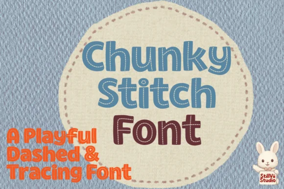
Playful chunky block font with dashed interior stitch lines
 #3 · Editor's Choice
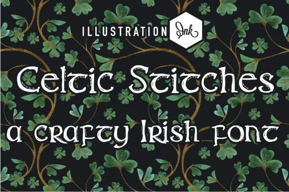
Rounded Irish uncial lettering with dashed stitch lines inside every stroke
We kept 14 of 205 candidates that actually show a stitch pattern in the glyphs rather than in the mockup. Judged on dash spacing at 2 inch hoop scale, whether the applique path is visible as a separate contour, and stroke weight relative to typical 40-weight thread.
Side-by-side summary
Compare specimens, OpenType/PUA traits and primary project roles side by side.
| Rank & Font | Style & File Specs | Best Project Fit | Store Listing |
|---|---|---|---|
| DecorativeAppliqué | Faux-appliqué sublimation onesie, nursery print & quilt label | Get fontPaid link | |
| DisplayCrafty | Preschool letter-tracing worksheet & classroom craft sign | Get fontPaid link | |
| DecorativeUncial | St. Patrick's Day greeting card, Irish bakery tag or quilt label | Get fontPaid link | |
| DisplayBold | Craft-room bin label, canvas tote HTV or patch lettering | Get fontPaid link | |
| DecorativeFile formats | Cut-and-paste scissor worksheet, sewing pattern & tracing card | Get fontPaid link |
#1 · Best OverallBubble Stitch is a crafty, rounded appliqué display font bordered just inside every letter edge by a crisp dashed running-stitch line.
Bubble Stitch is a fabric-appliqué bubble face with interior running stitches: fat rounded letters with a torn fabric edge, a dashed running stitch following the outline just inside the shape and a small thread knot at each corner. The stitches are the design and they merge into a solid line once the face is reduced. It needs roughly 30 mm for the stitch pitch to read, and it is best as a one-colour print on a textured stock, or a real appliqué where the stitch line becomes an actual sewn path.
Faux-appliqué sublimation onesie, nursery print & quilt label — Clip gingham, floral cotton, or corduroy digital patterns into the solid letter shapes in Canva/Photoshop for realistic faux-patch shirts.
Tiny perimeter stitch dashes mean you should produce this via sublimation, DTF, or Print-Then-Cut—never weed dozens of tiny vinyl dashes.
#2 · Runner-Up PickChunky Stitch is a rounded, solid block typeface pierced down the center of every stroke by a crisp dashed running-stitch line.
Chunky Stitch is a playful chunky block face with dashed interior stitch lines: fat squared letters with rounded corners, a dashed running stitch following each stem inside the shape and a small thread knot at the corners, drawn so the word reads as sewn fabric. The stitch pitch is the design and it merges into a solid line once the face is reduced. It needs roughly 28 mm for the stitch pitch and the block edge to read, and it is best as a one-colour vinyl cut or a two-colour print where the stitch takes the lighter ink.
Preschool letter-tracing worksheet & classroom craft sign — Print large 72–96 pt words in pale gray or sky blue on practice sheets so crayon or marker strokes show clearly on top.
Best used for printed worksheets, Print-Then-Cut stickers, and sublimation—on cut vinyl, every letter would have tiny dash pieces to weed.
#3 · Editor's ChoiceCeltic Stitches is a rounded uncial face in which the letterforms keep their traditional wide curves and a dashed stitch line runs inside every stroke, so a word reads as letters cut from felt and sewn down.
The A arches over a broad counter, the b lifts a wide bowl on a short stem, the g closes a rounded descender and the stems all carry a regular dashed line at their centre. The stitch dashes are the character: they sit inside the strokes rather than tracing the outline, which is why the sample sets one word with a plain ground. Because the dashes are fine, the face wants 30 pt before they read as stitches and not as print noise, and the even strokes cut cleanly from three quarters of an inch of cap height. The green ground, the small shamrocks and the caption are presentation; the pale stitched letters are the face.
St. Patrick's Day greeting card, Irish bakery tag or quilt label — Set in Mixed Case over deep shamrock green, navy or kraft paper.
Internal stitch dashes print and sublimate crisply; use solid/print workflow rather than tiny vinyl weeding.
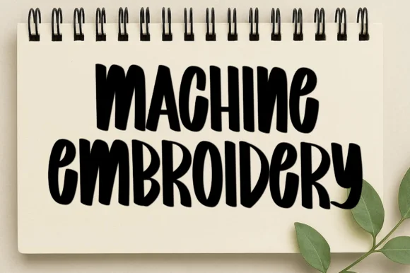 #4 · Top Maker Utility
Machine Embroidery is a tall condensed capital alphabet in which the strokes stretch upward, the edges stay dry and uneven, and the weight changes across each letter, so a word reads as something brushed onto a notebook cover.
The M keeps three tall stems with uneven joins, the A pinches a narrow apex, the C cuts a long crescent, the H sets a low bar, the E stacks three short arms and the R turns a blunt leg, all at a brush weight with ragged contours and a compressed fit. The dry edge is the character: the brush runs out of ink at the stroke ends, which is why the sample sets one short word per line at large size. Because the strokes carry texture, the face needs 40 pt before the rag reads as a brush mark rather than as dirt, and it prints best in one dark colour. The cream notebook, the spiral binding and the small plant stem are presentation; the black brushed words are the face.
Craft-room bin label, canvas tote HTV or patch lettering — Stack two condensed uppercase lines tightly at centre.
Standard OTF/TTF vector font (not a pre-digitized stitch file); cuts cleanly on Cricut and Silhouette.
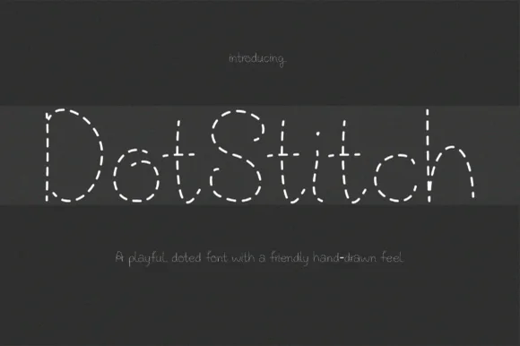 #5 · Standout Silhouette
Dotstitch is a charming monoline dashed-stitch font mimicking hand-sewn embroidery running stitches and scissor cut-lines (OTF & TTF).
Dotstitch is a monoline alphabet drawn as a running stitch: each stroke is broken into even dashes with rounded ends, so the letterforms read as thread sewn through fabric rather than as an outline drawn on top of it. Because the weight never varies, the face scales predictably for cutting and plotting, and the dash rhythm gives clear entry points for anyone following the line. Lowercase and uppercase differ enough to be set as a pair, which is unusual for a novelty stitched face. It carries small labels well and pulls apart in large sizes where the gaps become part of the drawing.
Cut-and-paste scissor worksheet, sewing pattern & tracing card — Set mixed-case titles at 48–96 pt in chalk white over slate/denim or dark charcoal over white worksheet stock.
Use with Cricut Pens, printables, DTF, or sublimation—do NOT blade-cut hundreds of individual stitch dashes in vinyl!
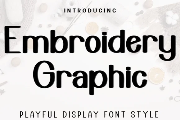 #6
Embroidery Graphic is a playful display sans in which the strokes stay even, the ascenders run tall and a few letters open into loops, so a two-word title reads as a friendly sign rather than as a neutral grotesque.
The E sets three even arms, the m turns two flat shoulders, the b rises a tall ascender into a loop, the r keeps a straight arm, the o stays a wide circle and the G carries a low spur, all at an even monoline weight with open counters and a light change in rhythm at the loops. The tall ascender is the character: it lifts the mixed-case line and keeps the word airy, which is why the sample sets two stacked words at a generous spacing. Because the strokes are even, the face holds from 22 pt to a board and prints in one colour; the loops need a little tracking to stay open. The pale fabric ground, the spools, the small buttons and the caption below are presentation; the black display words are the face.
Appliqué pattern template, quilt label or kids' name tag — Set cleanly in Mixed Case with comfortable tracking.
Supplied as vector OTF/TTF (not PES/DST); uniform stroke width is ideal for vinyl and easy auto-digitizing.
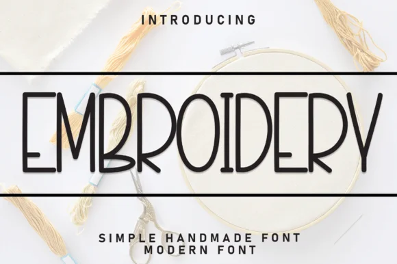 #7
Embroidery (by Robbots stores) is a tall, narrow monoline uppercase sans print engineered for clean minimalist labels and easy cutting.
Embroidery is a tall narrow monoline print sans in caps with rounded corners and even stroke weight, drawn for clean minimal labels and easy cutting. Because the stroke is a single uniform line, the face converts to a stitch path or a cut path without redrawing, and the narrow stance fits a long word on a small hoop. It needs roughly 8 mm for the stitch to hold and roughly 18 mm for a cut shape, and it is best in charcoal on natural linen or one floss colour on white.
Floss-bobbin organizer label, minimal care card & jar — Center 1 uppercase word at 44–84 pt framed top and bottom by clean hairline horizontal rules.
Uniform medium monoline strokes cut in seconds on Cricut Oracal 651, label tape, and Pens down to 0.55 inches!
 #8
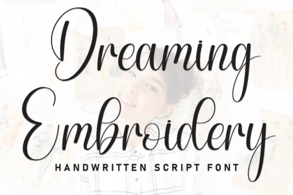
Dreaming Embroidery is a brush script in which the downstrokes run heavy, the upstrokes thin out and the capitals climb into tall loops, so a two-word title reads as handwriting made with a loaded brush pen.
The D opens a tall loop that swings left of the stem, the r finishes a light hook, the e turns a round eye, the a closes a bowl, the m keeps three even shoulders and the g drops a hooked tail, all at a brush contrast with generous looped ascenders and a quick right slant. The tall loops are the character: they lift the line and leave space under the word, which is why the sample sets two stacked words with wide leading over a pale photograph. Because the downstrokes are heavy, the face holds from 24 pt and prints on most stocks; the hairline upstrokes need a smooth surface at small sizes. The faded photograph, the pale background and the small caps line beneath are presentation; the black brush words are the face.
Printed embroidery-hoop quote backdrop or handmade care card — Weld overlapping joins if cutting vinyl; note this is a smooth OTF/TTF vector font, not a PES/BX embroidery machine file.
Confirm vector vs stitch format: use embroidery digitizing software if converting for stitch machines.
 #9
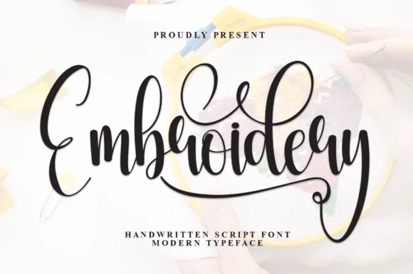
Embroidery is a flourished calligraphic script in which the ascenders rise into tall loops, the capital opens with a wide curve and the word ends in a swash that sweeps below the line and curls back.
The capital E opens as a broad crescent that crosses the baseline, and the letters after it keep a calligraphic contrast: the m and the b hold thick stems, the r and the o close small bowls, the i dot sits high and the d rises into a loop. The terminal swash is the character — it leaves the last letter, travels under the word and hooks upward, which is what fills the bottom of a composition and makes the face suit tags and labels rather than running text. Weight is heavy in the stems with fine joins, so the face wants 22 pt minimum and a smooth stock. The photograph of hands stitching, the black ink, the two credit lines are presentation; the script is the word shown.
Handmade shop logo, woven-label art or care instruction header — Pair with clean uppercase sans for washing/care instructions.
Standard smooth OTF/TTF vector typeface (not pre-digitized machine embroidery stitches); weld before vinyl cutting.
 #10
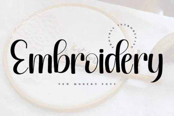
Embroidery (by ABBAsalam) is the boldest, sturdiest of the three 'Embroidery' scripts—featuring thick upright brush strokes and clean open counters!
Embroidery by ABBAsalam is a bold upright brush script with thick shaded stems, a double-bellied E and tidy untangled loops, so a name reads as lettering drawn for a hoop rather than a wedding script. The weight is sturdy enough for HTV and plotting, and the open counters keep it legible at 14 mm on a linen label where a fine script would break. It needs roughly 22 mm for the brush shading to read, and it is best in solid black on natural linen or in one thread colour on white.
HTV canvas project bag, stitched sweater pattern & mug — Center 1 word at 4.5–8 inches wide across linen zipper pouches or wooden hoop signs.
Weld all touching cursive connectors before cutting HTV or permanent vinyl; weeds cleanly down to 0.85 inches!
 #11
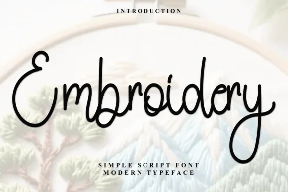
Embroidery (by Inermedia Studio) is a clean, medium-weight monoline cursive script—smooth solid ink rather than faux stitch dashes.
Embroidery is a smooth rounded monoline marker cursive: an even medium stroke with fully rounded ends, joined letters, a light slant and almost no thick-thin contrast, drawn so the line reads like a single running stitch. The monoline is what makes it survive machine embroidery, where a contrast stroke merges into a solid block. It needs roughly 26 mm for the rounded join and the monoline to read, and it is best as a single thread colour on a light ground, or one ink print on smooth stock.
Craft-room organizer bin decal, tote bag & maker mug — Center single-word craft labels ('Ribbon', 'Fabric', 'Thread') at 1.25–2 in height across clear acrylic storage bins.
Weld overlapping lowercase connectors before cutting vinyl; note that for real machine embroidery you will digitize it as a satin/run path.
 #12
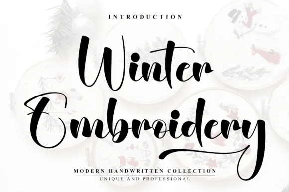
Winter Embroidery is a bouncy modern calligraphy brush script—despite its name, it features smooth solid ink strokes rather than stitch textures.
Winter Embroidery is a thick-thin bouncy modern brush script: a high-contrast stroke with a swollen thick and a hairline-thin, letters that rise and fall along the baseline and joins that loop back into the word. It is the look of a machine-embroidered name, so it suits a patch or a knit more than a leaflet. The hairlines are the finest element and they break first, on thread and in print. It needs roughly 34 mm for the thick-thin contrast to read, and it is best one colour on a soft ground where the hairline holds.
Holiday mug decal, gift sack & ornament lettering — Stack a two-word winter phrase with tight leading so the upper capital sits neatly above the wider lowercase second word.
Weld all cursive joins before vinyl cutting and keep x-height above 0.65 in so the thin upward connectors do not lift during weeding.
 #13
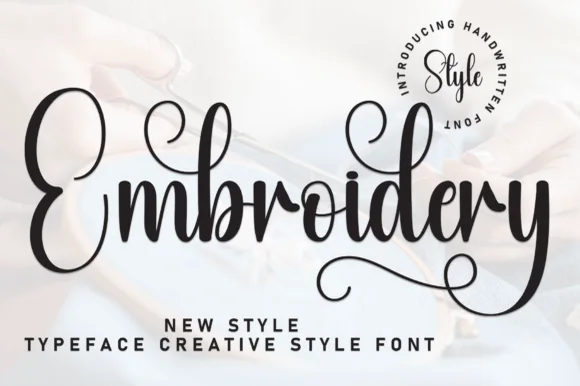
Embroidery (by Strongkeng Old) is an airy, high-contrast calligraphy script accented with coiled spiral loops inside 'm', 'd', and 'y' (PUA encoded).
Embroidery is an airy high-contrast calligraphy script with a grand curled E, shaded upright downstrokes and small inward-coiled spirals inside the m, d and y, supplied with PUA alternates. The coils are delicate, so the face needs roughly 20 mm before they read as spirals rather than blots, and the upright stance keeps a long name inside a narrow column. It is a hoop, card and label face, best in one dark ink on a soft ground, and it pairs naturally with craft and textile subjects.
Hand-embroidered hoop pattern transfer, card & gift tag — Center 1 title-case word at 5–7 inches wide inside a round wooden embroidery hoop.
IMPORTANT for machine embroiderers: hairline connectors and tiny spirals are for HAND-stitching, print, or 2 in+ vinyl—too thin for auto-digitized satin machine stitches!
 #14
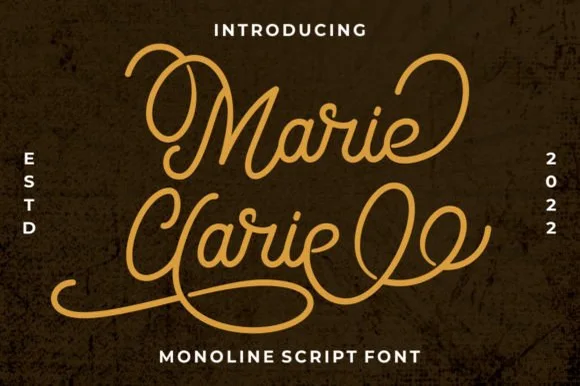
Marie Clarie is a smooth, medium-fine monoline script featuring oversized vintage ribbon loops on capitals and spiraled terminal flourishes.
Marie Clarie is a vintage neon-sign and badge monoline script: an even tubular stroke that reads as bent glass, joined letters, a shallow slant and a badge frame of concentric rules around the word with small dots at the corners. The monoline is what lets it work as a neon tube, and the badge rules are the finest element. It needs roughly 28 mm for the tube and the badge rule to read, and it is best as a one-colour neon or vinyl job, or a flat two-colour print on a dark ground.
LED neon wall-sign mockup, salon logo & vintage jacket — Stack a two-word name tightly so the sweeping lower loop of the second capital nests beneath the first word.
Consistent monoline thickness cuts far cleaner on HTV and vinyl than high-contrast scripts—just weld all overlapping loops first.
Practical buyer checklist
Key cutting, printing and pairing answers before choosing a hoops, appliqué & stitch-style typeface.
Not directly. Embroidery software needs stitch paths, not outlines, and will auto-digitise with occasional bad choices such as long jump stitches or satin columns that are too wide. Expect to adjust density and underlay for every weight.
Around 1.5 to 3 mm of stroke converts to a clean 3 to 4 mm satin column. Below 1 mm the software produces a run stitch that looks thin and patchy; above 5 mm it splits into fill sections and changes the letter's character.
Medium-weight cotton with a fusible backing holds a clean edge. Stretch knits need a cut-away stabiliser and a wider satin border, or the applique curls after the first wash.
They print beautifully, and that is often the fastest use: run the same stitched lettering on price cards and labels so the table reads as one brand without sewing a single sample.
Keep exploring
Explore adjacent maker roundups or check our practical pre-production checklists.
38 curated fonts · Previews & pairings
33 curated fonts · Previews & pairings
27 curated fonts · Previews & pairings
20 curated fonts · Previews & pairings
Guides: Invitation font checklist · Vinyl & cutting checklist · How to pair script & sans fonts
Allow optional Google Analytics to measure visits and catalogue actions. Your search words and notes are not included. Privacy & storage