Modern Grotesque Body

Vorgraven + Godthem
Creates crisp high-hierarchy contrast beneath Vorgraven headlines across menus, websites and labels.
Inspect Godthem specimenDisclosure: MakerFileHub may earn a commission from qualifying purchases via paid links on this page. How our links work.
Carved heritage serif with gothic spurs and heavy slab feet
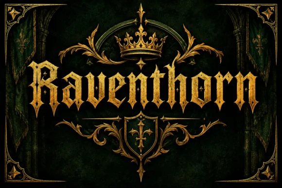
Vorgraven is a heritage serif in which the stems carry gothic spurs, the bowls are cut square and the feet flare into heavy slabs, so a word reads as lettering carved into stone.
Paid link
Get this fontProject & layout blueprintsAt-a-glance maker compatibility
Crisp hairline serifs shine on stationery, foil stamping, and packaging; add slight offset for small decals.
Visual anatomy & craft review
The V opens with two spurred stems, the O closes a squared counter, the G carries a straight bar and a spur, and the R holds a heavy bowl and a straight leg, all at a heavy even weight with flat tops and unbracketed slabs. The spurs are the character: short cuts project from the stems at an angle and catch the light like chiselled edges, which is what gives the face its monument register. The fit is tight, so a single word builds a solid block at 60 pt on a label or a sign, and the counters stay open at display sizes. Because the weight is uniform and the edges are flat, the face reproduces well in foil and in deboss. The dark stone, the gold frame, the crest, the thin rules and the two caption lines are presentation; the typeface is the word.
Carved · Spurred · Heritage
Two-font hierarchy recipes
Tested contrast partners — pairing Vorgraven with grounded secondary typography.
Vorgraven + Godthem
Creates crisp high-hierarchy contrast beneath Vorgraven headlines across menus, websites and labels.
Inspect Godthem specimen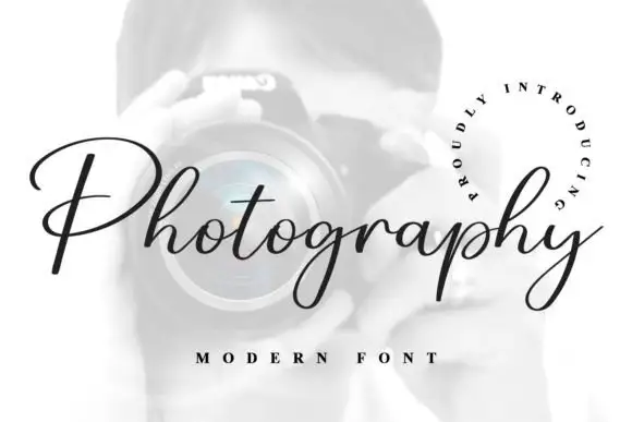
Vorgraven + Photography Font
Adds a warm human signature touch for 1-to-3-word callouts without competing against structured serif capitals.
Inspect Photography Font specimenPractical applications
Concrete hierarchy, scale and production guidance tailored to Vorgraven’s stroke geometry.
The carved spur gives a bottle label a heritage register, and the flat edges reproduce cleanly in foil at 15 pt where a rounded serif would smear.
Hierarchy & layout recipe
Print a 60 by 90 mm label: set the brand at 15 pt, set the age statement in a 6 pt caps serif beneath, and keep 6 mm of margin so the spurs are not cut by the label's rounded corner.
Pre-production check
Foil on a spur under 0.5 mm bridges; check a foil dummy at final size and blunt the smallest spurs rather than dropping the foil.
The carved letters read at 14 cm on a stone or metal plate, and the uniform weight reproduces in engraving without losing the spurs.
Hierarchy & layout recipe
Engrave a 500 by 200 mm plate: set the hotel name at 14 cm, set the founding year in a 4 cm caps serif beneath, and keep 8 cm of border so the fixing holes fall on blank metal rather than through a letter.
Pre-production check
Engraving a deep spur needs a wider cut; confirm the engraver's minimum and widen the spur rather than the stems.
The heritage weight suits a period building, and the heavy blocks read at 10 cm on a wooden or painted board where a light serif would vanish.
Hierarchy & layout recipe
Paint a 800 by 500 mm board: set the greeting at 10 cm, set the names in a 5 cm caps serif beneath, and leave 10 cm of border so the slabs sit clear of the board edge and the frame.
Pre-production check
Paint bridges the spurs on a wooden board; check the sign at two metres and keep the spur width above 4 mm.
Technical & licence verification
Confirm included OTF/TTF/WOFF formats, full glyph tables and licence coverage on the live store page before batch production.
Closest visual alternatives
Matched across letterform anatomy, stroke behaviour and craft applications.
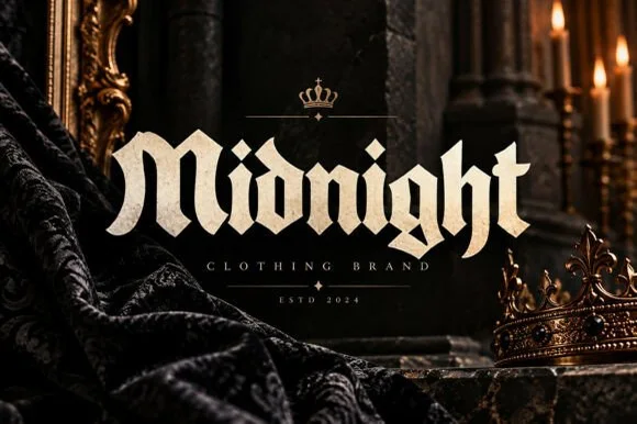
Bold street-gothic blackletter with compact forms and heavy verticals
Midnight is a bold blackletter in which the letters stay compact, the verticals run heavy and the breaks bend at sharp angles, so a word reads as a clothing label rather than as a manuscript.
Ideas for this font
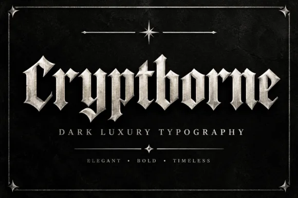
Crisp cathedral blackletter with flat tops and fine diamond spurs
Cryptborne is a crisp cathedral blackletter in which the letters are built from flat-topped stems, fine diamond spurs and thin hairlines against heavy mass, so a short word reads as carved stonework.
Ideas for this font
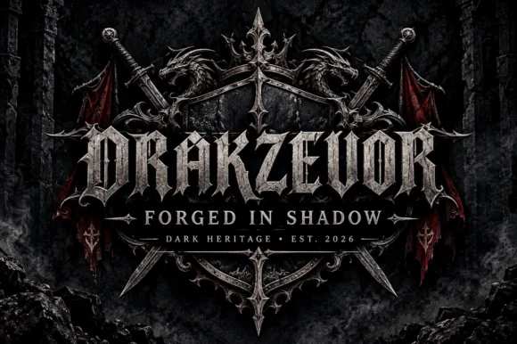
Armoured dark-fantasy gothic with pointed spurs and heavy blackletter structure
Drakzevor is an armoured dark-fantasy gothic alphabet in which each letter grows pointed spurs and the blackletter skeleton is thickened into metal plates.
Ideas for this font
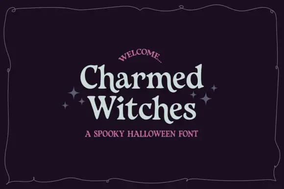
Soft irregular mixed case with flared rounded endings
Charmed Witches shows pale letters with softly curved stems, small flared serifs and uneven proportions: the W spreads broadly while the lowercase h and t rise above compact rounded bowls inside a thin wavy frame.
Same independent foundry
Allow optional Google Analytics to measure visits and catalogue actions. Your search words and notes are not included. Privacy & storage