Neutral Sans Workhorse

Zenvora + Bareum
Lets Zenvora own the focal silhouette while handling secondary copy, sizing and subheads cleanly.
Inspect Bareum specimenDisclosure: MakerFileHub may earn a commission from qualifying purchases via paid links on this page. How our links work.
Heavy gothic display with waist notches
Zenvora is a heavy gothic display in bone cream on a dark mottled ground: narrow letter bodies with waist notches cut into the sides, a slanted Z that starts the word, sharp spurs and a stone texture, framed by a thin ruled border with fleur-de-lis corners, a small line beneath and a plain caption.
Paid link
Get this fontProject & layout blueprintsAt-a-glance maker compatibility
Sturdy stroke walls and open counters weed cleanly on adhesive vinyl, HTV apparel film, and cut cardstock.
Visual anatomy & craft review
The word fills the frame and the drawing is a heavy gothic capital with two devices: the waists are notched inward so each stem reads as carved stone, and the first letter is slanted, which gives the block an asymmetric start. That construction sets a moderate size floor, because the notches close first, and the dark mottled ground with the bone fill shows that the face holds against a textured background at display size. The ruled border and the fleur-de-lis corners are staging that name the register, and the caption beneath is product copy. Because the letters are heavy and faceted, the face suits a poster, a label and a sign for a historical subject, and it is a face for one or two words.
Display, gothic, heavy, carved
Two-font hierarchy recipes
Tested contrast partners — pairing Zenvora with grounded secondary typography.
Zenvora + Bareum
Lets Zenvora own the focal silhouette while handling secondary copy, sizing and subheads cleanly.
Inspect Bareum specimen
Zenvora + Augler
Grounds bold display lettering with classic typographic authority on posters, badges and apparel.
Inspect Augler specimenPractical applications
Concrete hierarchy, scale and production guidance tailored to Zenvora’s stroke geometry.
A faceted gothic reads as carved rather than printed, and the notched waists hold against a dark textured ground where a fine gothic would break up.
Hierarchy & layout recipe
A2 poster: the event at 100 mm cap height, the details in a 14 mm serif, and the venue at 11 mm. Keep 32 mm margins and print one colour on a dark stock with the type reversed out.
Pre-production check
Check the A2 at five metres, where a notch can vanish; keep it above 2.5 mm. Confirm the 11 mm venue reads at two metres and that the block clears the border.
A notched gothic frames a period cover, and the slanted first letter gives a short title a start that a regular gothic cannot offer.
Hierarchy & layout recipe
Set the title at 85 mm cap height across 180 mm, the author in a 12 pt serif, and the imprint at 8 pt. Print two colours on a textured stock and keep 22 mm margins at the head.
Pre-production check
Check the title at 85 mm, where a notch can clot; keep the counters open. Confirm the 8 pt imprint survives lamination and that the title clears the trim.
A heavy gothic label reads as a house with history, and the notched stems give a small die texture where a flat face would look plain.
Hierarchy & layout recipe
Print a 55 by 85 mm label: the house at 13 pt, the expression at 8 pt, and two colours on a coated stock. Keep 5 mm inside the die and keep the notches above 0.5 mm.
Pre-production check
Check the 13 pt house on a small die, where a notch can fill; keep it above 0.5 mm. Confirm the 8 pt expression reads at arm's length and that the label holds in a cellar.
Technical & licence verification
Confirm included OTF/TTF/WOFF formats, full glyph tables and licence coverage on the live store page before batch production.
Closest visual alternatives
Matched across letterform anatomy, stroke behaviour and craft applications.
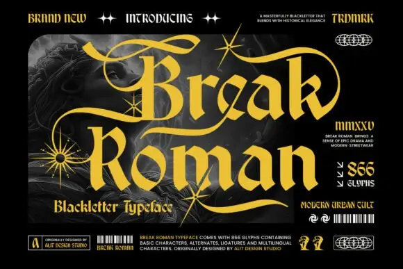
Angular blackletter forms with broad strokes and sweeping alternate-like curls
Break Roman is a bold blackletter display face with wide letters, thick stems, and flourishes that sweep out of the capitals across the whole line, framed by drawn starbursts.
Ideas for this font
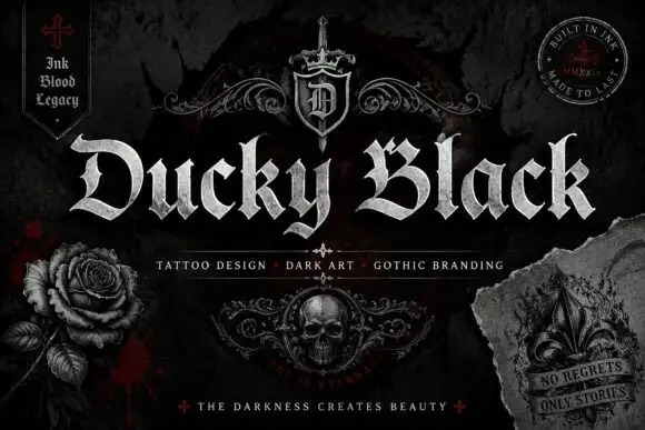
Wide blackletter with sweeping D and a densely split B
Ducky Black is a tattoo and dark-art blackletter with wide stems, sharp spurs and a distressed silver fill, framed by drawn roses, a skull and a fleur.
Ideas for this font
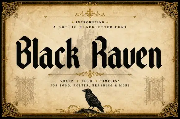
Solid blackletter with angular B and R bowls and pointed feet
Black Raven is a bold blackletter display face with wide stems, tight spacing and a flat black contour, drawn to print solid at large sizes on a light ground.
Ideas for this font
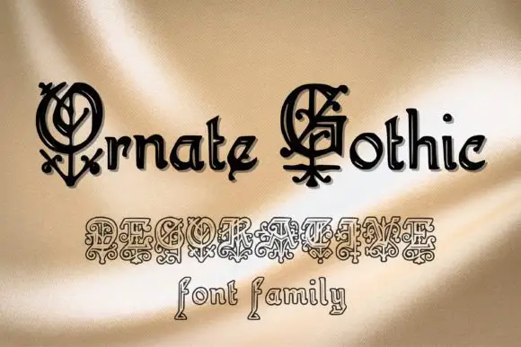
Gothic family with ornamental caps
Ornate Gothic is a gothic family shown on gold satin: blackletter mixed case with elaborate initial capitals built from interlaced curls, and a second row beneath in an outline version with ornamental forms, with the words 'font family' set in a separate outlined gothic beneath.
Ideas for this font
Same independent foundry
Allow optional Google Analytics to measure visits and catalogue actions. Your search words and notes are not included. Privacy & storage