Neutral Sans Workhorse

Bronzewick + Clyne Sans
Lets Bronzewick own the focal silhouette while handling secondary copy, sizing and subheads cleanly.
Inspect Clyne Sans specimenDisclosure: MakerFileHub may earn a commission from qualifying purchases via paid links on this page. How our links work.
Engraved woodcut western display
Bronzewick pairs tall narrow Old West capitals with fine engraved linework inside every stem, so a single-colour print gains the depth of copperplate or woodblock engraving without a second ink.
Paid link
Get this fontProject & layout blueprintsAt-a-glance maker compatibility
Sturdy stroke walls and open counters weed cleanly on adhesive vinyl, HTV apparel film, and cut cardstock.
Visual anatomy & craft review
The letters stay narrow and tall with heavy bracketed serifs, and the interior of each stem carries thin parallel hatch lines that read as shading. The internal hatching is the character: the depth lives inside the letter rather than in an outline, which is why the sample suits a whiskey label. Because the hatch lines are fine, keep 34 pt before they resolve, and check that the chosen surface does not fill them at press. The face suits short heritage headings and loses the engraving effect on longer lines.
Western · Engraved · Hatched
Two-font hierarchy recipes
Tested contrast partners — pairing Bronzewick with grounded secondary typography.
Bronzewick + Clyne Sans
Lets Bronzewick own the focal silhouette while handling secondary copy, sizing and subheads cleanly.
Inspect Clyne Sans specimen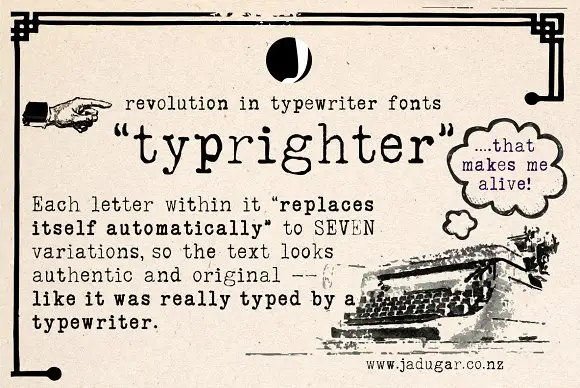
Bronzewick + Typrighter
Grounds bold display lettering with classic typographic authority on posters, badges and apparel.
Inspect Typrighter specimenPractical applications
Concrete hierarchy, scale and production guidance tailored to Bronzewick’s stroke geometry.
The hatched stems suit a spirits label, and the narrow capitals hold a brand at 22 pt on a 50 mm panel in one ink. The hatch also gives a flat single-colour print a second tone without a second ink.
Hierarchy & layout recipe
Print a 50 by 70 mm label: set the brand at 22 pt in capitals, keep every hatch line at 0.4 mm, and set the volume in a 6 pt caps at the foot with 5 mm of clear ground. Keep the label panel tall.
Pre-production check
Hatch lines under 0.3 mm fill on an uncoated label; check the plate proof and keep the brand at 20 pt or above.
The woodcut capitals set a period poster, and the hatched stems read from a few paces at 60 mm on a printed sheet. The narrow capitals also keep a poster title from spreading.
Hierarchy & layout recipe
Print an A2 poster: set the title at 60 mm in capitals, keep 24 mm of clear ground beneath for the date line at 16 mm, and keep 25 mm of margin all round the sheet. Keep the date line plain.
Pre-production check
Hatching printed at 30 mm turns into a grey tone; check the film at full size and keep the title at 50 mm or above.
The engraved western letters suit a shopfront, and the heavy serifs hold a two-word name at 55 mm on a painted board. The engraved interior also reads on a painted board at distance.
Hierarchy & layout recipe
Paint a 550 by 250 mm board: set the name at 55 mm, keep each hatch stroke at 2 mm, and keep 24 mm of border so the bracketed serifs stay inside the frame. Keep the board upright on its posts.
Pre-production check
Hatch strokes painted at 1 mm close under a second coat; check the mask and keep them at 2 mm. Use a sign-grade enamel for the board.
Technical & licence verification
Confirm included OTF/TTF/WOFF formats, full glyph tables and licence coverage on the live store page before batch production.
Closest visual alternatives
Matched across letterform anatomy, stroke behaviour and craft applications.
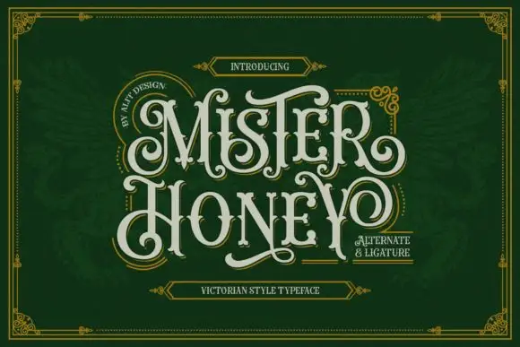
Curled display capitals with ball terminals and a looping Y
Mister Honey revives a Victorian poster style: tall condensed capitals with bulbous serifs, curling tails and a thin inner keyline that opens a second colour inside every letter.
Ideas for this font
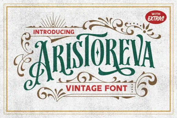
Condensed vintage letters with elaborate swashes
Aristoreva is a condensed vintage face in which the letters stay tall with high contrast, the terminals curl and a long A flourish descends below the baseline while several strokes sweep across or under neighbouring characters.
Ideas for this font
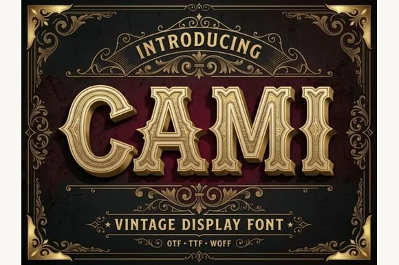
Bevel-grooved 1920s saloon capitals
Cami sculpts wide Victorian-Western capitals with mid-stem spurs and recessed inline grooves, so a three to seven letter name reads as a carved sign over a saloon door or a theatre header.
Ideas for this font
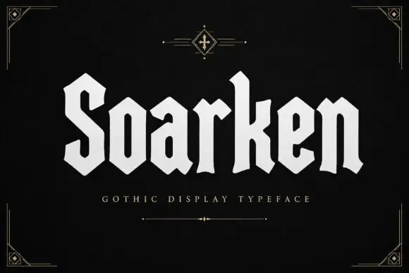
Geometric heavy blackletter
Soarken is a heavy geometric blackletter in bone on a black ground: a broad S, clipped angular bowls, flat terminals and even stroke widths, set as one word between a small ornament above and a tracked descriptor beneath, with fine corner rules at the frame.
Ideas for this font
Same independent foundry
Allow optional Google Analytics to measure visits and catalogue actions. Your search words and notes are not included. Privacy & storage