Neutral Sans Workhorse

Drexon + Montreal
Lets Drexon own the focal silhouette while handling secondary copy, sizing and subheads cleanly.
Inspect Montreal specimenDisclosure: MakerFileHub may earn a commission from qualifying purchases via paid links on this page. How our links work.
Heavy playful rounded forms with irregular widths and soft corners
Drexon is a heavy playful display in which the letters keep thick rounded bodies, the widths shift from letter to letter and the openings stay compact, so a short phrase reads as hand-drawn merchandise lettering.
Paid link
Get this fontProject & layout blueprintsAt-a-glance maker compatibility
Sturdy stroke walls and open counters weed cleanly on adhesive vinyl, HTV apparel film, and cut cardstock.
Visual anatomy & craft review
The D closes a broad soft bowl, the r shortens its arm, the e keeps a small opening and the x splays two heavy diagonals, all at a chunky weight with rounded ends and an uneven baseline that lifts and settles across a word. The irregular rhythm is the character: it makes a two-word line feel drawn rather than set, which is why the sample shows it on shirts and a cup. Because the shapes are wide, a layout needs deliberate leading from 30 pt and the small openings should be checked after any reduction. The shirt, hoodie, cup and stationery in the sample are mockups rather than production proof; the dark lettering is the face.
Chunky · Playful · Irregular
Two-font hierarchy recipes
Tested contrast partners — pairing Drexon with grounded secondary typography.
Drexon + Montreal
Lets Drexon own the focal silhouette while handling secondary copy, sizing and subheads cleanly.
Inspect Montreal specimen
Drexon + Worldstar
Grounds bold display lettering with classic typographic authority on posters, badges and apparel.
Inspect Worldstar specimenPractical applications
Concrete hierarchy, scale and production guidance tailored to Drexon’s stroke geometry.
The chunky lettering holds on canvas at a walkway distance, and the uneven widths keep a short studio name from looking like a template at 50 mm.
Hierarchy & layout recipe
Print a 300 mm tote: set the name at 50 mm, keep 20 mm of clear canvas at the seam, and keep the handle stitching outside the printed block so no letter is folded.
Pre-production check
A chunky word printed across a bag seam loses part of a letter in the fold; check the template and shift the block 18 mm inward.
The rounded weight keeps a greeting friendly, and the irregular baseline gives a small card movement at 34 pt without extra decoration.
Hierarchy & layout recipe
Print an A6 card: set the greeting at 34 pt on one line, set the name at 14 pt in a neutral sans beneath with 12 mm of clear ground, and keep 14 mm of margin all round.
Pre-production check
A heavy display face set at 20 pt closes its compact openings; check the proof and keep the greeting at 30 pt or above.
The playful forms cut into simple shapes, and the soft corners keep a two-word mark whole at 28 mm on a shaped die with a pale ground.
Hierarchy & layout recipe
Print a 60 mm shaped sticker: set the mark at 28 mm, keep 4 mm of clear vinyl around the outermost curve, and keep 6 mm between the words so the die cuts stay separate.
Pre-production check
A die cut that follows a soft corner too closely leaves a fragile rim; check the sheet and keep 4 mm of clearance.
Technical & licence verification
Confirm included OTF/TTF/WOFF formats, full glyph tables and licence coverage on the live store page before batch production.
Closest visual alternatives
Matched across letterform anatomy, stroke behaviour and craft applications.
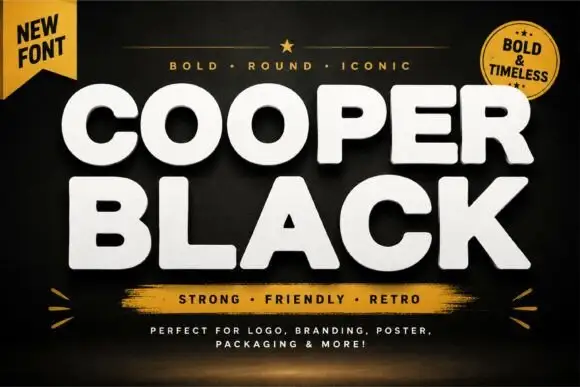
Heavy rounded capitals shown in a plain block specimen
This Cooper Black listing shows heavy rounded capitals in which the strokes stay largely even, the C and O open broad, the A closes a small triangular counter and the R finishes in a blunt diagonal leg, so a title reads as a soft solid block.
Ideas for this font
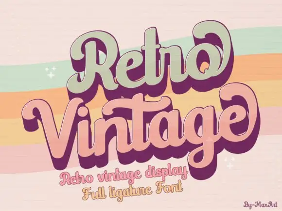
Groovy layered display with heavy offset
Retro Vintage is a groovy display in sage green and dusty pink with a deep plum offset: fat rounded letters that lean and swell, a solid shadow layer that steps down and to the right, and ligatures that fuse adjoining letters into a single shape.
Ideas for this font
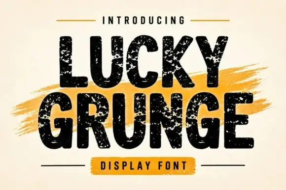
Grunge heavy sans display
Lucky Grunge is a heavy grunge display in black on cream: wide condensed caps with chipped edges, speckled interiors and a slightly rough baseline, set over a dry orange brush swipe with a banner caption, so the pair reads as a stencilled crate label.
Ideas for this font
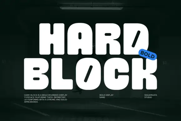
Very heavy rounded blocks with tiny counters and diagonal slots in D and O
Hard Block is a very heavy rounded display in which the capitals sit almost solid, the counters shrink to small pills and the D and O carry a long diagonal slot instead of an open bowl, so two stacked words read as one compact block.
Ideas for this font
Same independent foundry
Allow optional Google Analytics to measure visits and catalogue actions. Your search words and notes are not included. Privacy & storage