Editorial Serif Anchor

Doodlina + Alerigue
Anchors Doodlina's fluid strokes with crisp Roman proportions on wedding suites, headers and packaging.
Inspect Alerigue specimenDisclosure: MakerFileHub may earn a commission from qualifying purchases via paid links on this page. How our links work.
Tall narrow hand-drawn letters with uneven weights and a level baseline
Doodlina is tall narrow hand-drawn lettering in which the letters keep a level baseline but vary in weight, so a word reads as something drawn with a felt tip rather than written with a pen.
Paid link
Get this fontProject & layout blueprintsAt-a-glance maker compatibility
Weld or Unite overlapping script joins into one continuous vector path before sending to the blade.
Visual anatomy & craft review
The D is a tall stem with a narrow bowl that does not close fully against the stem, and the letters that follow keep that drawn quality: the o is a narrow ellipse, the second o sits slightly differently, the d carries a short stem and the l and the i and the n and the a each vary in thickness by a stroke or two. Nothing connects and nothing slants, the weight drifts between letters but stays within a band, and the corners are rounded so no stroke ends sharply. The narrowness is what gives the word its height: the letterfit is tight horizontally and the ascenders are tall, so a short name fills a tall panel. Counters are small ovals. The notebook page, the pencil, the clips, the doodled stars and the three caption lines are presentation; the lettering is the word.
Drawn · Tall · Uneven
Two-font hierarchy recipes
Tested contrast partners — pairing Doodlina with grounded secondary typography.
Doodlina + Alerigue
Anchors Doodlina's fluid strokes with crisp Roman proportions on wedding suites, headers and packaging.
Inspect Alerigue specimen
Doodlina + Bareum
Keeps small-scale dates, URLs, nutrition facts and care instructions crisp and legible below script titles.
Inspect Bareum specimenPractical applications
Concrete hierarchy, scale and production guidance tailored to Doodlina’s stroke geometry.
The drawn uneven look reads as something a teacher made rather than printed, and the tall narrow letters fill a strip above a row of children's work.
Hierarchy & layout recipe
Set the heading at 60 pt on a 900 mm strip, keep the subject labels in a plain 16 pt sans, and hold 20 mm above the strip so the tall stems are not clipped by the frame.
Pre-production check
School strip printers stretch narrow letters; print one strip on the classroom machine and confirm the bowls have not closed before trimming.
The drawn hand gives a handout a friendly, working voice, and the tall narrow fit lets a long workshop title hold one line at the head of an A4 page.
Hierarchy & layout recipe
Set the header at 32 pt at the top of an A4 page, keep the instructions in a 10 pt sans at 14 pt leading, and hold 12 mm below the header before the first step.
Pre-production check
Photocopying closes small counters on a narrow face; check a copy at full size and open the a and o if the ink begins to fill them.
The drawn letters suit a classroom label, and the narrow fit lets a two-word name sit on a 60 mm strip without wrapping onto a second line.
Hierarchy & layout recipe
Set the name at 18 pt on a 60 by 20 mm tray label, keep the class name at 7 pt on the right, and leave 3 mm of margin so the uneven strokes stay inside the cut.
Pre-production check
Labels on trays rub at the edges; print a sheet, apply one to a real tray and check that the drawn strokes do not scuff within a week.
Technical & licence verification
Confirm included OTF/TTF/WOFF formats, full glyph tables and licence coverage on the live store page before batch production.
Closest visual alternatives
Matched across letterform anatomy, stroke behaviour and craft applications.
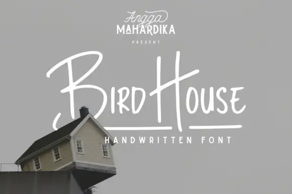
Thin informal marker mixed case with towering capitals and long cross-strokes
Bird House is a thin informal marker hand in which the first capital towers over a narrow lowercase body, the H rises especially high and a long cross-stroke travels across the second word, so a name reads as a quick marker sketch.
Ideas for this font
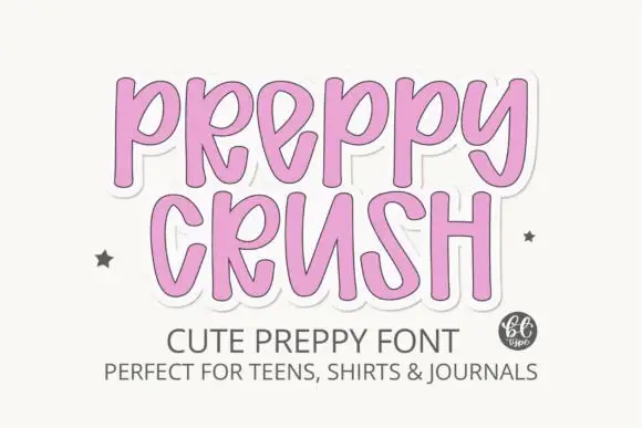
Tall rounded letters with a heavy sticker edge
Preppy Crush is a tall rounded display in pink on white: narrow letters with rounded tops, a heavy white sticker edge and a soft shadow, set as two stacked words with a small logo at the side.
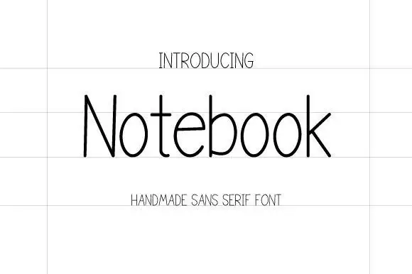
Thin handmade sans
Notebook is a thin handmade sans in near-black on a lined sheet: tall narrow letters with hairline strokes, a very large x-height, open counters and a slight irregularity in the stems, set as one word with a tracked label above and below in the same weight.
Ideas for this font
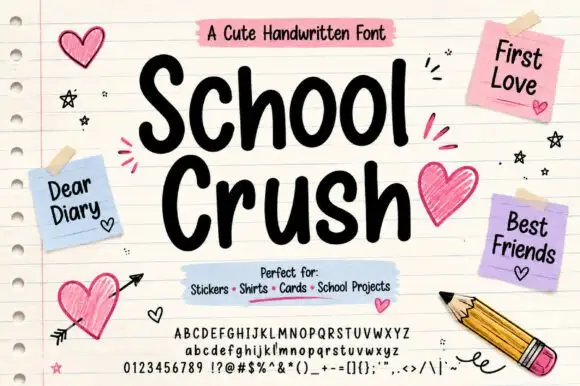
Heavy rounded marker print on a notebook page
School Crush is a heavy rounded marker print in black on a lined notebook page, with drawn hearts, sticky notes and a pencil turning the specimen into a school desk.
Ideas for this font
Same independent foundry
Allow optional Google Analytics to measure visits and catalogue actions. Your search words and notes are not included. Privacy & storage