Modern Grotesque Body

Virellore + Prime Nordic
Creates crisp high-hierarchy contrast beneath Virellore headlines across menus, websites and labels.
Inspect Prime Nordic specimenDisclosure: MakerFileHub may earn a commission from qualifying purchases via paid links on this page. How our links work.
Rugged ornamental display serif
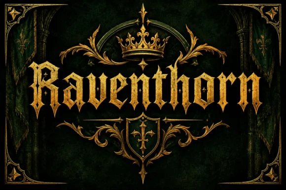
Virellore is an ornate display serif in weathered cream on a dark gothic scene: heavy bracketed serifs, split terminals, small thorns along the strokes, and rules with diamond finials between the lines, so the plate reads as a fantasy title card rather than as an editorial serif.
Paid link
Get this fontProject & layout blueprintsAt-a-glance maker compatibility
Sturdy stroke walls and open counters weed cleanly on adhesive vinyl, HTV apparel film, and cut cardstock.
Visual anatomy & craft review
The name is set once, large, and the drawing takes a serif skeleton and adds ornament along the strokes: the terminals split into forks, small points grow from the shoulders, and the serifs flare, which gives the letters a carved quality without closing the counters. The interior is textured rather than flat, with a fine speckle that reads as stone, and the edges are chipped, so the word holds a middle ground between a printed face and an illustration. Spacing is generous, and the supporting lines are set in a small caps roman between rules with diamond centres, which is what keeps the composition from turning into a single texture. The ground is a full gothic scene: a castle, a moon, candles, a crown and an open book, all pushed dark so the cream type stays the brightest element.
Rugged, ornate, dark, cinematic
Two-font hierarchy recipes
Tested contrast partners — pairing Virellore with grounded secondary typography.
Virellore + Prime Nordic
Creates crisp high-hierarchy contrast beneath Virellore headlines across menus, websites and labels.
Inspect Prime Nordic specimen
Virellore + Honey
Adds a warm human signature touch for 1-to-3-word callouts without competing against structured serif capitals.
Inspect Honey specimenPractical applications
Concrete hierarchy, scale and production guidance tailored to Virellore’s stroke geometry.
An ornate rugged serif sets a fantasy tone that a horror face cannot reach, and the speckled interior reads as carved stone at poster size where a flat serif would look modern.
Hierarchy & layout recipe
A2 portrait: the event name at 120 mm cap height, the date in a 20 mm small caps roman, and the venue at 14 mm. Keep 30 mm margins, print cream on a dark ground, and keep the rules and diamonds away from the smallest text.
Pre-production check
Check the poster at five metres, where the thorns can look like damage; keep the detail above 6 mm. Confirm the 14 mm venue reads at three metres and that the texture does not fill the counters after printing.
An ornate serif frames a fantasy title as an object from the world inside the book, and the built-in rules and diamonds give a cover its ornament without a second typeface.
Hierarchy & layout recipe
Set the title at 100 mm cap height across 230 mm, the subtitle in a 14 pt small caps roman between rules, and the author at 10 pt. Print cream and one metallic spot on a dark matte stock, and let the illustration run behind the top third.
Pre-production check
Check the title at thumbnail size, where the speckle reduces contrast; keep the cream at full strength. Confirm the 10 pt author survives lamination and that the rules hold at 40 percent scale in an online listing.
An ornate serif gives a game box the weight of a world, and the same plate can be reused across a series so the shelf reads as a collection rather than as separate products.
Hierarchy & layout recipe
Print a 200 by 200 mm box face: the title at 45 mm cap height, the subtitle between rules at 12 pt, and the player count at 8 pt. Keep 12 mm margins and print cream on a dark board with the ornament kept to the title.
Pre-production check
Check the 45 mm title on a laminated box, where the thin terminals can catch glare; specify a matte finish. Confirm the 8 pt player count reads on a shelf and that the rules align across the series.
Technical & licence verification
Confirm included OTF/TTF/WOFF formats, full glyph tables and licence coverage on the live store page before batch production.
Closest visual alternatives
Matched across letterform anatomy, stroke behaviour and craft applications.
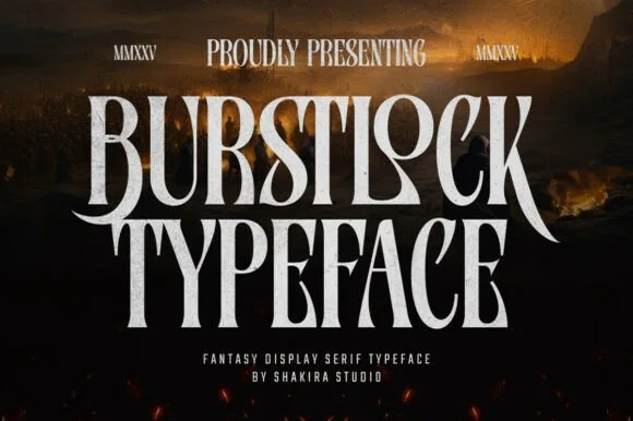
Tall condensed sword-winged dark-fantasy display serif
Burstlock is a dramatic, tall condensed fantasy serif whipping sweeping sword-blade legs off 'R' and 'K' for game titles and dark-fantasy covers!
Ideas for this font
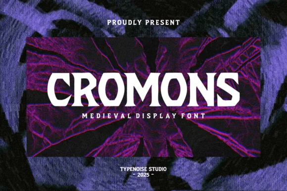
Heavy wide battle-ready medieval wedge serif
Cromons is a brawny, heavy-weight medieval wedge serif built to punch stark white fantasy, gaming, and esport headlines through dark backgrounds!
Ideas for this font
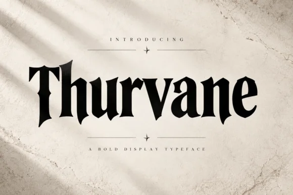
Heavy blade-spurred gothic wedge serif (OTF)
Thurvane is a bold hybrid gothic-wedge serif merging heavy Roman readability with sharp medieval diamond spurs and blade hooks (OTF).
Ideas for this font
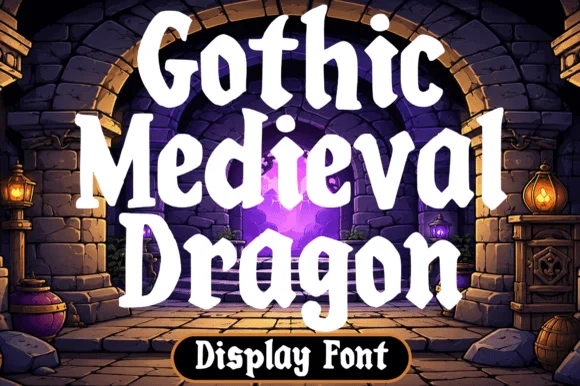
Chunky fantasy serif with rounded wedge serifs and heavy lowercase bowls
Gothic Medieval Dragon is a chunky fantasy serif in which the serifs wedge out round, the lowercase bowls stay heavy and the contrast stays low, so a game-night title reads as friendly storybook lettering rather than as black-metal type.
Ideas for this font
Same independent foundry
Allow optional Google Analytics to measure visits and catalogue actions. Your search words and notes are not included. Privacy & storage