High-Contrast Display Serif

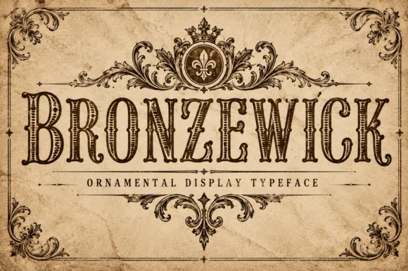
Strivon + Alerigue
Pairs sculptural editorial warmth with Strivon's clean modern geometry.
Inspect Alerigue specimenDisclosure: MakerFileHub may earn a commission from qualifying purchases via paid links on this page. How our links work.
Very tall condensed sans
Strivon is a very tall condensed sans in black on a ruled off-white sheet: mixed case with long straight ascenders, a pointed v, narrow bowls and flat terminals, set as one large word with four small tracked notes in the corners and a plain line beneath.
Paid link
Get this fontProject & layout blueprintsAt-a-glance maker compatibility
Sturdy stroke walls and open counters weed cleanly on adhesive vinyl, HTV apparel film, and cut cardstock.
Visual anatomy & craft review
The word rises to fill most of the sheet and the drawing is a very tall condensed sans: the ascenders are long and straight, the v is pointed, and the bowls are narrow, so the face reads as a modern editorial condensed rather than as a sports block. That construction sets a moderate size floor for small print and works best at large sizes, which the plate demonstrates by setting the word as tall as the sheet allows. The ruled ground and the four corner notes are plain and small, and they carry the style, the studio and the year. Because the letters are narrow and even, the face suits a cover, a poster and a fascia, and it fits a long word in a narrow column without dropping the cap height, which is the practical reason to choose a condensed face.
Sans serif, condensed, tall, modern
Two-font hierarchy recipes
Tested contrast partners — pairing Strivon with grounded secondary typography.
Strivon + Alerigue
Pairs sculptural editorial warmth with Strivon's clean modern geometry.
Inspect Alerigue specimen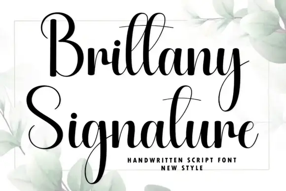
Strivon + Brittany Signature
Introduces organic movement on pull-quotes, signatures and gift tags.
Inspect Brittany Signature specimenPractical applications
Concrete hierarchy, scale and production guidance tailored to Strivon’s stroke geometry.
A tall condensed sans fills a narrow cover, and the straight ascenders give the title a vertical rhythm. A narrow cover needs height, not width.
Hierarchy & layout recipe
Set the title at 140 mm cap height across 150 mm, the issue in a 9 pt sans, and the price at 8 pt. Print one ink on a matte stock and keep 20 mm margins.
Pre-production check
Check the title at 140 mm, where a pointed v can look fragile; keep the joins solid. Confirm the 8 pt price survives lamination and that the title clears the trim.
A tall condensed sans fits a long studio name on a narrow fascia, and the even stroke holds under backlighting. Long names fit a fascia only when condensed.
Hierarchy & layout recipe
Fabricate a 1,100 by 300 mm sign: the studio at 120 mm cap height, the floor in a 22 mm sans, and a 4 mm rule. Keep 22 mm margins and specify an even backlight.
Pre-production check
Check the sign at 120 mm, where a narrow bowl can fill with light; keep it above 6 mm. Confirm the 22 mm floor reads at three metres and that the rule clears the fixings.
A condensed sans sets a long series title in one row, and the tall letters read from the back of a hall. A hall banner is read from the back row.
Hierarchy & layout recipe
Print 1,300 by 420 mm: the series at 150 mm cap height, the dates in a 30 mm sans, and a 5 mm border. Keep 28 mm margins and print two colours on light vinyl.
Pre-production check
Check the banner at ten metres, where the narrow bowls can merge; add 2 percent tracking. Confirm the 30 mm dates read at five metres and that the eyelets clear the block.
Technical & licence verification
Confirm included OTF/TTF/WOFF formats, full glyph tables and licence coverage on the live store page before batch production.
Closest visual alternatives
Matched across letterform anatomy, stroke behaviour and craft applications.
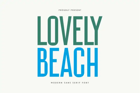
Tall even-stroke capitals
Lovely Beach is a tall narrow sans set in two colours on cream: even-stroke capitals with a rectangular O, a sharp A opening and flat terminals, the first word in sea green and the second in bright blue, with two small tracked lines above and beneath.
Ideas for this font
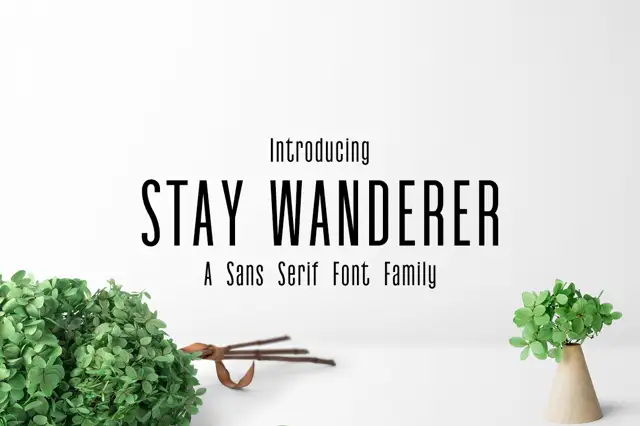
Very narrow upright family
Stay Wanderer is a very narrow upright sans shown in black on a pale studio wall: capitals with small counters, long straight diagonals and an even stroke, with a small line above, a subtitle beneath, and two potted plants and a pair of scissors at the foot of the frame.
Ideas for this font
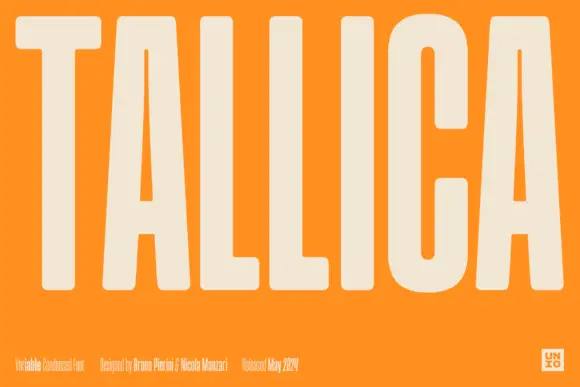
Extremely tall narrow capitals
Tallica is an extremely tall narrow sans in cream on a flat orange field: capitals with softly squared ends, long triangular A counters and an even stroke, set as one enormous word that fills the frame from edge to edge, with a small credits row along the foot.
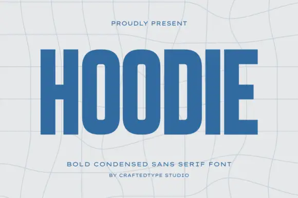
Condensed block capitals with rounded rectangular O counters
Hoodie shows a large blue uppercase word on a pale warped-grid field, where heavy straight uprights and flat horizontal endings form a dense block, the O and D hold rounded rectangular counters, the H crossbar sits near the middle and the E keeps three squared arms.
Ideas for this font
Same independent foundry
Allow optional Google Analytics to measure visits and catalogue actions. Your search words and notes are not included. Privacy & storage