High-Contrast Display Serif

Kravix + Amor Hadena
Pairs sculptural editorial warmth with Kravix's clean modern geometry.
Inspect Amor Hadena specimenDisclosure: MakerFileHub may earn a commission from qualifying purchases via paid links on this page. How our links work.
Heavy forward-slanted mixed case with squared bowls and sharply cut ends
Kravix shows black slanted lettering across a tilted cream panel with orange accents, where thick near-even strokes form squared round bowls, a wide r shoulder and a small rectangular i dot, while the K and x end in sharp diagonals.
Paid link
Get this fontProject & layout blueprintsAt-a-glance maker compatibility
Sturdy stroke walls and open counters weed cleanly on adhesive vinyl, HTV apparel film, and cut cardstock.
Visual anatomy & craft review
The weight stays heavy and even, the lean runs forward, the bowls square at the shoulders and the terminals cut on an angle rather than a curve. That cut end is the character: the word looks like a sports or street mark without an outline, which is why the sample tilts a single word across a panel. The panel and accents are artwork, so set the upright composition yourself and keep 28 pt before the sharp cuts blunt. The sharp cut is the fragile edge: it blunts at about 20 pt and softens on absorbent stock, so keep 28 pt and print on a coated or vinyl surface.
Heavy · Slanted · Squared bowls
Two-font hierarchy recipes
Tested contrast partners — pairing Kravix with grounded secondary typography.
Kravix + Amor Hadena
Pairs sculptural editorial warmth with Kravix's clean modern geometry.
Inspect Amor Hadena specimen
Kravix + Wishful Women
Introduces organic movement on pull-quotes, signatures and gift tags.
Inspect Wishful Women specimenPractical applications
Concrete hierarchy, scale and production guidance tailored to Kravix’s stroke geometry.
The slanted heavy letters suit a street mark, and the squared bowls hold a short name at 28 mm on a die-cut sticker, where the sharp ends stay sharp on vinyl.
Hierarchy & layout recipe
Cut a 100 mm sticker: set the brand at 28 mm on one row, keep 8 mm of clear vinyl around the sharp terminals, and keep the die contour 4 mm outside the outermost cut so no corner is clipped.
Pre-production check
A sharp terminal cut too close to the die tears; check the cut file and keep 6 mm of clear vinyl.
The forward lean sets a sports heading, and the heavy forms hold a two-word title at 50 pt across a page, where the squared shoulders keep the movement controlled.
Hierarchy & layout recipe
Print a 210 mm page: set the heading at 50 pt on one row, keep 18 mm beneath before the standfirst at 10 pt, and keep the block inside the column so the diagonals stay parallel to the type edge.
Pre-production check
A slanted heading over a straight column looks crooked; check the page and keep the lean as designed.
The heavy slanted caps set a party banner, and the squared bowls read at 56 pt across an A3 sheet, so the word carries from the other side of a yard.
Hierarchy & layout recipe
Print an A3 banner: set the heading at 56 pt on one row, keep 22 mm beneath before the details at 13 pt, and keep 20 mm of margin so the cut terminals stay whole.
Pre-production check
A tilted line on a wide sheet reads as a printing error; check the banner and keep the row level.
Technical & licence verification
Confirm included OTF/TTF/WOFF formats, full glyph tables and licence coverage on the live store page before batch production.
Closest visual alternatives
Matched across letterform anatomy, stroke behaviour and craft applications.
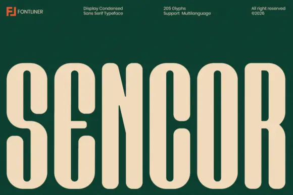
Condensed heavy rounded sans
Sencor is a condensed sans on a deep green ground: tall heavy rounded capitals in cream, with long slot counters, a short soft E arm and a narrow R leg, set as one word across the base beneath a header row naming the foundry, the style, the glyph count and the rights line.
Ideas for this font
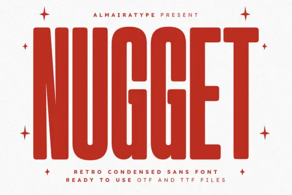
Very tall heavy capitals with rounded corners and narrow internal channels
Nugget shows red capitals filling most of a white cover, where thick near-even strokes leave thin vertical openings in the U and G, the N draws a sharply narrowing diagonal and every outer corner softens.
Ideas for this font
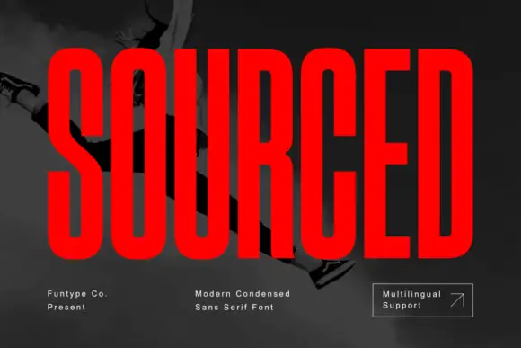
Very condensed heavy capitals with narrow rounded rectangular counters
Sourced shows vivid red capitals across a dark monochrome photograph, where tall heavy uprights and flat-ended arms leave thin rounded rectangular counters inside the O and D, the R carries a straight angled leg and the C opens only a small gap on its right side.
Ideas for this font
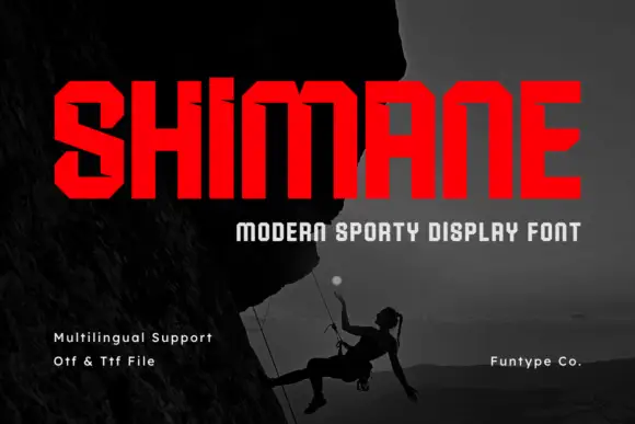
Chamfered condensed display sans
Shimane is an angular condensed sans in red on a dark photograph of a climber: wide capitals with chamfered corners, small horizontal notches on the stems and flat terminals, set as one large word with a tracked line beneath and three plain notes at the foot.
Ideas for this font
Same independent foundry
Allow optional Google Analytics to measure visits and catalogue actions. Your search words and notes are not included. Privacy & storage