Neutral Sans Workhorse

Morvakrith + Borsen
Lets Morvakrith own the focal silhouette while handling secondary copy, sizing and subheads cleanly.
Inspect Borsen specimenDisclosure: MakerFileHub may earn a commission from qualifying purchases via paid links on this page. How our links work.
Blackletter with a metal bevel treatment
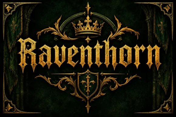
Morvakrith is a heavy blackletter shown with a metallic bevel: dense vertical strokes, sharp spurs and a narrow lowercase rhythm, rendered in polished silver over a moonlit castle scene with a skull, chains and a motto rule beneath.
Paid link
Get this fontProject & layout blueprintsAt-a-glance maker compatibility
Sturdy stroke walls and open counters weed cleanly on adhesive vinyl, HTV apparel film, and cut cardstock.
Visual anatomy & craft review
The name is set in the centre of the frame in a blackletter that is closer to a fraktur than a textura: the strokes are heavy and vertical, the capitals carry long spurs that break the outline, and the letters nearly touch so the word reads as one textured mass. What makes the specimen is the surface treatment, because each letter is filled with a silver bevel and a shadow, which gives the flat drawing a cast-metal feel and hides the fine joins that a printed blackletter would show. Beneath the word a motto line in spaced capitals sits between thin rules with diamond terminals, which is the standard heraldic construction and gives the eye somewhere to rest after the dense headline. The ground is a night scene of spires, a full moon, chains and a skull, and the whole image is low contrast except the word, so the lettering carries the page.
Gothic, metallic, dark, ceremonial
Two-font hierarchy recipes
Tested contrast partners — pairing Morvakrith with grounded secondary typography.
Morvakrith + Borsen
Lets Morvakrith own the focal silhouette while handling secondary copy, sizing and subheads cleanly.
Inspect Borsen specimen
Morvakrith + Bulgary
Grounds bold display lettering with classic typographic authority on posters, badges and apparel.
Inspect Bulgary specimenPractical applications
Concrete hierarchy, scale and production guidance tailored to Morvakrith’s stroke geometry.
A dense blackletter is the fastest way to set a gothic mood, and a metallic treatment makes a printed poster look like a carved sign without a photograph of one.
Hierarchy & layout recipe
A2 portrait: the name at 130 mm cap height, the motto in 12 mm spaced caps between two 1 pt rules below, and the details at 10 mm. Keep 20 mm between the word and the rule so the spurs do not collide with the ornament.
Pre-production check
Check the spurs at full size, where a blackletter's fine joins can close and turn the word into a smudge; open the tracking slightly for print. Confirm the metallic fill is built as a flat grey rather than a gradient for single-colour printing, and that the 10 mm details read at two metres.
A blackletter label signals an old recipe and a dark character, and the metallic rendering transfers naturally to foil, which is where this face is strongest.
Hierarchy & layout recipe
Print a 70 by 100 mm label: the name at 26 pt, the motto in 7 pt caps between rules, and the strength in 6.5 pt at the base. Specify gold foil for the name and a single black ink for everything else on a dark stock.
Pre-production check
Check the foil at 26 pt, where the thin spurs under 0.3 mm will not hold on a textured stock; thicken them for that substrate. Confirm the 6.5 pt strength line stays legible on the bottle's curve and that the foil does not touch the label edge.
A blackletter cover signals genre before a reader opens the book, and the metallic treatment keeps the type visible over a dark illustration without a plate.
Hierarchy & layout recipe
Set the title at 100 pt across 180 mm on a 240 mm cover, the editor credit in 9 pt caps at the foot, and a 0.5 pt frame rule 15 mm inside the trim. Keep the illustration to the lower half so the title sits on near-black.
Pre-production check
Check the reversed type on the dark plate at proof stage, where a blackletter's joins can fill and the word becomes illegible at thumbnail size. Confirm the title still reads at 120 px wide in an online store and that the frame rule clears the trim.
Technical & licence verification
Confirm included OTF/TTF/WOFF formats, full glyph tables and licence coverage on the live store page before batch production.
Closest visual alternatives
Matched across letterform anatomy, stroke behaviour and craft applications.
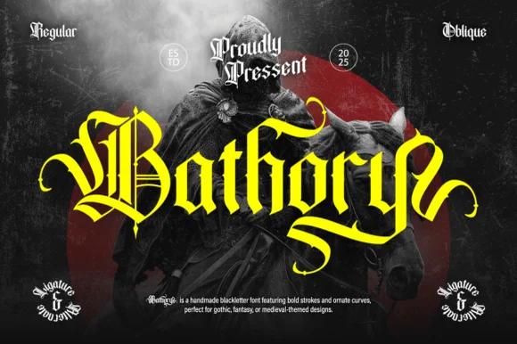
Ornate medieval blackletter family (Regular & Oblique)
Bathory is a lush, handmade medieval blackletter family (Regular & Oblique) featuring double-barred capitals and sweeping flame-curled descenders.
Ideas for this font
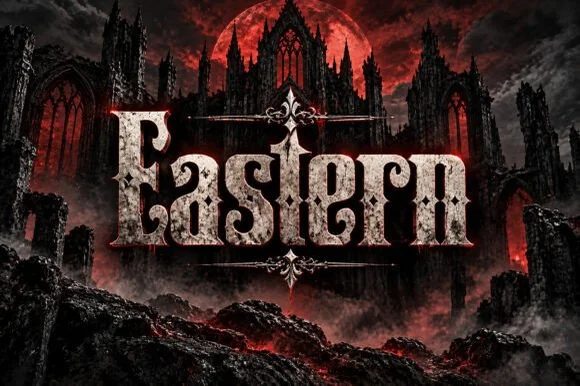
Weathered cathedral Fraktur blackletter display (OTF)
Eastern is a dramatic medieval Fraktur blackletter display font featuring bifurcated crown spurs and classic gothic lowercase (OTF).
Ideas for this font
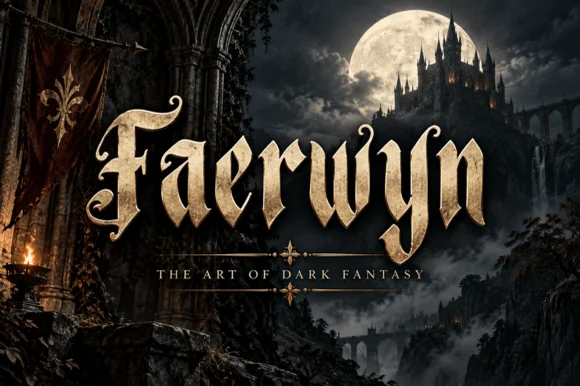
Elven-medieval dark-fantasy calligraphic blackletter
Faerwyn is a mystical dark-fantasy blackletter blending sharp medieval broad-nib calligraphy with sweeping elven ascender curls.
Ideas for this font
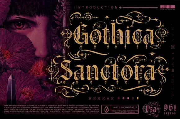
961-glyph cathedral-filigree & Victorian-scroll blackletter
Gothica Sanctora is an opulent 961-glyph gothic blackletter crowning Victorian-medieval letters with intricate filigree halos and scroll cages.
Ideas for this font
Same independent foundry
Allow optional Google Analytics to measure visits and catalogue actions. Your search words and notes are not included. Privacy & storage