Modern Grotesque Body

Nemorie + Noar
Creates crisp high-hierarchy contrast beneath Nemorie headlines across menus, websites and labels.
Inspect Noar specimenDisclosure: MakerFileHub may earn a commission from qualifying purchases via paid links on this page. How our links work.
Celestial high-contrast art-nouveau & fantasy ligature serif
Nemorie is a refined high-contrast display serif featuring sweeping scythe-like swash bars, sculpted ligatures, and four-point star accents.
Paid link
Get this fontProject & layout blueprintsAt-a-glance maker compatibility
Crisp hairline serifs shine on stationery, foil stamping, and packaging; add slight offset for small decals.
Visual anatomy & craft review
Nemorie is a high-contrast art-nouveau serif with celestial ligatures: a thin-thick stroke with hairline hairlines, tall whipped ascenders that rise into a small star or comet tail and ligature pairs that knit two letters into one drawn shape. The hairlines are the design and the first thing to break on textured stock, and the ligatures change the word's width as they engage. It needs roughly 28 mm for the hairline and the comet tail to read, and it is best in one fine ink on smooth or coated stock, or a foil impression above 40 pt where the hairlines still carry.
Ethereal · Ornamental · Editorial
Two-font hierarchy recipes
Tested contrast partners — pairing Nemorie with grounded secondary typography.
Nemorie + Noar
Creates crisp high-hierarchy contrast beneath Nemorie headlines across menus, websites and labels.
Inspect Noar specimen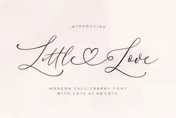
Nemorie + Little Love
Adds a warm human signature touch for 1-to-3-word callouts without competing against structured serif capitals.
Inspect Little Love specimenPractical applications
Concrete hierarchy, scale and production guidance tailored to Nemorie’s stroke geometry.
An art-nouveau serif with celestial ligatures turns an astronomy feature into a drawn opening page rather than a styled headline. The ligatures hold at 64 pt on a coated opener, and one metallic keeps the hairlines from silting.
Hierarchy & layout recipe
Opener 210 x 297 mm, title 64 pt with 10 mm tail clearance, standfirst 11/15 pt, body 9/13 pt over two columns of 82 mm, 18 mm margins. Drop cap 96 pt over three lines. Pull quote 40 pt.
Pre-production check
At 40 pt on the pull quote the hairlines drop out on an uncoated sheet and the quote reads as pale marks. Keep the face on coated stock at 52 pt and above, and proof one spread at 1:1.
A celestial serif reads as a drawn art-nouveau label rather than a modern mark, which is what a small perfumer wants on a bottle. The ligatures hold at 26 mm on a label, and one fine ink prints the label and the box in one order.
Hierarchy & layout recipe
Bottle label 90 x 70 mm, word 26 mm with 8 mm tail clearance, details 7/9 pt, 5 mm margins. Box print 150 x 100 mm, word 40 mm, 10 mm margins. Card 85 x 55 mm, word 14 mm, 5 mm margins.
Pre-production check
A 90 x 70 mm label wrapped on a curve pulls the hairlines past the die line and the blade clips the tails. Pull the word in 4 mm, and check one label on an empty bottle before the run.
An art-nouveau serif with ligatures gives a wedding a drawn plate rather than a printed invitation. The ligature pairs knit a long double surname into one shape at 26 pt, and one fine ink keeps the hairlines alive on smooth card.
Hierarchy & layout recipe
Invitation 130 x 180 mm, names 26 pt with 10 mm tail clearance, details 9/13 pt, 16 mm margins. Menu 120 x 210 mm, header 16 pt, courses 9/12 pt. Vow card 105 x 148 mm, text 9/12 pt.
Pre-production check
At 9 pt in the vow card the hairlines silt completely and the text reads as a grey block. Raise the text to 10.5 pt, and proof one booklet before the set.
Technical & licence verification
Confirm included OTF/TTF/WOFF formats, full glyph tables and licence coverage on the live store page before batch production.
Closest visual alternatives
Matched across letterform anatomy, stroke behaviour and craft applications.
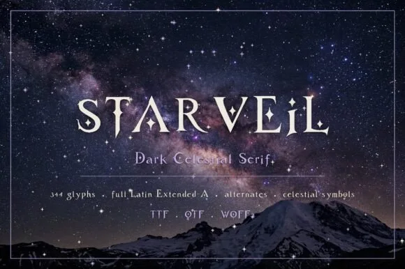
Dark celestial serif with crescent moons & stars (344 glyphs, OTF/TTF/WOFF2)
Starveil is a dark celestial display serif (344 glyphs, Latin Extended-A, TTF/OTF/WOFF2) embedding crescent moons and star sparkles into flared stems.
Ideas for this font
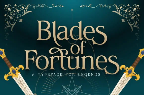
Heroic sword-flared epic fantasy display serif
Blades of Fortunes is a sculpted epic-fantasy display serif featuring sword-hilted crossbars, sweeping swash loops, and sharp triangular terminals.
Ideas for this font
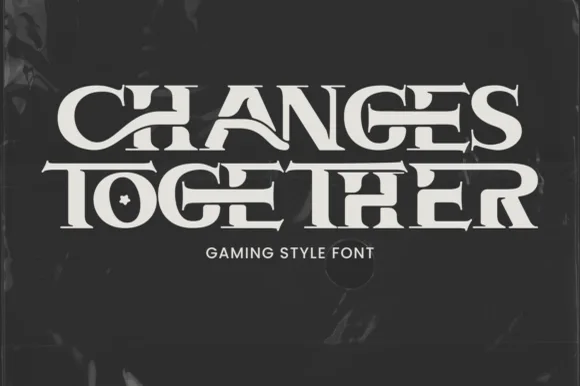
Interlocking ligature fantasy-RPG & gaming title serif
Changes Together is a bold, wide fantasy-gaming serif bridging extended horizontal crossbars ('H-A', 'T-O-G-E-T-H-E-R') and carving a star inside 'O'!
Ideas for this font
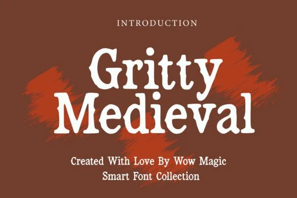
Rough stone-chipped medieval tavern & folklore serif
Gritty Medieval is a rugged, rough-edged medieval serif with hand-chipped contours that feel carved into tavern oak or iron.
Ideas for this font
Allow optional Google Analytics to measure visits and catalogue actions. Your search words and notes are not included. Privacy & storage