Modern Grotesque Body

Roses Garden + Furion
Creates crisp high-hierarchy contrast beneath Roses Garden headlines across menus, websites and labels.
Inspect Furion specimenDisclosure: MakerFileHub may earn a commission from qualifying purchases via paid links on this page. How our links work.
Romantic high-contrast floral-editorial swash serif
Roses Garden is a refined modern editorial serif crowned with graceful overhead S-swashes, looped ligatures, and multilingual support.
Paid link
Get this fontProject & layout blueprintsAt-a-glance maker compatibility
Crisp hairline serifs shine on stationery, foil stamping, and packaging; add slight offset for small decals.
Visual anatomy & craft review
A high-contrast floral-editorial serif shown in snow white over dusty terracotta rose: a delicate ribbon flourish arches over the S, the R and G bowls curve with crisp Didone contrast, and the hairlines run thin against heavy stems, so the word reads as a fashion masthead rather than a book face. The flourishes are drawn to frame a photographic inset, which is why the composition leaves a window at the centre. The size floor is set by the hairline strokes, and the face needs a smooth stock to hold them. The floral framing is staging.
Floral-chic · High-contrast · Graceful
Two-font hierarchy recipes
Tested contrast partners — pairing Roses Garden with grounded secondary typography.
Roses Garden + Furion
Creates crisp high-hierarchy contrast beneath Roses Garden headlines across menus, websites and labels.
Inspect Furion specimen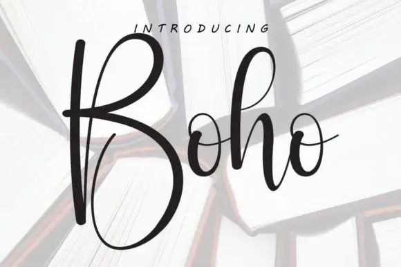
Roses Garden + Boho
Adds a warm human signature touch for 1-to-3-word callouts without competing against structured serif capitals.
Inspect Boho specimenPractical applications
Concrete hierarchy, scale and production guidance tailored to Roses Garden’s stroke geometry.
The delicate overhead curls frame botanical photography with a florist's elegance, so a garden invitation can carry a photograph inset instead of an illustration, and the Didone contrast gives the names a formality that a soft script cannot.
Hierarchy & layout recipe
Stack two uppercase words at 54 to 90 pt with +10 tracking over dusty rose, sage or ivory, keep 24 mm margins on an A5 card, and reserve a 60 mm window for the photograph inset.
Pre-production check
The ultra-thin hairlines belong in flat print, letterpress or foil rather than blade-cut vinyl. Proof the plate before a letterpress run, since a hairline thinner than 0.3 mm will sink into the paper.
A floral-editorial serif reads as a beauty house rather than a hobby brand, and the contrast gives a small carton the look of a printed label at a size where a soft script would turn into a grey band.
Hierarchy & layout recipe
Print a 50 by 140 mm carton: the house at 14 pt, the product at 8 pt, and the volume at 7 pt. Keep 6 mm inside the trim, pair with a clean geometric sans for the micro-copy, and keep the hairlines above 0.3 mm.
Pre-production check
Print at 24 pt and above when reversing white type out of a coloured ground, or the hairlines fill. Confirm the type clears the fold line and that the label sits square on the bottle.
A masthead of this contrast carries a floristry or interiors title, and the flourishes give the cover a drawn detail that an all-caps serif cannot, while the white on terracotta holds from across a room.
Hierarchy & layout recipe
Set the title at 80 mm cap height across 190 mm, the cover lines in a 9 pt sans, and the issue at 7 pt. Print two colours on a coated stock, keep 20 mm margins and keep 0.25 mm as the finest hairline.
Pre-production check
Check the title at 80 mm, where a hairline can break on a textured stock; move to a coated sheet if it does. Confirm the issue line survives lamination and that the flourishes clear the trim.
Technical & licence verification
Confirm included OTF/TTF/WOFF formats, full glyph tables and licence coverage on the live store page before batch production.
Closest visual alternatives
Matched across letterform anatomy, stroke behaviour and craft applications.

Bold transitional display serif with overhead canopy swash
Vanielst is a substantial, medium-high-contrast display serif highlighted by graceful overhead swash loops and crisp bracketed feet.
Ideas for this font
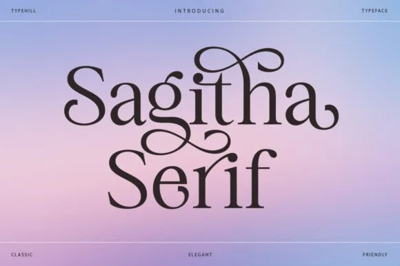
Romantic high-contrast serif with soaring ascender loops
Sagitha Serif is a lyrical, high-contrast display serif where arched ascender ribbons and teardrop terminals weave across mixed-case titles.
Ideas for this font

Romantic spiral-swashed high-fashion editorial serif
Amor Hadena is a dramatic swash-serif weaving lyrical spiral curls and towering looped ascenders across high-contrast Roman letters!
Ideas for this font
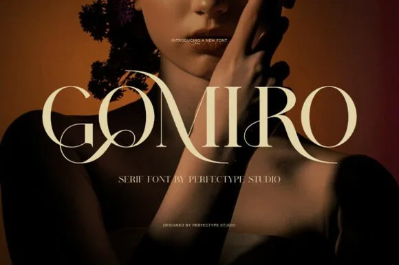
Sculptural interlocking swash-ligature uppercase luxury serif
Gomiro is a glamorous uppercase luxury serif sweeping dramatic ribbon ligatures through 'G-O' and 'R-O' letter pairs!
Ideas for this font
Same independent foundry
Allow optional Google Analytics to measure visits and catalogue actions. Your search words and notes are not included. Privacy & storage