Neutral Sans Workhorse

Siri + Headline
Lets Siri own the focal silhouette while handling secondary copy, sizing and subheads cleanly.
Inspect Headline specimenDisclosure: MakerFileHub may earn a commission from qualifying purchases via paid links on this page. How our links work.
Inline-ornamented vintage Deco serif with bevel lines and a heavy contour
Siri is a vintage Deco serif in which every stem carries an inline bevel, the serifs curl and a heavy contour closes the shape, so a word reads as a painted shop window from the thirties.
Paid link
Get this fontProject & layout blueprintsAt-a-glance maker compatibility
Sturdy stroke walls and open counters weed cleanly on adhesive vinyl, HTV apparel film, and cut cardstock.
Visual anatomy & craft review
The S opens with a curled terminal and an inner line, the I stands as a heavy stem with a double bevel, the R keeps a squared bowl with an inline and the full alphabet beneath shows the same treatment on every letter, all at a heavy weight with a high contrast and a contour that follows the outline. The inline is the character: it runs inside the stem and turns with the serif, which is what gives the face its boutique register at 60 pt and what fails first when it is reproduced small. Below 24 pt the inline fills with ink. The pale ground, the black ink, the botanical shadow and the small badges are presentation; the display face is the word shown.
Deco · Inline · Boutique
Two-font hierarchy recipes
Tested contrast partners — pairing Siri with grounded secondary typography.
Siri + Headline
Lets Siri own the focal silhouette while handling secondary copy, sizing and subheads cleanly.
Inspect Headline specimen
Siri + Cronelo
Grounds bold display lettering with classic typographic authority on posters, badges and apparel.
Inspect Cronelo specimenPractical applications
Concrete hierarchy, scale and production guidance tailored to Siri’s stroke geometry.
The inline bevel gives a hotel sign its period register, and the heavy contour reads at 12 cm in a printed or painted panel.
Hierarchy & layout recipe
Print a 700 by 350 mm panel: set the hotel name at 12 cm, set the founding year in a 4 cm caps serif beneath, and keep 9 cm of border so the curled serifs sit clear of the frame and the fixings.
Pre-production check
An inline under 1 mm fills on a matte panel; check the sign at final size and widen the bevel rather than the stem.
The Deco inline reads on a small label at 14 pt, and the curled serifs give a plain jar the look of a period shop product.
Hierarchy & layout recipe
Print a 45 by 75 mm coated label: set the name at 14 pt, set the volume in a 5 pt caps sans beneath, and keep 5 mm of margin so the inline stays on the flat of the label rather than on the bottle curve.
Pre-production check
Foil inside an inline bridges at the turn; check a foil dummy at final size and drop the inline on the smallest label rather than the foil.
The Deco weight gives a feature cover its period at 72 pt, and the inline adds the boutique detail without a second element.
Hierarchy & layout recipe
Print an A4 cover: set the title at 72 pt across the upper half, set the standfirst in a 11 pt serif beneath, and keep 18 mm of margin so the curled serifs stay inside the trim.
Pre-production check
An inline printed on uncoated stock fills at 72 pt; check a press proof and keep the bevel above 1.5 mm at that size.
Technical & licence verification
Confirm included OTF/TTF/WOFF formats, full glyph tables and licence coverage on the live store page before batch production.
Closest visual alternatives
Matched across letterform anatomy, stroke behaviour and craft applications.
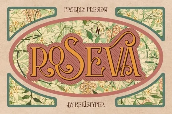
Art nouveau display with hatched shadow
Roseva is an ornate art nouveau display in gold on rose: rounded letters with curling terminals, a dark outline and a hatched shadow, set inside an oval frame over a botanical wallpaper pattern.
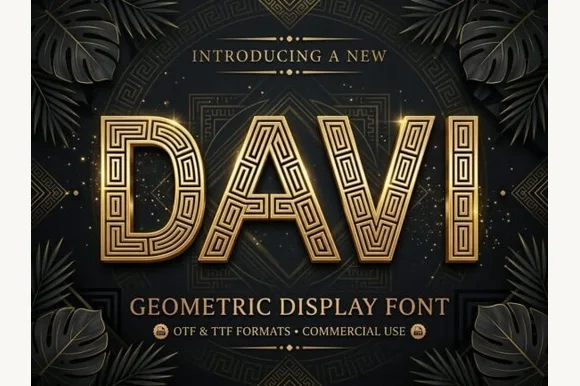
Geometric display caps inlaid with a greek-key maze pattern
Davi is a geometric display capital alphabet in which every stroke is a wide band filled with a drawn greek-key maze, so a word reads as gilded metalwork rather than as lettering.
Ideas for this font
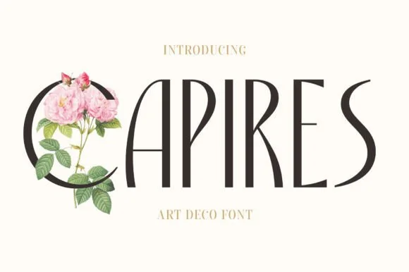
Tall slender Art-Nouveau & Art-Deco crossover serif
Capires is a tall, poised display serif fusing 1920s high-waisted Art Deco proportions with soft Art Nouveau curved tapers.
Ideas for this font
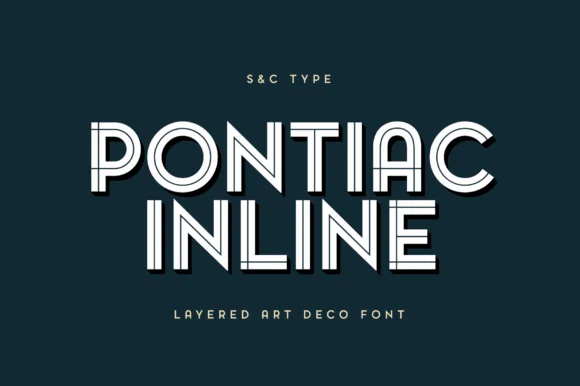
Parisian layered Art Deco geometric inline sans
Pontiac Inline is a balanced Parisian Art Deco inline sans featuring wide circular bowls and crisp centered parallel linework.
Ideas for this font
Same independent foundry
Allow optional Google Analytics to measure visits and catalogue actions. Your search words and notes are not included. Privacy & storage