Neutral Sans Workhorse

The Arkanes + Montreal
Lets The Arkanes own the focal silhouette while handling secondary copy, sizing and subheads cleanly.
Inspect Montreal specimenDisclosure: MakerFileHub may earn a commission from qualifying purchases via paid links on this page. How our links work.
Layered Victorian decorative lettering with ornamental inner lines
The Arkanes is a decorative Victorian alphabet in which the stems carry drawn ornament, the letters arch along a curve and two offset layers sit behind each word, so a title reads as a hand-painted fairground sign.
Paid link
Get this fontProject & layout blueprintsAt-a-glance maker compatibility
Cut solid base, outline, and shadow layers in separate vinyl colors and align on registration marks.
Visual anatomy & craft review
The A opens a tall arch with an ornamental spine, the r turns a curled arm, the k splays two decorated diagonals, the n keeps two stems with inner lines and the s holds a spiral spine, all at a display weight with drawn interior ornaments and a second offset layer in a warm tone. The ornament is the character: it is drawn inside the letter rather than added around it, which is why the sample arches the word and surrounds it with swirls. Because the inner lines are fine, the face needs 44 pt before they read, and the arched setting must be done in vector rather than by eye. The dark ground, the swirling frame and the small banner text are presentation; the cream ornamented word is the face.
Victorian · Ornamented · Layered
Two-font hierarchy recipes
Tested contrast partners — pairing The Arkanes with grounded secondary typography.
The Arkanes + Montreal
Lets The Arkanes own the focal silhouette while handling secondary copy, sizing and subheads cleanly.
Inspect Montreal specimen
The Arkanes + Rosemode
Grounds bold display lettering with classic typographic authority on posters, badges and apparel.
Inspect Rosemode specimenPractical applications
Concrete hierarchy, scale and production guidance tailored to The Arkanes’s stroke geometry.
The ornamented letters give an event poster a period voice, and the arched setting fills the top half of a poster at 80 mm per letter.
Hierarchy & layout recipe
Print an A2 poster: set the word on an arch at 80 mm per letter, keep the inner ornament at 2 mm, and keep 35 mm of border so the outer swirls stay on the sheet.
Pre-production check
An arched word set by eye drifts off centre; check the imposed poster and build the curve in vector before printing.
The Victorian register suits a herbal shop, and the ornamented stems hold a short name at 30 mm on a painted fascia in two tones.
Hierarchy & layout recipe
Paint a 700 by 250 mm fascia: set the name at 30 mm, keep the inner line as a 2 mm gap, and paint the offset layer first so the ornament reads against the fill.
Pre-production check
An inner line painted without a mask closes up; check the fascia and cut a vinyl mask rather than lettering freehand.
The ornamented face sets the tone of a gothic period anthology, and the layered offset holds at 60 pt on a printed cover.
Hierarchy & layout recipe
Print an A5 cover: set the title at 60 pt on a slight arch, keep the offset layer at 2 mm, and set the editor line in a 9 pt caps sans beneath with 18 mm of clearance.
Pre-production check
Two warm tones printed on uncoated stock can merge; check the proof and open the value gap between fill and offset.
Technical & licence verification
Confirm included OTF/TTF/WOFF formats, full glyph tables and licence coverage on the live store page before batch production.
Closest visual alternatives
Matched across letterform anatomy, stroke behaviour and craft applications.
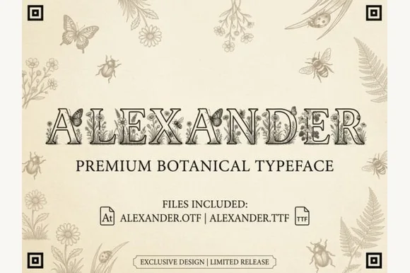
Botanical & entomology engraved naturalist serif (OTF & TTF)
Alexander is an intricate vintage naturalist's display serif filling hollowed Roman capitals with fine-line butterflies, honeybees, and wildflowers (OTF & TTF)!
Ideas for this font
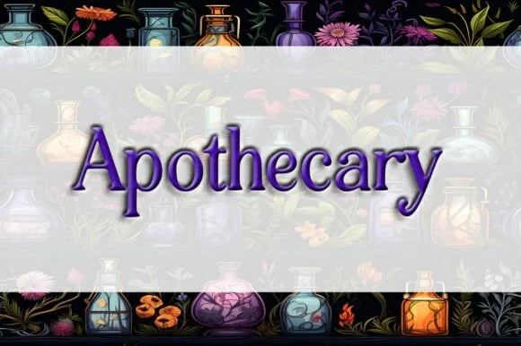
Classic Victorian potion-bottle bracketed serif
Apothecary (by Heidi Vargas-Smith) is a dignified, bracketed Victorian serif (compare with pinkmeca's brush script #1007!) built for potion jars & tea tins.
Ideas for this font
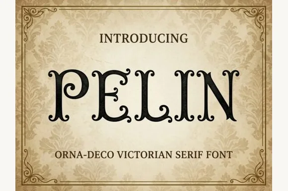
Victorian Orna-Deco serif with curled inner terminals
Pelin is an Orna-Deco Victorian display serif blending classical Roman stems with inward-curled spiral hooks and diamond stem nodes.
Ideas for this font
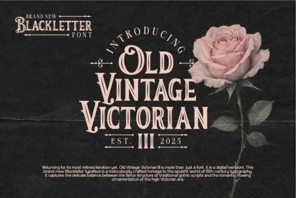
Narrow ornamental inline serifs
Old Vintage Victorian III is a narrow ornamental display serif in cream on near-black: condensed capitals with hooked serifs, a fine white inline through every stem, and small drawn fleurons above and below the block.
Ideas for this font
Same independent foundry
Allow optional Google Analytics to measure visits and catalogue actions. Your search words and notes are not included. Privacy & storage