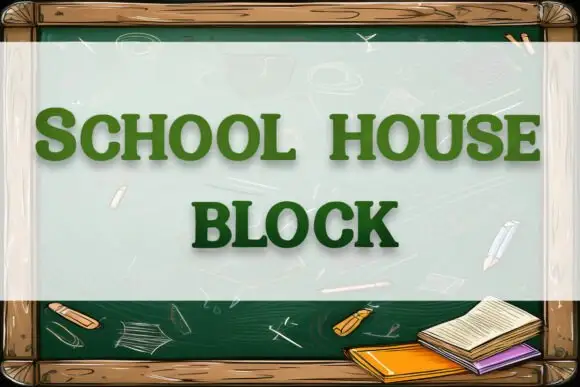
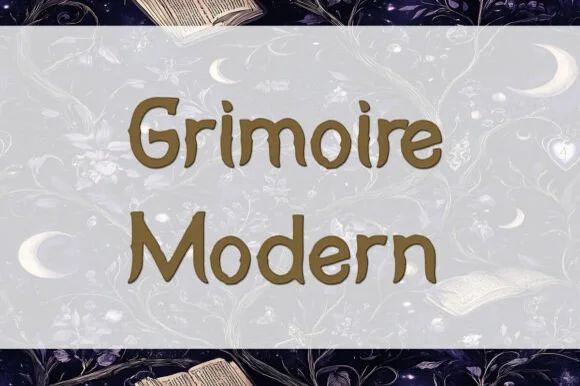
Modern Grotesque Body

Apothecary + Headline
Creates crisp high-hierarchy contrast beneath Apothecary headlines across menus, websites and labels.
Inspect Headline specimenDisclosure: MakerFileHub may earn a commission from qualifying purchases via paid links on this page. How our links work.
Classic Victorian potion-bottle bracketed serif
Apothecary (by Heidi Vargas-Smith) is a dignified, bracketed Victorian serif (compare with pinkmeca's brush script #1007!) built for potion jars & tea tins.
Paid link
Get this fontProject & layout blueprintsAt-a-glance maker compatibility
Sturdy stroke walls and open counters weed cleanly on adhesive vinyl, HTV apparel film, and cut cardstock.
Visual anatomy & craft review
Apothecary is a dignified Victorian serif with sturdy vertical stems, bracketed feet and a moderate contrast that keeps it legible below display sizes. It reads as a label printed for a pharmacy rather than a fantasy prop, which is why it works on jars and tins without additional ornament. The faces are simple and the caps are slightly narrow, so a long product name fits a small label, and the face holds at 9 pt on an ingredients panel. It is a packaging and signage face, best in one deep ink on a warm ground.
Potion-label · Classic-bracket · Herbalist
Two-font hierarchy recipes
Tested contrast partners — pairing Apothecary with grounded secondary typography.
Apothecary + Headline
Creates crisp high-hierarchy contrast beneath Apothecary headlines across menus, websites and labels.
Inspect Headline specimen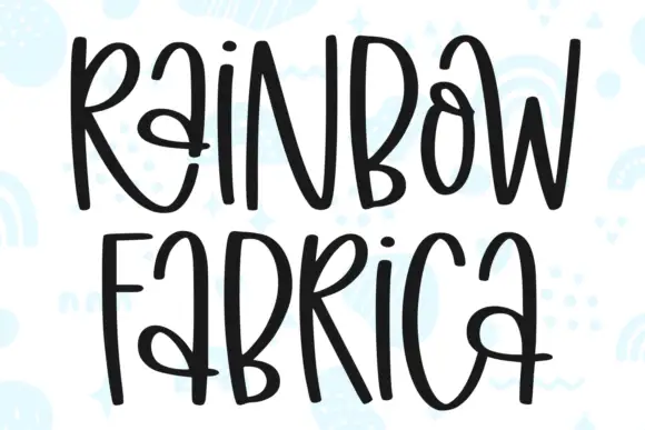
Apothecary + Rainbow Fabrica
Adds a warm human signature touch for 1-to-3-word callouts without competing against structured serif capitals.
Inspect Rainbow Fabrica specimenPractical applications
Concrete hierarchy, scale and production guidance tailored to Apothecary’s stroke geometry.
A period pharmacy serif gives a potion theme credibility without a cartoon, so adult guests read it as designed rather than themed. Narrow caps fit a long ingredient name on a small jar.
Hierarchy & layout recipe
Jar label 60 x 80 mm, product 11 mm, ingredients 5/7 pt, 5 mm margin. Tin 75 x 100 mm, name 14 mm, brewing 5.5 pt. Card 60 x 90 mm, name 10 mm, 4 mm border.
Pre-production check
Jar labels are applied by hand and a narrow label leaves no room for error. Print with a 2 mm inner rule so a crooked label still looks intentional, and check one applied jar for tilt.
A Victorian serif reads as a traditional remedy rather than a wellness start-up, which is what a herbal producer is selling. Moderate contrast prints cleanly on an uncoated label.
Hierarchy & layout recipe
Tin 75 x 100 mm, name 16 mm, brewing 5/7 pt. Bottle 40 mm diameter, label 70 x 45 mm wrap, name 9 mm, dosage 4.5 pt. Soap wrap 90 x 120 mm, name 10 mm, ingredients 5 pt.
Pre-production check
Tincture bottles are handled with droppers and the label edge lifts first. Use a synthetic label with rounded corners, and test one bottle after a fortnight of daily handling.
A bracketed serif reads as a winter-provisions label rather than a festive graphic, which keeps a gift set usable beyond December. The face holds at 9 mm on a jar wrap.
Hierarchy & layout recipe
Candle jar 70 mm diameter, wrap 55 x 45 mm, word 8 mm, 3 mm top arc. Box sleeve 180 x 60 mm, name 16 mm. Tea label 70 x 45 mm, name 11 mm, brewing 5 pt.
Pre-production check
Candles burn and the label sits above a warm surface; adhesive softens and the top edge curls. Use a high-tack adhesive rated for warm glass, apply at room temperature, and check one burned candle.
Technical & licence verification
Confirm included OTF/TTF/WOFF formats, full glyph tables and licence coverage on the live store page before batch production.
Closest visual alternatives
Matched across letterform anatomy, stroke behaviour and craft applications.
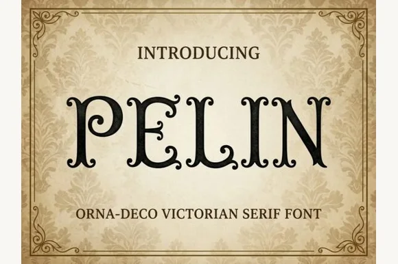
Victorian Orna-Deco serif with curled inner terminals
Pelin is an Orna-Deco Victorian display serif blending classical Roman stems with inward-curled spiral hooks and diamond stem nodes.
Ideas for this font
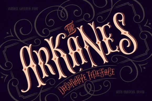
Layered Victorian decorative lettering with ornamental inner lines
The Arkanes is a decorative Victorian alphabet in which the stems carry drawn ornament, the letters arch along a curve and two offset layers sit behind each word, so a title reads as a hand-painted fairground sign.
Ideas for this font
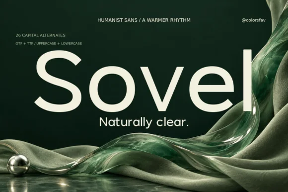
Warm humanist sans-serif with 26 expressive capital alternates
Sovel is a poised humanist sans-serif combining clean open lowercase forms with subtly flared stroke terminals and 26 capital alternates.
Ideas for this font
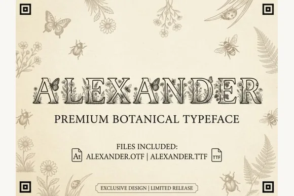
Botanical & entomology engraved naturalist serif (OTF & TTF)
Alexander is an intricate vintage naturalist's display serif filling hollowed Roman capitals with fine-line butterflies, honeybees, and wildflowers (OTF & TTF)!
Ideas for this font
Same independent foundry
Allow optional Google Analytics to measure visits and catalogue actions. Your search words and notes are not included. Privacy & storage