High-Contrast Display Serif

Dream Wish + The Avenue Editorial
Pairs sculptural editorial warmth with Dream Wish's clean modern geometry.
Inspect The Avenue Editorial specimenDisclosure: MakerFileHub may earn a commission from qualifying purchases via paid links on this page. How our links work.
Heavy display and fine tailed script
Dream Wish contrasts chunky uneven capitals in a flat pink with a fine black looping script line beneath, where the script w begins in a long entry tail and the h finishes in a high sweeping exit that lifts above the cap height of the lower word.
Paid link
Get this fontProject & layout blueprintsAt-a-glance maker compatibility
Set Cricut or Silhouette operation to Pen, Foil Quill, or Laser Score — not Basic Blade Cut.
Visual anatomy & craft review
The caps stay blocky and slightly uneven, the script stays thin and continuous, the entry and exit tails run long and the two rows overlap lightly. That overlap is the character: the script sits close enough to touch the caps, which is why the sample keeps both rows centred with nothing else competing. A rainbow arc above is cover artwork. Keep 46 pt for the caps and 20 pt for the script, leave 16 mm of clear ground between the rows and check the exit tail against your right margin.
Heavy display and fine tailed script
Two-font hierarchy recipes
Tested contrast partners — pairing Dream Wish with grounded secondary typography.
Dream Wish + The Avenue Editorial
Pairs sculptural editorial warmth with Dream Wish's clean modern geometry.
Inspect The Avenue Editorial specimen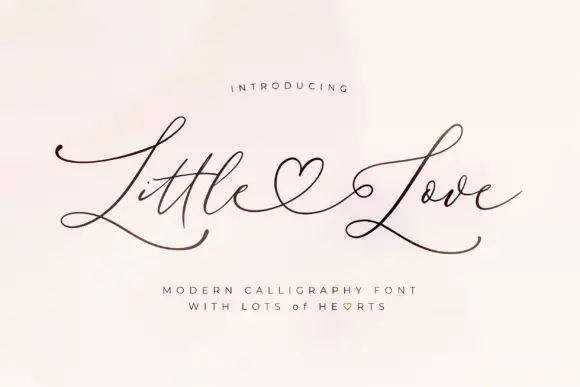
Dream Wish + Little Love
Introduces organic movement on pull-quotes, signatures and gift tags.
Inspect Little Love specimenPractical applications
Concrete hierarchy, scale and production guidance tailored to Dream Wish’s stroke geometry.
The chunky caps and the fine script give a small celebration two registers, so a short greeting reads warm rather than designed by committee.
Hierarchy & layout recipe
Print a 100 by 150 mm card: set the greeting in the caps at 38 pt, run the wish in the script at 22 pt beneath with 12 mm of clear ground between the rows, and keep 14 mm of margin at each side.
Pre-production check
The script exit tail runs wide; check the artwork and pull the row 8 mm left of centre before the die is cut.
The pairing works at small sizes because the caps carry the weight and the script adds a hand note without needing a third font.
Hierarchy & layout recipe
Print a 60 by 60 mm label: set the studio name in the caps at 20 pt, place the script line at 12 pt beneath with 6 mm of clear ground, and keep 5 mm to the die edge for the exit tail.
Pre-production check
The script hairline vanishes on kraft; check the plate proof and choose a coated label for the print run.
The soft caps suit a bouquet tag and the sweeping script gives the message a handwritten feel, which is what a gift tag is for.
Hierarchy & layout recipe
Print a 50 by 100 mm tag: set the greeting in the caps at 22 pt, run the script at 13 pt beneath with 8 mm of clear ground, and keep 9 mm to the punch hole so the tail stays clear.
Pre-production check
The w entry tail needs room at the left; check the tag layout, keep 10 mm of clear space and cut the die after that.
Technical & licence verification
Confirm included OTF/TTF/WOFF formats, full glyph tables and licence coverage on the live store page before batch production.
Closest visual alternatives
Matched across letterform anatomy, stroke behaviour and craft applications.
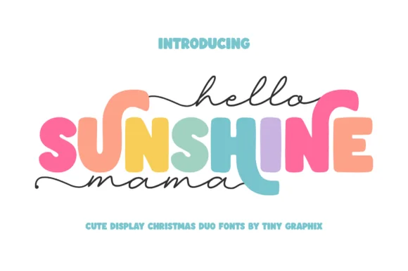
Chunky rounded caps in mixed colours with a fine monoline script above and below
Hello Sunshine Mama pairs chunky rounded caps that can each take a different colour with a fine monoline script that runs above and below the caps in long flat strokes.
Ideas for this font
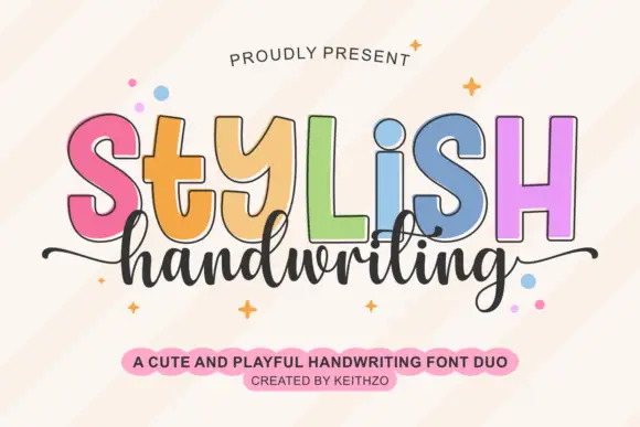
Colourful outlined capitals above a thin script
Stylish Handwriting is a duo on cream: fat outlined capitals with a black contour, each in a different pastel, and a thin joined script that runs beneath them with long tails.
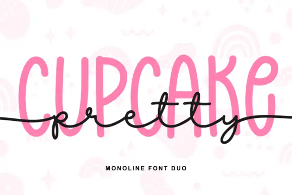
Tall monoline capitals with a flowing script
Pretty Cupcake is a monoline duo in pink and black: very tall condensed capitals with rounded stems, and a thin flowing script that runs across them at the waist, crossing the cap line on purpose.
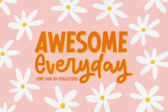
Irregular upright capitals paired with connected rounded script and long y loops
Awesome Everyday Duo places a capital row with thick narrow stems and uneven top edges above a connected rounded script whose y descenders drop into large lower loops and whose capital E begins with an open curl.
Ideas for this font
Same independent foundry
Allow optional Google Analytics to measure visits and catalogue actions. Your search words and notes are not included. Privacy & storage