 #1 · Best Overall
Pixel Game
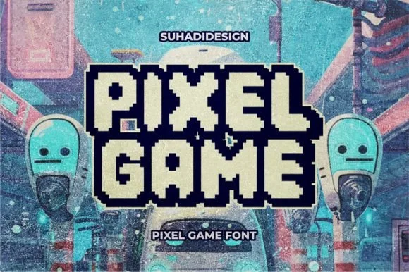
Double-outlined retro pixel arcade alphabet with a filled inner core
Get fontPaid link
Read review ↓Disclosure: MakerFileHub may earn a commission from qualifying purchases via paid links on this page. How our links work.
Bitmap grids, NES-era caps & scanline blocks
A pixel font is only authentic if every stem sits on the same grid. Terminal and Default Lingo respect that grid inside serif and glitch variants, Playback and Glory add the VHS scanline layer, and Pixel Game, Pixel Zone and Old Game reproduce the arcade cabinet proportions people recognise instantly. Module 24 shows the modular retro-OS side of the same discipline.
Quick verdict
Pixel Game is the most recognisable arcade face for merch, Pixel Zone suits RPG and stream overlays, and Old Game is the closest to an authentic 1983 cabinet. Terminal covers the editorial pixel serif case.
Quick answer
Short on time? Start with our three highest-rated 8-bit pixel, VHS & gaming standouts before scrolling the full breakdown.
#1 · Best OverallDouble-outlined retro pixel arcade alphabet with a filled inner core
 #2 · Runner-Up Pick
 #3 · Editor's Choice
We kept 13 of 168 candidates that hold a consistent bitmap grid across the full alphabet. Scored on stroke alignment at 8, 16 and 32 px, whether counters close when scaled, and whether the file includes a clean solid weight for print.
Side-by-side summary
Compare specimens, OpenType/PUA traits and primary project roles side by side.
| Rank & Font | Style & File Specs | Best Project Fit | Store Listing |
|---|---|---|---|
| Display8-bit | Level-up gaming birthday shirt or stream overlay | Get fontPaid link | |
| Display16-bit | Indie game Steam capsule, YouTube gaming banner or party invite | Get fontPaid link | |
| DecorativePure-NES | Retro arcade party invite, 'PLAYER 1' shirt & game-room sign | Get fontPaid link | |
| DisplayRetro-tech | YouTube retro-tech thumbnail, 80s party flyer or cassette zine | Get fontPaid link | |
| DisplayGrid-pure | Gamer room door decal, arcade cabinet marquee or party cup | Get fontPaid link |
#1 · Best OverallPixel Game is an arcade alphabet in which every letter carries two outlines and a filled core, so a word reads as an eight-bit game logo rendered as a sticker.
The P is built from square pixels with a stepped bowl, the L keeps one arm of even blocks, the A carries a stepped bar and the Y forks into two staircases, all on a fixed grid with a heavy weight distributed between the core and the two outlines. That three-part construction is what makes the face work at sticker size: the inner core holds the colour while the outlines keep each letter separate on a busy ground. Because everything sits on whole pixels, the letterfit is wide and a short word spans a panel at 50 pt without tracking adjustments. Below 24 pt the double outline merges with the core. The teal ground, the night city, the game characters and the two small labels are presentation; the display face is the two words.
Level-up gaming birthday shirt or stream overlay — Add a dark pixel-stepped offset border around bright light fills.
Straight 90-degree pixel corners cut cleanly at 1.5"+ letter height on HTV.
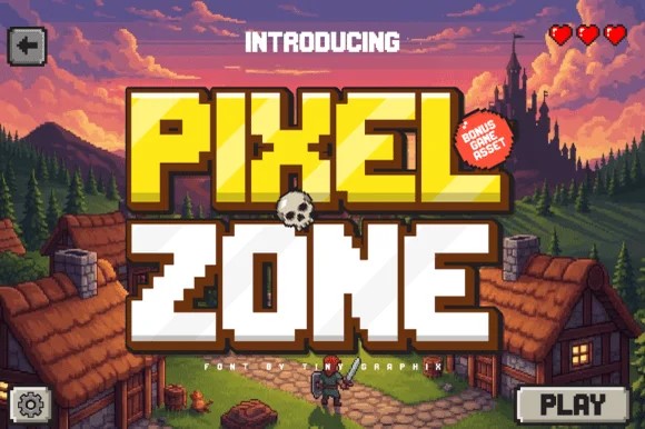
#2 · Runner-Up PickPixel Zone is a chunky sixteen-bit display in which every stem is built from square blocks, the corners bevel slightly and the strokes carry mass, so a title reads as an arcade logo rather than as a modern squarish sans.
The P stacks a block bowl over a straight stem, the Z steps a diagonal in even units, the O closes a square ring and the E sets three even arms, all on a shared pixel grid with a slight bevel on the outer corners. The grid is the character: every edge lands on the same module, which is why the sample sets two short rows on a dark ground. Because the modules are fixed, the face must be set at a multiple of the base size or the pixels distort, and it prints crisply at any scale as long as the grid is respected. The dark field, the small score line and the caption are presentation; the blocky letters are the face.
Indie game Steam capsule, YouTube gaming banner or party invite — Pair warm gold/white fills with a dark brown or black pixel drop shadow.
Clean stepped vector paths cut well on larger HTV and sticker decals.
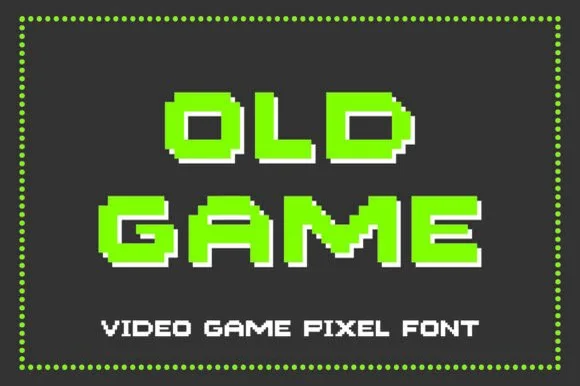
#3 · Editor's ChoiceOld Game is a pure, authentic 8-bit arcade pixel font built on a classic wide NES/Atari tile grid with crisp white drop-shadow readiness.
Old Game is an eight-bit pixel display drawn on the 1983 console grid: every letter is built from square pixels on a fixed lattice, the curves are stepped rather than smooth, and a shadow or outline variant doubles each pixel block. The lattice means the face only works at whole multiples of its pixel size, so any in-between scale produces uneven pixels. It needs roughly 24 mm for the stepped curve to read, and it is best in four colours or one ink on a dark screen-like ground, never anti-aliased.
Retro arcade party invite, 'PLAYER 1' shirt & game-room sign — Stack 2 uppercase words centered in neon green or gold with a 1-pixel white offset on dark charcoal.
Wide blocky pixel stems cut cleanly on 0.9 in+ Cricut HTV and vinyl—use transfer tape where diagonal corners kiss!
 #4 · Top Maker Utility
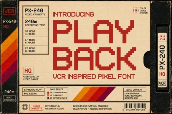
Playback is a blocky pixel alphabet modelled on the lettering printed on VHS cassettes, with square pixels, wide spacing and no diagonal or curved detail at all.
The P is drawn as a stack of squares with a notch, the L keeps one arm of even pixels, the A carries a bar that steps rather than slants and the Y forks into two staircases, all on a fixed pixel grid with an even weight and no anti-aliasing anywhere. That grid is the character: the face reproduces as a bitmap graphic, and its proportions come from the character cells rather than from drawing. Because every letter occupies a whole number of squares, the fit is wide and a short word spans a panel at 40 pt while staying crisp. The face is unsuited to small sizes on coated stock, where the pixels blur; it belongs on screen-styled print and on garments. The cassette label, the red ink, the colour bars and the small type blocks are presentation; the display face is the two words.
YouTube retro-tech thumbnail, 80s party flyer or cassette zine — Stack flush-left in warm red/orange beside crisp technical spec boxes.
Clean 90-degree stepped corners cut and weed sharply on vinyl plotters!
 #5 · Standout Silhouette
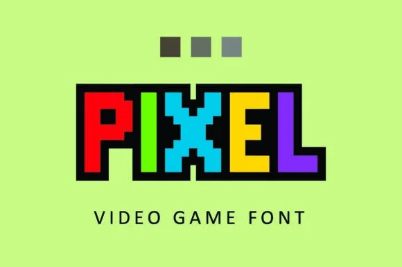
Pixel constructs 8-bit arcade capitals from uniform square blocks, with no diagonal curves and no tiny notches, so every edge follows a crisp orthogonal pixel grid on a fixed unit.
The blocks sit on one module, the corners never round, the strokes step in whole units and the counters close to rectangles. The pure grid is the character: the letters look like a screen font rather than a display face with a pixel texture laid over it, which is why the sample keeps the row even. Because the unit is fixed, scale in whole multiples of the grid so a block never falls on a half cell, and check 20 pt for the smallest usable step.
Gamer room door decal, arcade cabinet marquee or party cup — Assign alternating primary arcade colours per letter inside a black border.
Very easy vinyl cut thanks to clean right-angle grid edges.
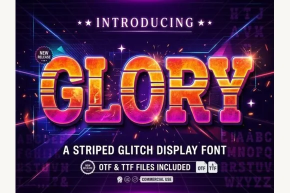 #6
Glory is a chunky arcade block in which every letter carries horizontal scanline gaps, so a word reads as a stretched slice of a 1980s title screen rather than as flat lettering.
The G closes with a square bar, the L keeps one heavy arm, the O holds a rectangular counter and the Y forks with flat cuts, all at a very heavy weight with squared corners and a bevel across the top and left edges. The scanlines are the defining feature: three or four horizontal gaps cut through each stroke at regular intervals and stay aligned across the word, which is what makes the face read as a screen artifact. That alignment is also the risk — set at different sizes, the stripes drift out of register between letters. Because the shapes are simple, the face holds at 60 pt on a poster and fails below 20 pt where the gaps read as damage. The dark ground, the gradient fills, the sparks and the two caption lines are presentation; the typeface is the word.
80s arcade night poster, synthwave album or retro tee — Fill with vertical warm-sunset gradients over dark navy/violet backdrops.
Multiple horizontal stripes per letter suit DTF, screen printing and digital graphics.
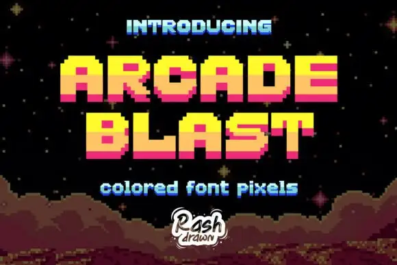 #7
Arcade Blast builds block capitals from visible square steps, where bright yellow upper portions shift to orange middles and deep pink lower bands, the O and A keep square counters, diagonals become staircases and a dark offset edge adds depth.
The steps stay one unit wide, the colour changes on a horizontal line through the letters, the corners never round and the counters close as rectangles. That stacked band is the character: the word looks lit from above by a shaded screen rather than filled with a gradient, which is why the cover adds stars and a rocky pixel landscape. The scene and the depth treatment belong to the artwork, so smooth nothing and scale in whole multiples of the step.
A retro arcade-party heading — Set PRESS above PLAY on black, with the date in a plain white lower strip and no borrowed landscape.
Check the new glyphs and export scaling; do not imply licensed game affiliation.
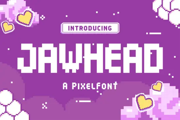 #8
Jawhead is a pixel font drawn on a coarse square grid: chunky capitals built from visible blocks, stair-stepped diagonals, and counters that close up if the word is set small.
JAWHEAD sits across the middle of a purple card in white, the letters built from large square pixels, with the diagonal of the A stepped in three blocks and the W formed from four short staircases. The grid is coarse enough that the steps are the style rather than a compromise, and the counters are generous, so the word still reads at the size shown. Hearts, hexagons and small crosses are scattered across the ground in the same pixel logic, and a rounded pill at the top introduces the face in a smaller pixel face. Below the word one line names the style. The face belongs to game interfaces, stream overlays, stickers and party graphics, and its practical limit is the grid: at a size where one pixel falls below about two points, the steps blur into a grey line and the whole character of the face disappears.
A pixel-party invitation title — Place GAME DAY in a white central panel on a purple invitation with the date in plain dark type below.
Verify new glyphs and inspect scaling sharpness.
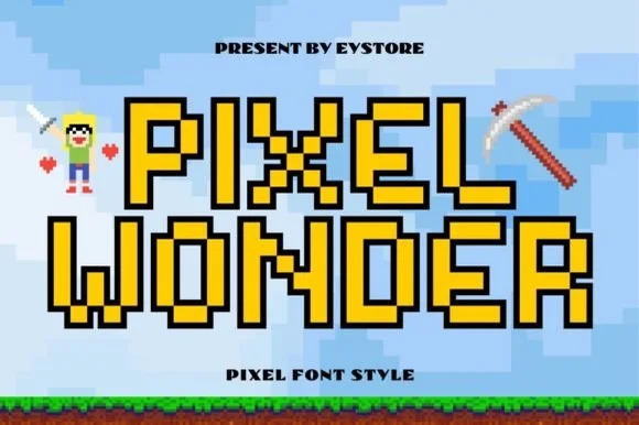 #9
Pixel Wonder is an authentic, grid-locked 8-bit pixel block font framed by crisp stepped black pixel outlines for instant sandbox-game nostalgia.
Pixel Wonder is an outlined eight-bit pixel block font: every letter is built from square pixels on a fixed lattice with a hollow interior and a black contour around the outside, so a word reads as a stamped screen rather than a filled bitmap. The lattice means the face only works at whole multiples of its pixel size, and the outline closes first. It needs roughly 26 mm for the contour and the pixel step to read, and it is best in two inks on white, or one ink plus a knocked-out interior on black for a screen look.
Minecraft/sandbox gamer birthday banner, cake topper & tee — Fill interiors with bright gold, emerald green, or diamond cyan inside Canva/Illustrator for Print-Then-Cut party toppers.
Straight 90-degree pixel corners cut cleanly on cardstock, HTV, and vinyl when scaled above 1.25 inches.
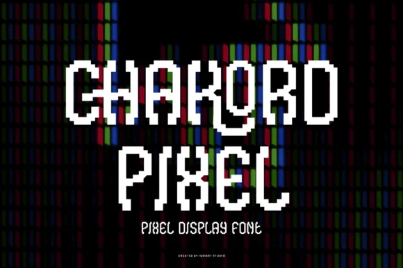 #10
Chakord Pixel builds chunky 8-bit arcade capitals from crisp square pixel blocks with playful notched corners and ligature-like joins.
Chakord Pixel is a stair-stepped eight-bit arcade pixel display: every stroke is built from square cells on a fixed grid, with hard diagonal steps, chunky caps and no anti-aliased curves at all. The grid is the design, so the face must be set on an even multiple of the cell size or the steps break into uneven runs. The corners are the finest element and they crumble when the face is scaled off-grid. It needs roughly 32 mm for the cell to read as a pixel, and it is best one bright ink on a dark ground.
'Level Up' gamer birthday topper & party shirt — Stack 'LEVEL 10' or the birthday kid's gamer tag in two centered lines, backing white letters with a black offset pixel shadow.
Because stepped corners create many tiny 90-degree turns, use a fresh 45-degree blade at medium speed so vinyl corners lift sharply.
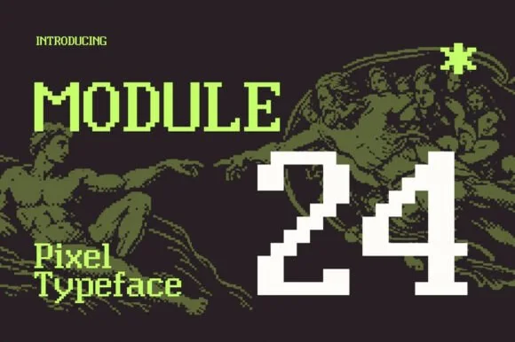 #11
Module 24 is a clean, modular pixel typeface pairing crisp uppercase/lowercase 8-bit text with bold arcade numerals ('24').
Module 24 is a modular pixel typeface on an eight-bit grid: uppercase and lowercase are drawn at a medium weight with clean stepped diagonals, while the numerals are deliberately oversized and heavier so a score or a price reads first. Because every edge falls on the grid, the face reproduces without softening at small sizes on screen and stays crisp in a bi-level plot or a laser cut. It is a screen-native alphabet, best used where the pixel construction is the message, and its counters are open enough for a two-line poster title.
Tech-art exhibition poster, indie game dialogue & album — Contrast crisp pixel typography against classical Renaissance halftone art or dark photography.
Clean square-grid vectors work cleanly in web/game engines, print, DTF, and 1 in+ PC-case vinyl decals.
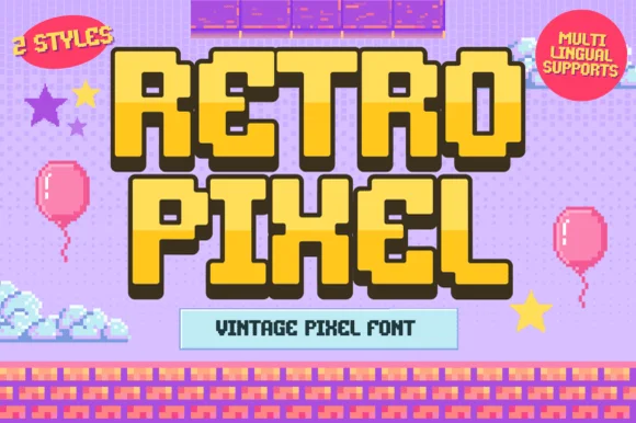 #12
Retro Pixel is a cheerful 2-style retro platformer pixel font with multilingual character support and chunky 16-bit adventure charm.
A two-style sixteen-bit pixel display shown over a pastel platform-game level: golden-yellow capitals carry crisp dark pixel outlines and drop shadows, and a second style is included, so the face reads as arcade title lettering rather than as a novelty font with a grid filter. The outlines are drawn on the pixel grid, which is why the letters stay sharp at multiples of the base size and blur between them. Multilingual coverage means a title can mix scripts without a second face. The brick-and-sky level behind is staging. Uses are game-themed parties, stream art, retro zines and any layout that wants a console-era voice.
Super-Mario-style birthday banner, favor box & cake topper — Layer bright yellow fill letters over dark-brown/black shadow style at 64–120 pt.
Chunky rectangular pixel blocks cut and layer cleanly in Cricut cardstock and HTV down to 1 inch!
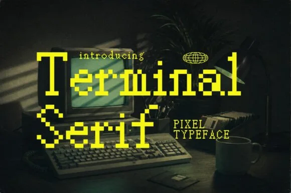 #13
Terminal is an eight-bit pixel serif in which the letterforms keep their editorial brackets and serifs while every curve is rebuilt from square blocks, so a title reads as a literary masthead on a vintage screen.
The T keeps a wide serif on a stepped stem, the e closes a stair-stepped bowl, the r carries a pixel shoulder and the brackets of a classic serif survive as one- or two-block steps rather than as smooth transitions. The hybrid is the character: literary proportions on a computer grid, which is why the sample suits a tech zine or a game title. Because the grid is fixed, the face must be set at a multiple of the base module or the pixels distort, and it prints crisply from 10 pt upward with a hot-foil finish on signage. The dark field and the small caption are presentation; the pixel serif lines are the face.
Indie game title screen, tech newsletter header or coding zine — Set in Mixed Case at multiples of 12pt for razor-crisp pixel alignment.
Clean orthogonal pixel edges cut neatly at large poster/decal sizes and shine on digital screens.
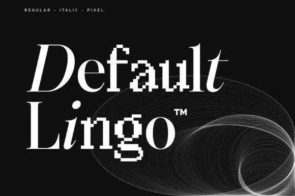 #14
Default Lingo is an experimental serif family in which a smooth regular, an italic and a pixel cut share one set of proportions, so a designer can glitch a letter or two inside a word and keep the baseline steady.
The regular holds even serifs and open bowls, the italic leans with the same stroke logic and the pixel cut rebuilds each stem from square blocks while keeping the serif footprint, so the three mix inside a single word. The mixing is the character: it is designed to be combined, which is why the sample sets one line with swapped letters rather than three specimens apart. Because the pixel blocks are small, the face wants 30 pt before the squares read as pixels and not as ragged print, and it weeds cleanly from three quarters of an inch of cap height. The plain ground, the small caption and the studio credit are presentation; the mixed line is the family.
Design conference identity, creative studio logo or album title — Set base words in Regular/Italic and substitute key vowels or initials in Pixel.
Best for digital branding, web headers, posters and book covers.
Practical buyer checklist
Key cutting, printing and pairing answers before choosing a 8-bit pixel, VHS & gaming typeface.
Because the pixels are being interpolated. Render at an exact multiple of the design grid, export as PNG without resampling, and avoid CSS transforms that scale non-integer amounts.
At their native grid size, yes: that is what they were drawn for. Blown up or squeezed down, the grid breaks and letters stop resolving, so always check the actual rendered size rather than the preview.
Yes, and DTF handles the hard edges well. Keep the design large enough that each pixel block is at least 1 mm, otherwise the print merges the grid into a soft blur that loses the entire effect.
Many include a small symbol set mapped to the punctuation range, which is useful for game UI. Check the glyph table, since the available symbols vary a lot between arcade fonts and pixel serifs.
Keep exploring
Explore adjacent maker roundups or check our practical pre-production checklists.
16 curated fonts · Previews & pairings
35 curated fonts · Previews & pairings
37 curated fonts · Previews & pairings
29 curated fonts · Previews & pairings
Guides: Invitation font checklist · Vinyl & cutting checklist · How to pair script & sans fonts
Allow optional Google Analytics to measure visits and catalogue actions. Your search words and notes are not included. Privacy & storage