Neutral Sans Workhorse

Merry Twinkle + Bareum
Lets Merry Twinkle own the focal silhouette while handling secondary copy, sizing and subheads cleanly.
Inspect Bareum specimenDisclosure: MakerFileHub may earn a commission from qualifying purchases via paid links on this page. How our links work.
Playful cutout-star storybook block
Merry Twinkle bounces cheerful uneven paper-cut block capitals: the forms stay solid and chunky with no fragile hairlines, and the baseline shifts so a short title reads as if cut from coloured paper.
Paid link
Get this fontProject & layout blueprintsAt-a-glance maker compatibility
Sturdy stroke walls and open counters weed cleanly on adhesive vinyl, HTV apparel film, and cut cardstock.
Visual anatomy & craft review
The blocks stay thick and simple, the edges look cut rather than drawn, the letters vary in height and the baseline moves from letter to letter. The paper-cut bounce is the character: the title reads as a classroom decoration, which is why the sample suits boards and stickers. Because the forms are solid, the face cuts and weeds cleanly from 20 mm of cap height, and the uneven baseline needs 16 mm between rows at heading size. The varying baseline is the risk in a two-row heading: the tall letter of the lower row meets the descender above, so keep 16 mm between rows and 20 mm of cap height before a vinyl cut.
Storybook · Block · Paper-cut
Two-font hierarchy recipes
Tested contrast partners — pairing Merry Twinkle with grounded secondary typography.
Merry Twinkle + Bareum
Lets Merry Twinkle own the focal silhouette while handling secondary copy, sizing and subheads cleanly.
Inspect Bareum specimen
Merry Twinkle + Askinо
Grounds bold display lettering with classic typographic authority on posters, badges and apparel.
Inspect Askinо specimenPractical applications
Concrete hierarchy, scale and production guidance tailored to Merry Twinkle’s stroke geometry.
The cutout blocks suit a school board, and the chunky forms stay readable at 45 mm across a printed sheet in one colour. The simple blocks also keep a board readable from the back of a room.
Hierarchy & layout recipe
Print an A3 board set: set the heading at 45 mm, keep 18 mm between the bouncing letters so each block reads alone, and keep 25 mm of margin for pins at the corners. Keep the heading on two rows.
Pre-production check
A pin driven through a letter tears the card; check the layout and keep the pin holes 15 mm clear of the type.
The paper-cut letters cut cleanly, and the simple blocks stay whole at 25 mm on a shaped sticker. The thick blocks also cut cleanly from vinyl at small sizes.
Hierarchy & layout recipe
Print a sticker sheet: set the word at 25 mm, keep 4 mm of clear vinyl around each block, and leave 6 mm between motifs so the die cuts stay separate. Keep the sheet layout even.
Pre-production check
Two blocks closer than 5 mm share a cut line; check the sheet and open the spacing by 2 mm. Print one sheet before the batch.
The bouncing blocks give a holiday card its cheer, and the even weight keeps a short greeting clear at 32 pt on an A6 sheet. The uneven baseline also keeps a card from feeling stiff.
Hierarchy & layout recipe
Print an A6 card: set the greeting at 32 pt, keep 14 mm of clear ground beneath the uneven baseline, and set the family name at 11 pt in a clean sans with 10 mm of space. Keep the lower third for writing.
Pre-production check
A bouncing line printed tight to a border looks like a mistake; check the card and keep 12 mm of margin. Keep the motifs at 3 mm or more.
Technical & licence verification
Confirm included OTF/TTF/WOFF formats, full glyph tables and licence coverage on the live store page before batch production.
Closest visual alternatives
Matched across letterform anatomy, stroke behaviour and craft applications.
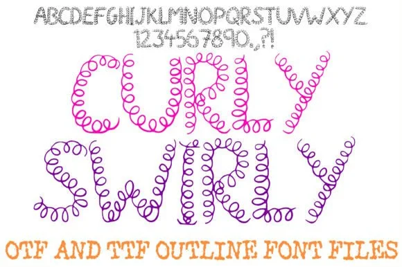
Continuous coiled-loop & telephone-cord doodle alphabet
Curly Swirly Handwriting Abc is a whimsical novelty display font drawn entirely from continuous, bouncy spring-coil pen loops.
Ideas for this font
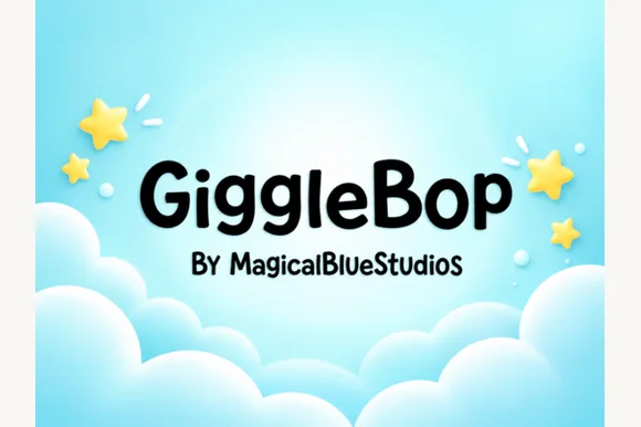
Clean rounded storybook & toddler toy-box sans
Giggle Bop is a clean, plump rounded display sans with bouncy textbook-clear lowercase and sunny children's-book readability.
Ideas for this font
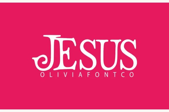
Swash-curled storybook uppercase display serif
Jesus (by OliviaFontCo) is a bold, all-caps display serif (not a handwritten script) featuring coiled spiral tail hooks and bracketed Roman stems.
Ideas for this font
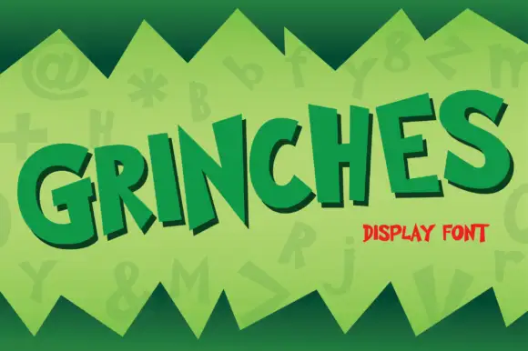
Uneven angled cartoon capitals
Grinches shows separate heavy capitals tilted at different angles along a rising word, where the N carries sharp diagonal points while the G and S use broad curves with blunt open ends and each letter sits at its own angle above the baseline.
Ideas for this font
Same independent foundry
Allow optional Google Analytics to measure visits and catalogue actions. Your search words and notes are not included. Privacy & storage