Neutral Sans Workhorse

Batzby + Swaraga
Lets Batzby own the focal silhouette while handling secondary copy, sizing and subheads cleanly.
Inspect Swaraga specimenDisclosure: MakerFileHub may earn a commission from qualifying purchases via paid links on this page. How our links work.
Slanted heavy graffiti-like capitals with blunt hooked strokes and an irregular baseline
Batzby places a hot-pink uppercase word inside a heavy black outline, where wide curved B bowls contrast with a sharp A apex and a long rising Y arm, several stroke ends curl into blunt hooks and the Z sweeps low across the baseline.
Paid link
Get this fontProject & layout blueprintsAt-a-glance maker compatibility
Sturdy stroke walls and open counters weed cleanly on adhesive vinyl, HTV apparel film, and cut cardstock.
Visual anatomy & craft review
The strokes slant forward, the weights stay heavy, the ends hook over and the baseline wanders under the Y. That hooked terminal is the character: the word reads as sprayed quickly rather than drawn carefully, which is why the cover surrounds it with icons and a liquid border. Those icons and the outline belong to the composition, so try the plain silhouette first, verify any glyph or language claims in the file and keep 34 pt before the hooks merge.
Slanted · Hooked ends · Graffiti
Two-font hierarchy recipes
Tested contrast partners — pairing Batzby with grounded secondary typography.
Batzby + Swaraga
Lets Batzby own the focal silhouette while handling secondary copy, sizing and subheads cleanly.
Inspect Swaraga specimen
Batzby + Amor Hadena
Grounds bold display lettering with classic typographic authority on posters, badges and apparel.
Inspect Amor Hadena specimenPractical applications
Concrete hierarchy, scale and production guidance tailored to Batzby’s stroke geometry.
The hooked graffiti caps suit a sticker, and the heavy strokes survive a die cut at 28 mm, where the blunt ends stay blunt through the peel.
Hierarchy & layout recipe
Cut a 100 mm sticker: set the brand at 28 mm on one row, keep 6 mm of clear vinyl around the blunt hooks, and keep the die contour 4 mm outside the outermost stroke.
Pre-production check
A hook cut against the die tears on peel; check the cut file and keep 5 mm of clear vinyl.
The slanted tags set a street poster, and the irregular baseline holds a two-word title at 50 pt on an A3 sheet, where the hooked ends keep the row moving.
Hierarchy & layout recipe
Print an A3 poster: set the title at 50 pt on one row, keep 22 mm beneath before the date block at 14 pt, and keep 20 mm of margin so the long Y arm stays inside.
Pre-production check
A heavy outline added on top blunts the hooks; check the artwork and print the plain fill first.
The graffiti caps give a teen card attitude, and the hooked ends hold a name at 32 pt on an A6 sheet, small enough for a card but still clearly tagged.
Hierarchy & layout recipe
Print an A6 card: set the name at 32 pt on one row, keep 18 mm of clear ground beneath for the low Z, and set the details at 11 pt in a plain sans at the foot.
Pre-production check
Two tagged rows on a small card become unreadable; check the card and keep one row in the display face.
Technical & licence verification
Confirm included OTF/TTF/WOFF formats, full glyph tables and licence coverage on the live store page before batch production.
Closest visual alternatives
Matched across letterform anatomy, stroke behaviour and craft applications.
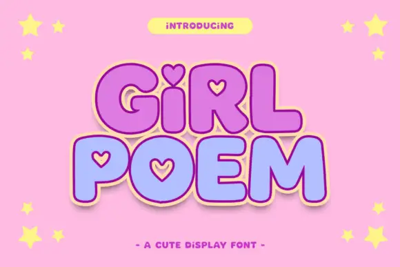
Round display blocks with heart-shaped counters and a soft outline
Girl Poem is a round display alphabet in which several letters carry heart-shaped counters, drawn as heavy soft blocks with a light outline and no contrast at all.
Ideas for this font
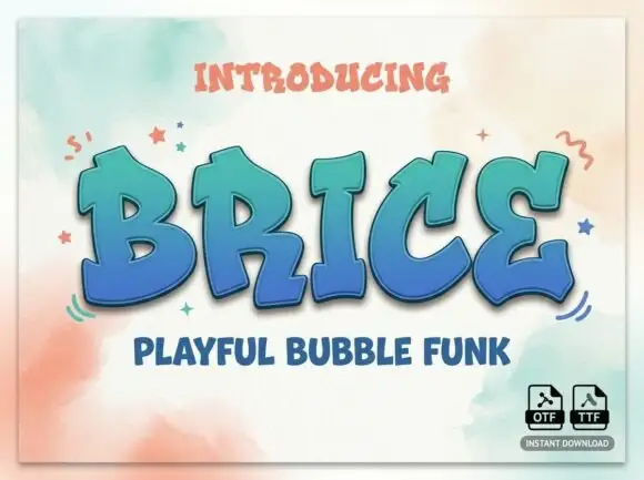
Heavy tilted capitals with rounded bowls and irregular wedge-like ends
Brice is a playful bubble funk display face: fat rounded letters with a wide white inline, a heavy coloured contour and a soft shadow offset below, so a word looks moulded from plastic.
Ideas for this font
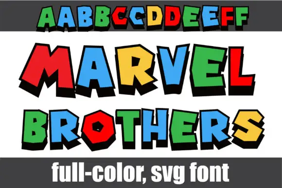
Tilted multicolour block display
Marvel Brothers is a colour block display on a banded ground: tilted capitals with thick black depth, each in a different saturated colour, set as an alphabet row at the head and then as two large words, with a plain footer naming the format.
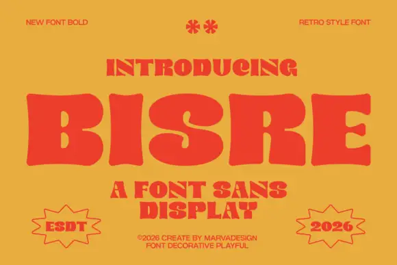
Retro fat display sans with blobby bowls and tight spacing
Bisre is a retro fat display sans in which the bowls swell into blobs, the counters close to slots and the letters jostle each other, so a short word reads as a hand-painted 1970s sign.
Ideas for this font
Allow optional Google Analytics to measure visits and catalogue actions. Your search words and notes are not included. Privacy & storage