Neutral Sans Workhorse

Cardift + Cultivo
Lets Cardift own the focal silhouette while handling secondary copy, sizing and subheads cleanly.
Inspect Cultivo specimenDisclosure: MakerFileHub may earn a commission from qualifying purchases via paid links on this page. How our links work.
Tall heavy mixed case with deeply rounded bowls and short projecting crossbars
Cardift shows pale lettering on charcoal: a high narrow C opens beside rounded a and d bowls, the heavy stems finish softly and the f and t crossbars project only a short distance past the stroke, with a large round i dot above a compact centre.
Paid link
Get this fontProject & layout blueprintsAt-a-glance maker compatibility
Sturdy stroke walls and open counters weed cleanly on adhesive vinyl, HTV apparel film, and cut cardstock.
Visual anatomy & craft review
The stems stay thick with soft terminals, the bowls round into deep curves, the crossbars barely extend and the i dot sits as a full circle above the line. The short crossbar is the character: the letters feel packed and deliberate rather than airy, which is why the sample sets one word on charcoal. Because the internal spaces are tight, keep 30 pt before the counters stay open, and check a new word at final size since the ornaments around the title are layout elements rather than an icon set.
Tall · Heavy · Soft ends
Two-font hierarchy recipes
Tested contrast partners — pairing Cardift with grounded secondary typography.
Cardift + Cultivo
Lets Cardift own the focal silhouette while handling secondary copy, sizing and subheads cleanly.
Inspect Cultivo specimen
Cardift + The Bilstein Editorial
Grounds bold display lettering with classic typographic authority on posters, badges and apparel.
Inspect The Bilstein Editorial specimenPractical applications
Concrete hierarchy, scale and production guidance tailored to Cardift’s stroke geometry.
The heavy letters read from the pavement, and the short crossbars keep a two-word name compact at 65 mm on a painted board. The compact setting also keeps a small sign from looking busy.
Hierarchy & layout recipe
Paint a 550 by 240 mm board: set the name at 65 mm, keep 22 mm of border so the soft terminals stay whole, and set the opening hours in a 13 mm caps on a plain band beneath. Keep the bar name to two words.
Pre-production check
Soft terminals painted to a board edge look clipped; check the mounted sign and keep 20 mm of margin. A matte sign paint holds the soft edge better.
The tall forms suit a bag label, and the tight counters stay open at 22 pt on a 55 mm panel in one ink. The tall forms also fit a narrow bag where a wide face would not.
Hierarchy & layout recipe
Print a 55 by 80 mm bag label: set the roast name at 22 pt, keep 6 mm of clear ground beneath the deep bowl, and set the weight in a 6 pt caps at the foot with 5 mm of space. Keep the panel narrow and tall.
Pre-production check
A press on an uncoated bag closes the tight counters at 18 pt; check the proof and keep the name at 20 pt or above.
The tall weight sets an opening page, and the compact centre holds a two-word title at 58 pt across a printed spread. The solid weight also keeps the title clear of the image behind it.
Hierarchy & layout recipe
Print a 210 mm spread: set the title at 58 pt on the upper third, keep 18 mm of clear ground beneath before the standfirst at 11 pt, and keep the block inside the text column.
Pre-production check
Two tight rows stacked lose the air between them; check the page and open the leading to 22 mm. Set the standfirst on the same column measure.
Technical & licence verification
Confirm included OTF/TTF/WOFF formats, full glyph tables and licence coverage on the live store page before batch production.
Closest visual alternatives
Matched across letterform anatomy, stroke behaviour and craft applications.
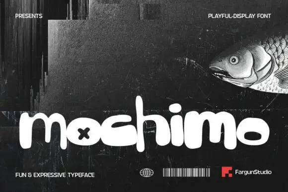
Playful fat rounded display
Mochimo is a playful fat display in white on a dark collage: lowercase letters with inflated bowls, tight spacing, an x cut into one counter and a bouncing baseline, presented with small agency marks at the corners, so the plate reads as a contemporary brand experiment.
Ideas for this font
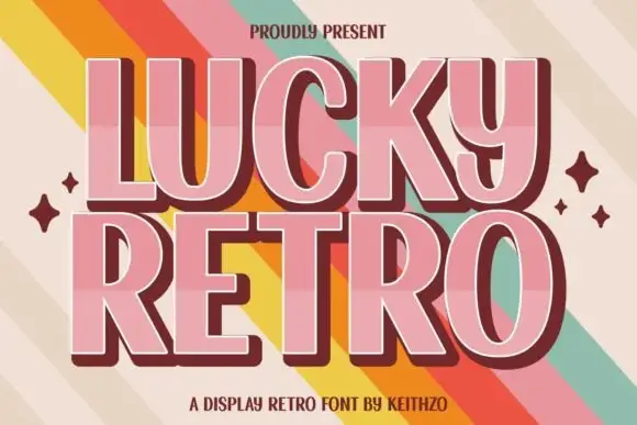
Retro display with extrusion
Lucky Retro is a retro display in pink with a maroon extrusion on a striped ground: wide caps with rounded corners, a thin inline highlight, a hard shadow that steps down and right, and four-point sparkles at the sides, so the plate reads as a seventies poster headline.
Ideas for this font
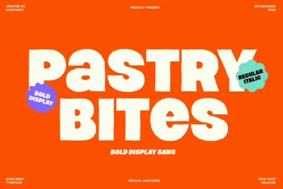
Heavy mixed-case display
Pastry Bites is a heavy display in white on a bright orange ground: mixed case with thick strokes, small counters, stepped changes of height and a few joined pairs, set in two lines between four small credits and two shaped badges.
Ideas for this font
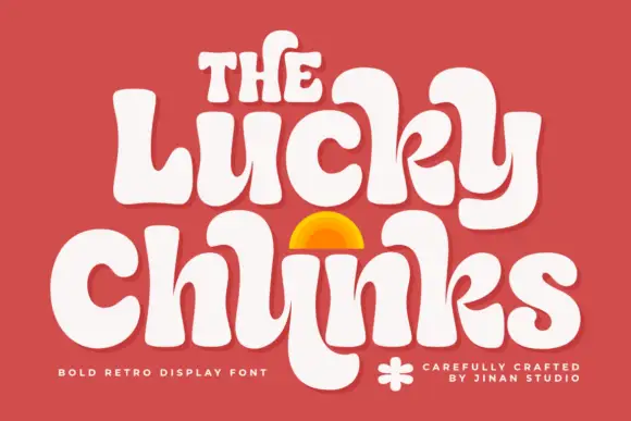
Bulging retro forms with curled joins
Lucky Chunks is a bold retro display face in cream on terracotta: very fat letters whose bowls bulge past the stems, curled joins between the letters of a word, and a half-sun arch drawn between the two lines.
Ideas for this font
Same independent foundry
Allow optional Google Analytics to measure visits and catalogue actions. Your search words and notes are not included. Privacy & storage