Neutral Sans Workhorse

Happy Kids + Clyne Sans
Lets Happy Kids own the focal silhouette while handling secondary copy, sizing and subheads cleanly.
Inspect Clyne Sans specimenDisclosure: MakerFileHub may earn a commission from qualifying purchases via paid links on this page. How our links work.
Chunky comic-outlined kids' display with dancing baselines
Happy Kids is a bold, comic-outlined children's display font with oversized playful capitals and energetic baseline tilt.
Paid link
Get this fontProject & layout blueprintsAt-a-glance maker compatibility
Sturdy stroke walls and open counters weed cleanly on adhesive vinyl, HTV apparel film, and cut cardstock.
Visual anatomy & craft review
Happy Kids is a chunky comic-outlined kids display with dancing baselines: fat rounded letters, a thick keyline with a white gap behind the fill, and letters that hop above and below the line so a word looks like it is moving. The hop grows the word vertically and the gap closes first when the face shrinks. It needs roughly 30 mm for the keyline and the hop to read, and it is best in three flat inks on white, or two inks where the gap is the paper itself.
Bouncy · Bold-outlined · Joyful
Two-font hierarchy recipes
Tested contrast partners — pairing Happy Kids with grounded secondary typography.
Happy Kids + Clyne Sans
Lets Happy Kids own the focal silhouette while handling secondary copy, sizing and subheads cleanly.
Inspect Clyne Sans specimen
Happy Kids + Evoire
Grounds bold display lettering with classic typographic authority on posters, badges and apparel.
Inspect Evoire specimenPractical applications
Concrete hierarchy, scale and production guidance tailored to Happy Kids’s stroke geometry.
A comic-outlined display announces a loud children's party through the lettering alone. The keyline holds at 44 mm on a topper, and three flat inks print the invite and the wraps as one set.
Hierarchy & layout recipe
Invite A6, word 44 mm with 10 mm keyline clearance, details 8/11 pt, 12 mm margins. Topper 130 x 110 mm, word 48 mm with a 6 mm stick slot and 12 mm clear. Cup wrap 200 x 90 mm, word 20 mm, 12 mm from the rim.
Pre-production check
A cup wrap printed across the taper squeezes the keyline at the seam and the word reads as a doubled outline. Keep the word inside the flat 60 mm centre band, and wrap one cup before the party.
A dancing comic display turns a children's page into a moving headline. The gap holds at 52 pt on a coated page, and three flat inks keep the keyline from merging with the fill.
Hierarchy & layout recipe
Header 52 pt with 8 mm keyline clearance, body 12/17 pt over two columns of 82 mm, 18 mm margins. Cover flash 90 x 60 mm, word 32 pt, 6 mm margins. Activity title 36 pt.
Pre-production check
At 36 pt on the activity title the gap closes and the title reads as a solid bar. Keep the face at 46 pt and above, and proof one page at 1:1.
A dancing comic display reads as a celebration award rather than a worksheet heading, which is what a primary wall wants. The hop holds at 140 mm on a display, and three flat inks print the display and the stickers in one pass.
Hierarchy & layout recipe
Display 1200 x 400 mm, letters 160 mm with 12 mm keyline clearance, 20 mm margins. Name card 105 x 75 mm, name 18 mm, 5 mm margins. Reward sticker 50 mm round, word 10 mm, 3 mm die margin.
Pre-production check
At 18 mm on a name card the gap closes and the name reads as a grey bar after a term of handling. Raise cards to 24 mm and laminate them, and make one before the class set.
Technical & licence verification
Confirm included OTF/TTF/WOFF formats, full glyph tables and licence coverage on the live store page before batch production.
Closest visual alternatives
Matched across letterform anatomy, stroke behaviour and craft applications.
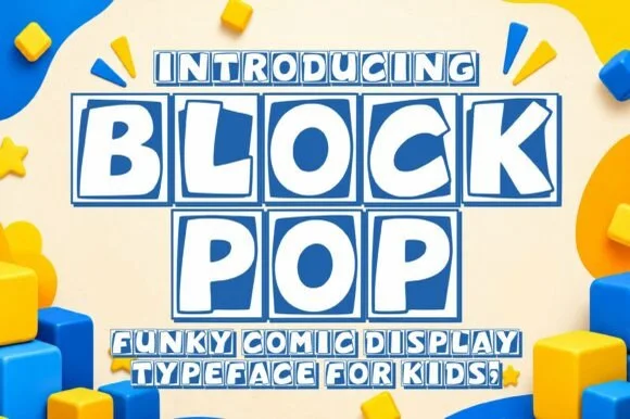
Tilted square-tile comic block & toy-brick display
Block Pop is a playful comic display typeface that frames every chunky letter inside its own slightly tilted, outlined square tile.
Ideas for this font
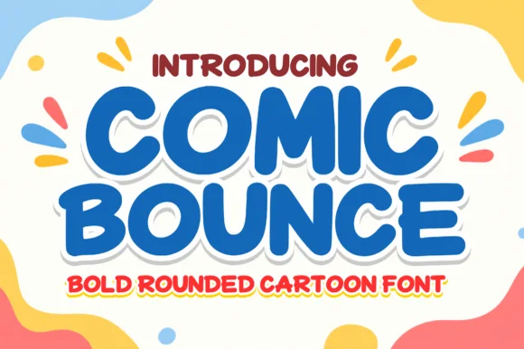
Chunky marshmallow-rounded cartoon headline sans
Comic Bounce is a thick, solid single-layer cartoon display font with puffy rounded strokes, playful tilt, and clean open counters.
Ideas for this font
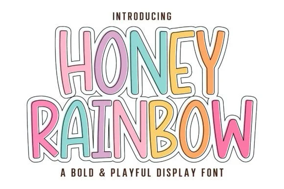
Tall playful rainbow-sticker outlined & solid cartoon display
Honey Rainbow is a tall, upbeat cartoon display font built for multi-colored pastel fills and crisp double-line sticker framing!
Ideas for this font
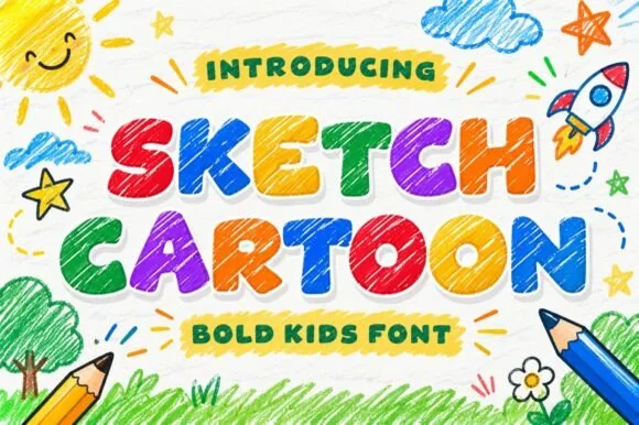
Hand-hatched colored-pencil & crayon kids' cartoon font
Sketch Cartoon is a chunky kids' cartoon display font textured inside every stroke with lively diagonal colored-pencil scribble hatching.
Ideas for this font
Same independent foundry
Allow optional Google Analytics to measure visits and catalogue actions. Your search words and notes are not included. Privacy & storage