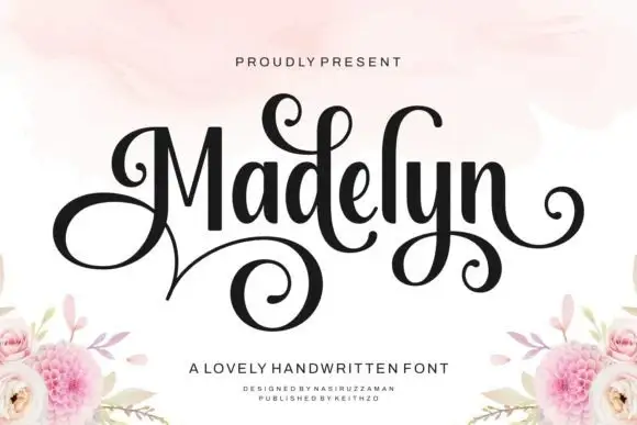
High-Contrast Display Serif

Shortcake Strawberry + The Lumina Awesome
Pairs sculptural editorial warmth with Shortcake Strawberry's clean modern geometry.
Inspect The Lumina Awesome specimenDisclosure: MakerFileHub may earn a commission from qualifying purchases via paid links on this page. How our links work.
Fine looped script with heavy playful sans duo
Shortcake Strawberry puts a fine tall-looped script above a heavy irregular sans whose bowls are almost as wide as the letters are tall, on a soft pink ground.
Paid link
Get this fontProject & layout blueprintsAt-a-glance maker compatibility
Weld or Unite overlapping script joins into one continuous vector path before sending to the blade.
Visual anatomy & craft review
In the pink specimen the script keeps thin even stems with open ascender loops and a small heart tittle, so its weight sits closer to a pointed pen than a brush. Beneath it the capital line is broad and soft, with a slightly uneven baseline and counters that shrink to narrow slits in the R and B. The two voices share almost no weight, which is exactly why the pair works as a lockup: the script supplies the tenderness and the sans supplies the punch. The underline stroke beneath the last line and the tiny speech-bubble mark are layout decoration. Both members are meant to be used together, but each also reads on its own.
Sweet · Contrasting · Bouncy
Two-font hierarchy recipes
Tested contrast partners — pairing Shortcake Strawberry with grounded secondary typography.
Shortcake Strawberry + The Lumina Awesome
Pairs sculptural editorial warmth with Shortcake Strawberry's clean modern geometry.
Inspect The Lumina Awesome specimen
Shortcake Strawberry + Easy Handwriting
Introduces organic movement on pull-quotes, signatures and gift tags.
Inspect Easy Handwriting specimenPractical applications
Concrete hierarchy, scale and production guidance tailored to Shortcake Strawberry’s stroke geometry.
The weight contrast gives a child's invitation both a decorative line and a headline that carries across a table full of people.
Hierarchy & layout recipe
Set the heavy word at 40 pt across the centre, add the script at 18 pt above with 4 mm clearance, and keep the party details at 10 pt below the block.
Pre-production check
The heavy letter's counters close early, so test the child's actual name at card size before choosing the second colour.
A narrow sleeve needs a decorative line and a readable one in a small space, and the weight difference does that without a third font.
Hierarchy & layout recipe
Keep the script at 11 pt on a 70 mm sleeve, set the flavour word at 16 pt, and leave 3 mm between the two lines so the loops never touch the heavy capitals.
Pre-production check
The fine script hairlines are the real risk on corrugated stock, so proof them before committing the sleeve run.
The soft round sans carries the greeting while the script adds a signature line that looks hand-written at card size, which is what the occasion needs.
Hierarchy & layout recipe
Print the greeting at 28 pt on a 105 by 148 mm card, put the script signature at 14 pt in the lower third and left-aligned, and keep 8 mm clear above the fold line.
Pre-production check
Check the looped ascenders against the card edge, because they reach taller than the cap height suggests.
Technical & licence verification
Confirm included OTF/TTF/WOFF formats, full glyph tables and licence coverage on the live store page before batch production.
Closest visual alternatives
Matched across letterform anatomy, stroke behaviour and craft applications.
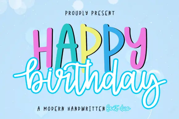
Duo pairing tall hand-lettered caps with an outlined script
Happy Birthday is a two-cut family in which tall hand-lettered capitals stand in a bouncing row and an outlined script writes the second word beneath, so a greeting reads as a decorated card from a stationery shop.
Ideas for this font
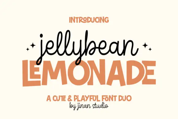
Looped monoline script stacked over a squared playful sans in flat capitals
Jellybean Lemonade pairs a looped monoline script with a squared playful sans, so one lockup carries a light handwritten first line and a flat block second line in the same colour.
Ideas for this font
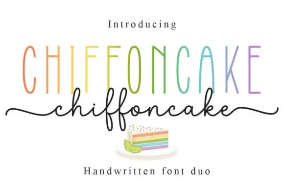
Tall narrow sans and fine looping script duo
Chiffoncake Duo pairs very tall narrow capitals, each in a different pastel tone, with a low connected script whose deep f loops drop below the baseline, and long tails extend from both sides of the lower word above a small cake illustration.
Ideas for this font
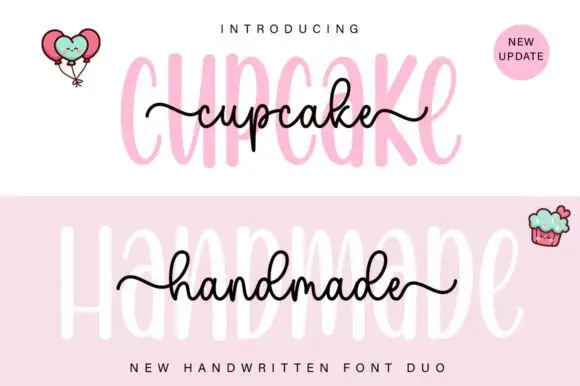
Tall rounded sans with fine extended script
Cupcake Handmade Duo places tall narrow rounded letters in pale pink behind a smaller connected script line in black, twice on one cover, where the script carries long outer tails and looped k and h forms while a balloon pair, a cupcake drawing and an update badge sit in the corners.
Ideas for this font
Same independent foundry
Allow optional Google Analytics to measure visits and catalogue actions. Your search words and notes are not included. Privacy & storage