High-Contrast Display Serif

Jellybean Lemonade + Auretha
Pairs sculptural editorial warmth with Jellybean Lemonade's clean modern geometry.
Inspect Auretha specimenDisclosure: MakerFileHub may earn a commission from qualifying purchases via paid links on this page. How our links work.
Looped monoline script stacked over a squared playful sans in flat capitals
Jellybean Lemonade pairs a looped monoline script with a squared playful sans, so one lockup carries a light handwritten first line and a flat block second line in the same colour.
Paid link
Get this fontProject & layout blueprintsAt-a-glance maker compatibility
Weld or Unite overlapping script joins into one continuous vector path before sending to the blade.
Visual anatomy & craft review
The script half is a monoline with tall looping ascenders: the j drops a long curved descender and dots high, the e and the a close open bowls, the double l rises into narrow loops and the y finishes with a deep tail that overlaps the block line below. The sans half is a playful block alphabet in which the E carries three even arms, the M splays from a narrow centre and the A holds a low bar, all with squared corners and no contrast. Because both halves sit at the same visual weight, the pair reads as one object rather than as a headline plus decoration, which is why the sample stacks them tight. The cream ground, the orange ink, the two sparkles and the small credit line are presentation; the duo is the two lines.
Looped · Squared · Paired
Two-font hierarchy recipes
Tested contrast partners — pairing Jellybean Lemonade with grounded secondary typography.
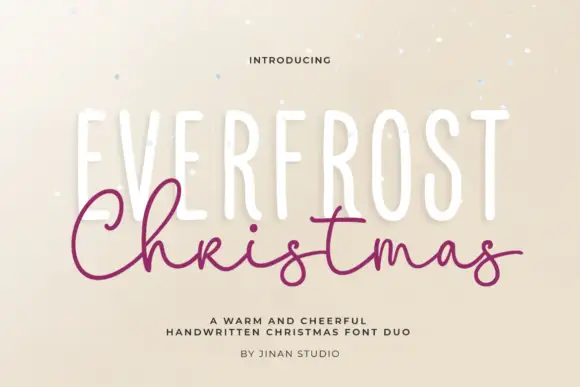
Jellybean Lemonade + Auretha
Pairs sculptural editorial warmth with Jellybean Lemonade's clean modern geometry.
Inspect Auretha specimen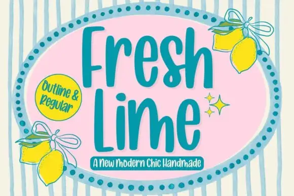
Jellybean Lemonade + Fresh Lime
Introduces organic movement on pull-quotes, signatures and gift tags.
Inspect Fresh Lime specimenPractical applications
Concrete hierarchy, scale and production guidance tailored to Jellybean Lemonade’s stroke geometry.
The light script carries the shop name and the flat blocks shout the opening offer, so one postcard does both jobs at 26 pt and 34 pt.
Hierarchy & layout recipe
Print on a 148 by 105 mm card: set the shop name in the script at 26 pt across the top, drop the offer in the blocks at 34 pt beneath it, and keep 12 mm clear below the script tail.
Pre-production check
The script descender overlaps the block line in the sample; check the proof at final size and raise the upper line by 3 mm so the tail does not sit on a counter.
The squared blocks carry the date at a readable size while the looped script keeps the card playful, which is what a party insert needs.
Hierarchy & layout recipe
Print on an A6 card: set the child's name in the script at 30 pt, set the time in the blocks at 18 pt, and leave 14 mm between the two lines so the loops stay legible.
Pre-production check
Two cheerful faces printed close together look cluttered; check the card at final size and move the time line to the lower third.
The blocks hold a flavour word at 11 pt on a narrow bottle label while the script signs the brand above it, so both read on a curved surface.
Hierarchy & layout recipe
Print on a 55 by 80 mm label: set the brand in the script at 14 pt, set the flavour in the blocks at 11 pt, and keep 6 mm of margin so the descender does not run into the label edge.
Pre-production check
A curved label pulls the outer letters apart; check a labelled bottle in the hand and keep the script word short enough to stay on the flat of the label.
Technical & licence verification
Confirm included OTF/TTF/WOFF formats, full glyph tables and licence coverage on the live store page before batch production.
Closest visual alternatives
Matched across letterform anatomy, stroke behaviour and craft applications.
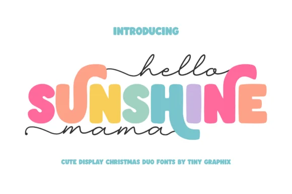
Chunky rounded caps in mixed colours with a fine monoline script above and below
Hello Sunshine Mama pairs chunky rounded caps that can each take a different colour with a fine monoline script that runs above and below the caps in long flat strokes.
Ideas for this font

Fine looped script with heavy playful sans duo
Shortcake Strawberry puts a fine tall-looped script above a heavy irregular sans whose bowls are almost as wide as the letters are tall, on a soft pink ground.
Ideas for this font
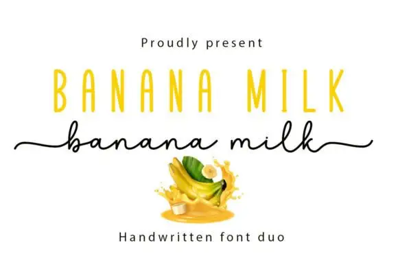
Casual marker handwriting with a bouncing baseline
Banana Milk is casual handwriting drawn with a rounded marker weight, its baseline bouncing up and down between letters, the ascenders short and the joins broken, so a word looks written quickly on a note rather than set on a line.
Ideas for this font
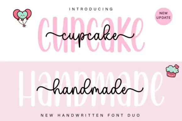
Tall rounded sans with fine extended script
Cupcake Handmade Duo places tall narrow rounded letters in pale pink behind a smaller connected script line in black, twice on one cover, where the script carries long outer tails and looped k and h forms while a balloon pair, a cupcake drawing and an update badge sit in the corners.
Ideas for this font
Same independent foundry
Allow optional Google Analytics to measure visits and catalogue actions. Your search words and notes are not included. Privacy & storage