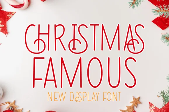
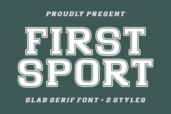
Neutral Sans Workhorse

Children Brooklyn + Montreal
Lets Children Brooklyn own the focal silhouette while handling secondary copy, sizing and subheads cleanly.
Inspect Montreal specimenDisclosure: MakerFileHub may earn a commission from qualifying purchases via paid links on this page. How our links work.
Clean rounded monoline marker caps for kids' design
Children Brooklyn is a tidy, outline-free rounded marker display font with tall friendly capitals and calm Nordic-playroom clarity.
Paid link
Get this fontProject & layout blueprintsAt-a-glance maker compatibility
Sturdy stroke walls and open counters weed cleanly on adhesive vinyl, HTV apparel film, and cut cardstock.
Visual anatomy & craft review
Children Brooklyn is a clean rounded monoline marker caps display built for children's design: an even medium stroke, fully rounded ends, wide even spacing and all-capital letters that stay separate so young readers do not run a word together. The monoline keeps it crisp at small sizes, and the rounded ends are the only warmth. It needs roughly 20 mm for the rounded end and the counter to read, and it is best in one bright ink on white, or a single dark colour on pastel paper.
Clean · Friendly · Minimal-kids
Two-font hierarchy recipes
Tested contrast partners — pairing Children Brooklyn with grounded secondary typography.
Children Brooklyn + Montreal
Lets Children Brooklyn own the focal silhouette while handling secondary copy, sizing and subheads cleanly.
Inspect Montreal specimen
Children Brooklyn + Marquis - Elegant Modern Serif
Grounds bold display lettering with classic typographic authority on posters, badges and apparel.
Inspect Marquis - Elegant Modern Serif specimenPractical applications
Concrete hierarchy, scale and production guidance tailored to Children Brooklyn’s stroke geometry.
A rounded marker caps face separates characters for early readers, which is what a primary wall and a worksheet both need. The stroke holds at 18 mm on a name card, and one ink prints the display and the sheets in one pass.
Hierarchy & layout recipe
Display 1200 x 400 mm, letters 160 mm with 12 mm counter clearance, 20 mm margins. Name card 105 x 75 mm, name 18 mm, 5 mm margins. Worksheet A4, header 16 mm, boxes 60 x 40 mm, 12 mm margins.
Pre-production check
At 16 mm on a worksheet header the rounded counters close and the word reads as a grey bar after photocopying. Raise the header to 22 mm, and print one sheet before the class set.
A rounded caps face reads as a hand-made invitation rather than a purchased one. The stroke holds at 44 mm on a topper, and one bright ink prints the invite and the labels as one set.
Hierarchy & layout recipe
Invite A6, word 40 mm with 8 mm counter clearance, details 8/11 pt, 12 mm margins. Topper 130 x 110 mm, word 48 mm with a 6 mm stick slot and 12 mm clear. Bag label 80 x 50 mm, word 14 mm, 5 mm margins.
Pre-production check
A 80 x 50 mm bag label at 14 mm closes the counters and the greeting reads as a bright bar. Raise the label word to 20 mm, and print one label before the batch.
A rounded marker caps face reads as a playful publisher mark rather than a corporate logo. The stroke holds at 26 mm on a card, and one ink prints the card and the sticker in one order.
Hierarchy & layout recipe
Card 85 x 55 mm, word 26 mm with 6 mm counter clearance, details 7/9 pt, 6 mm margins. Sticker 60 x 60 mm, word 20 mm, 4 mm die margin. Wrap band 200 x 40 mm, word 16 mm, 6 mm margins.
Pre-production check
On a 200 x 40 mm band the word crosses the fold and splits when wrapped. Keep it 8 mm clear of the crease, and wrap one band before the order.
Technical & licence verification
Confirm included OTF/TTF/WOFF formats, full glyph tables and licence coverage on the live store page before batch production.
Closest visual alternatives
Matched across letterform anatomy, stroke behaviour and craft applications.
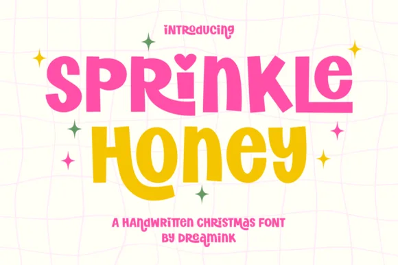
Chunky cut-paper kids' display with heart-dotted i (Year-round!)
Sprinkle Honey is a chunky, playful cut-paper display font with a sweet heart-dotted 'i'—zero Christmas icons attached so it shines all 12 months!
Ideas for this font
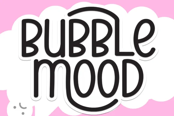
Tall rounded monoline marker display withnesting arches
Bubble Mood is a tall, medium-weight rounded marker display font where curved outer stems wrap playfully around neighboring vowels.
Ideas for this font
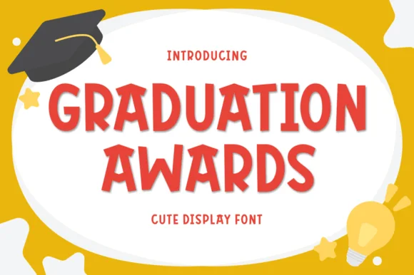
Playful bouncy cut-paper elementary display sans (Multilingual)
Graduation Awards is a sunny, bouncy cut-paper display sans (NOT a slab serif!) built for Pre-K/Kindergarten awards, stickers, and kid celebrations (Multilingual)!
Ideas for this font
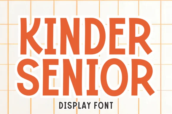
Playful soft-block school & milestone display
Kinder Senior is a warm, hand-crafted rounded block display font built specifically for kindergarten-to-senior school milestones and family tees.
Ideas for this font
Same independent foundry
Allow optional Google Analytics to measure visits and catalogue actions. Your search words and notes are not included. Privacy & storage