Modern Grotesque Body

Arcoba + Miniplate
Creates crisp high-hierarchy contrast beneath Arcoba headlines across menus, websites and labels.
Inspect Miniplate specimenDisclosure: MakerFileHub may earn a commission from qualifying purchases via paid links on this page. How our links work.
Warm hand-drawn vintage circus & carnival poster serif
Arcoba is a charming, hand-crafted vintage circus serif with flared wedge terminals, playful arched rhythm, and zero fragile hairlines!
Paid link
Get this fontProject & layout blueprintsAt-a-glance maker compatibility
Sturdy stroke walls and open counters weed cleanly on adhesive vinyl, HTV apparel film, and cut cardstock.
Visual anatomy & craft review
Arcoba is a hand-drawn vintage circus serif with flared wedge terminals, a playful arched rhythm and no fragile hairlines anywhere in the family, so it holds at small label sizes as well as on a poster. Capitals are tall and organic, the inked edges are slightly uneven, and the flared feet give a word a carnival bounce without a script's connections. It needs roughly 12 mm to look like sign painting, and its natural setting is an arch or a curved line, which is what the flared terminals are drawn for. It is a warm display face for events and packaging.
Big-top-carnival · Flared-hand-serif · Sunburst-warm
Two-font hierarchy recipes
Tested contrast partners — pairing Arcoba with grounded secondary typography.
Arcoba + Miniplate
Creates crisp high-hierarchy contrast beneath Arcoba headlines across menus, websites and labels.
Inspect Miniplate specimen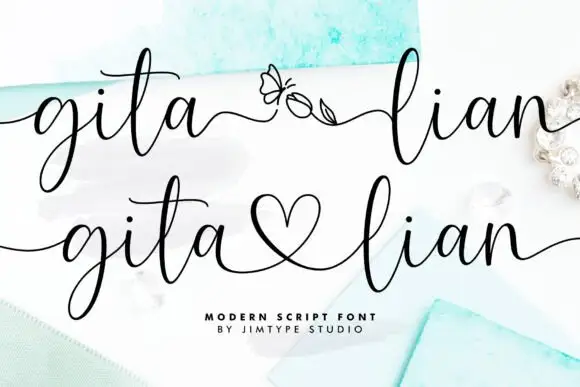
Arcoba + Gita Lian
Adds a warm human signature touch for 1-to-3-word callouts without competing against structured serif capitals.
Inspect Gita Lian specimenPractical applications
Concrete hierarchy, scale and production guidance tailored to Arcoba’s stroke geometry.
Flared circus terminals read as hand-painted fair signage, which is a theme a parent can build without licensed graphics. The absence of hairlines means the face survives being cut from card and printed on a small popcorn box.
Hierarchy & layout recipe
Banner letters 120 mm tall on 2 mm card, 5 mm hole at 12 mm, 25 mm margins, 40 mm pitch. Popcorn box 90 x 140 x 60 mm, word 22 mm, 10 mm margins. Invite A6, title 18 mm, details 4.5 mm.
Pre-production check
A flared terminal at 22 mm on a folded popcorn box can cross the crease and split. Keep the word 10 mm clear of every fold, and score the box blank before folding one sample.
A no-hairline circus serif reads as a sign painted on a shop window, which suits small producers who want warmth without nostalgia. Sturdy terminals emboss and cut cleanly on a bag.
Hierarchy & layout recipe
Bag 180 x 250 x 100 mm, word 40 mm on the front panel, 25 mm margins. Pouch 130 x 200 mm, word 26 mm, nutrition 5.5 pt. Label 80 x 110 mm, name 16 mm, abv 4.5 pt.
Pre-production check
Paper bags are printed before they are glued, and a word placed within 20 mm of the side gusset distorts when the bag is formed. Check one assembled bag with its artwork on the actual cut sheet before the run.
Carnival flares suit a harvest fair where everything is hand-painted, and heavy terminals survive a board that is read from a car. Warm letterforms sit well on kraft.
Hierarchy & layout recipe
Sign 900 x 600 mm, word 160 mm, 60 mm margins. Label 70 x 95 mm, name 14 mm, 5 mm top arc. Price card 100 x 70 mm, item 12 mm, price 10 mm, 6 mm right column.
Pre-production check
Kraft board plus a warm brown ink gives almost no contrast at dusk, when a pumpkin patch actually trades. Print one sign and check it in the last hour of daylight before the season opens.
Technical & licence verification
Confirm included OTF/TTF/WOFF formats, full glyph tables and licence coverage on the live store page before batch production.
Closest visual alternatives
Matched across letterform anatomy, stroke behaviour and craft applications.
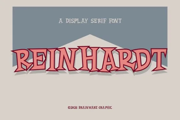
Angular notched display serif
Reinhardt is a display serif in rose pink with a layered maroon shadow on a warm grey ground: tall caps with angular, flared spurs, cut notches on the stem ends and a narrow waist, with a small tracked label above and a copyright line beneath.
Ideas for this font
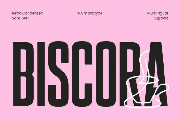
Diagonal-sliced retro café condensed sans (Multilingual)
Biscora is a stylish condensed sans distinguished by crisp diagonal stencil-like angle cuts across the joints of 'S', 'R', and 'A' (Multilingual)!
Ideas for this font
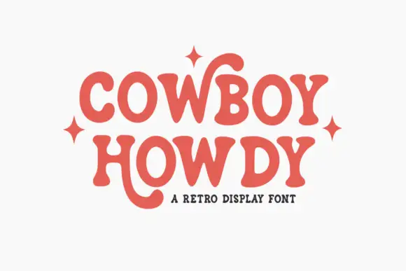
Soft retro serif with curling letter tails
Cowboy Howdy uses rounded heavy serif forms and open circular bowls in a warm coral red, where the Y of the upper word throws a tall curl high above the cap line and the H of the lower word drops a long rounded tail beneath the baseline.
Ideas for this font
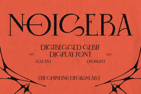
Distressed detailed serif display
Noisera is a distressed serif display in near-black on orange paper: very tall narrow letters with high-contrast stems, thin slab-like serifs cut with notches and small punctures through the bowls, with a stack of bracketed captions and a spray of black botanical shapes at the foot.
Ideas for this font
Same independent foundry
Allow optional Google Analytics to measure visits and catalogue actions. Your search words and notes are not included. Privacy & storage