Editorial Serif Anchor

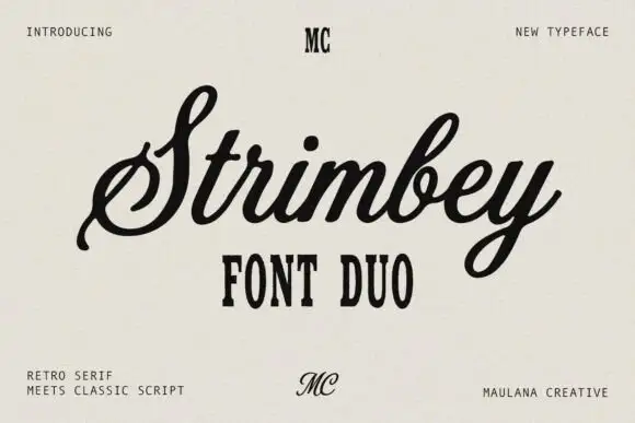
Mantiques + Medvilea Editorial
Anchors Mantiques's fluid strokes with crisp Roman proportions on wedding suites, headers and packaging.
Inspect Medvilea Editorial specimenDisclosure: MakerFileHub may earn a commission from qualifying purchases via paid links on this page. How our links work.
Slanted retro-casual monoline sign-painter script (Alternates & swashes)
Mantiques is a smooth, slanted casual monoline script blending 1950s sign-painter grace with clean modern readability (plus swash alternates!).
Paid link
Get this fontProject & layout blueprintsAt-a-glance maker compatibility
Weld or Unite overlapping script joins into one continuous vector path before sending to the blade.
Visual anatomy & craft review
Mantiques is a slanted casual monoline script that borrows 1950s sign-painter rhythm and adds swash alternates, so a name reads as painted quickly on a shop window rather than as calligraphy. The even monoline weight makes it predictable in vinyl and plotter work, and the swashes extend the word at both ends. It needs roughly 20 mm for the open lowercase to read, and it is best in ink black on warm paper or in one bright ink on a dark ground.
Retro-casual · Monoline-flow · Boutique-cafe
Two-font hierarchy recipes
Tested contrast partners — pairing Mantiques with grounded secondary typography.
Mantiques + Medvilea Editorial
Anchors Mantiques's fluid strokes with crisp Roman proportions on wedding suites, headers and packaging.
Inspect Medvilea Editorial specimen
Mantiques + Bargain Condensed
Keeps small-scale dates, URLs, nutrition facts and care instructions crisp and legible below script titles.
Inspect Bargain Condensed specimenPractical applications
Concrete hierarchy, scale and production guidance tailored to Mantiques’s stroke geometry.
A casual sign-painter script reads as a shop that lettered its own glass, which is what a small business wants. The monoline weight cuts in vinyl without tearing, and the swashes give a short name a finished start and end on a 900 mm window.
Hierarchy & layout recipe
Window vinyl 900 x 300 mm, word 150 mm with 20 mm swash clearance, 60 mm margins. Label 70 x 45 mm, name 12 mm, 4 mm die margin. Card 85 x 55 mm, name 9 mm, 5 mm margins.
Pre-production check
A vinyl cut at 150 mm leaves a 1 mm swash tail that lifts in the weeding. Thicken tails to 2 mm on the cut file, and weed one window word before the run.
Sign-painter script reads as a note written by a person rather than a printed courtesy, which is what a staff thank-you needs. The even stroke holds at 9 mm on a card, and the swashes give a short message a decorative start without a border.
Hierarchy & layout recipe
Card 148 x 105 mm, greeting 16 mm with 8 mm swash clearance, message 8/11 pt, 12 mm margins. Note 105 x 148 mm, greeting 18 mm, message 8/11 pt. Tag 45 x 80 mm, word 9 mm with a 4 mm hole and 6 mm clear card.
Pre-production check
A 45 mm tag with an entry swash runs into the punched hole and the card tears on the string. Keep 6 mm of clear card, and check one strung tag before the batch.
Fifties script reads as a seasonal drive-in, which is what a summer stand is selling at the window. The monoline holds at 240 mm on a banner in one colour, and the swashes give the name a period flourish without a second face.
Hierarchy & layout recipe
Menu 210 x 297 mm, sections 20 mm, items 9/12 pt, 15 mm margins. Cup print 200 x 90 mm, word 22 mm, 12 mm from the rim on a 120 mm band. Banner 1500 x 400 mm, word 240 mm, 100 mm margins.
Pre-production check
A cup print wraps a cone and a slanted script climbs the taper, so the name looks crooked on the cup. Use the wrap template and keep the word inside a 120 mm band, and check one printed cup.
Technical & licence verification
Confirm included OTF/TTF/WOFF formats, full glyph tables and licence coverage on the live store page before batch production.
Closest visual alternatives
Matched across letterform anatomy, stroke behaviour and craft applications.
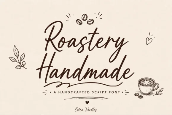
Warm café marker brush script with bonus coffee doodles
Roastery Handmade is a lively, upright café brush script accompanied by charming hand-drawn coffee-bean, latte-cup, leaf, and heart doodles.
Ideas for this font
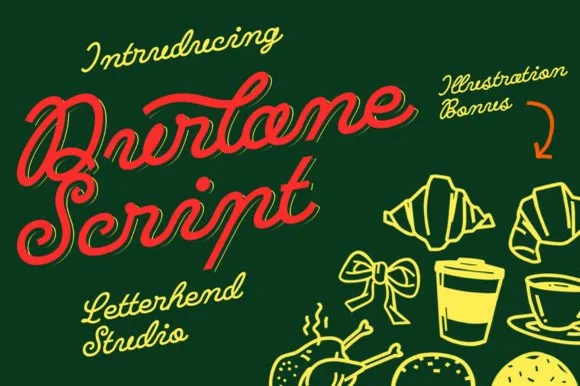
Fat retro script with an inline highlight and a heavy slant
Durlane is a fat retro script in which the strokes swell, a thin inline runs along the middle of every stem and the joins stay heavy, so a name reads as a hand-painted bakery sign from the 1980s.
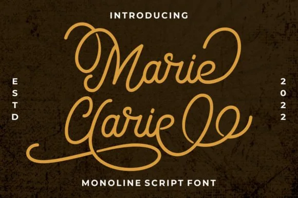
Vintage neon-sign & badge monoline script
Marie Clarie is a smooth, medium-fine monoline script featuring oversized vintage ribbon loops on capitals and spiraled terminal flourishes.
Ideas for this font
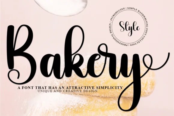
Curly spiral-terminal thick modern brush script
Bakery (by ade studio) is a thick, joyful brush calligraphy script distinguished by cute spiral curls on 'k', 'r', and its sweeping 'y' tail!
Ideas for this font
Same independent foundry
Allow optional Google Analytics to measure visits and catalogue actions. Your search words and notes are not included. Privacy & storage