 #1 · Best Overall
Disclosure: MakerFileHub may earn a commission from qualifying purchases via paid links on this page. How our links work.
Even-weight connected scripts
23 Best Monoline Cursive & Marker Scripts
Monoline means the upstroke is as thick as the downstroke, which changes everything downstream. Durlane brings sign-painter rhythm with no fragile hairlines, Tail and Welcome carry long tails that weld into one shape, and Santaheart holds an even-weight heart connector open at small sizes. For neon signage this even weight is a physical requirement.
Quick verdict
Durlane is the strongest all-rounder for café and shop signage, Welcome handles door signs and wide banners, and Santaheart is the seasonal script that still cuts. Pick I Heart You when the heart connector is the whole point of the design.
Quick answer
Top 3 monoline cursive & marker scripts picks right now.
Short on time? Start with our three highest-rated monoline cursive & marker scripts standouts before scrolling the full breakdown.
#1 · Best Overall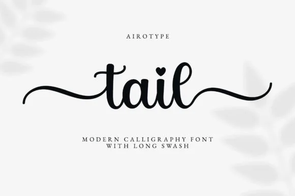 #2 · Runner-Up Pick
 #3 · Editor's Choice
How we tested & selected these 23 fonts
We reviewed 270 paid scripts and kept 23 with a measured stroke ratio near 1:1 across at least three lowercase letters. Weight given to connector continuity, counter openings larger than 1.5 mm at 1 inch, PUA swash access, and how the baseline behaves when a single word is stretched to fill a 20 inch sign.
Side-by-side summary
Top 5 monoline cursive & marker scripts picks at a glance.
Compare specimens, OpenType/PUA traits and primary project roles side by side.
| Rank & Font | Style & File Specs | Best Project Fit | Store Listing |
|---|---|---|---|
| ScriptRetro | Café window decal, pastry box or tote bag | Get fontPaid link | |
| ScriptAlternates & swashes | Personalized tumbler name, hat patch or wood round | Get fontPaid link | |
| ScriptPUA encoded · Alternates & swashes | Round wood welcome sign or nursery plaque | Get fontPaid link | |
| ScriptAlternates & swashes · File formats | Kids' cocoa mug, ornament or holiday pajama shirt | Get fontPaid link | |
| ScriptPUA encoded · Alternates & swashes | A single-line Valentine front | Get fontPaid link |
Scripts & Calligraphy
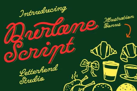
10 fonts#1 · Best OverallDurlane
Durlane is a fat retro script in which the strokes swell, a thin inline runs along the middle of every stem and the joins stay heavy, so a name reads as a hand-painted bakery sign from the 1980s.
The D opens a heavy loop, the u keeps two thick stems, the r swells an arm, the l rises on a fat stem, the a closes a wide bowl and the e turns a heavy eye, all at a brush weight with an even slant and an inline drawn inside the thick strokes. The inline is the character: it splits each fat stroke into two bands, which is why the sample sets a single name at large size and lets it carry the whole image. It ships with a set of food illustrations, but the type stands alone. The dark green ground, the croissants, the coffee cup and the small script credits are presentation; the red display name is the face.
Recommended project & layout
Café window decal, pastry box or tote bag — Angle headlines 6–8 degrees upward in warm cream, red or mustard tones.
Before you cut or print
Weld cursive joins before cutting window or sign vinyl.
Best paired with
Get fontPaid link
#2 · Runner-Up PickTail
Tail is a clean medium-weight calligraphy script with built-in beginning and ending wavy swashes and heart-dotted i glyphs, so a short personalised line reads as smooth writing with a flourish at each end.
The downstrokes stay sturdy, the counters open round, the entry and exit tails run in long waves and the i dots arrive as small hearts in the alternates. The wavy tail is the character: the line starts and finishes with a gesture, which is why the sample suits tumblers and round signs. Because the tails travel, keep 20 mm at each end from 26 pt, and where the surface is narrow set the word without the decorative tails rather than cropping them.
Recommended project & layout
Personalized tumbler name, hat patch or wood round — Type lowercase with start and end tail alternates enabled, then Weld.
Before you cut or print
Medium-thick stroke weeds cleanly on permanent and heat-transfer vinyl.
Best paired with
Get fontPaid link
#3 · Editor's ChoiceWelcome
Welcome features relaxed lowercase cursive with long level beginning and ending swash tails, tailored for round wood signs and entryways, where the smooth monoline-leaning strokes and open letter spacing keep words calm while the extended w and e tails span a circular blank.
The stroke stays one width, the spacing opens, the tails run level and the word sits calm. That level tail is the character: the greeting stretches to the width of a round board without a bigger point size, which is why the sample targets door signs. Plan the tails against the blank's curve, keep the stroke at 3 mm for cutting, and check the exits in your own word before committing the sign. The wide tail is also the weak point on a shaped blank: it has to end inside the panel, so a 12 mm tail on a 300 mm round board is safe and anything longer gets trimmed at the edge.
Recommended project & layout
Round wood welcome sign or nursery plaque — Centre the tailed lowercase word across the middle third and tuck family names below in small caps.
Before you cut or print
PUA-encoded tails weld cleanly in Cricut/Silhouette; verify thin tail tips before weeding small decals.
Best paired with
Get fontPaid link
 #4 · Top Maker Utility
Santaheart
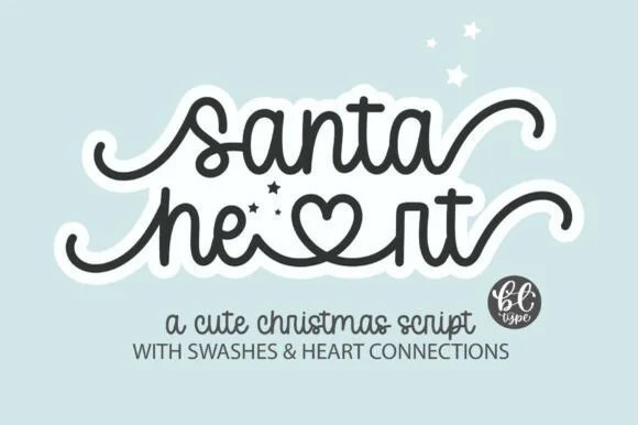
Santaheart weaves inline heart connectors and curled beginning and ending tails into a smooth monoline cursive for holiday mugs and children's gifts, where the thick even tubing keeps both standard cursive words and the heart-connected swash alternates durable for vinyl weeding.
The stroke stays one even width, the hearts sit inside the connectors, the tails curl out and the alternates are separate characters. That inline heart is the character: the greeting carries its own decoration, which is why the sample targets vinyl and mugs. The alternates need the character map, so check they open in your software, keep the tubing above 3 mm for weeding, and test a small curvy word first since closed counters are the hardest part to cut.
Recommended project & layout
Kids' cocoa mug, ornament or holiday pajama shirt — Use lowercase throughout to activate smooth baseline connections and heart ligatures.
Before you cut or print
PUA encoded; always Weld connected letters and swashes before cutting vinyl.
Best paired with
Get fontPaid link
 #5 · Standout Silhouette
I Heart You
I Heart You runs a fine connected phrase along one long baseline, where a heart replaces the dot on the opening i and two more hearts rise above the joins between words, with long entrance and exit strokes widening the phrase on both sides.
The stroke stays one even monoline weight, the letters stay connected, the hearts sit on the joins rather than beside them and the ends run long. Those heart joins are the character, because the phrase is drawn as a single ribbon with three interruptions. The small typeface label beneath is cover text. Check how the heart is reached in your file, keep 26 pt so the monoline stays unbroken and remember that a cutting machine will need the hearts joined to the letters.
Recommended project & layout
A single-line Valentine front — Centre the phrase on a wide card with generous end margins. Put the recipient name on the reverse rather than squeezing it between the heart loops.
Before you cut or print
Confirm the required heart alternates; single-line machine behaviour is not tested.
Best paired with
Get fontPaid link
 #6
Mantiques
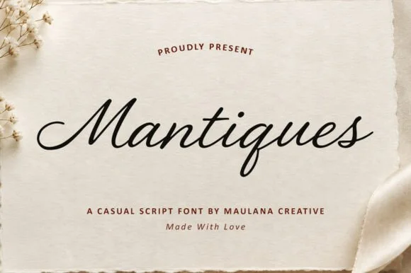
Mantiques is a smooth, slanted casual monoline script blending 1950s sign-painter grace with clean modern readability (plus swash alternates!).
Mantiques is a slanted casual monoline script that borrows 1950s sign-painter rhythm and adds swash alternates, so a name reads as painted quickly on a shop window rather than as calligraphy. The even monoline weight makes it predictable in vinyl and plotter work, and the swashes extend the word at both ends. It needs roughly 20 mm for the open lowercase to read, and it is best in ink black on warm paper or in one bright ink on a dark ground.
Recommended project & layout
Vintage antique-shop sign, coffee sleeve, apparel chest & mug — Center 1 title-case word at 64–125 pt above clean tracked sans caps ('A CASUAL SCRIPT FONT').
Before you cut or print
Weld overlapping cursive joins in Design Space—cuts and weeds smoothly on Oracal 651, HTV, and embroidery templates down to 0.9 in!
Best paired with
Get fontPaid link
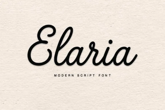 #7
Elaria
Elaria is a thick, smooth monoline-cord script with rounded pen ends and open loops—engineered to weed like a dream on Cricut vinyl and HTV!
Elaria is a plump rounded monoline-cord retro script built for vinyl: a fat even stroke with fully rounded ends, letters linked by thick cords and a small bounce that keeps the line from looking mechanical. The cords are the design and they close into one pillow when the face is reduced, and the monoline cut weeds cleanly from vinyl. It needs roughly 26 mm for the cord and the rounded end to read, and it is best as a one-colour vinyl cut, or one bright ink on white where the cord reads as a soft edge.
Recommended project & layout
Small cosmetic-jar vinyl decal, embroidered crewneck & mug — Center 1 title-case name at 60–120 pt above wide-tracked geometric sans ('M O D E R N S C R I P T F O N T').
Before you cut or print
Click Weld in Cricut Design Space and weed in 5 seconds on Oracal 651, glossy HTV, or 3D puff vinyl!
Best paired with
Get fontPaid link
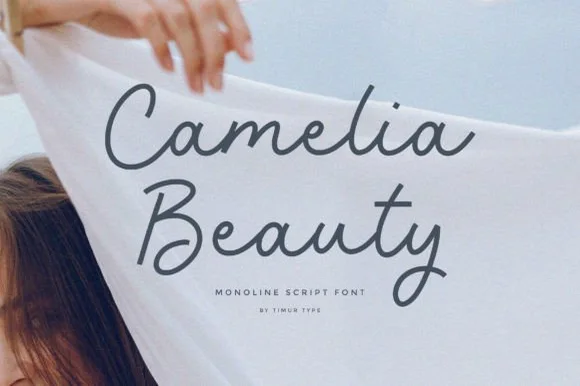 #8
Camelia Beauty
Camelia Beauty is a calm, tidy monoline handwritten script with open C/B capitals and smooth, legible upright lowercase.
A clean upright monoline cursive shown in slate charcoal over billowy white linen: uniform medium-thin marker curves with clean open loops and no fussy swashes, so the word reads as confident hand lettering rather than as a formal calligraphic script. The monoline stroke is what makes it feel modern, and the upright axis keeps a two-word name level without a bounce. Because nothing is hairline, the face survives small sizes and cuts without welding on the larger variants. The coastal linen behind is staging. Uses are beauty, spa, wellness and quiet wedding stationery, where the lettering should look considered rather than decorative.
Recommended project & layout
Clean-beauty serum bottle, linen spray & spa menu — Stack 2 title-case words centered at 38–64 pt in slate gray or espresso over crisp white.
Before you cut or print
Clean solid monoline paths cut reliably on 1 in+ cosmetic-bottle vinyl once cursive connectors are welded.
Best paired with
Get fontPaid link
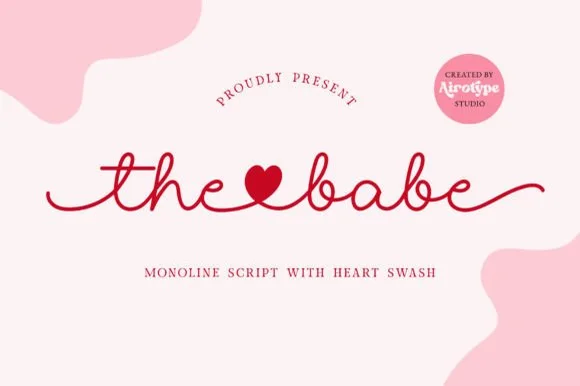 #9
The Babe
The Babe is a clean, steady monoline handwritten script featuring solid heart-shaped word connectors and smooth horizontal end tails.
The Babe is a smooth monoline cursive script in which the connectors swell into solid heart shapes: an even thin stroke, a gentle rightward slant and a heart that sits on the baseline between certain letter pairs. The hearts are drawn into the joins rather than added as an ornament, so a word reads as a chain of hearts, and the monoline keeps the face honest at small sizes. It needs roughly 22 mm for the heart connector to read, and it is best in one warm ink on ivory, or a foil impression above 34 pt where the monoline stays thin.
Recommended project & layout
Bride-squad satin robe HTV, slipper decal & hanger name — Link two short lowercase words ('the♥bride', 'maid♥honor') across a 7-inch robe back or 3.5-inch tumbler.
Before you cut or print
Always Weld the entire connected line in Cricut Design Space so the heart connector and cursive loops cut as one continuous ribbon.
Best paired with
Get fontPaid link
 #10
William Jameson
William Jameson is a lively monoline signature script with broad looping capitals and a bold underline swash tail.
William Jameson is a slanted signature cursive with a sweeping underline swash: a fast forward-leaning stroke, letters joined at the baseline, and a long flat swash that draws under the whole name and lifts at the end. The swash is the design, so the face needs a wide measure rather than a square panel. The swash thins are the finest element and they break first in print and in foil. It needs roughly 30 mm for the swash and the slant to read, and it is best one dark ink on a smooth stock.
Recommended project & layout
Apparel neck label, hangtag & founder sign-off — Stack the first name slightly left of the surname so the descending 'J' or capital loop balances the underline swash across a 3-inch width.
Before you cut or print
For HTV hoodies or t-shirts, size the lockup at least 3.5 inches wide so compact 'e' and 's' loops weed without lifting.
Best paired with
Get fontPaid link
Matched Font Duos & Packs
13 fonts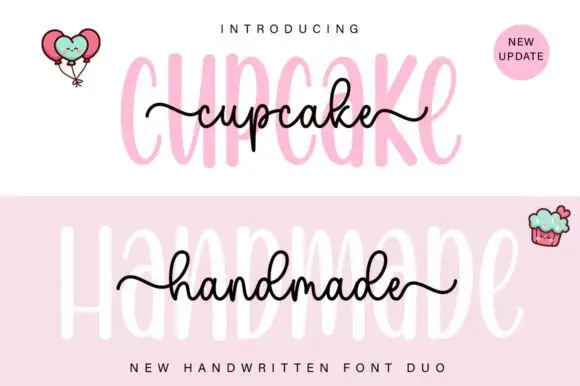 #11
Cupcake Handmade Duo
Cupcake Handmade Duo places tall narrow rounded letters in pale pink behind a smaller connected script line in black, twice on one cover, where the script carries long outer tails and looped k and h forms while a balloon pair, a cupcake drawing and an update badge sit in the corners.
The caps stay tall and narrow, the script stays compact and continuous, the loops open large and the tails run wide past the caps on both sides. That size gap is the character, because the script sits inside the cap row rather than under it. The balloons, the cupcake and the badge are separate sample elements, so do not count them as part of the type. Keep 34 pt for the caps and 16 pt for the script, and check the k and h loops against your margins before locking the lockup.
Recommended project & layout
A cupcake-table heading — Place the capital title above, not behind, the script; put flavours and dietary information in a plain panel below.
Before you cut or print
Check both supplied styles and essential food information separately.
Best paired with
Get fontPaid link
 #12
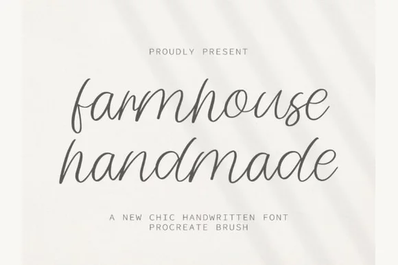
Farmhouse Handmade
Farmhouse Handmade is a breezy, light-stroke handwritten cursive with tall open ascender loops and relaxed baseline bounce.
Farmhouse Handmade is an airy tall-looped monoline handwritten script: a fine even stroke, very high ascenders that loop twice, wide spacing and long tapered descenders that drop below the baseline. The airy spacing needs a wide measure and the descenders close the line below, so stacked text needs extra leading. It needs roughly 26 mm for the double loop and the fine stroke to read, and it is best in one warm ink on smooth or uncoated stock, or a single dark colour where the thin stroke still carries.
Recommended project & layout
Handmade linen care tag & craft-booth price card — Pair lowercase two-word product titles at 22 pt on unbleached cotton paper with tiny all-caps sans weight and scent notes underneath.
Before you cut or print
Because every stroke is fine monoline, favor flat printing, rubber stamps, or Cricut fine-point pen drawing over small adhesive vinyl cuts.
Best paired with
Get fontPaid link
 #13
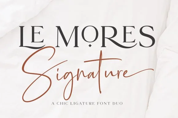
Le Mores Signature
Le Mores Signature pairs an editorial ligature serif—highlighted by cradled base loops—with a brisk copper-toned signature cursive.
Le Mores Signature pairs a ligature-rich editorial serif with a slanted signature script: the serif is a moderate-contrast face with true ligatures and oldstyle figures for running text, while the script is a fast slanted signature with a looping capital and a heavy exit stroke. The pair is how a printed magazine signs a page, so the serif carries the body and the signature carries the name. The signature's thin connectors are the finest element and they break first. The serif needs roughly 20 mm and the signature 30 mm for their detail to read.
Recommended project & layout
Boutique fashion hangtag, perfume box & atelier logo — Set the primary brand name in tracked-open serif capitals at 36 pt and overlap a single script subword across the lower-left stem.
Before you cut or print
Keep the slender signature script in print, hot foil, or larger 2.5 in+ decals rather than tiny blade-cut vinyl.
Best paired with
Get fontPaid link
 #14
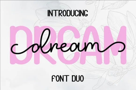
Dream Duo
Dream Duo combines a plump, soft-cornered uppercase sans-serif with a fluid monoline script that threads cleanly across wide titles.
Dream Duo pairs a chunky pastel rounded sans with a smooth monoline cursive: the sans is a fat even-width block with fully rounded corners and tight spacing for headlines, while the cursive is a soft even stroke with open loops and a gentle slant. The pair is built for a soft palette, so it loses its character when printed in a single harsh black. The monoline hairline is the finest element and it breaks first. The sans needs roughly 26 mm and the cursive 28 mm for their detail to read.
Recommended project & layout
Nursery wall name sign & sweet-sixteen acrylic backdrop — Scale the background sans to 3.5 inches tall in soft pastel and center the dark monoline script across the middle 60% height.
Before you cut or print
Weld all cursive joins before cutting vinyl, and use Cricut's Slice or a 0.07 in offset knockout if avoiding two-layer vinyl overlap.
Best paired with
Get fontPaid link
 #15
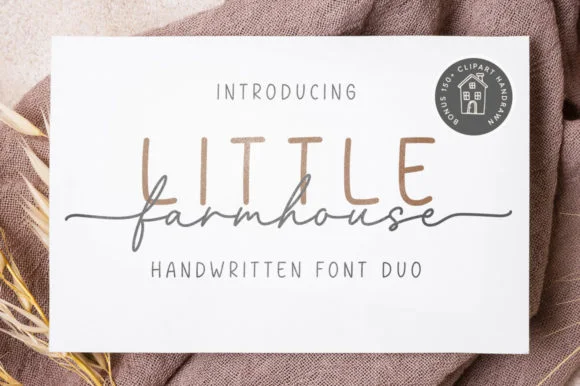
Little Farmhouse
Little Farmhouse pairs a tall, narrow rounded sans-serif with a delicate, wide-tracked monoline cursive.
On the framed white card mockup, warm taupe capitals 'LITTLE' stand tall and widely spaced behind dark charcoal script 'farmhouse', whose long entry and exit tails extend past both edges of the sans word while the lowercase 'f' drops a deep narrow loop. PUA encoding provides easy access to the extended end swashes. The layering is the fragile part: the script is cut as a separate vinyl layer across the sans, so the long entry and exit tails thin out at the overlap and lift first on a textured board. Keep the script x-height at 1.5 in or above, press the sans layer down first, and test one plaque before painting a set.
Recommended project & layout
Framed shiplap entryway or kitchen pantry sign — Track the sans capitals out to +120 in muted tan or gray at 2.8 in height, then center the dark script word across their lower stems.
Before you cut or print
When cutting stencil film for wood painting, keep the fine script above 1.5 in x-height so narrow 'f' and 'a' bridges hold firm against bleed.
Best paired with
Get fontPaid link
 #16
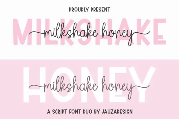
Milkshakehoney
Milkshakehoney pairs a crisp, wide-stance uppercase sans-serif with a tall, narrow-looped monoline cursive accented by straight side tails.
Milkshakehoney pairs a clean geometric uppercase sans with a tall-looped monoline script: the sans is a wide, even-width capital set for signage and labels, while the script is a thin monoline with high loops that rise well above the x-height and joins that stay open. The pair gives one card a printed voice and a hand-written line and works from a single ink. The monoline hairline is the finest element and it breaks first. The sans needs roughly 20 mm and the script 30 mm for their detail to read.
Recommended project & layout
Bridesmaid proposal box lid & satin robe chest print — Track the uppercase sans role title ('BRIDESMAID') wide in pale pink or gold behind the recipient's cursive first name.
Before you cut or print
Size HTV chest names at 4 inches wide or larger so the tall narrow 'k' and 'h' loops weed cleanly without stretching.
Best paired with
Get fontPaid link
 #17
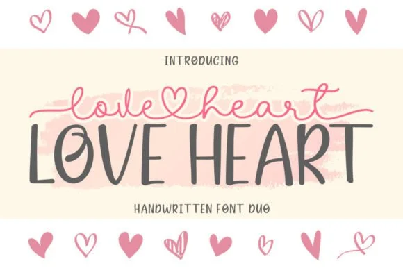
Love Heart Duo
Love Heart Duo matches a tall, slightly textured uppercase brush-sans with a fine monoline cursive featuring a built-in center heart swash.
Love Heart Duo pairs a hand-brushed tall sans with a heart-connected monoline script: the sans is narrow with a dry brush edge and open counters for headlines and lists, while the script runs an even thin stroke where the joins between two words swell into a small drawn heart. The pair gives one card a hand-linked line and a legible second voice from a single family and a single palette, so an invitation, a tag and a seal can be built together. The hearts are the finest element and they close into dots as soon as the face shrinks, and the dry brush edge fills when the sans is reversed or printed small. The sans needs roughly 24 mm and the script 26 mm for their detail to read.
Recommended project & layout
Couple anniversary mug, pillow sham & Valentine card — Match the outer tip-to-tip width of the tailed script to the full width of the uppercase sans row underneath.
Before you cut or print
The fine monoline script cuts best above 1.75 in tall on vinyl; for smaller mugs, use sublimation or Print-Then-Cut.
Best paired with
Get fontPaid link
 #18
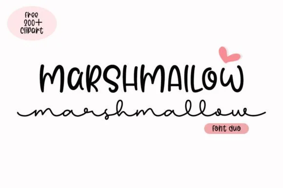
Marshmallow Duo
Marshmallow Duo matches a quirky condensed uppercase marker sans with a low, wide-looped monoline script.
Marshmallow Duo pairs a tall narrow marker sans with a wide monoline cursive: the sans is a squeezed felt-tip block with soft ends for a stacked headline, while the cursive is a broad even stroke with open bowls that stays legible at small sizes. The pair is built for a two-line title where the narrow cut holds the top row and the wide cut holds the second. The marker edge is the finest element and it softens first under a coarse screen. The sans needs roughly 24 mm and the cursive 26 mm for their detail to read.
Recommended project & layout
Hot-cocoa bar jar labels & party favor tags — Stack the ingredient title in 1.1 in marker caps on top and run a short flavor note in the wide monoline script across the base.
Before you cut or print
On matte sticker paper, print-then-cut with a 0.08 in white offset contour rather than weeding the thin lowercase connectors individually.
Best paired with
Get fontPaid link
 #19
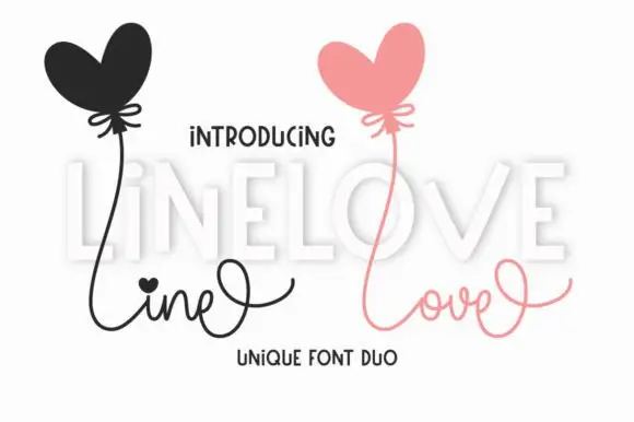
Line Love Duo
Line Love Duo is a two-cut pair in which a fine connected script with long loops answers a tall display letter set with uneven heights, so a card can separate a written line from a printed word in one palette.
The script lifts a heart-shaped dot over its i, runs thin connectors between small bowls and finishes with a long exit loop, while the display cut stands tall and unjoined with letters that vary in height and a slight lean. The contrast in join is the character: one member is written, the other is drawn, which is why the sample places a fine script above a set of tall letters. Set the script at 26 pt and the display at 34 pt, and weld the script before cutting from 1.1 inches of x-height. The heart balloons, the pale shading and the small caption are presentation; the two lettered rows are the duo.
Recommended project & layout
A two-voice love note — Use LOVE as the main line with a small script phrase below, leaving high loops open and any balloon illustration separate.
Before you cut or print
Confirm supplied styles and any heart variant before composing.
Best paired with
Get fontPaid link
 #20
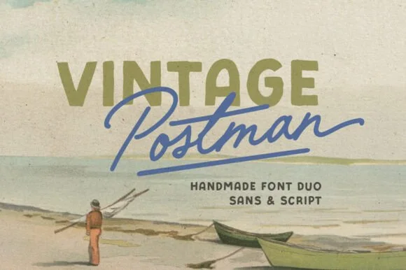
Vintage Postman
Vintage Postman pairs a sturdy retro sans with the look of a soft rubber stamp and a brisk monoline brush script: the olive sans holds a solid horizontal line while the angled script cuts across the baseline with a hand-signed slant.
The sans cut keeps even stems, softly rounded corners and a slightly uneven impression, and the script cut draws a monoline stroke at a steady width with a sharp slant and quick connectors. The pairing of a grounded row and an angled line is the character: one gives structure and the other gives motion, which is why the sample sets the olive words above the blue signature. Because the script slants, keep 18 mm between the rows and 20 mm at the right for the exit; the sans stays readable from 0.35 inches of pen height.
Recommended project & layout
Coffee bag label, travel poster or surf-shop tee — Set the geographical or brand noun in all-caps sans and overlap the descriptor in angled script.
Before you cut or print
Check light organic edge texture on the sans if cutting decals under 1.5 inches.
Best paired with
Get fontPaid link
 #21
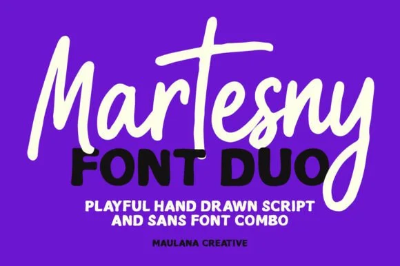
Martesny
Martesny combines a lively, tall-crossed hand-drawn marker script with a solid, rounded geometric uppercase sans partner.
Martesny is a duo of an energetic marker brush script and a chunky rounded sans: the script runs a wet loaded stroke with small flicks and joined letters, while the sans is a fat rounded block with tight counters for badges and prices. The pair carries a loud card in one ink, and the marker edge is the finest element. The script needs roughly 24 mm and the chunky sans 26 mm for their detail to read, and both work in one bright ink on white.
Recommended project & layout
Podcast cover, YouTube thumbnail & custom party hoodie — Let the script's descending 'y' or 'g' overlap slightly across the corner of the bold uppercase sans line beneath it.
Before you cut or print
Both the chunky sans and medium-thick marker script weed reliably on HTV and decal vinyl at 1 inch+ scale.
Best paired with
Get fontPaid link
 #22
Shortcake Strawberry
Shortcake Strawberry puts a fine tall-looped script above a heavy irregular sans whose bowls are almost as wide as the letters are tall, on a soft pink ground.
In the pink specimen the script keeps thin even stems with open ascender loops and a small heart tittle, so its weight sits closer to a pointed pen than a brush. Beneath it the capital line is broad and soft, with a slightly uneven baseline and counters that shrink to narrow slits in the R and B. The two voices share almost no weight, which is exactly why the pair works as a lockup: the script supplies the tenderness and the sans supplies the punch. The underline stroke beneath the last line and the tiny speech-bubble mark are layout decoration. Both members are meant to be used together, but each also reads on its own.
Recommended project & layout
A strawberry cake sleeve — Put a small script flavour line above one bold product line and keep ingredients on another panel.
Before you cut or print
Check the script joins remain legible beside the heavy letter mass.
Best paired with
Get fontPaid link
 #23
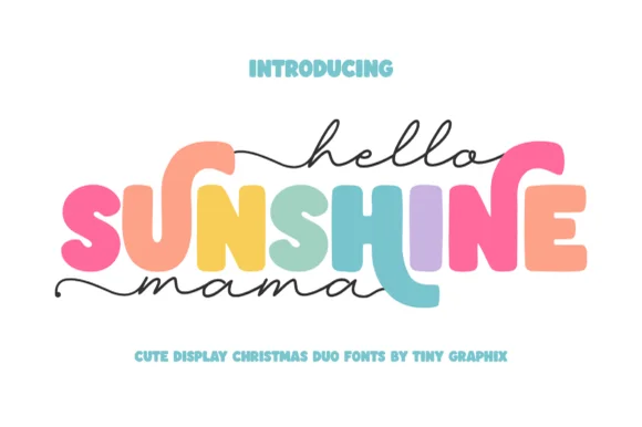
Hello Sunshine Mama
Hello Sunshine Mama pairs chunky rounded caps that can each take a different colour with a fine monoline script that runs above and below the caps in long flat strokes.
The cap half is heavy and soft: the S swells through two fat curves, the U holds a deep bowl, the N keeps one thick diagonal and the E carries three even arms, all rounded and even in weight. Because each letter is a separate shape of equal weight, the sample fills them in different colours, which is how the pair is meant to be used on children's pieces. The script half is a light monoline with flat entry and exit strokes that extend well past the caps on both sides, and that sweep is what holds the composition together. Contrast comes from weight, not from style, so the two layers never fight. The white ground, the pink script, the pastel fills and the two caption lines are presentation; the duo is the lettering.
Recommended project & layout
Mother's Day sweatshirt, tote or tumbler — Set the middle keyword in rainbow/earth-tone caps and sandwich with lowercase tailed script.
Before you cut or print
Thicken the thin monoline script slightly (0.02" offset) if cutting small adhesive vinyl decals.
Best paired with
Get fontPaid link
Practical buyer checklist
Frequently asked questions.
Key cutting, printing and pairing answers before choosing a monoline cursive & marker scripts typeface.
Are monoline scripts actually required for LED neon signs?
Flexible LED neon is bent from tubing of a single fixed width, so the artwork has to be a single-width path. A monoline script maps almost directly onto a channel layout, while a calligraphic script forces the fabricator to redraw every thick and thin transition.
Do monoline scripts weed more easily than copperplate calligraphy?
Usually yes. Because the upstroke carries the same weight as the downstroke, the connector between letters has thickness, so it does not snap when the waste vinyl lifts off the transfer.
What point size keeps a monoline script legible on a mug?
Below about 8 pt on a curved surface the counters close up and the word muddles. Print at 10 to 12 pt and keep the line short, or wrap the design on a curved mockup before committing to sublimation.
Why do some monoline scripts look bouncy and others look formal?
Bounce comes from a baseline that rises and falls between letters. A sign-painter script usually keeps a flat baseline and tilts instead, which reads more formal. Choose based on the surrounding layout, not on the preview's styling.
Keep exploring
Related collections & guides.
Explore adjacent maker roundups or check our practical pre-production checklists.

01 / Cricut & Craft
Vinyl & Cricut cutting
38 curated fonts · Previews & pairings
02 / Cricut & Craft
Single-line writing & Foil Quill
15 curated fonts · Previews & pairings

03 / Cricut & Craft
Cricut fonts with tails
21 curated fonts · Previews & pairings
04 / Branding & Print
Artisan bakery, café & menus
28 curated fonts · Previews & pairings
Guides: Invitation font checklist · Vinyl & cutting checklist · How to pair script & sans fonts