Editorial Serif Anchor

Whiskey + Auretha
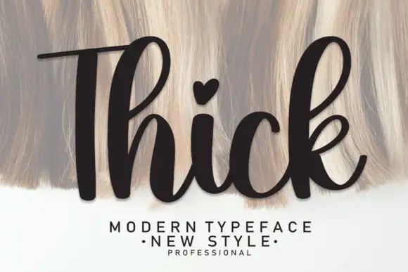
Anchors Whiskey's fluid strokes with crisp Roman proportions on wedding suites, headers and packaging.
Inspect Auretha specimenDisclosure: MakerFileHub may earn a commission from qualifying purchases via paid links on this page. How our links work.
Bold vintage sign-painter script
Whiskey delivers heavy mid-century sign-painter brush script, where thick retro strokes and compact loops carry a bold sweeping underline tail built for barware, sauce labels, hats and gifts rather than a formal invitation.
Paid link
Get this fontProject & layout blueprintsAt-a-glance maker compatibility
Weld or Unite overlapping script joins into one continuous vector path before sending to the blade.
Visual anatomy & craft review
The strokes stay heavy and brushy, the loops close compact, the connectors thicken and the final tail sweeps under the whole word. That underline tail is the character: the word arrives already signed off, which is why the sample sets one short spirit name on a dark ground. Because the tail travels below and beyond the letters, keep 22 mm of clearance at the outer end from 28 pt and confirm whether the swash is a separate character before promising it on a curved surface.
Bold · Swash underline · Retro
Two-font hierarchy recipes
Tested contrast partners — pairing Whiskey with grounded secondary typography.
Whiskey + Auretha
Anchors Whiskey's fluid strokes with crisp Roman proportions on wedding suites, headers and packaging.
Inspect Auretha specimen
Whiskey + Limited Coffee
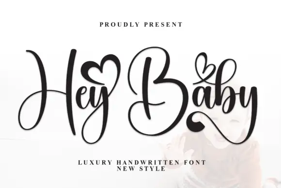
Keeps small-scale dates, URLs, nutrition facts and care instructions crisp and legible below script titles.
Inspect Limited Coffee specimenPractical applications
Concrete hierarchy, scale and production guidance tailored to Whiskey’s stroke geometry.
The sign-painter script gives a bottle label warmth, and the sweeping tail holds a two-word name at 24 pt on a 55 mm panel.
Hierarchy & layout recipe
Print a 55 by 60 mm label: set the name at 24 pt on one line, keep 14 mm of clear ground beneath for the long tail, and set the strength at 6 pt in a plain caps at the foot.
Pre-production check
A tail wrapped around a curved bottle distorts; check the label in place and keep the tail flat on the panel.
The heavy brush script reads across a counter, and the compact loops hold a short name at 50 pt on a printed board, where the thick strokes stay solid at distance.
Hierarchy & layout recipe
Print a 500 by 250 mm board: set the name at 50 pt on one row, keep 22 mm of clear ground beneath for the underline, and keep 24 mm of border so the tail stays inside.
Pre-production check
A heavy script at 30 pt read outdoors turns into a smear; check the mounted board and hold 44 pt or above.
The retro script keeps a card warm without sentimentality, and the thick strokes hold a short line at 30 pt on an A6 sheet.
Hierarchy & layout recipe
Print an A6 card: set the greeting at 30 pt on one row, keep 18 mm of clear ground beneath for the tail, and set the name at 12 pt in a plain sans at the foot.
Pre-production check
Two heavy script rows on a small card compete; check the card and keep only one line in the script.
Technical & licence verification
Confirm included OTF/TTF/WOFF formats, full glyph tables and licence coverage on the live store page before batch production.
Closest visual alternatives
Matched across letterform anatomy, stroke behaviour and craft applications.
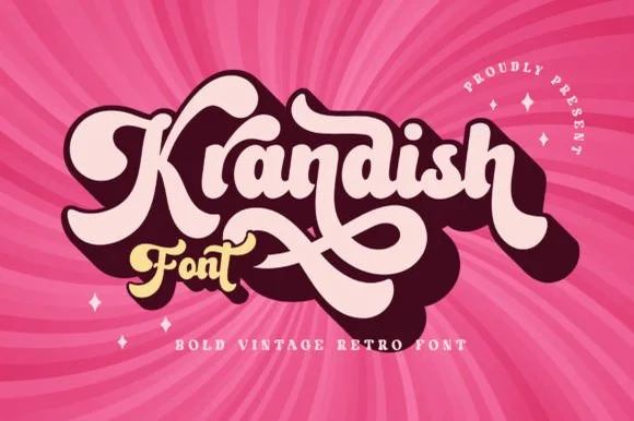
Chunky 1970s swash-tail retro brush script
Krandish is a heavy, cream-smooth 1970s retro script featuring dramatic looping swash capitals and thick figure-eight underline tails.
Ideas for this font
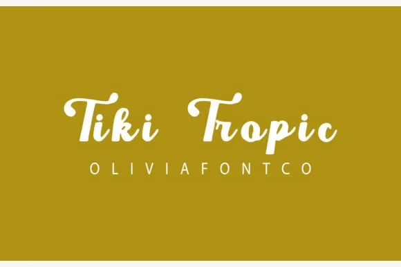
Chunky retro brush-signage & resort script
Tiki Tropic (by OliviaFontCo) is a bold, vintage sign-painter brush script (not a carved block font) with thick loops and warm mid-century charm.
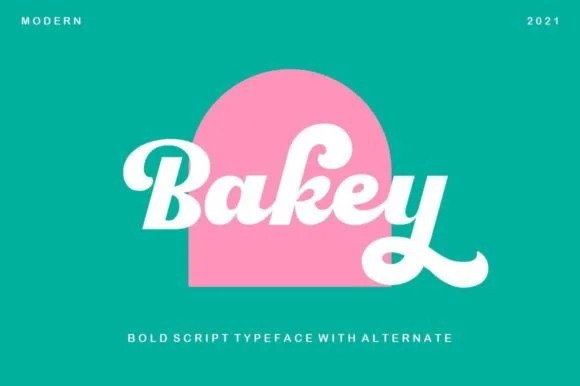
Heavy 1960s bakery & Packaging script
Bakey is a bold, upright 1960s/70s packaging script with thick syrupy downstrokes, plump bowls, and upturned retro tails.
Ideas for this font
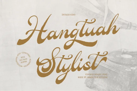
Bold retro sign-painter brush script with underline swashes
Hangtuah is a thick, slanted vintage sign-painter script featuring bold brush strokes, dynamic swash capitals, and retro underline tails.
Ideas for this font
Same independent foundry
Allow optional Google Analytics to measure visits and catalogue actions. Your search words and notes are not included. Privacy & storage