High-Contrast Display Serif

Coffee Font + Extras + Mewah
Pairs sculptural editorial warmth with Coffee Font + Extras's clean modern geometry.
Inspect Mewah specimenDisclosure: MakerFileHub may earn a commission from qualifying purchases via paid links on this page. How our links work.
Heavy script lettering paired with a light rounded uppercase sans
Coffee Font + Extras pairs a heavy connected script with a light rounded uppercase sans, so a name can be carried loudly in script and supported quietly in caps beneath.
Paid link
Get this fontProject & layout blueprintsAt-a-glance maker compatibility
Weld or Unite overlapping script joins into one continuous vector path before sending to the blade.
Visual anatomy & craft review
The script half is a fat connected hand with a rounded terminal on every stroke: the capital C opens as a broad crescent, the o and the f close tight bowls, the e loops back through its own counter and the second f repeats the shape, which is what gives the word its café-sign look. The sans half is a light rounded capital face with even strokes and wide letterfit, and in the sample it carries a supporting line at a size small enough to stay quiet under the script. The contrast between the heavy script and the light caps is the whole point of the pairing: one line announces, the other informs. The dark timber ground, the white inks, the coffee cup and the crumbed biscuits are presentation; the duo is the lettering.
Heavy · Light · Paired
Two-font hierarchy recipes
Tested contrast partners — pairing Coffee Font + Extras with grounded secondary typography.
Coffee Font + Extras + Mewah
Pairs sculptural editorial warmth with Coffee Font + Extras's clean modern geometry.
Inspect Mewah specimen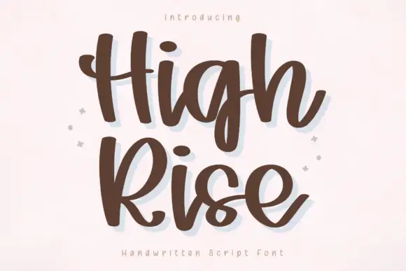
Coffee Font + Extras + High Rise
Introduces organic movement on pull-quotes, signatures and gift tags.
Inspect High Rise specimenPractical applications
Concrete hierarchy, scale and production guidance tailored to Coffee Font + Extras’s stroke geometry.
The heavy script announces the name on a cup or bag while the light caps carry the blend, and both stay legible on a small curved surface at 13 pt and 7 pt.
Hierarchy & layout recipe
Set the brand in the script at 13 pt on a 60 by 90 mm bag label, set the blend in the light caps at 7 pt, and leave 6 mm at the sides so the tails are not clipped.
Pre-production check
A curved label squeezes the ends of a heavy script; check a printed label wrapped on the actual bag and widen the margins before the run.
The pair reads from the far side of a counter, and the light caps give the opening hours without competing with the script name at a metre.
Hierarchy & layout recipe
Set the café name in the script at 8 cm on a 400 by 300 mm counter card, set the hours in the light caps at 3 cm, and hold 4 cm between the two lines.
Pre-production check
Counter cards sit behind glass and reflect light; check the card in place and darken the ink rather than enlarging the lettering.
The pairing suits a mobile bar or cart where a loud name has to be readable from a queue, and the light caps can list the drinks without clutter.
Hierarchy & layout recipe
Set the cart name in the script at 10 cm on the cart panel, set the drinks list in the light caps at 3 cm beneath, and leave 8 cm of margin so the tail stays on the panel.
Pre-production check
Outdoor panels catch glare; check the sign in daylight at the venue and keep the drinks list on a plain area of the panel rather than over a pattern.
Technical & licence verification
Confirm included OTF/TTF/WOFF formats, full glyph tables and licence coverage on the live store page before batch production.
Closest visual alternatives
Matched across letterform anatomy, stroke behaviour and craft applications.
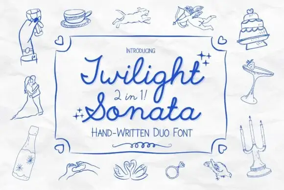
Looped script with narrow print
Twilight Sonata is a 2-in-1 duo in blue ink on a sketched page: a looping rounded script and a narrow upright print, framed by line drawings of a wedding — cake, doves, rings, glasses, a couple.
Ideas for this font
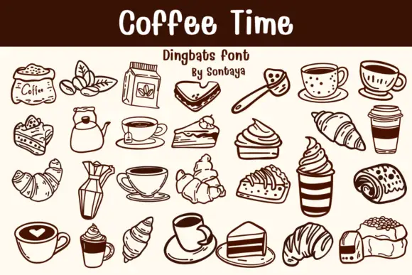
Dark brown cafe dingbats with cups, pastries and hand-drawn food contours
Coffee Time is a dingbat collection drawn in a single warm-brown line: cups, mugs and pots, croissants and layered cakes, beans, a grinder, a paper to-go cup and a latte with a heart in the foam.
Ideas for this font
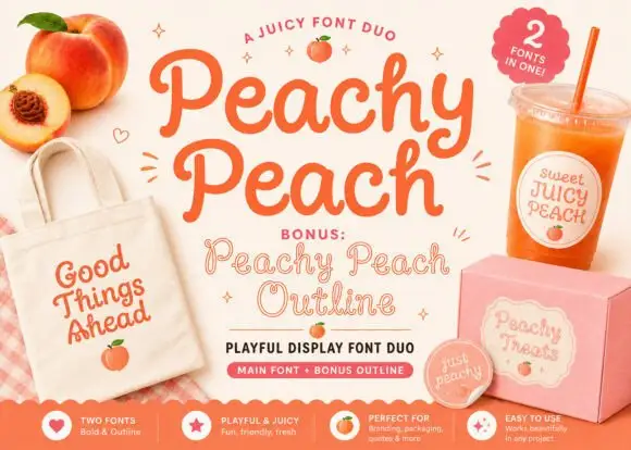
Playful display duo with outline variant
Peachy Peach is a playful display duo in coral on cream: a fat rounded face with swelling strokes and a bouncing baseline, plus an outline variant of the same letters, presented with peach illustrations and merchandise mockups, so the sheet reads as a small brand kit rather than a type specimen.
Ideas for this font

Narrow upright capitals paired with a looped connected kitchen script
Country Kitchen is a two-cut duo in which narrow upright capitals set the plain line and a darker connected script carries the warm one, so a kitchen sign can separate a heading from a phrase without a third family.
Ideas for this font
Allow optional Google Analytics to measure visits and catalogue actions. Your search words and notes are not included. Privacy & storage