 #1 · Best Overall
Disclosure: MakerFileHub may earn a commission from qualifying purchases via paid links on this page. How our links work.
Bulletin boards, worksheets & classroom decor
32 Best Classroom, School & Teacher Fonts
Classroom typography has two audiences: children reading a worksheet at 11 pt and a parent reading a bulletin board across a hallway. Ainsley and Sweetbell handle the friendly print register, Children Writing and Teacher Treats keep the worksheet hand, and Kinder Senior and Book Lover fill the display side of a classroom theme. Chalky Teacher and Back to School add the board and craft-fair looks.
Quick verdict
Ainsley is the most usable classroom print, Sweetbell is the neatest for worksheets, and Kinder Senior carries a bulletin board headline. Chalky Teacher is the pick for a chalkboard theme.
Quick answer
Top 3 classroom & school picks right now.
Short on time? Start with our three highest-rated classroom & school standouts before scrolling the full breakdown.
#1 · Best Overall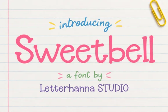 #2 · Runner-Up Pick
Sweetbell
Neat upright notebook print with even strokes and generous counters
Get fontPaid link
Read review ↓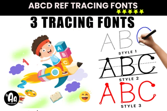 #3 · Editor's Choice
How we tested & selected these 32 fonts
We kept 32 of 975 candidates after removing athletic lettering and planner faces that share the school keyword. Weighted legibility at 9 to 11 pt, letter-shape consistency for early readers, and whether the licence covers classroom printing.
Side-by-side summary
Top 5 classroom & school picks at a glance.
Compare specimens, OpenType/PUA traits and primary project roles side by side.
| Rank & Font | Style & File Specs | Best Project Fit | Store Listing |
|---|---|---|---|
| HandwrittenFriendly | Teacher tumbler, student cubby vinyl label or pencil pouch | Get fontPaid link | |
| HandwrittenFriendly | Classroom worksheet header, kids' snack packaging or sticker sheet | Get fontPaid link | |
| HandwrittenEducational | Custom student name-tracing worksheet or KDP penmanship workbook | Get fontPaid link | |
| HandwrittenClassroom-neat | Primary-grade bulletin board, sight-word card & binder | Get fontPaid link | |
| HandwrittenSweet | Snack-cart bin label, teacher lounge jar & treat topper | Get fontPaid link |
Clean Sans & Handwritten Print
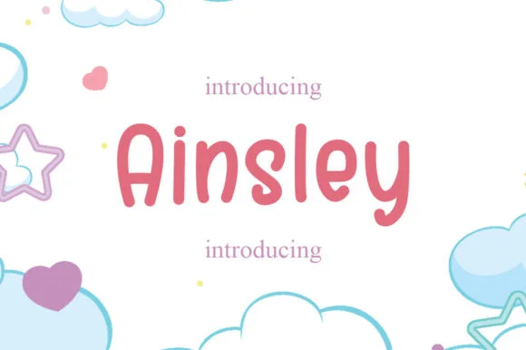
8 fonts#1 · Best OverallAinsley
Ainsley is a solid marker-weight print in which the strokes keep an even thickness, the corners round off and the counters stay open, so a name reads as lettering written with a felt tip and then cleaned up for cutting.
The A carries a rounded apex over a wide base, the i dots a solid square-ish block, the n turns two even arches and the s closes a smooth spine, all at a single marker weight with no taper and no chalk texture. The evenness is the character: nothing frays, which is why the sample sets a name inside a circle badge and a supply label beside it. The face weeds cleanly from three quarters of an inch of cap height on adhesive vinyl and holds from 18 pt in print. The soft pastel ground, the pencil and the small caption lines are presentation; the solid dark name and labels are the face.
Recommended project & layout
Teacher tumbler, student cubby vinyl label or pencil pouch — Set in cheerful coral, mint or mustard paired with simple star accents.
Before you cut or print
100% vinyl-ready — thick solid strokes and open counters weed in seconds.
Best paired with
Get fontPaid link
#2 · Runner-Up PickSweetbell
Sweetbell is a neat upright print in which the letters stand apart, the strokes stay even and the counters stay generous, so a word reads as careful handwriting rather than as a printed face.
The capital S reverses through two even curves and the w follows with three shallow valleys, then the letters settle into a regular rhythm: the e loops back through a wide counter, the double l keeps two plain stems and the b closes a round bowl against a thick stem. Nothing is connected, nothing is slanted and the weight is a consistent medium with rounded terminals, which is what makes the face read as something written with a good pen at a sensible pace. The x-height is tall, so at 12 pt it behaves like a rounded sans and stays legible on a price card. The ruled paper ground, the paper clip, the small arrows and the three caption lines are presentation; the lettering is the word.
Recommended project & layout
Classroom worksheet header, kids' snack packaging or sticker sheet — Use in Mixed Case for friendly headers, labels and short body callouts.
Before you cut or print
Disconnected clean letters cut and weed effortlessly on vinyl at small sizes.
Best paired with
Get fontPaid link
#3 · Editor's ChoiceAbcd Ref Tracing Lined
Abcd Ref Tracing Lined offers three purpose-built handwriting practice styles, dotted, lined and start-dot, for teachers, homeschoolers and KDP creators, where students trace dashed outlines along primary penmanship rules or follow starting dots typed directly in a word processor.
Each style carries a different guide, the ruling mimics classroom paper, the start dots mark entry points and the letters stay simple enough to copy. That division of labour is the character: one file teaches the shape and another teaches the line, which is why the pack targets worksheets rather than display work. Test each style in your own software, keep the dashed stroke at 1 mm, and run a teacher review before any practice sheet goes to print. The ruling is the fragile part on a copier: the dashed guides fade before the letters do, so a practice sheet printed at the default 600 dpi comes back with the letters and no lines. Print at 1200 dpi on 90 gsm paper, and keep the guide stroke at 1 mm.
Recommended project & layout
Custom student name-tracing worksheet or KDP penmanship workbook — Type each child's name at 48–72pt on landscape worksheets and laminate for dry-erase reuse.
Before you cut or print
Purpose-built for printed worksheets, KDP interiors and dry-erase mats — not vinyl cutting.
Best paired with
Get fontPaid link
 #4 · Top Maker Utility
Children Writing
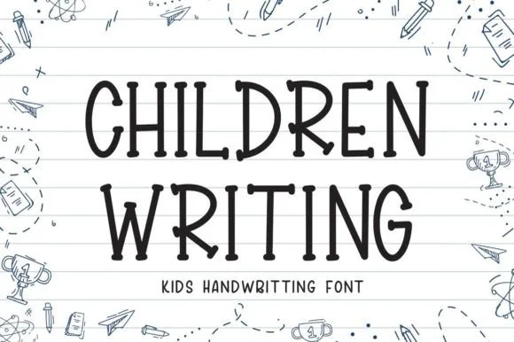
Children Writing is a tidy, cheerful uppercase/print handwritten font with soft marker-dot terminals built for school and kid crafts.
Children Writing is a tidy upright print alphabet with rounded marker-bead terminals, even spacing and a deliberately simple skeleton, drawn to look like the best handwriting on a classroom wall rather than a teacher's script. Because each letter is a straightforward closed or open shape with generous counters, the face reads at 8 mm on a sight-word card and at 60 mm on a bulletin board without changing character, and it prints cleanly from a school copier. Lowercase and uppercase differ in proportion rather than ornament, so setting a proper name does not look like shouting.
Recommended project & layout
Primary-grade bulletin board, sight-word card & binder — Stack 2 centered uppercase lines at 48–88 pt across ruled notebook-paper backgrounds.
Before you cut or print
Uniform medium-bold strokes with zero touching letters cut and weed fast on Cricut cardstock and vinyl down to 0.6 in!
Best paired with
Get fontPaid link
 #5 · Standout Silhouette
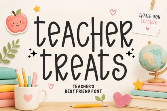
Teacher Treats
Teacher Treats is a tall, whimsical hand-drawn marker font featuring gently curled ascenders and airy, disconnected mixed-case print.
Teacher Treats is a playful classroom marker print with curved letters: each character bows slightly, the baseline arcs across the word and the terminals finish in a small hook rather than a blunt cut. The curve grows the word vertically and the hook is the smallest detail. It needs roughly 24 mm for the hook and the bow to read, and it is best in one bright ink on white and cream, or a single dark colour on pastel card where the hooks stay open.
Recommended project & layout
Snack-cart bin label, teacher lounge jar & treat topper — Stack 2 lowercase words centered at 48–84 pt with tight 0.95 leading and tiny star accents on both sides.
Before you cut or print
Smooth, even marker strokes cut cleanly on Cricut vinyl, HTV, and sticker stock down to 0.65 inches.
Best paired with
Get fontPaid link
 #6
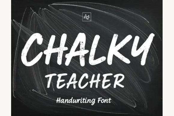
Chalky Teacher
Chalky Teacher is an authentic blackboard handwritten font streaked internally with realistic dry-chalk grain across bold slanted strokes.
Chalky Teacher is a slanted brush alphabet with dry-chalk grain baked into the strokes, so the interior of each letter breaks into fibrous streaks instead of presenting a flat colour. The letters are bold and a little irregular in height, which reproduces the way a board is written quickly during a lesson, and the slant gives the line momentum. Because the texture is internal, the face needs a reasonable size to read as chalk rather than noise, and it is the wrong choice for a small label where the grain fills the counters; it belongs on boards, posters and large photo props.
Recommended project & layout
'First Day of Kindergarten' photo-prop board & classroom poster — Stack bold uppercase headers (72 pt) over smaller mixed-case teacher/grade lines (36 pt) on dark slate textures.
Before you cut or print
Internal chalk-dust streaks require Print-Then-Cut, posters, sublimation, or DTF—never attempt to blade-weed vinyl!
Best paired with
Get fontPaid link
 #7
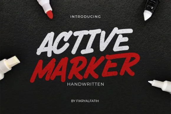
Active Marker
Active Marker captures brisk, slanted broad-tip marker lettering with organic stroke tapers and natural double-letter ligatures.
Active Marker is a slanted chisel-tip whiteboard and chalkboard marker sans: even strokes with a visible chisel angle, blunt ends that read as a marker turned in the hand, a firm slant and open counters that stay clean on a board. The chisel angle is the design and it flattens when the face is reduced. It needs roughly 20 mm for the chisel angle and the blunt end to read, and it is best in one dry-erase or chalk ink on a board, or a single dense ink on uncoated stock where the chisel edge prints as a step.
Recommended project & layout
Coffee-shop daily specials board & deli menu header — Highlight section headers ('ESPRESSO', 'FRESH BAKED') in bold white or red at 36–54 pt above clean tabular price columns.
Before you cut or print
Sturdy solid strokes cut smoothly on chalk-style matte vinyl at 0.8 in and taller with minimal weeding fuss.
Best paired with
Get fontPaid link
 #8
School Bold
School Bold shows heavy upright sans capitals with rounded corners and tall oval counters: the C opening stays broad and the B closes two small rounded bowls, while the cover adds a white edge and a deep offset shadow.
The stems stay thick and upright, the corners round off, the counters stretch into tall ovals and the C keeps a wide mouth while the B presses two small bowls together. The rounded weight is the character: the row reads as friendly signage rather than a technical sans, which is why the sample pairs it with an edge and an offset shadow. Because the counters are small, keep 28 pt before they hold, and treat the white edge and shadow as layout effects rather than font features.
Recommended project & layout
A classroom project board — Put the title on a plain top band and leave pupils a large separate project area.
Before you cut or print
Check the B counters and O spacing at the board viewing distance.
Best paired with
Get fontPaid link
Display & Decorative Headlines
10 fonts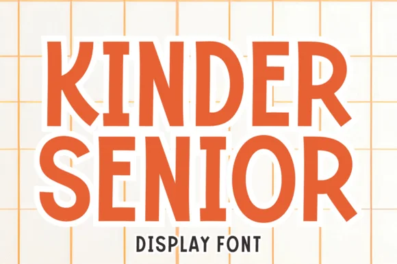 #9
Kinder Senior
Kinder Senior is a warm, hand-crafted rounded block display font built specifically for kindergarten-to-senior school milestones and family tees.
Kinder Senior is a playful soft-block school and milestone display: fat squared letters with rounded corners, a small internal bevel that gives the block a soft edge and enough spacing for young readers to separate characters. The near-solid weight closes the counters early, and the internal bevel is the only shading. It needs roughly 28 mm for the bevel and the counter to read, and it is best in two bright inks on white, or one ink plus a knocked-out bevel on coloured card.
Recommended project & layout
'Kinder Crew' / 'Senior 2027' back-to-school shirt & board — Stack 2 bold uppercase words across a 9-inch kids' tee front over a subtle grid or notebook-line graphic.
Before you cut or print
Broad solid strokes with zero fragile serifs cut and weed fast on HTV, puff vinyl, and cardstock banners.
Best paired with
Get fontPaid link
 #10
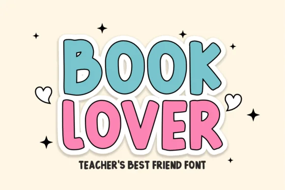
Book Lover
Book Lover is a cheerful, bouncy classroom display font built for reading corners, teacher shirts, and die-cut sticker packs.
Book Lover is a playful comic-outlined display in which each letter is drawn with a thin contour outside a solid stroke, tilted slightly off the baseline, with a book, bookmark or reading-glasses ornament attached to some glyphs. The contour needs clear space around the word, and the ornaments sit on the silhouette. It needs roughly 28 mm for the contour and the ornament to read, and it is best in one dark ink on white with the contour left as paper, or two inks where the outline carries the second colour.
Recommended project & layout
Classroom library banner, 'READ MORE BOOKS' tee & bookmark — Stack 2 uppercase words at 68–135 pt inside a 0.16 in white cloud border accented by tiny hearts and sparkles.
Before you cut or print
Smooth, chunky rounded vectors cut and weed in 4 seconds on Cricut cardstock, HTV, and Print-Then-Cut stickers down to 0.55 in!
Best paired with
Get fontPaid link
 #11
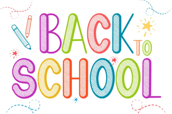
Back to School
Back to School is a tall, lively classroom display font outlining narrow hand-drawn capitals filled with multi-angle colored-pencil/chalk hatching.
Back to School is a tall display in narrow hand-drawn capitals, each filled with multi-angle pencil or chalk hatching in a different colour, so a word reads as a row of shaded blocks rather than a set of letterforms. The hatching runs at varying angles, which keeps the pattern lively, and the narrow proportions let a long heading stand in a column. Detail is fine, so the face needs roughly 25 mm before the hatch reads as pencil work, and it is at its best on white with a dark outline holding each letter together.
Recommended project & layout
'Back to School' newsletter, teacher shirt (DTF) & binder cover — Color each letter in alternating rainbow shades at 60–115 pt on crisp white cardstock with pencil doodles.
Before you cut or print
Fine interior hatch lines shine in color printing, sublimation, Print-Then-Cut stickers, and DTF shirts—avoid vinyl weeding!
Best paired with
Get fontPaid link
 #12
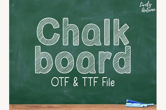
Chalkboard
Chalkboard (by LivelyAutumn 11.11) is a tidy, rounded mixed-case classroom font filled inside clean outlines with even diagonal sketch stripes (OTF & TTF).
Chalkboard is a rounded mixed-case classroom face whose letters stay inside clean outlines filled with even diagonal sketch stripes, so a word looks chalked onto a board rather than printed. The stripes run at one angle across every letter, which means the fill reads as texture only when the letters are large enough for several stripes to cross a stroke, and the outlines keep the counter shapes open at small sizes. It needs roughly 20 mm for the stripes to read, and it is best in white on green board or in a single colour on kraft.
Recommended project & layout
Primary-grade phonics poster, worksheet header & slide deck — Stack mixed-case words at 56–100 pt above clean monoline print subtext ('OTF & TTF File' style).
Before you cut or print
Designed for classroom printables, SmartBoard slides, and Cricut Pen drawing (at larger scale)—not blade-cut vinyl.
Best paired with
Get fontPaid link
 #13
Bouncy Block Deluxe
Bouncy Block Deluxe is a thick, solid-filled bubble display font with pillowy rounded terminals, playful tilt, and tiny counter pinholes.
Bouncy Block Deluxe is a heavy rounded chunky bubble display: fat even-width letters with fully rounded corners, tight counters that almost close and a baseline that lifts a few letters so the word looks stacked and bouncing. It is a signage face, so it wants size and a single flat colour rather than fine detail. The counters are the finest element and they plug as soon as the face is reduced or cut in vinyl. It needs roughly 30 mm for the counter and the corner radius to read, and it is best as one flat ink on a light ground.
Recommended project & layout
Back-to-school tote, water-bottle sticker & kids' tee — Stack 2 or 3 short punchy words ('STAY COOL', 'DREAM BIG') at tight 0.88 line-height inside a contoured die-cut sticker shape.
Before you cut or print
When weeding small decals under 1 inch, use a fine pin pen solely to pop out the tiny teardrop counters inside 'B', 'o', 'a', and 'e'.
Best paired with
Get fontPaid link
 #14
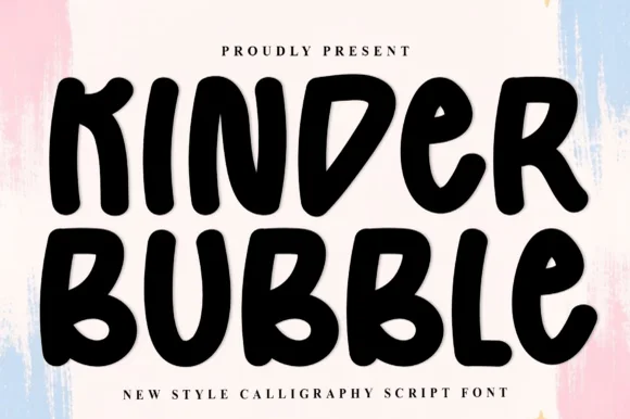
Kinder Bubble
Kinder Bubble is a bold, solid-black hand-drawn block display font with soft organic edges and playful mixed-case letterforms.
Kinder Bubble is a heavy hand-cut playroom block display: fat squared letters with visible scissor-cut edges, slightly mismatched heights and blunt corners, drawn to look as if cut from coloured card and pinned to a playroom wall. The cut edges are the design and they silt when the face is reduced. It needs roughly 26 mm for the cut edge and the height mismatch to read, and it is best as a one-colour vinyl or paper cut on a light ground, or one ink print where the cut edge reads as a shadow.
Recommended project & layout
Daycare cubby nameplates, teacher shirts & backpack tags — Center a child's name or grade level in 1.5–2.5 in solid letters, pairing classroom room numbers in the same bold face.
Before you cut or print
Weeds cleanly on both permanent vinyl and puff HTV; just watch the compact double counters inside 'B' below 0.8 inches.
Best paired with
Get fontPaid link
 #15
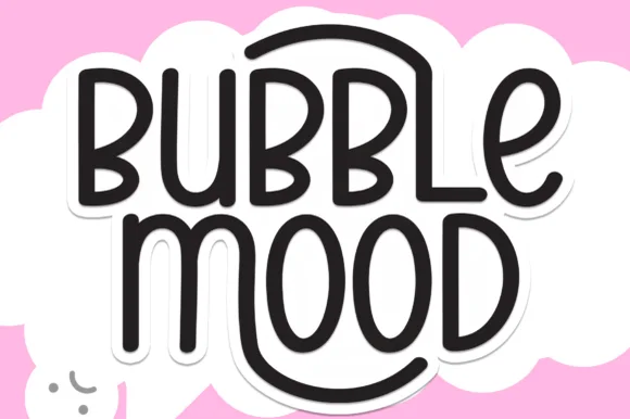
Bubble Mood
Bubble Mood is a tall, medium-weight rounded marker display font where curved outer stems wrap playfully around neighboring vowels.
Bubble Mood is a tall rounded monoline marker display with nesting arches: narrow upright letters drawn with an even round-tipped stroke, where each word sits under a shallow arch that nests inside the next line's arch. The arch grows the word vertically and the monoline keeps it honest at small sizes. It needs roughly 22 mm for the arch and the rounded end to read, and it is best in one bright ink on white, or a single dark colour on a pale board.
Recommended project & layout
Die-cut laptop sticker, planner cover & iced-latte cup — Stack two short words centered and add a 0.12 in white offset contour in Cricut Design Space for an instant die-cut sticker silhouette.
Before you cut or print
Clean medium-weight strokes and wide open 'O' and 'D' counters make adhesive vinyl weeding quick even at 0.75 in height.
Best paired with
Get fontPaid link
 #16
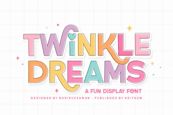
Twinkle Dreams
Twinkle Dreams combines firm block capitals with a heart-shaped dot above the i and curling extensions on selected letters, where the R and K tails swing below the main rows, each letter takes a pastel fill with a fine dark edge and the whole block sits on a faint grid.
The bodies stay blocky and even, the edges stay fine, the fills change per letter and two letters drop long tails under the baseline. That heart dot is the character: a plain display face gains one playful substitution, which is why the sample keeps a short title. The grid and the sparkles are cover treatment. Keep 40 pt so the fine edges stay separate from the fills, verify the heart form in your file and check the swinging tails against the line beneath.
Recommended project & layout
A wish-themed party invitation — Keep the phrase large with clear room below any R tail; place details in plain text.
Before you cut or print
Check the actual letters and do not assume a heart appears in words without i.
Best paired with
Get fontPaid link
 #17
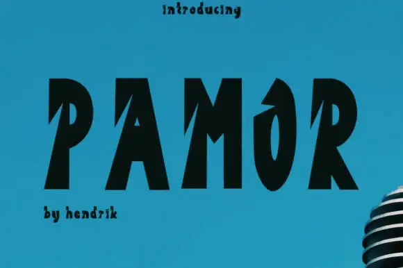
Pamor
Pamor uses five black capitals on blue, where sharp diagonal cuts enter the left sides of the P, A and M, the O keeps a narrow tall counter and a pointed upper opening, and the letters lean slightly as a group while a microphone fragment sits behind.
The stems stay heavy, the notches cut deep from the left, the counters narrow and the row leans. That notch is the character: the word reads as carved rather than outlined, which is why the sample keeps a flat blue ground. The introductory text uses a different treatment and the microphone is artwork, so check whether one style covers your needs, keep 40 pt so the notches stay visible and test the O opening at your size. The notch is the fragile detail: it fills with ink on an uncoated sheet and it closes below about 30 pt, so keep 40 pt and print on a smooth stock where the cut stays visible.
Recommended project & layout
A live spoken-word poster — Stack SPEAK and LOUD in black on cyan, with performer names in a plain white footer.
Before you cut or print
Check the new letters and do not compress the diagonal openings.
Best paired with
Get fontPaid link
 #18
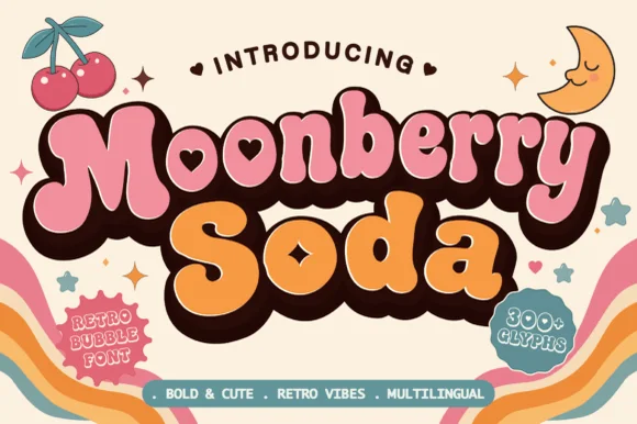
Moonberry Soda
Moonberry Soda is a plump retro bubble display in which the round bowls hide heart-shaped counters, the silhouettes stay thick and soft and the alternates add playful variants, so a short word reads as a kawaii sticker.
The B closes two round bowls with a heart cut inside one, the o keeps a small heart counter, the S swells through a soft spine and the lowercase m sits low under round shoulders, all at a bubble weight with thick sticker-ready outlines. The heart counters are the character: they sit inside the letter rather than beside it, which is why the sample sets a two-word phrase with air around it. Because the hearts are small, the face wants 34 pt before they read and the alternates should be checked for the shapes a project prefers. The pastel ground and the small caption are presentation; the dark bubble letters are the face.
Recommended project & layout
Boba cup decal, kawaii sticker shop logo or party tee — Layer a deep brown drop-shadow offset behind pastel pink and orange fills.
Before you cut or print
Keep cut height above 1.2 inches on vinyl so the tiny heart counters weed cleanly.
Best paired with
Get fontPaid link
Serifs & Slab Serifs
3 fonts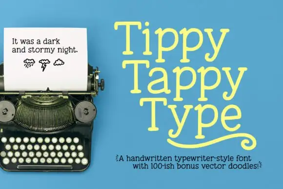 #19
Tippy Tappy Type
Tippy Tappy Type shows yellow mixed-case lettering on blue in three stacked rows, where broad round bowls and uneven little feet give the line a handwritten rhythm and the final row carries a long curled underline-like flourish beneath it.
The strokes stay slab-ended, the bowls stay round, the feet wobble from letter to letter and the baseline drifts slightly. That wobble is the character: the sample reads as typing rather than typesetting, which is why the three rows stack tightly. The typewriter photograph, the weather doodles and the bonus-vector caption belong to the cover, and neither monospacing nor a doodle count is shown. Keep 30 pt so the feet stay distinct, check that your file has the flourish and set the rows tight only on a plain ground.
Recommended project & layout
A playful writing journal cover — Place Tiny Tales near the top of a pale-blue cover, with a plain author line at the bottom and no flourish until its source is checked.
Before you cut or print
Verify the lowercase y and any alternate or underline mechanism in the actual files.
Best paired with
Get fontPaid link
 #20
Varsity Spirit
Varsity Spirit is a layered varsity capital alphabet in which each letter carries an inline stroke, a keyline and a set of matching numerals, so a team name reads as the appliqué on a college jacket.
The V cuts two thick diagonals with an inline running between them, the S holds a stepped spine, the A pinches a flat apex, the R turns a notched leg and the numerals carry the same inline and keyline, all at a heavy slab weight with square serifs. The inline is the character: it divides each stroke into two bands, which is why the sample sets a stacked word above a full numeral line. Because the inline is narrow, the face needs 40 pt before it stays open, and each layer has to be a clean vector for a vinyl or embroidery cut. The white timber ground, the format strip and the small badge are presentation; the black and white layered words are the face.
Recommended project & layout
A school-spirit event poster — Put a broad title over a separate plain schedule and keep the inner lines away from background patterns.
Before you cut or print
Check every required numeral and letter rather than assuming the sample alphabet is complete.
Best paired with
Get fontPaid link
 #21
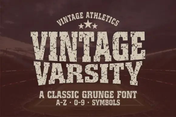
Vintage Varsity
Vintage Varsity is a condensed athletic capital alphabet with heavy flat slabs and a cracked wear texture, so a short word reads as a printed team jersey from decades ago.
The letters are narrow and tall: the V closes to a sharp point, the A keeps a low bar, the R carries a straight leg and the S reverses through flat terminals, with slabs at every stem and no bracketing. The wear is drawn into the letterforms rather than applied as an effect: cracks run through the slabs and a few counters show chipped edges, which is what gives the face its printed-jersey look. Weight is heavy and uniform, the fit is tight enough that a long team name holds a single line, and because the texture is coarse the face needs a decent size to stay legible. The dark ground, the cream ink, the star rule and the two small caption lines are presentation; the typeface is the two words.
Recommended project & layout
A reunion match poster — Keep dates and scores in a clean companion face.
Before you cut or print
Inspect cracks in the narrowest strokes.
Best paired with
Get fontPaid link
Matched Font Duos & Packs
11 fonts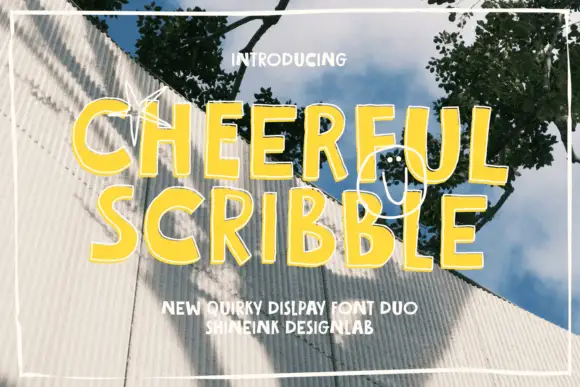 #22
Cheerful Scribble
Cheerful Scribble pairs heavy informal capitals with a fine scribble font, so a design can set a loud word and a thin looping second layer that reads as a pencil draft over the top.
The cap half is an uneven block alphabet: the C closes a narrow crescent, the H holds two stems of different widths and the E carries three arms, all at a heavy weight with slightly wobbly edges, which is what keeps it informal rather than corporate. The scribble half is a fine single-line hand drawn as loops rather than letterforms in the sample, and it is used as a texture layer behind or across the caps. That combination is the point of the pairing: one cut carries the message and the other adds a drawn background at almost no visual weight. The caps hold at 30 pt on a print, and the scribble is a texture that should stay above 40 pt or be dropped. The photograph, the yellow ink, the sketch marks and the two caption lines are presentation; the duo is the two layers.
Recommended project & layout
A creative activity-book cover — Build a clear main title before adding one verified scribble accent.
Before you cut or print
Confirm supplied members and keep loops away from small captions.
Best paired with
Get fontPaid link
 #23
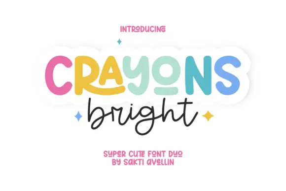
Crayons Bright
Crayons Bright pairs a heavy rounded display line with a fine connected handwriting below, where the display word mixes cap-like forms with a lowercase-looking y, an extended R leg and a short lower o stroke.
The upper member stays heavy and round, the R leg reaches out, the o stays shallow and the lower member joins in a fine looped line. The size and weight jump is the character: one row announces and the other explains, which is why the sample sets only two lines. Multiple colours, stars and a white outer edge belong to the artwork, so print in one ink first and check whether the pair is supplied as two separate members or a single file with both cuts.
Recommended project & layout
A classroom art-display heading — Place the heavy word above one short handwriting accent. Keep student names and project descriptions in a plain caption strip below the g-height loop zone.
Before you cut or print
Teachers should check reading clarity and actual characters; do not rely on colour alone to distinguish roles.
Best paired with
Get fontPaid link
 #24
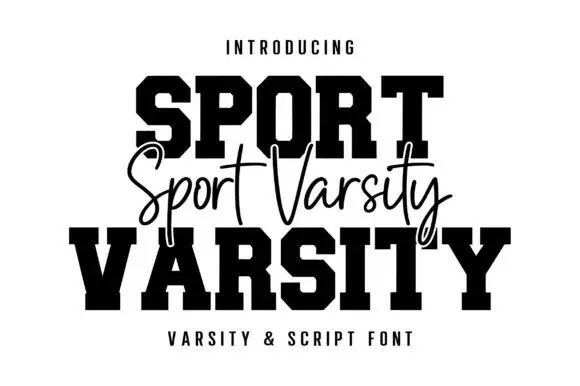
Sport Varsity
Sport Varsity pairs heavy clipped-corner slab capitals with a much thinner flowing script, where the block O has a tall angular counter and the script crosses the centre with long t bars, a deep y loop and a sweeping entry stroke from the left.
The caps stay square and heavy, the corners clip at an angle, the script stays fine and crosses the block row, and two strokes sweep far outside the word. That crossing is the character: the script is placed on the join between the two cap rows rather than under them, which is why the sample stacks three rows. Keep 48 pt for the caps and 22 pt for the script, leave 20 mm for the entry sweep and check the y loop against your bottom margin before locking the stack.
Recommended project & layout
A school-team fundraiser poster — Keep the large title in two lines and place a script accent in a separate gap, not over essential counters.
Before you cut or print
Check which styles are included and whether the fine script prints clearly.
Best paired with
Get fontPaid link
 #25
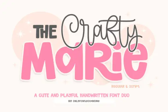
The Crafty Marie
The Crafty Marie sets fat rounded blocks at poster scale and a fine looping script above them, so a maker's name reads as a bold shape with a delicate signature riding over it.
The block half is very heavy: the M holds two thick diagonals and a shallow vertex, the A closes with a low bar, the R keeps a fat bowl and a straight leg and the E carries three even arms, all with fully rounded corners and no contrast at all. The script half is the opposite: a fine monoline with tall loops, thin joins and a light slant, set smaller and tracked across the top of the blocks. That contrast is the whole point of the pair — one face carries visual weight and the other carries personality, which is how a small craft brand gets both at once. Counters in the blocks stay open at 30 pt. The blush ground, the pale circles, the sparkles and the two small caption lines are presentation; the duo is the lettering.
Recommended project & layout
A craft-stall name board — Separate the script line from the block name rather than letting loops cross small counters.
Before you cut or print
Verify both styles and the actual name characters.
Best paired with
Get fontPaid link
 #26
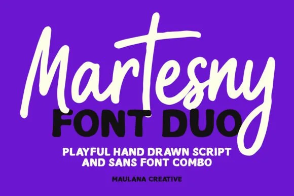
Martesny
Martesny combines a lively, tall-crossed hand-drawn marker script with a solid, rounded geometric uppercase sans partner.
Martesny is a duo of an energetic marker brush script and a chunky rounded sans: the script runs a wet loaded stroke with small flicks and joined letters, while the sans is a fat rounded block with tight counters for badges and prices. The pair carries a loud card in one ink, and the marker edge is the finest element. The script needs roughly 24 mm and the chunky sans 26 mm for their detail to read, and both work in one bright ink on white.
Recommended project & layout
Podcast cover, YouTube thumbnail & custom party hoodie — Let the script's descending 'y' or 'g' overlap slightly across the corner of the bold uppercase sans line beneath it.
Before you cut or print
Both the chunky sans and medium-thick marker script weed reliably on HTV and decal vinyl at 1 inch+ scale.
Best paired with
Get fontPaid link
 #27
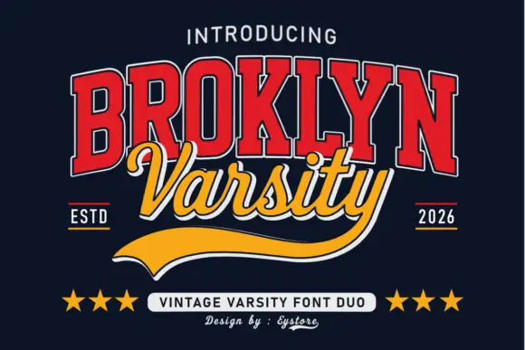
Broklyn Varsity
Broklyn Varsity pairs tall collegiate slab capitals drawn with an inline outline against a sweeping script that sits between them and drops a heavy sport tail below the baseline.
The caps half is nested: a red face with a white inline and a dark edge, every letter narrow and tall, the B and the R carrying small bowls high on long stems and the Y ending in a sharp fork. That nesting is what gives the word its vintage athletic look at a distance. The script half is a bold slanted hand with rounded tails, set across the middle of the caps so the two halves overlap, and it finishes with a broad sport tail that sweeps out to the right beneath both words. The pairing works because the caps supply height and the script supplies motion. The navy ground, the stars, the ESTD and year markers and the small credits are presentation; the duo is the two words.
Recommended project & layout
A varsity-club event header — Keep the block title above the script line and leave the underline a clear bottom margin.
Before you cut or print
Verify both supplied styles and whether the long y underline is accessible.
Best paired with
Get fontPaid link
 #28
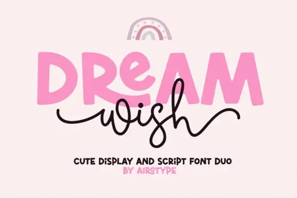
Dream Wish
Dream Wish contrasts chunky uneven capitals in a flat pink with a fine black looping script line beneath, where the script w begins in a long entry tail and the h finishes in a high sweeping exit that lifts above the cap height of the lower word.
The caps stay blocky and slightly uneven, the script stays thin and continuous, the entry and exit tails run long and the two rows overlap lightly. That overlap is the character: the script sits close enough to touch the caps, which is why the sample keeps both rows centred with nothing else competing. A rainbow arc above is cover artwork. Keep 46 pt for the caps and 20 pt for the script, leave 16 mm of clear ground between the rows and check the exit tail against your right margin.
Recommended project & layout
A birthday wish-card heading — Place a heavy first word over a short script line, keeping the personal note inside the card.
Before you cut or print
Confirm members and actual tail joins.
Best paired with
Get fontPaid link
 #29
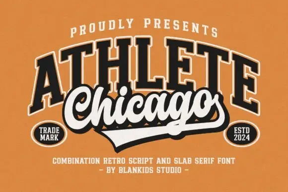
Chicago Athlete
Chicago Athlete pairs a tall arched slab word with a thick flowing script below, where the script carries round loops and a long terminal that forms the lower edge of a badge.
The slabs stay tall and arched, the script thickens and flows, the loops close round and the final stroke flattens out to close the shape at the bottom. That shared edge is the character: the two members read as one badge rather than two lines, which is why the cover binds them with cream borders and shadows. The overlap is a designed lockup and not an automatic alignment, so build the arch and the edge yourself and check that any two words will actually meet that way.
Recommended project & layout
A neighbourhood club identity study — Keep the slab row above the script and allow the lower tail to define the badge edge.
Before you cut or print
Verify both supplied styles and confirm any club or location naming rights.
Best paired with
Get fontPaid link
 #30
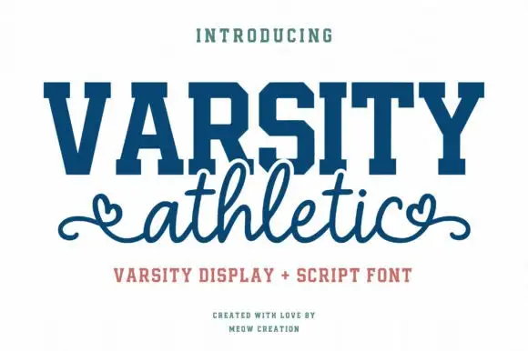
Varsity Athletic
Varsity Athletic pairs a solid collegiate slab capital alphabet with a looping script whose ends curl into small hearts, so a two-line design can carry both a team voice and a friendly one.
The caps half is heavy and squared: the V and the A meet in sharp vertices, the R carries a straight leg, the S keeps its curves and the T holds a wide flat bar, with unbracketed slabs at every stem and a tight fit across the word. The script half is light and looping, with tall ascenders and a heart worked into the entry and exit strokes at both ends, which softens the pairing considerably. Together they cover the two registers a school or club design usually needs: a name that reads at distance and a subtitle that feels personal. The blue ink, the cream ground and the three small caption lines are presentation; the duo is the two words.
Recommended project & layout
A school athletics event title — Keep the block line above a separate script line with clear space around both end curls.
Before you cut or print
Confirm the specific terminal flourishes and the two included styles.
Best paired with
Get fontPaid link
 #31
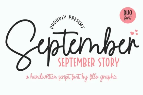
September Story
September Story is a sweet handwritten font duo pairing a thick, looped monoline cord script (with swash alternates) and a tall narrow uppercase sans!
September Story is a duo of a bouncy monoline cord script and a tall skinny farmhouse sans, both with alternates: the script carries a light even stroke with joined letters and a soft bounce, and the sans is narrow with blunt terminals for the information. The pairing lets a card use two voices from one family, and the script's bounce grows the word vertically. The script needs roughly 22 mm and the sans 18 mm for their detail to read.
Recommended project & layout
Teacher planner cover, back-to-school shirt & classroom bin — Tuck a row of tall uppercase Sans (36 pt) snugly into the pocket beneath the hero Script word (88 pt)!
Before you cut or print
Weld overlapping cursive joins on the Script—cuts and weeds smoothly on Oracal 651 and HTV down to 0.85 inches!
Best paired with
Get fontPaid link
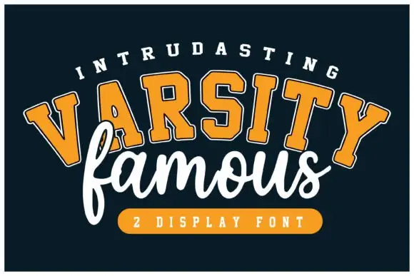 #32
Varsity Famous
Varsity Famous pairs rounded varsity slab capitals set on an arc against a loose connected script that runs flat beneath them and slightly overlaps.
The caps half is drawn on a curve: the letters rotate individually so the baseline of the arch holds, the slabs are rounded rather than square, and the weight is uniform enough that the arc reads as one band. Each cap carries a thin inner line and a light outline, which gives the word a two-colour look from a single fill. The script half is a loose connected hand with tall narrow loops, its baseline level and its exit running out to the right, and it overlaps the lower edge of the caps so the two lines feel printed together rather than stacked. The navy ground, the orange band with the type count and the small tracked captions are presentation; the duo is the two words.
Recommended project & layout
A school-team celebration poster — Use a straight block title and put the script line below with room for the f loop.
Before you cut or print
Confirm both styles before imitating the arched cover composition.
Best paired with
Get fontPaid link
Practical buyer checklist
Frequently asked questions.
Key cutting, printing and pairing answers before choosing a classroom & school typeface.
Can I print classroom worksheets with a personal-use font?
Not usually. Most craft-font licences cover personal projects but exclude redistribution and school-wide printing. Buy the commercial or extended tier before sharing files or printing for a whole department.
What size is best for worksheet text?
Between 12 and 16 pt for early years, and 10 to 12 pt for older students, with 1.4 line spacing. Guides and labels can go smaller, but anything a student writes on needs room above and below.
Which fonts work on a classroom chalkboard?
Plain monoline marker faces only. Chalk cannot reproduce hairline contrast or fine texture, so heavy rounded lettering at 1.5 inches or more is what actually gets read from the back of the room.
Do these fonts include number and punctuation sets for teaching?
Most include 0 to 9 with basic punctuation, which is enough for labels and worksheets. If you need maths symbols or a specific fraction set, check the glyph table before building a worksheet template.
Keep exploring
Related collections & guides.
Explore adjacent maker roundups or check our practical pre-production checklists.
01 / Cricut & Craft
Dotted tracing & worksheet fonts
16 curated fonts · Previews & pairings
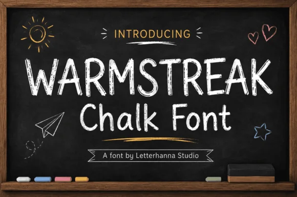
02 / Branding & Print
Chalkboard, slate & bistro
15 curated fonts · Previews & pairings
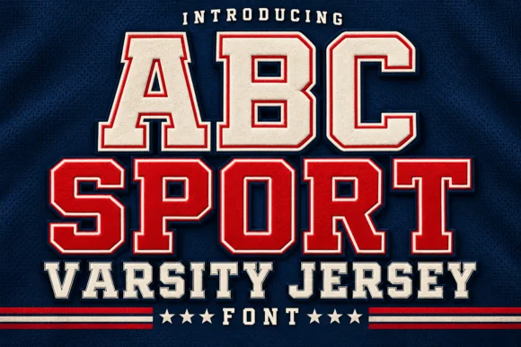
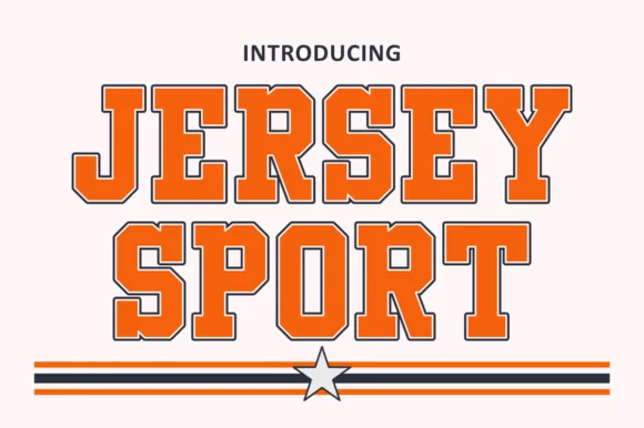
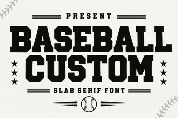
03 / Branding & Print
Varsity & athletic
25 curated fonts · Previews & pairings
04 / Branding & Print
Digital planner & GoodNotes
19 curated fonts · Previews & pairings
Guides: Invitation font checklist · Vinyl & cutting checklist · How to pair script & sans fonts