 #1 · Best Overall
Disclosure: MakerFileHub may earn a commission from qualifying purchases via paid links on this page. How our links work.
HUD stencils, angular blocks & industrial geometry
16 Best Cyberpunk, Sci-Fi & Mecha Fonts
Sci-fi lettering has to look engineered: consistent chamfers, mechanical joints and a width that suggests a machine produced it. Gandisient and Chronex keep an industrial condensed structure, Roadpunk and Sersre add the slashed speed angle, and Hackd and Decagon Type build circuit and faceted geometry. Noa Voren and Quantum Sector cover the wide aerospace and modular stencil ends.
Quick verdict
Gandisient is the most credible industrial face for a tech brand, Roadpunk is the strongest for a game key art, and Noa Voren handles wide aerospace display. Quantum Sector covers the modular HUD stencil case.
Quick answer
Top 3 cyberpunk, sci-fi & mecha tech picks right now.
Short on time? Start with our three highest-rated cyberpunk, sci-fi & mecha tech standouts before scrolling the full breakdown.
#1 · Best Overall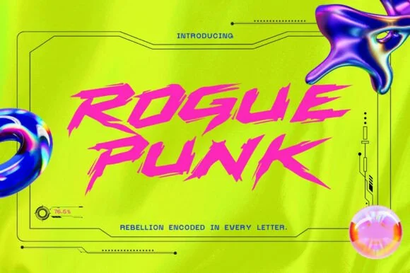 #2 · Runner-Up Pick
 #3 · Editor's Choice
How we tested & selected these 16 fonts
We kept 15 of 84 candidates, a narrow pool. Judged on whether facets and chamfers follow a consistent angle, how the face reads on a dark UI panel, and whether a stencil or solid version exists for practical use.
Side-by-side summary
Top 5 cyberpunk, sci-fi & mecha tech picks at a glance.
Compare specimens, OpenType/PUA traits and primary project roles side by side.
| Rank & Font | Style & File Specs | Best Project Fit | Store Listing |
|---|---|---|---|
| SerifTechno-editorial | Sci-fi book spine, techno vinyl cover & fashion lookbook | Get fontPaid link | |
| DisplayDystopian | Cyberpunk gaming thumbnail, drift-car livery & drum-and-bass art | Get fontPaid link | |
| DisplayY2K-futuristic | Y2K club flyer, hyperpop album cover & streetwear graphic | Get fontPaid link | |
| DisplayHacker | Hackathon logo, gaming peripheral box & tech podcast | Get fontPaid link | |
| DisplayStreet-cyber | Synthwave/cyberpunk comic cover, anime poster & game banner | Get fontPaid link |
Display & Decorative Headlines
11 fonts#1 · Best OverallGandisient
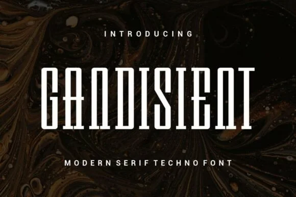
Gandisient is a towering, ultra-condensed techno-serif blending monolithic industrial vertical pillars with crisp flat bracketed serifs.
Gandisient is an ultra-condensed techno serif that stacks monolithic vertical pillars with crisp flat bracketed serifs, so a word reads as a corporate monolith rather than a magazine headline. The extreme condensation fits a long name in a narrow column, which is its purpose, and the very narrow counters need size to stay open. It needs roughly 32 mm for the brackets to read, and it is best in white on a dark marbled ground or a single flat ink on a pale one.
Recommended project & layout
Sci-fi book spine, techno vinyl cover & fashion lookbook — Center 1 uppercase title at 64–110 pt with +15 tracking above wide-spaced sans subcaptions.
Before you cut or print
Clean straight outer edges cut nicely on 1.5 in+ decals, though narrow interior slits favor print and digital covers at small scale.
Best paired with
Get fontPaid link
#2 · Runner-Up PickRoadpunk
Roadpunk (shown as Rogue Punk) is a hyper-kinetic cyberpunk display font slashed with razor-sharp diagonal speed hooks and aggressive street slant.
Roadpunk is a slashed cyberpunk street-racing display: angular slanted letters with thin blade slashes cutting across the stems, sharp terminals and a forward lean that reads as speed lines on a car panel. The slashes break the silhouette and close first at small sizes, and the lean pushes the word right. It needs roughly 30 mm for the slash and the terminal to read, and it is best in one acid or chrome ink on black, or black on a pale technical tone where the slashes stay sharp.
Recommended project & layout
Cyberpunk gaming thumbnail, drift-car livery & drum-and-bass art — Stack 2 uppercase words at tight 0.88 leading in hot magenta or cyan over acid yellow or pitch black.
Before you cut or print
Broad core bodies cut well on large drift-car window vinyl and hoodie HTV—peel slowly along the needle-sharp outer spike tips!
Best paired with
Get fontPaid link
#3 · Editor's ChoiceDecagon Type
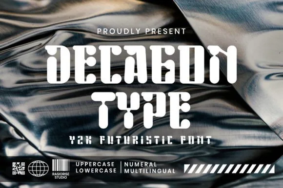
Decagon Type is a chunky Y2K futuristic display font blending ten-sided faceted block outer walls with curvy, liquid-like interior cutouts.
Decagon Type is a Y2K display that pairs ten-sided faceted outer walls with soft liquid cutouts inside the counters, so each letter reads as a machined shell with something poured into it. The contrast between hard outer edges and curvy interiors gives the face its period signature, and the weight is heavy enough to hold a silhouette at poster size. The inner curves are the detail that disappears first, so it needs roughly 30 mm, and it is at its best in white or chrome-like flat colour on a dark ground.
Recommended project & layout
Y2K club flyer, hyperpop album cover & streetwear graphic — Set centered uppercase stacks over metallic chrome textures alongside barcode and diagonal-stripe Y2K graphic bars.
Before you cut or print
Chunky solid fills cut cleanly on streetwear HTV, puff vinyl, and holographic sticker vinyl down to 0.9 inches!
Best paired with
Get fontPaid link
 #4 · Top Maker Utility
Hackd
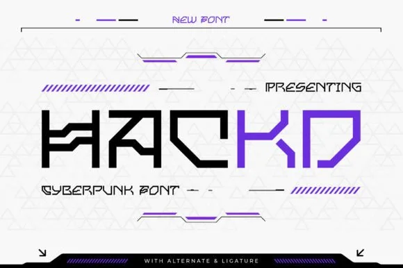
Hackd is a sharp-angled cyberpunk sans featuring connected horizontal crossbar ligatures, stencil breaks, and aggressive 45-degree chamfers.
Hackd is a sharp geometric sans in caps whose crossbars link into neighbouring letters, with 45-degree chamfers and crisp stencil breaks slicing the C, K and D, so a word reads as a circuit routed across a panel. The stencil gaps are functional: they let the face paint on awkward surfaces, but they also mean the letters must be large enough for the gaps to stay open. It needs roughly 30 mm before the chamfers read as machined, and it is best in electric violet or white on a dark ground.
Recommended project & layout
Hackathon logo, gaming peripheral box & tech podcast — Set 1 uppercase brand word large (56–100 pt) in two-tone black and electric violet over clean light or dark HUD grids.
Before you cut or print
Straight, sharp-cornered flat bars cut cleanly on laptop vinyl decals and apparel HTV at 0.85 in+.
Best paired with
Get fontPaid link
 #5 · Standout Silhouette
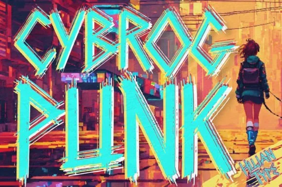
Cybrogpunk
Cybrogpunk is a tall, angular street-cyberpunk display font fusing condensed industrial pillars with jagged graffiti-blade spurs.
Cybrogpunk is a tall condensed street-cyberpunk display that fuses industrial pillars with jagged graffiti-blade spurs, so a word reads as a stencilled alley tag rather than a clean techno face. The spurs break the vertical rhythm on purpose and the strokes are narrow, which lets a long name stack in a tight column while the jagged edges keep the neon energy. It needs roughly 28 mm before the blades read as deliberate cuts, and it is at its best as a light outline on a dark ground or a single bright ink on black.
Recommended project & layout
Synthwave/cyberpunk comic cover, anime poster & game banner — Rim solid pale fills with an electric cyan or magenta neon outer stroke over warm orange/teal artwork.
Before you cut or print
Solid single-layer base shapes cut well on 1.25 in+ hoodie HTV and wall vinyl; peel carefully at sharp diagonal spurs.
Best paired with
Get fontPaid link
 #6
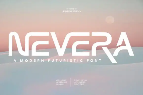
Nevera
Nevera is a wide futuristic sans in caps and lowercase: monoline strokes, rounded joins, a single-storey a and a very open skeleton that makes a word look engineered rather than written.
NEVERA spans the card in white over a soft gradient of sand and sky, and the letters are built from wide arcs: the N is drawn with a rounded junction instead of a sharp corner, the E has three equal bars, the V and the A share a rounded vertex, and the whole word sits on a wide even spacing that gives it the look of a logotype. The stroke weight never changes, which keeps the face neutral, and the rounded joins do the work that a chamfer would do in a technical sans. Two small blocks of type below list the character set in a light grotesque, and a caption under the word names the style. It is a futuristic display cut for technology, packaging and titles, and it needs a wide measure: at a narrow column the rounded joins collide and the word loses its openness.
Recommended project & layout
A future-mobility name proof — Set NEVERA in black through a clear white landscape panel with a separate pastel product-code tab below the right edge.
Before you cut or print
Check character recognition and reserve space under the R leg.
Best paired with
Get fontPaid link
 #7
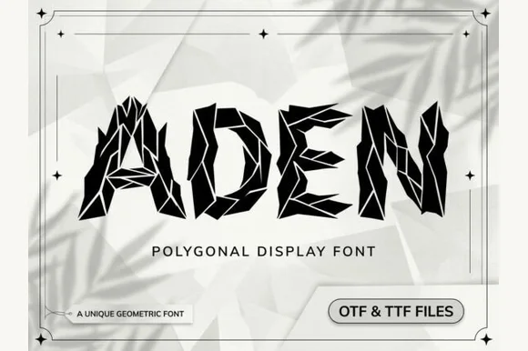
Aden
Aden is a sharp, polygonal display font built from faceted geometric crystal shards separated by crisp white origami crease lines (OTF & TTF).
Aden is a faceted low-poly display in caps, where each letter is assembled from crystal shards separated by crisp white crease lines, so a word reads as a shattered surface rather than a solid block. The crease lines are the only detail and they are structural, which means they have to stay separated or the letter becomes a polygon blob. It needs roughly 30 mm before the faceting reads as crystal, and it is at its best in one dark ink on a pale ground or reversed out of a deep colour.
Recommended project & layout
Tech conference banner, architectural journal & gaming cover — Set short 4-to-7-letter titles huge (72–140 pt) in jet black on stark white or neon cyan on obsidian.
Before you cut or print
Hair-thin polygon seam lines require digital graphics, posters, DTF, or laser engraving—avoid weeding tiny vinyl shards!
Best paired with
Get fontPaid link
 #8
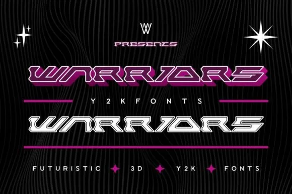
Warriors
Warriors is an ultra-wide, forward-slanted Y2K cyberpunk display font featuring sliced horizontal speed bars in both Outline and Solid styles.
Warriors is an ultra-wide cyber-racing display in solid and outline styles, with forward-slanting speed bars that lock neighbouring capitals into continuous horizontal rails, so a word reads as a wireframe HUD header. The bars are structural, which fixes tracking, and the outline style only works when the background stays dark. It needs roughly 40 mm for the rails to read, and it is best in magenta outline or white solid on black, or a single ink on a pale ground.
Recommended project & layout
Sim-racing stream overlay, synthwave car banner & esports — Stretch 1 uppercase word across a wide 16:9 banner in chrome silver, white, or neon magenta.
Before you cut or print
Wide solid bars cut like a dream on car-window vinyl decals (Oracal 651) and racing helmets down to 0.8 in tall!
Best paired with
Get fontPaid link
 #9
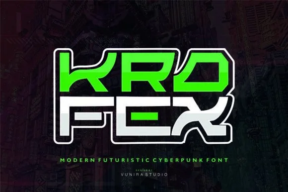
Krofex
Krofex fuses sharp cyberpunk mecha angles with wide street-calligraphy strokes for bold gaming & futuristic streetwear!
Krofex is a cyber-graffiti display that fuses wide street-calligraphy strokes with sharp mecha angles and katana-like joints, so a word reads as a gamer tag cut from armour rather than as a tag on a wall. The joints are acute and repeat across every letter, which means the face needs size for the blades to read, and the wide stance fills a panel with a short name. It needs roughly 34 mm for the joints to hold, and it is best in electric green or white on a dark ground or in one ink with a doubled outline.
Recommended project & layout
Esports team logo, custom controller skin & streetwear hoodie — Stack 3-letter rows tight, fill alternating letters in neon green and stark white, and add a 0.14 in double sticker contour.
Before you cut or print
Bold, straight-edged solid vectors cut fast and clean on Cricut HTV, vinyl decals, and Print-Then-Cut stickers down to 0.7 in!
Best paired with
Get fontPaid link
 #10
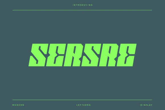
Sersre
Sersre is an aggressive, forward-slanted cyberpunk display typeface slicing razor-sharp horizontal speed notches into monolithic futuristic blocks!
Sersre is an aggressive cyberpunk display: monolithic forward-slanted blocks with razor-thin horizontal slits cut through the stems, so the letters read as machined panels in motion. The slant is consistent and the plate edges are hard, which keeps a word coherent at large sizes, and the slits give the face its only fine detail — they vanish below roughly 24 mm. It is a title face for covers, signage and apparel, and it needs a dark ground so the slits read as cuts rather than as printed lines.
Recommended project & layout
Cyberpunk / racing game UI, Twitch overlay & synthwave LP — Center 1 uppercase word at 80–165 pt in electric lime, cyber-yellow, or stark white over dark gunmetal.
Before you cut or print
Straight-line geometric polygons cut fast and sharp on PC-case/car-window Oracal 651 and athletic HTV at 0.85 in+!
Best paired with
Get fontPaid link
 #11
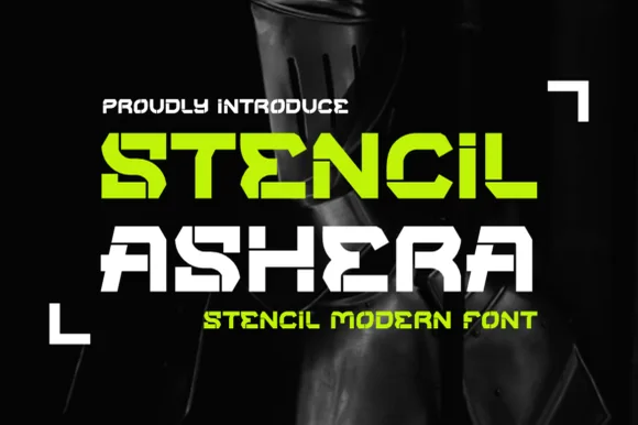
Stencil Ashera
Stencil Ashera is a wide, geometric futuristic stencil font slicing horizontal and diagonal tech bridges through bold sci-fi capitals.
Stencil Ashera is a wide futuristic stencil sans drawn on a cyber-industrial grid: extended squared caps, thick plate-like stems, chamfered corners and a bridge cutting every closed counter at an angle. The extension makes each word long, so a line that fits in a normal sans will need two lines here. The chamfers are the smallest surviving detail, and the angled bridges are structural rather than decorative, which is why a small size collapses the identity of the face into a plain square sans. It needs roughly 32 mm for the chamfer and the bridge to read, and it is best in one cool grey or acid green on black, or black on a pale technical sheet.
Recommended project & layout
Sci-fi mech decal, gaming clan overlay & drone case stencil — Color row one neon lime and row two stark white inside L-bracket corner targeting frames on black.
Before you cut or print
Crisp straight-line polygons cut fast and clean on Cricut Mylar stencils, PC-case Oracal 651, and HTV down to 0.75 in!
Best paired with
Get fontPaid link
Clean Sans & Handwritten Print
5 fonts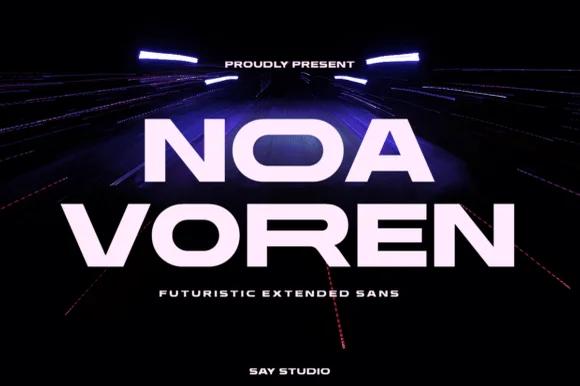 #12
Noa Voren
Noa Voren is a bold, wide-stance extended sans serif featuring stretched horizontal proportions and subtle speed-sliced diagonal cuts.
Noa Voren is a wide extended grotesk with stretched horizontal proportions and subtle angled terminal cuts that suggest speed without a literal slant. The caps are monolithic and evenly spaced, so a short word fills a wide banner as a solid graphic, and the diagonals keep the letters from looking like plain blocks. Width is the constraint: a word needs a wide container and a short letter count, and the face is at its best at 40 mm and above in one bright colour on a dark ground.
Recommended project & layout
EV/automotive badge, tech startup hero & drone hardware — Center 1 or 2 short words at 48–90 pt with +20 tracking above ultra-wide-spaced micro sans descriptors.
Before you cut or print
Thick, clean geometric strokes cut and weed with razor precision on car windshield banners, laptop decals, and HTV!
Best paired with
Get fontPaid link
 #13
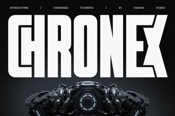
Chronex
Chronex is an imposing, ultra-condensed sci-fi sans serif built with heavy monolithic pillars and chamfered geometric corners.
Chronex is a towering ultra-condensed industrial sans: very narrow squared stems, a tall cap height, a small flat notch cut into the shoulders and a machined regularity that reads as stencilled steel. The condensation packs a long word into a tall block, and the notch is the only detail, so it vanishes when the face shrinks. It needs roughly 24 mm for the notch and the squared corner to read, and it is best in one dense ink on metal-grey stock, or a single white on a dark ground where the notch prints as a cut.
Recommended project & layout
Sci-fi movie poster, mecha game box & dystopian novel — Span 1 uppercase title across the top half of your poster with tight 0 tracking and tiny slash-separated top credits.
Before you cut or print
Straight outer contours cut fast on large signage; watch the ultra-narrow counter slits inside 'O' and 'R' if cutting vinyl under 1.5 in.
Best paired with
Get fontPaid link
 #14
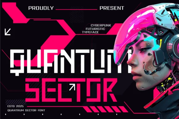
Quantum Sector
Quantum Sector is a square-jawed cyberpunk techno sans featuring futuristic stencil cuts, directional arrow accents, and HUD geometry.
Quantum Sector is a modular cyberpunk techno sans with square jaws, notched crossbars, stencil cut-outs at the corners and integrated arrow accents, so a word reads as a heads-up display panel rather than a headline. The module grid is strict, which lets the face tile across a screen mock-up, and the stencil gaps are what allow it to be cut or sprayed. It needs roughly 34 mm for the notches and arrows to read, and it is best in white and magenta on a near-black ground.
Recommended project & layout
Twitch esports HUD overlay, sci-fi UI & gaming thumbnail — Stack 2 uppercase lines flush-left in white and hot magenta inside angled cyberpunk UI brackets.
Before you cut or print
Clean straight modular bars cut reliably on PC-case vinyl decals, controller skins, and jersey HTV down to 0.8 in.
Best paired with
Get fontPaid link
 #15
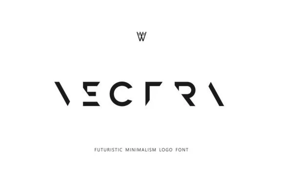
Vectra
Vectra is an experimental futuristic logo font that strips each capital down to minimalist geometric strokes and negative-space angles.
Vectra is a deconstructed minimalist stencil and puzzle logo font: letters are broken into separated segments with deliberate gaps, sharp modular angles and a geometry that reads as a sliced mark rather than a drawn letter. The gaps are the design and they close under vinyl weeding if they are too narrow, and the modular build means a letter can look like two pieces. It needs roughly 26 mm for the gaps and the angles to read, and it is best as a one-colour vinyl or cut job, or a flat two-colour print on coated stock.
Recommended project & layout
Tech startup wordmark, architecture studio & synth label — Track capitals wide (+250 to +400) across stark white or matte-black surfaces, paired with a conventional sans descriptor below.
Before you cut or print
Because missing stems rely on Gestalt word recognition, use Vectra strictly for short 1-word logos—never body copy or long phrases.
Best paired with
Get fontPaid link
 #16
Oscorp
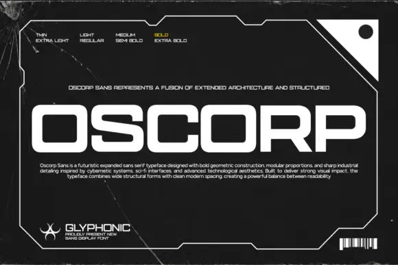
Oscorp places large white capitals inside an angular frame on black, where broad rectangular bowls with rounded corners form the O, C and P, the S carries long nearly horizontal strokes and the low expanded proportions give a short word a wide footprint.
The bowls turn into rounded rectangles, the arms lie flat, the S stretches sideways and the whole row spreads wide. That footprint is the character: a four-letter word fills a square frame without growing tall, which is why the sample sets it alone inside a border. The frame, scratches and barcode are artwork rather than part of the letters, and the weight legend shows only one treatment, so check the styles in your file and keep 40 pt before the narrow openings close.
Recommended project & layout
A modular-device label heading — Set CORE UNIT across a black equipment-card header with serial and version in a separate white grid below.
Before you cut or print
Verify required numerals and counter openings at the planned label size.
Best paired with
Get fontPaid link
Practical buyer checklist
Frequently asked questions.
Key cutting, printing and pairing answers before choosing a cyberpunk, sci-fi & mecha tech typeface.
Are cyberpunk fonts readable in body text?
No. Angular cuts, narrow counters and mixed case behaviour slow reading considerably. Use them for titles, UI labels and key art, and set any real paragraph in a neutral sans or mono.
Can sci-fi fonts be cut from acrylic for a sign?
Yes when the shapes are solid and the joints are thick. Fine stencil cuts and thin slashes chip on acrylic, so choose a stencil variant with wide bridges and cut at 4 inches or more.
Do these fonts include lowercase and numerals?
Many ship capitals, numerals and a limited punctuation set only, since they are drawn for interface labels. Check before designing a long heading, and plan for all-caps layouts if lowercase is missing.
What separates cyberpunk from generic futuristic type?
Cyberpunk references decay and urban technology, with slashes, circuitry and distressed metal, while generic futuristic type is smooth and aspirational. The reference should show in the letterforms, not only in the artwork around them.
Keep exploring
Related collections & guides.
Explore adjacent maker roundups or check our practical pre-production checklists.
01 / Type Styles
Y2K & futuristic tech
16 curated fonts · Previews & pairings
02 / Type Styles
80s synthwave, outrun & neon
14 curated fonts · Previews & pairings
03 / Type Styles
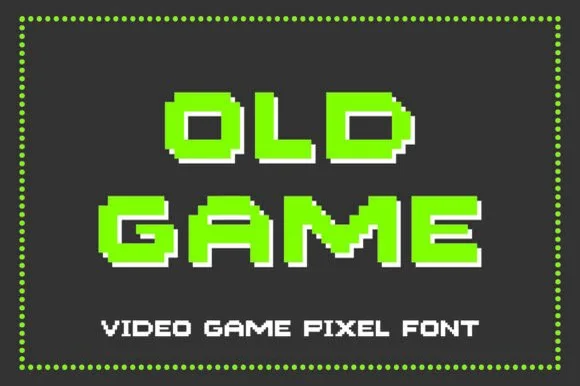
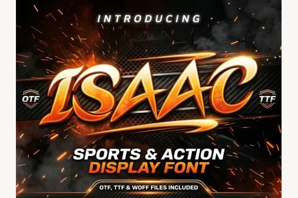
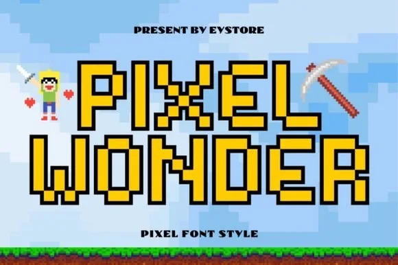
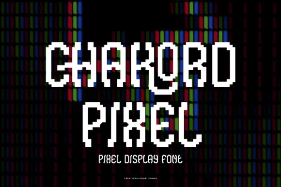
8-bit pixel, VHS & gaming
14 curated fonts · Previews & pairings
04 / Branding & Print
YouTube thumbnails, podcasts & gaming
24 curated fonts · Previews & pairings
Guides: Invitation font checklist · Vinyl & cutting checklist · How to pair script & sans fonts