MakerFileHub · Fonts4,091 curated & craft fonts · 93 curated collections · Original previews
MakerFileHubSaved 0

Geometric, grotesque & workhorse sans

Sans serif Fonts (305 Profiles) — Page 2

Three hundred and nine sans-serif faces covering geometric circles, neo-grotesque neutrality and cutting-friendly bold display. These are the fonts that make the rest of a layout readable.

93 CollectionsA–Z Index

305 fonts (sorted by maker demand)Page 2 of 13

Font profiles

Original Cultivo preview by Glyphonic

Open rounded mixed case with a tall t and broad circular bowls

Cultivo

Cultivo shows a large black title-case name across the lower part of a pale beige cover, where light to moderate nearly even strokes form an open C, a broad u and near-circular bowls, the t finishes with a rounded lower turn and the v opens a clean diagonal.

Explore
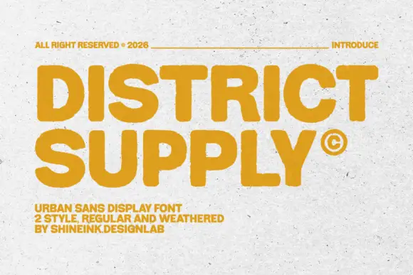
Original District Supply preview by shineink.designlab

Heavy soft capitals with compact counters and slightly uneven edges

District Supply

District Supply shows mustard uppercase words across a pale concrete-like field. Broad nearly even strokes form compact round counters, the T arms run flat, the Y angles sharply, and small irregularities soften the outer edges of a dense rectangular heading.

Explore
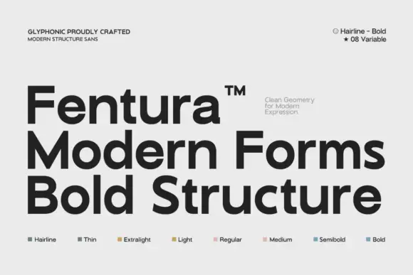
Original Fentura preview by Glyphonic

Substantial plain mixed case with broad bowls and open horizontal e bars

Fentura

Fentura presents three black lines on light grey, the name above Modern Forms and Bold Structure, where straight substantial stems meet broad rounded bowls, the e opens wide, the a keeps a double storey and the crossbars stay flat and plain.

Explore
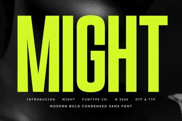
Original Might preview by Funtype Co.

Very tall heavy capitals with narrow counters and a deep M center

Might

Might shows lime uppercase lettering over a dark monochrome photograph, where very tall heavy stems and tight vertical counters create a compressed block, the M drops a deep centre and the G keeps rounded rectangular outer corners with a narrow internal opening.

Explore
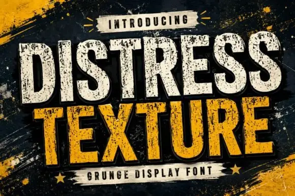
Original Distress Texture preview by Dreamspace.studio

Tall heavy capitals with dense chipped texture and flat terminals

Distress Texture

Distress Texture is a heavy tall sans in capitals only, its strokes eaten by dense irregular chips and its terminals cut flat, so a word looks stencilled, weathered and printed through a mask.

Explore
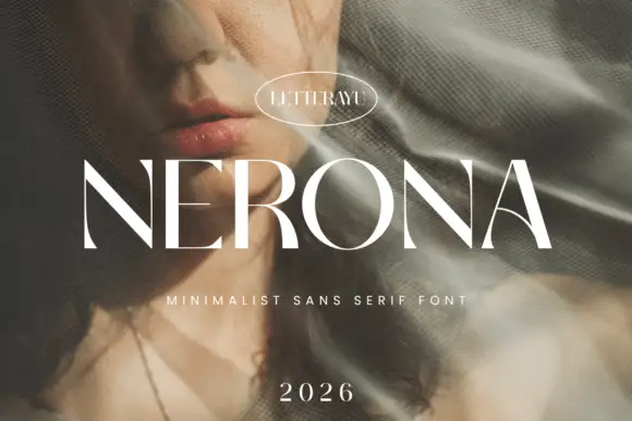
Original Nerona preview by Letterayu

Minimal contrast capital sans

Nerona

Nerona is a minimal contrast capital sans in white over a portrait veiled by netting: wide capitals with a broad round O, thin diagonal joins, flat terminals and slight contrast, set as one word with an oval maker's badge above, a tracked line beneath and a year at the foot.

Explore
Original Prime Nordic preview by SayStudio

Geometric sans with a variable weight range

Prime Nordic

Prime Nordic is a geometric sans in white on charcoal, set as two lines of the same name: the first in a light cut and the second in a heavy one, with a small badge tucked at the shoulder stating nine weights and two notes in the corners about the variable file and the language support.

Explore
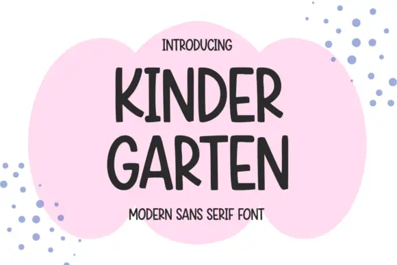
Original Kindergarten preview by Minimalist Eyes

Narrow informal capitals with rounded ends and an open angled K

Kindergarten

Kindergarten shows dark capitals split into KINDER and GARTEN over a pink cloud-like patch, where rounded ends and slightly changing widths soften the tall stems, the K and R carry open angled legs and the G keeps a short inward bar.

Explore
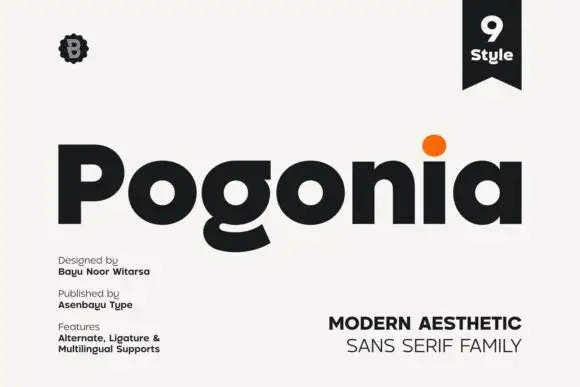
Original Pogonia preview by asenbayu

Modern heavy geometric sans

Pogonia

Pogonia is a modern geometric sans in near-black on off-white: heavy even strokes, circular counters, a raised dot on the i, and a set of ligatures, presented with a small badge, a ribbon label and two blocks of technical notes, so the plate reads as a contemporary type release.

Explore
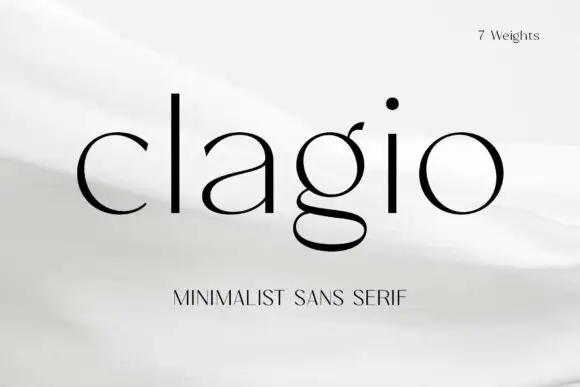
Original Clagio preview by Arterfak Project

Fine contrasting lowercase with a double-storey g and round open c

Clagio

Clagio shows black lowercase lettering on a pale softly folded background, where a tall plain l and i stand beside broad round bowls, the a has a thin rising join, the g drops into a wide double-storey lower loop and the c ends are slightly pointed while the o stays almost circular.

Explore
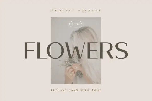
Original Flowers preview by Letterayu

Restrained contrasting capitals with round O and fine horizontal arms

Flowers

Flowers shows grey uppercase lettering across a small faded portrait on a pale beige field, where more substantial vertical and curved sections meet fine horizontal arms, the S retains a broad smooth curve and the F ends in flat unornamented arms.

Explore

Help improve the font catalogue?

Allow optional Google Analytics to measure visits and catalogue actions. Your search words and notes are not included. Privacy & storage

Original preview

Clear review data?