High-Contrast Display Serif

Sunset Ranch + Amor Hadena
Pairs sculptural editorial warmth with Sunset Ranch's clean modern geometry.
Inspect Amor Hadena specimenDisclosure: MakerFileHub may earn a commission from qualifying purchases via paid links on this page. How our links work.
Wide rounded western sans
Sunset Ranch is a wide rounded sans in clay brown on white: mixed case with heavy rounded strokes, an unusually long curved leg on the capital A and open bowls, set in two lines over a torn pink shape, with a small arced line above, a sun badge at the corner and a tracked line beneath.
Paid link
Get this fontProject & layout blueprintsAt-a-glance maker compatibility
Sturdy stroke walls and open counters weed cleanly on adhesive vinyl, HTV apparel film, and cut cardstock.
Visual anatomy & craft review
The two words are stacked and the drawing is a rounded sans with a western flavour: the strokes are heavy and rounded, the bowls are open, and the capital A keeps a long curved leg that reads as a spur, which is the detail that places the face in the genre. That construction sets a moderate size floor, because the open bowls close when the letters shrink, and the plate sets the words large enough that the leg is visible. The torn pink shape and the sun badge are staging that reinforce the theme, and the arced line above names the foundry. Because the letters are wide and heavy, the face suits a sign, a shirt and a label, and the plate shows only capitals and lowercase at display size, so small text is untested.
Sans serif, western, rounded, playful
Two-font hierarchy recipes
Tested contrast partners — pairing Sunset Ranch with grounded secondary typography.
Sunset Ranch + Amor Hadena
Pairs sculptural editorial warmth with Sunset Ranch's clean modern geometry.
Inspect Amor Hadena specimen
Sunset Ranch + I Heart You
Introduces organic movement on pull-quotes, signatures and gift tags.
Inspect I Heart You specimenPractical applications
Concrete hierarchy, scale and production guidance tailored to Sunset Ranch’s stroke geometry.
A rounded western sans sets a theme in one word, and the heavy strokes read on a board that faces a field all day. The spurs read across a field.
Hierarchy & layout recipe
Paint a 1,200 by 450 mm board: the event at 140 mm cap height, the times in a 26 mm sans, and a 6 mm border. Keep 30 mm margins and paint two colours on a primed board.
Pre-production check
Check the board at 140 mm, where the curved A leg can look like a fault; keep it deliberate. Confirm the 26 mm times read at five metres and that the border survives a wet season.
A western display prints in two screens and reads as costume rather than as a plain slogan on a party shirt. A costume shirt needs a face with a wink in it.
Hierarchy & layout recipe
Print a 250 mm chest graphic: the slogan at 55 mm cap height, the year at 26 mm, and two inks on a light shirt. Keep the narrowest gap at 4 mm and place the graphic 80 mm below the collar.
Pre-production check
Check the screen at actual mesh, where a 4 mm gap can fill; open the spacing. Wash-test one shirt and confirm the rounded ends stay even after five cycles.
A wide rounded sans gives a roaster a friendly mark, and the heavy stroke prints cleanly on a kraft bag. Friendly marks sell on a shelf of brown bags.
Hierarchy & layout recipe
Print a 90 by 120 mm label: the roaster at 15 pt, the blend at 9 pt, and the weight at 7.5 pt. Keep 6 mm inside the die and keep the smallest counter above 1.5 mm.
Pre-production check
Check the 15 pt roaster on kraft, where a heavy stroke can clot; keep the counters open. Confirm the 7.5 pt weight reads at arm's length and that the bag fold misses the type.
Technical & licence verification
Confirm included OTF/TTF/WOFF formats, full glyph tables and licence coverage on the live store page before batch production.
Closest visual alternatives
Matched across letterform anatomy, stroke behaviour and craft applications.
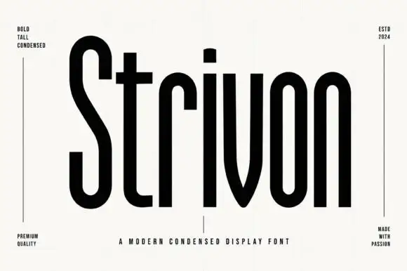
Very tall condensed sans
Strivon is a very tall condensed sans in black on a ruled off-white sheet: mixed case with long straight ascenders, a pointed v, narrow bowls and flat terminals, set as one large word with four small tracked notes in the corners and a plain line beneath.
Ideas for this font
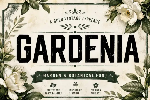
Distressed angular capitals with chamfered bowls and dense straight sides
Gardenia is a distressed angular capital face in which the stems run dense and straight, the bowls chamfer at the corners, the E sets flat arms and pale specks break through the surfaces, so a title reads as an old apothecary label.
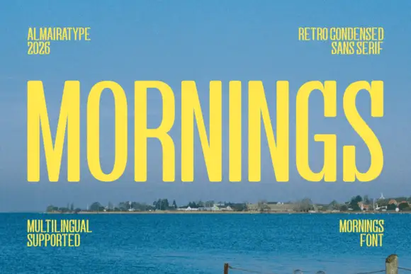
Light condensed capital sans
Mornings is a light condensed sans in yellow on a photograph of a shoreline: tall narrow capitals with oval bowls, a deep M centre and an even fine stroke, set as one large word with four tracked notes in the corners.
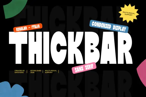
Heavy condensed display sans
Thickbar is a heavy condensed sans in white on black with paper shapes at the edges: capitals with tapered diagonals, pinched curved counters and flat terminals, set as one large word between four coloured labels and four plain credits, with a ghosted repeat of the word in the ground.
Ideas for this font
Same independent foundry
Allow optional Google Analytics to measure visits and catalogue actions. Your search words and notes are not included. Privacy & storage