Neutral Sans Workhorse

Think Loved + Nyxar
Lets Think Loved own the focal silhouette while handling secondary copy, sizing and subheads cleanly.
Inspect Nyxar specimenDisclosure: MakerFileHub may earn a commission from qualifying purchases via paid links on this page. How our links work.
Bold sans with ligature alternates
Think Loved is a bold sans in orange on a pale ground: wide geometric caps with flat terminals, a very high waist and tight spacing, with a ligature that fuses two letters into a single drawn shape, set in two lines with a small tracked note beneath naming the alternate.
Paid link
Get this fontProject & layout blueprintsAt-a-glance maker compatibility
Weld or Unite overlapping script joins into one continuous vector path before sending to the blade.
Visual anatomy & craft review
The two lines are set together and the drawing is a geometric sans at heavy weight: the strokes are even, the terminals are flat, and the forms are built from near-rectangles and circles, which gives the block its modern, poster-like tone. The ligature is the detail worth showing: two letters join into one silhouette, and the specimen places it where the eye lands so the buyer can judge whether the join works at scale. Because the counters are closed and the letters wide, the face works at display sizes only, and the plate keeps the two lines flush. The small tracked note beneath explains the alternate in a light grotesque, and the palette is one ink on a pale ground.
Bold, geometric, editorial, modern
Two-font hierarchy recipes
Tested contrast partners — pairing Think Loved with grounded secondary typography.
Think Loved + Nyxar
Lets Think Loved own the focal silhouette while handling secondary copy, sizing and subheads cleanly.
Inspect Nyxar specimen
Think Loved + The Lumina Awesome
Grounds bold display lettering with classic typographic authority on posters, badges and apparel.
Inspect The Lumina Awesome specimenPractical applications
Concrete hierarchy, scale and production guidance tailored to Think Loved’s stroke geometry.
A bold geometric face reads as a modern poster, and the ligature gives a short phrase one drawn gesture that a plain sans cannot offer.
Hierarchy & layout recipe
A2 portrait: the phrase at 120 mm cap height with one ligature, the details in a 14 mm sans, and the date at 24 mm. Keep 30 mm margins and print two colours on a light ground.
Pre-production check
Check the poster at five metres, where the ligature can close a counter; keep the joins open. Confirm the 14 mm details read at two metres and that the date aligns with the phrase block.
A bold sans with a ligature gives a cover a graphic hook, and the heavy letters hold at thumbnail size where a light face would fade.
Hierarchy & layout recipe
Set the title at 95 mm cap height across 220 mm with one ligature, the subtitle in a 12 pt sans, and the author at 8 pt. Print two colours on a matte stock and keep the block in the upper half.
Pre-production check
Check the title at thumbnail size, where the ligature can read as a mistake; keep the join legible. Confirm the 8 pt author survives lamination and that the title clears the trim by 12 mm.
A heavy geometric face prints as one screen and reads across a room, and the ligature makes a simple phrase look designed on a garment.
Hierarchy & layout recipe
Print a 260 mm chest graphic: the phrase at 55 mm cap height, one ligature, and one ink on a light shirt. Keep the thinnest stroke at 4 mm and place the graphic 80 mm below the collar.
Pre-production check
Check the screen at actual mesh, where a 4 mm stroke fills; thicken it. Wash-test one shirt and confirm the ligature still reads after five cycles.
Technical & licence verification
Confirm included OTF/TTF/WOFF formats, full glyph tables and licence coverage on the live store page before batch production.
Closest visual alternatives
Matched across letterform anatomy, stroke behaviour and craft applications.
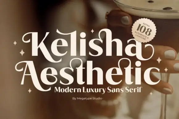
Heavy contrast mixed case with looped entry strokes and long curling capital legs
Kelisha Aesthetic is a modern luxury sans with high stroke contrast, tall narrow letters and a set of alternates in which an arm or an ascender curls into a loop.
Ideas for this font
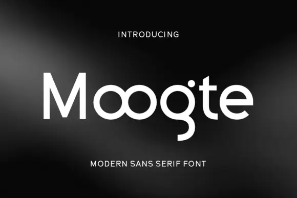
Joined circular display
Moogte is a joined circular display in white on a black ground: mixed case built from near-perfect circles, with the two o bowls fused into a single loop, a curling g descender and a cut on the t, set as one word with a small tracked line above and beneath.
Ideas for this font
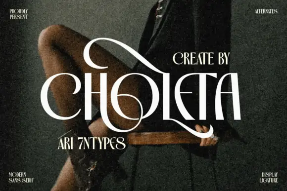
Contrasting capitals woven through a large upper loop and low circular sweep
Choleta builds tall white capitals and then lets thin strokes cross through them, so the counters open into slashes and the whole line reads as one sculpted ligature rather than six separate letters.
Ideas for this font
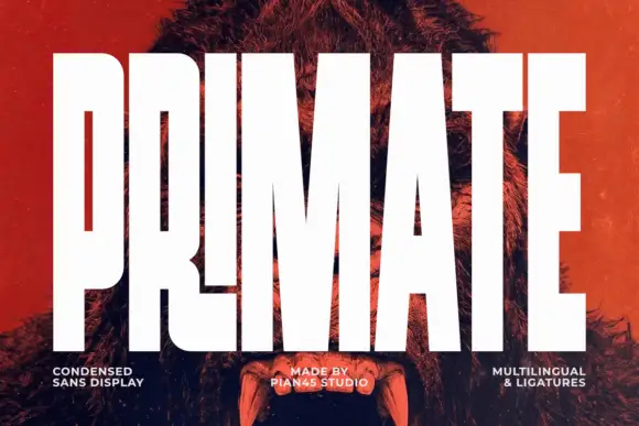
Ultra condensed display sans
Primate is an ultra condensed sans display in white on a red-tinted portrait: very tall narrow caps with flat terminals, a high waist and thin counters, set edge to edge so the letters nearly touch, with three small tracked labels along the foot.
Ideas for this font
Same independent foundry
Allow optional Google Analytics to measure visits and catalogue actions. Your search words and notes are not included. Privacy & storage