High-Contrast Display Serif

Sourced + Wolles Elegant Modern Serif
Pairs sculptural editorial warmth with Sourced's clean modern geometry.
Inspect Wolles Elegant Modern Serif specimenDisclosure: MakerFileHub may earn a commission from qualifying purchases via paid links on this page. How our links work.
Very condensed heavy capitals with narrow rounded rectangular counters
Sourced shows vivid red capitals across a dark monochrome photograph, where tall heavy uprights and flat-ended arms leave thin rounded rectangular counters inside the O and D, the R carries a straight angled leg and the C opens only a small gap on its right side.
Paid link
Get this fontProject & layout blueprintsAt-a-glance maker compatibility
Sturdy stroke walls and open counters weed cleanly on adhesive vinyl, HTV apparel film, and cut cardstock.
Visual anatomy & craft review
The stems stay tall and thick, the counters squeeze into vertical rectangles, the arms end flat and the side openings close. That compression is the character: a long word fits a narrow field without losing height, which is why the sample sets a single name alone on a photograph. Language support is mentioned on the cover but only the name and small captions appear, so check the accented characters you need, keep 40 pt before the counters close and give the rows extra leading.
Very condensed heavy capitals with narrow rounded rectangular counters
Two-font hierarchy recipes
Tested contrast partners — pairing Sourced with grounded secondary typography.
Sourced + Wolles Elegant Modern Serif
Pairs sculptural editorial warmth with Sourced's clean modern geometry.
Inspect Wolles Elegant Modern Serif specimen
Sourced + Rebel Marks
Introduces organic movement on pull-quotes, signatures and gift tags.
Inspect Rebel Marks specimenPractical applications
Concrete hierarchy, scale and production guidance tailored to Sourced’s stroke geometry.
The condensed caps give a bottle presence, and the narrow counters hold a two-word name at 24 pt on a 50 by 80 mm label, where the vertical slots stay open in one ink.
Hierarchy & layout recipe
Print a 50 by 80 mm bottle label: set the name at 24 pt over two rows with 14 mm between baselines, keep the counters at 5 mm minimum, and keep 6 mm of clear ground from the side edges.
Pre-production check
Counters printed at 3 mm fill in; check the plate proof at final size and hold the name at 22 pt or above.
The heavy condensed forms sit well over an image, and the flat arms hold a one-word title at 68 pt on a cover, where the narrow silhouette leaves the photograph visible.
Hierarchy & layout recipe
Print an A4 cover: set the title at 68 pt on one row, keep 24 mm of clear ground beneath before the cover lines at 9 pt, and place the block where the photograph stays visible behind it.
Pre-production check
Dark type over a dark image disappears; check the cover and add a subtle band behind the title.
The condensed caps fit a narrow banner, and the tall forms hold a three-word team name at 52 mm across a hanging panel, where the angled R leg keeps the row sharp.
Hierarchy & layout recipe
Print a 400 by 900 mm vertical banner: set the team name at 52 mm over three short rows with 20 mm between baselines, keep the counters at 7 mm, and keep 26 mm of border all round.
Pre-production check
Three tall rows crowd a narrow banner; check the proof from five metres and open the row spacing.
Technical & licence verification
Confirm included OTF/TTF/WOFF formats, full glyph tables and licence coverage on the live store page before batch production.
Closest visual alternatives
Matched across letterform anatomy, stroke behaviour and craft applications.
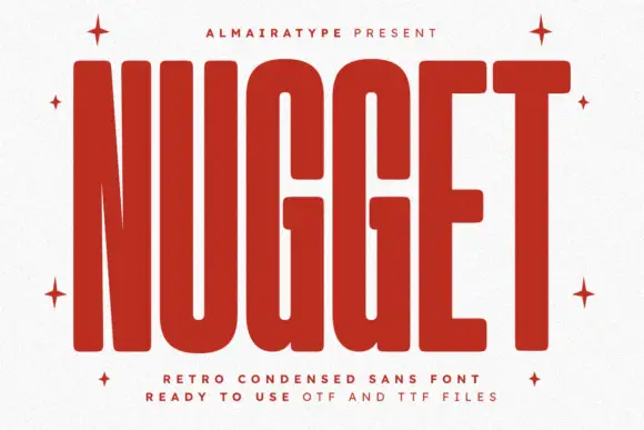
Very tall heavy capitals with rounded corners and narrow internal channels
Nugget shows red capitals filling most of a white cover, where thick near-even strokes leave thin vertical openings in the U and G, the N draws a sharply narrowing diagonal and every outer corner softens.
Ideas for this font
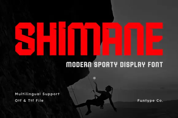
Chamfered condensed display sans
Shimane is an angular condensed sans in red on a dark photograph of a climber: wide capitals with chamfered corners, small horizontal notches on the stems and flat terminals, set as one large word with a tracked line beneath and three plain notes at the foot.
Ideas for this font
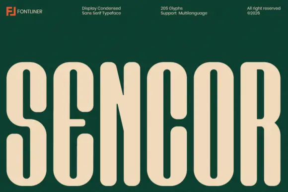
Condensed heavy rounded sans
Sencor is a condensed sans on a deep green ground: tall heavy rounded capitals in cream, with long slot counters, a short soft E arm and a narrow R leg, set as one word across the base beneath a header row naming the foundry, the style, the glyph count and the rights line.
Ideas for this font
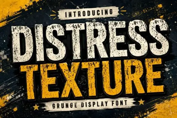
Tall heavy capitals with dense chipped texture and flat terminals
Distress Texture is a heavy tall sans in capitals only, its strokes eaten by dense irregular chips and its terminals cut flat, so a word looks stencilled, weathered and printed through a mask.
Ideas for this font
Same independent foundry
Allow optional Google Analytics to measure visits and catalogue actions. Your search words and notes are not included. Privacy & storage