High-Contrast Display Serif

Haruko + Raffined
Pairs sculptural editorial warmth with Haruko's clean modern geometry.
Inspect Raffined specimenDisclosure: MakerFileHub may earn a commission from qualifying purchases via paid links on this page. How our links work.
Light contrasting mixed case with a low H bar and curved k leg
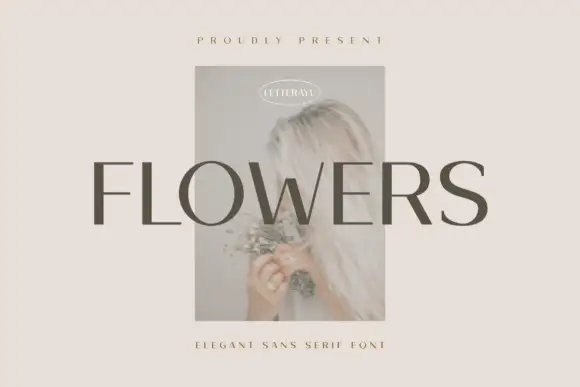
Haruko shows black title-case lettering on a flat pale beige field, where thin cross-strokes meet more substantial upright and curved sides, the H crossbar sits low, the a stays a simple round and the u opens broad, while the k moves into a curved tapering leg and the r ends in a small pointed shoulder.
Paid link
Get this fontProject & layout blueprintsAt-a-glance maker compatibility
Sturdy stroke walls and open counters weed cleanly on adhesive vinyl, HTV apparel film, and cut cardstock.
Visual anatomy & craft review
The stems thicken, the cross-strokes thin to hairlines, the H bar drops and one leg curves away. That single curved leg is the character: a light display sans gains one gesture in a word that otherwise stays restrained, which is why the sample shows only six letters. No further styles are offered on the cover, so confirm the weights you need, keep 26 pt for the fine joins and check the k and r against your own wording before a short brand.
Light contrasting mixed case with a low H bar and curved k leg
Two-font hierarchy recipes
Tested contrast partners — pairing Haruko with grounded secondary typography.
Haruko + Raffined
Pairs sculptural editorial warmth with Haruko's clean modern geometry.
Inspect Raffined specimen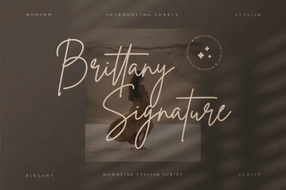
Haruko + Brittany Signature Script
Introduces organic movement on pull-quotes, signatures and gift tags.
Inspect Brittany Signature Script specimenPractical applications
Concrete hierarchy, scale and production guidance tailored to Haruko’s stroke geometry.
The light contrast gives a studio quiet authority, and the low H bar keeps a two-word name calm at 26 pt on a card, where the curved k leg adds a hand touch.
Hierarchy & layout recipe
Print an 85 by 55 mm card: set the wordmark at 26 pt on one row, keep 16 mm of clear ground beneath before the address at 7 pt, and keep the hairline joins on a coated stock so they stay clean.
Pre-production check
Hairline cross-strokes thicken on uncoated card; check a printed sample and stay on coated stock.
The light mixed case sets a long opening line, and the broad u and round a keep it readable at 22 pt across a page, where the thin joins stay crisp in the column.
Hierarchy & layout recipe
Print a 210 mm page: set the opening line at 22 pt over two lines, keep 14 mm of clear ground beneath before the body at 10 pt, and keep the measure under 65 characters so the light setting stays comfortable.
Pre-production check
A long line of light type tires the reader; check the page and split the sentence, keeping the measure under 65 characters.
The restrained sans suits a modern details card, and the low H bar holds a venue name at 18 pt on heavy stock, where the pointed r shoulder gives the row a fine finish.
Hierarchy & layout recipe
Print a 105 by 148 mm details card: set the venue at 18 pt on one row, keep 10 mm of clear ground beneath before the address at 11 pt, and keep 16 mm of margin all round so the light type has air.
Pre-production check
Only one style is shown on the cover; check the file before relying on a bold for the names.
Technical & licence verification
Confirm included OTF/TTF/WOFF formats, full glyph tables and licence coverage on the live store page before batch production.
Closest visual alternatives
Matched across letterform anatomy, stroke behaviour and craft applications.
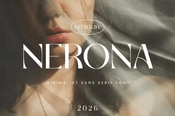
Minimal contrast capital sans
Nerona is a minimal contrast capital sans in white over a portrait veiled by netting: wide capitals with a broad round O, thin diagonal joins, flat terminals and slight contrast, set as one word with an oval maker's badge above, a tracked line beneath and a year at the foot.
Ideas for this font

Light rounded mixed case with an open e and slender upright stems
Clyne Sans draws a light geometric sans with even strokes, circular bowls and a short ascender, so a two-word name reads as a quiet line rather than as a mark.
Ideas for this font
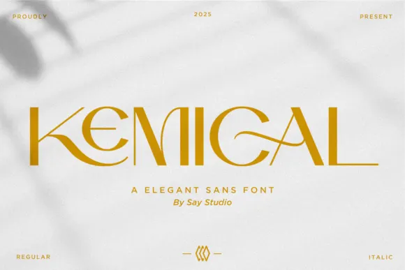
Thin geometric capitals with a sweeping K leg and crossing G stroke
Kemical shows gold capitals across a pale shadowed field, where slender straight stems sit beside broad circular curves, a K leg sweeps under the opening letters and a fine G stroke crosses into the counter.

Modern extended grotesque
One More is a modern extended grotesque in white over a photograph of a tennis court: wide even caps with flat terminals, tall x-height and open counters, set in two lines with technical notes in the corners, so the plate reads as a contemporary brand specimen rather than a poster.
Same independent foundry
Allow optional Google Analytics to measure visits and catalogue actions. Your search words and notes are not included. Privacy & storage