High-Contrast Display Serif

Distressed + Orvelia
Pairs sculptural editorial warmth with Distressed's clean modern geometry.
Inspect Orvelia specimenDisclosure: MakerFileHub may earn a commission from qualifying purchases via paid links on this page. How our links work.
Tall condensed sans with chipped, distressed texture
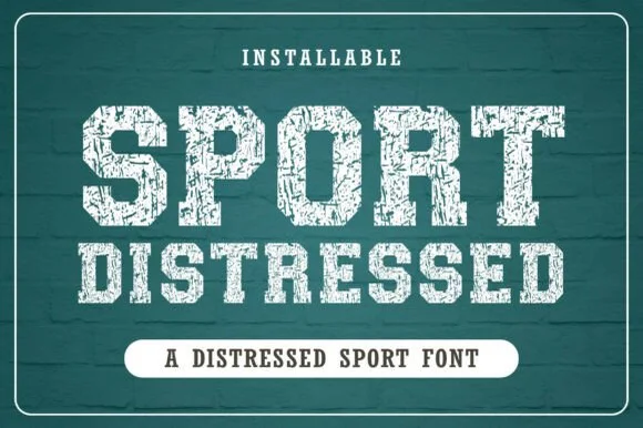
Distressed is a tall condensed sans whose strokes are eaten away by irregular chips, so the letters look printed, worn and flaked rather than cleanly drawn.
Paid link
Get this fontProject & layout blueprintsAt-a-glance maker compatibility
Fine grain and micro-texture excel in 300 DPI print, sublimation, and screen print rather than small vinyl weeding.
Visual anatomy & craft review
Every letter sits on a condensed skeleton: the D closes into a narrow rectangle, the F keeps three short bars attached to a tall stem, the O is a tall rounded rectangle, and the N repeats the same width so a word stacks as an even slab. The character comes entirely from the surface: the fill is broken by chips, scratches and small pinholes of varying size, and the density of the damage differs from letter to letter, which is what stops the word from looking like a repeated texture pattern. Corners are slightly rounded where the wear has taken the edge off. Weight is medium and uniform apart from the texture, and the counters stay tall and open. The dark ground, the pale ink and the thin frame are presentation; the typeface is the two words.
Tall · Condensed · Distressed
Two-font hierarchy recipes
Tested contrast partners — pairing Distressed with grounded secondary typography.
Distressed + Orvelia
Pairs sculptural editorial warmth with Distressed's clean modern geometry.
Inspect Orvelia specimen
Distressed + Autography
Introduces organic movement on pull-quotes, signatures and gift tags.
Inspect Autography specimenPractical applications
Concrete hierarchy, scale and production guidance tailored to Distressed’s stroke geometry.
The worn surface reads as material that has been through a process, which is what a reclaim yard sells, and the condensed width lets a long name fit a gate or a container.
Hierarchy & layout recipe
Set the yard name at 30 cm on the gate, keep the opening hours in a clean condensed at 6 cm, and hold 15 cm of margin so the chipped edges read against the metal rather than the frame.
Pre-production check
Cut vinyl of a distressed face loses the texture at small sizes; for a gate sign, consider stencil painting and check a 1:1 template first.
The chipped texture carries the subject without an illustration, and the condensed skeleton lets a long word sit on one line at headline size.
Hierarchy & layout recipe
Set the header at 60 pt on the opening spread, keep the standfirst in a clean 10 pt serif, and hold 18 mm above the header so the damaged edges are not confused with the page trim.
Pre-production check
A distressed face on newsprint absorbs unevenly and can read as a printing fault; check the page proof and keep the header off the folded edge.
A worn condensed sans reads as a poster that has been pasted up and weathered, which suits an attraction built around decay, and the tall letters stay legible from the street.
Hierarchy & layout recipe
Set the attraction name at 90 pt on an A3 poster, keep the dates in the same face at 24 pt, and leave 25 mm of margin so the chipped edges are not clipped by the trim.
Pre-production check
Printing a distressed texture on uncoated stock can look like ink starvation; check a proof and confirm the chips read as intended rather than as a fault.
Technical & licence verification
Confirm included OTF/TTF/WOFF formats, full glyph tables and licence coverage on the live store page before batch production.
Closest visual alternatives
Matched across letterform anatomy, stroke behaviour and craft applications.

Tall distressed vintage capitals with speckled edges and tight fit
Modern Vintage is a tall capital alphabet with a distressed print texture, tight letterfit and vertical proportions, so a word reads as letterpress that has been used a hundred times.
Ideas for this font
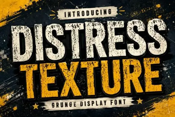
Tall heavy capitals with dense chipped texture and flat terminals
Distress Texture is a heavy tall sans in capitals only, its strokes eaten by dense irregular chips and its terminals cut flat, so a word looks stencilled, weathered and printed through a mask.
Ideas for this font
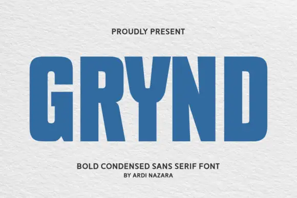
Angular geometric skate-deck lettering with cut corners and a shadow offset
Grynd sets a black word in angular geometric forms with several corners sliced away, a heavy even stroke and a pale shadow offset behind every letter, over a deck graphic.
Ideas for this font
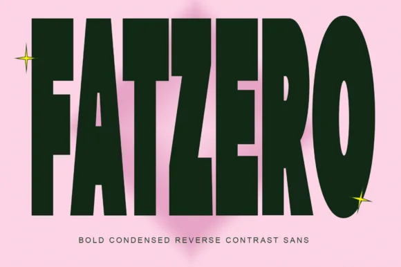
Bold condensed reverse-contrast sans with heavy bars and thin counters
Fatzero is a bold condensed reverse-contrast sans in which the horizontals run thick, the verticals thin and the counters close to slots, so a single word reads as a fashion poster rather than as a headline.
Ideas for this font
Same independent foundry
Allow optional Google Analytics to measure visits and catalogue actions. Your search words and notes are not included. Privacy & storage