Neutral Sans Workhorse

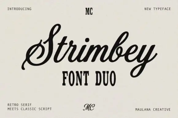
Mie Lobak + Prime Nordic
Lets Mie Lobak own the focal silhouette while handling secondary copy, sizing and subheads cleanly.
Inspect Prime Nordic specimenDisclosure: MakerFileHub may earn a commission from qualifying purchases via paid links on this page. How our links work.
Bulbous retro mixed case with long curled entry and exit strokes
Mie Lobak sets a fat retro slab in deep red, its stems swollen, its serifs rounded into bulbs and several letters finishing in a curl, so the word looks hand-painted on a shopfront.
Paid link
Get this fontProject & layout blueprintsAt-a-glance maker compatibility
Sturdy stroke walls and open counters weed cleanly on adhesive vinyl, HTV apparel film, and cut cardstock.
Visual anatomy & craft review
Mie over Lobak fills the card, the M built from two heavy arches, the L ending in a curled foot and the k throwing a curved leg. Strokes swell and taper slightly, which keeps the line from looking mechanical, and the spacing stays tight enough that the rows read as one colourful object. Small four-point stars in blue and yellow sit at the sides, and a tracked caption names the style and the studio. It is a display face with real warmth, and it needs size: at small settings the swollen stems fill the counters and the curls turn into blots.
Bulbous retro mixed case with long curled entry and exit strokes
Two-font hierarchy recipes
Tested contrast partners — pairing Mie Lobak with grounded secondary typography.
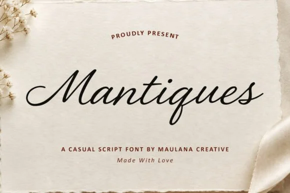
Mie Lobak + Prime Nordic
Lets Mie Lobak own the focal silhouette while handling secondary copy, sizing and subheads cleanly.
Inspect Prime Nordic specimen
Mie Lobak + Raffined
Grounds bold display lettering with classic typographic authority on posters, badges and apparel.
Inspect Raffined specimenPractical applications
Concrete hierarchy, scale and production guidance tailored to Mie Lobak’s stroke geometry.
The painted look suits a kiosk that wants to feel local, and the fat letters read from across a promenade in bright light.
Hierarchy & layout recipe
Print a 700 by 400 mm board: set the kiosk name at 80 mm on one row, keep 26 mm of clear ground beneath before the prices at 16 mm, and keep 30 mm of border so the curls stay inside the frame.
Pre-production check
Curled terminals overhang the letter width; check the layout at final size before the board is cut.
The retro slab gives a bottle a shelf character, and a short flavour name fits the fat letterforms on a narrow bottle wrap.
Hierarchy & layout recipe
Print a 58 by 120 mm bottle wrap: set the brand at 17 pt along the top, leave 11 mm of empty panel before the flavour line at 6.5 pt, and hold 7 mm clear where the label rolls away at both ends.
Pre-production check
Heavy strokes spread on a curved label; check a wrapped mock-up before the print run. Print a sample and re-check it at final size.
The playful weight keeps a big birthday from feeling formal, and two stacked words fill a poster with colour and shape alone.
Hierarchy & layout recipe
Print an A2 poster: set the greeting at 100 pt across two rows, keep 28 mm of clear ground beneath before the date at 18 pt, and keep 28 mm of border so the stars and curls stay on the sheet.
Pre-production check
Swollen stems merge when the rows are set tight; check the spacing at final size before printing.
Technical & licence verification
Confirm included OTF/TTF/WOFF formats, full glyph tables and licence coverage on the live store page before batch production.
Closest visual alternatives
Matched across letterform anatomy, stroke behaviour and craft applications.
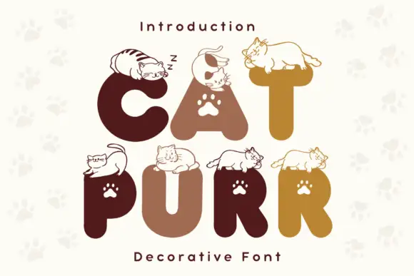
Rounded heavy capitals topped by resting cat drawings with paw-shaped counters
Cat Purr is a colour font that draws fat rounded letters in warm browns and golds, sets a white paw print in most counters, and rests a drawn cat on top of nearly every letter.
Ideas for this font
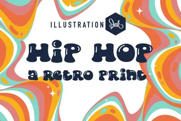
Inflated uneven letters with small white highlight cuts and rounded bulbous feet
Hip Hop draws fat retro caps with an inset groove running through each stroke, sets them in navy on cream, and frames the card with a marbled orange and pink border.
Ideas for this font
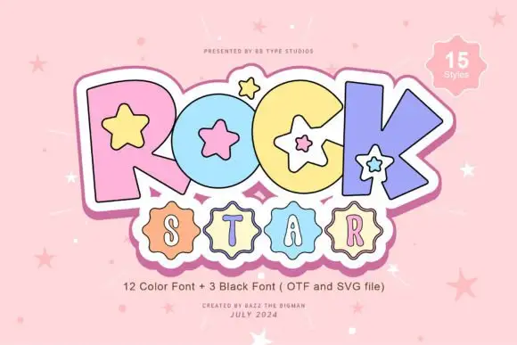
Pastel starred block display
Rock Star is a pastel block display on a pink ground: fat outlined capitals in four pastel colours with white star counters and a white keyline, a scalloped badge under them holding a second word, and a corner badge that names the count of styles.
Ideas for this font
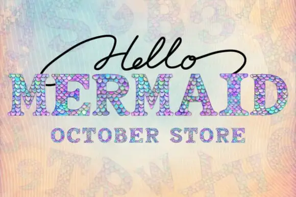
Scale-filled slab display
Mermaid is a slab display filled with overlapping pastel scales: heavy letters with a fine dark contour and a dotted inner edge, set with a script word above and a tracked line beneath, all on a pale iridescent ground with ghosted lettering behind.
Same independent foundry
Allow optional Google Analytics to measure visits and catalogue actions. Your search words and notes are not included. Privacy & storage