High-Contrast Display Serif

Tingler Duo + Wolles Elegant Modern Serif
Pairs sculptural editorial warmth with Tingler Duo's clean modern geometry.
Inspect Wolles Elegant Modern Serif specimenDisclosure: MakerFileHub may earn a commission from qualifying purchases via paid links on this page. How our links work.
Heavy separate print capitals paired with a connected lowercase script
Tingler Duo is a two-cut pair in which heavy print capitals with uneven shoulders set the plain word and a connected lowercase script with tall t stems carries the written one, so a project holds two registers in one warm tone.
Paid link
Get this fontProject & layout blueprintsAt-a-glance maker compatibility
Open counter bridges hold interior islands intact on laser-cut wood, acrylic, and mylar stencils.
Visual anatomy & craft review
The print cut keeps round ends, uneven shoulders and short stems, while the script cut joins a compact lowercase body through tall t stems and light connectors, with swashes and ligatures among a large glyph set. The contrast between separate and joined letters is the character: one member reads as stamped, the other as written, which is why the sample sets the two side by side. Set the print at 34 pt and the script at 28 pt, and keep 16 mm between rows so the connectors do not touch the capitals. The pale ground and the small caption are presentation; the two lettered cuts are the duo.
Duo · Print caps · Connected script
Two-font hierarchy recipes
Tested contrast partners — pairing Tingler Duo with grounded secondary typography.
Tingler Duo + Wolles Elegant Modern Serif
Pairs sculptural editorial warmth with Tingler Duo's clean modern geometry.
Inspect Wolles Elegant Modern Serif specimen
Tingler Duo + Stylish
Introduces organic movement on pull-quotes, signatures and gift tags.
Inspect Stylish specimenPractical applications
Concrete hierarchy, scale and production guidance tailored to Tingler Duo’s stroke geometry.
The print caps give the shop name a stamped look while the script softens the second line, and the pair holds at 50 mm and 34 mm on a printed board. The contrast in letterform is what carries the message.
Hierarchy & layout recipe
Print a 500 by 250 mm board: set the caps at 50 mm, set the script at 34 mm beneath with 22 mm of clear ground between the rows, and keep 28 mm of border all round. so no script connector reaches the frame.
Pre-production check
A script connector printed against the capital row tangles with a descender; check the board and open the gap by 6 mm.
The pair suits a small kraft tag, and the print capitals stay clear at 20 pt above a short script line on an 80 mm tag. The two voices read apart even at tag size, where a single script would blur.
Hierarchy & layout recipe
Print a 50 by 80 mm tag: set the caps at 20 pt at the head, set the script at 22 pt beneath, and punch a 4 mm hole 10 mm from the top edge clear of both rows. Set the punch after the type is placed.
Pre-production check
A hole punched near a tall script stem tears the tag; check the die and move the hole 5 mm clear. A reinforced eyelet helps on 300 gsm kraft.
The duo gives a box a heading and a phrase, and the print cut holds the shop name at 18 pt on a 90 mm printed label. One cut carries the identity, the other the sentence.
Hierarchy & layout recipe
Print a 90 by 50 mm label: set the shop name at 18 pt in the print cut, set the phrase at 24 pt in the script beneath, and keep 8 mm of clear border at each end. Keep both rows on the label's flat middle.
Pre-production check
Two members printed at the same optical weight flatten the contrast; check the proof and keep the script visibly lighter in colour.
Technical & licence verification
Confirm included OTF/TTF/WOFF formats, full glyph tables and licence coverage on the live store page before batch production.
Closest visual alternatives
Matched across letterform anatomy, stroke behaviour and craft applications.
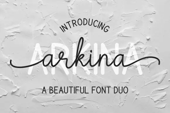
Tall sans capitals with a low looping script duo
Arkina Duo layers a very low looping connected script over tall narrow capitals that read as engraved lettering pressed into plaster, with entry strokes starting well left of the first letter.
Ideas for this font
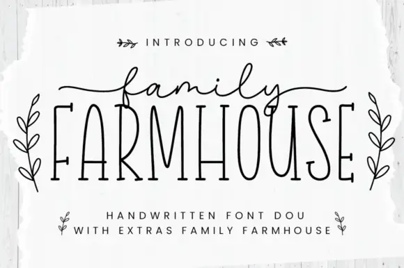
Thin tall serif capitals with a fine script duo
Family Farmhouse pairs very tall condensed serif capitals with a fine connected script, long side tails and a set of leaf-sprig ornaments sold as extras.
Ideas for this font
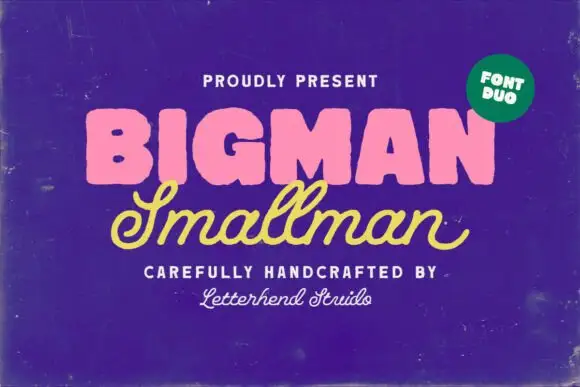
Heavy rounded block capitals paired with a slanted monoline signature script
Bigman Smallman pairs a very heavy rounded capital alphabet with a slanted monoline signature script, so the pair reads as one loud word and one quiet signed line beneath it.
Ideas for this font

Casual script with a sans companion
Malley Jacklist is a duo: a heavy casual script in cream with wide loops and a light sans companion, presented as a hand-lettered pair on a deep green photograph of leaves.
Ideas for this font
Same independent foundry
Allow optional Google Analytics to measure visits and catalogue actions. Your search words and notes are not included. Privacy & storage