Modern Grotesque Body

Petunia Bounce + Montreal
Creates crisp high-hierarchy contrast beneath Petunia Bounce headlines across menus, websites and labels.
Inspect Montreal specimenDisclosure: MakerFileHub may earn a commission from qualifying purchases via paid links on this page. How our links work.
Quirky playful serif with a bounce and hand-drawn alternates
Petunia Bounce is a quirky serif in which the letters step up and down, the serifs stay soft and the alternates swap in rounder forms, so a two-word title reads as a children's book headline rather than as a text face.
Paid link
Get this fontProject & layout blueprintsAt-a-glance maker compatibility
Sturdy stroke walls and open counters weed cleanly on adhesive vinyl, HTV apparel film, and cut cardstock.
Visual anatomy & craft review
The P opens a soft bowl on a slim stem, the e turns a round eye, the t sets a light bar, the u drops a curved tail and the a closes a wide bowl, all at a moderate contrast with soft serifs, a visible bounce and a set of alternates in regular and bold. The bounce is the character: the baseline moves letter to letter, which is why the sample sets two stacked words in alternating colours and lets them rock. Because the counters stay open, the face reads from 24 pt in print and holds a cover at 80 pt, and the alternates let a repeated letter vary. The cream ground, the drawn boy, the kite and the small line beneath are presentation; the coloured title words are the face.
Quirky · Playful · Serif
Two-font hierarchy recipes
Tested contrast partners — pairing Petunia Bounce with grounded secondary typography.
Petunia Bounce + Montreal
Creates crisp high-hierarchy contrast beneath Petunia Bounce headlines across menus, websites and labels.
Inspect Montreal specimen
Petunia Bounce + Easy Handwriting
Adds a warm human signature touch for 1-to-3-word callouts without competing against structured serif capitals.
Inspect Easy Handwriting specimenPractical applications
Concrete hierarchy, scale and production guidance tailored to Petunia Bounce’s stroke geometry.
The bounce and the soft serifs set a friendly title, and the alternates keep a repeated letter from looking mechanical at 70 pt.
Hierarchy & layout recipe
Print a 210 by 260 mm cover: set the title at 70 pt on two lines, keep 22 mm of margin, and switch the alternate on the second repeated letter so the pair reads as drawn rather than set.
Pre-production check
Two identical letters printed next to each other look mechanical in a playful face; check the proof and swap one to an alternate.
The quirky serif suits a primary school event, and the moderate weight keeps the headline legible at 54 pt from across a hall.
Hierarchy & layout recipe
Print an A2 poster: set the headline at 54 pt, set the details in a 16 pt sans beneath, and keep 30 mm of clear ground between the blocks so the bounce has air.
Pre-production check
A bouncing baseline above small type looks uneven; check the poster and set the details as one compact block with a straight left edge.
The soft serifs give a young child's card some warmth, and the visible bounce stays readable at 32 pt on a folded card without a second font.
Hierarchy & layout recipe
Print a 120 mm square card: set the name at 32 pt, set the date in a 10 pt sans beneath, and keep 12 mm of margin so the highest bouncing letter is clear of the fold.
Pre-production check
A fold across the top of a bouncing line cracks the print; check the folded card and place the word below the crease.
Technical & licence verification
Confirm included OTF/TTF/WOFF formats, full glyph tables and licence coverage on the live store page before batch production.
Closest visual alternatives
Matched across letterform anatomy, stroke behaviour and craft applications.
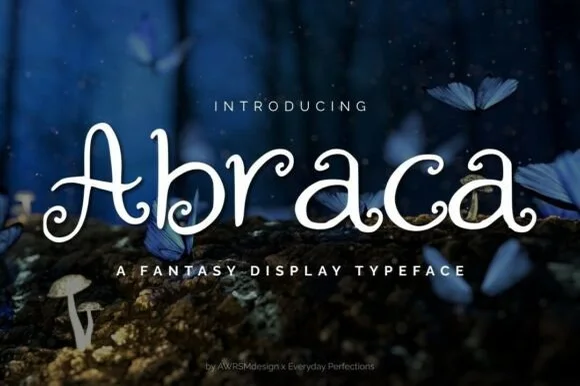
Whimsical spiral-curled enchanted fairytale display serif (OTF & TTF)
Abraca is an enchanted storybook display serif curling delicate fairytale spirals into the bowls and terminals of 'A', 'b', 'r', 'a', and 'c' (OTF & TTF)!
Ideas for this font
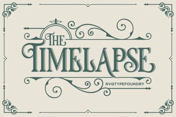
Swashed Victorian storybook & apothecary display serif
Timelapse is an ornate Victorian display serif crowned with spiraling vine swashes, teardrop terminals, and vintage apothecary charm.
Ideas for this font
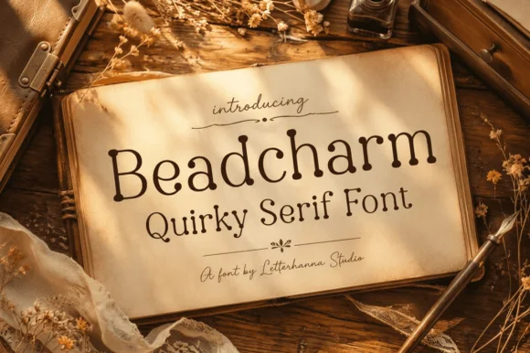
Whimsical beaded ball-terminal cottagecore serif
Beadcharm is an endearing hand-drawn serif tipping slender stems and arches with round, bead-like ball terminals!
Ideas for this font
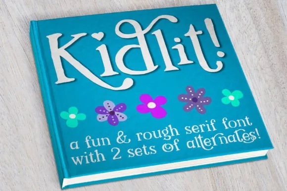
Hand-drawn bouncy storybook serif with curled ascenders
Kidlit is a lively hand-drawn serif with organic, slightly wiggly stems, curled ascender tops, and multi-set alternates.
Ideas for this font
Same independent foundry
Allow optional Google Analytics to measure visits and catalogue actions. Your search words and notes are not included. Privacy & storage