Modern Grotesque Body

History of Miracles + Cultivo
Creates crisp high-hierarchy contrast beneath History of Miracles headlines across menus, websites and labels.
Inspect Cultivo specimenDisclosure: MakerFileHub may earn a commission from qualifying purchases via paid links on this page. How our links work.
Elegant display serif with large ornamental swashes
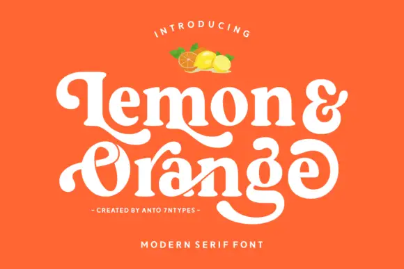
History of Miracles is an elegant display serif in which the stems carry fine serifs and large drawn swashes swing out from several letters, so a two-word title reads as an engraved certificate head.
Paid link
Get this fontProject & layout blueprintsAt-a-glance maker compatibility
Weld or Unite overlapping script joins into one continuous vector path before sending to the blade.
Visual anatomy & craft review
The H sets two tall stems with a fine bar, the i carries a light dot, the s holds a swash spine, the t spreads a curled arm, the o stays a wide ring and the y drops a long tail, all at a moderate contrast with fine serifs and swashes drawn from the first and last letters, plus a set of italic alternates. The swashes are the character: they take up as much space as the letters, which is why the sample sets two stacked words with a large gap above and below. Because the swashes are thin, the face needs 36 pt upward and a smooth ground, and it prints best in one flat colour. The dark teal sky, the planet, the small badge and the caption beneath are presentation; the yellow display words are the face.
Ornamental · Elegant · Swash
Two-font hierarchy recipes
Tested contrast partners — pairing History of Miracles with grounded secondary typography.
History of Miracles + Cultivo
Creates crisp high-hierarchy contrast beneath History of Miracles headlines across menus, websites and labels.
Inspect Cultivo specimen
History of Miracles + Handmade Calligraphy
Adds a warm human signature touch for 1-to-3-word callouts without competing against structured serif capitals.
Inspect Handmade Calligraphy specimenPractical applications
Concrete hierarchy, scale and production guidance tailored to History of Miracles’s stroke geometry.
The swashes give a printed certificate its formality, and the fine serifs keep a two-name head elegant at 40 pt on heavy card.
Hierarchy & layout recipe
Print an A4 certificate: set the names at 40 pt with the swash running under the line, set the body in a 12 pt serif beneath, and keep 25 mm of border so the swash stays inside the frame.
Pre-production check
A swash printed over a ruled frame looks like a collision; check the imposed certificate and drop the frame line by 6 mm.
The ornamental head suits a historical feature, and the moderate contrast holds over a plain ground at 64 pt on a printed page.
Hierarchy & layout recipe
Print an A4 opener: set the title at 64 pt across the upper third, set the standfirst in a 10 pt serif beneath, and keep 22 mm of clearance so the swashes do not touch the copy.
Pre-production check
Swash tails printed into a column of text read as a fault; check the proof and keep 20 mm of clear space below the title.
The engraved swash gives an atelier a mark with history, and the fine serifs hold a short name at 24 pt on a coated card in one ink.
Hierarchy & layout recipe
Print an 85 by 55 mm card: set the atelier name at 24 pt, set the address in a 6 pt caps serif at the foot, and keep 12 mm of white under the swash so it has room.
Pre-production check
A hairline swash printed on a matte card greys out; check one card and specify a coated stock if the line loses density.
Technical & licence verification
Confirm included OTF/TTF/WOFF formats, full glyph tables and licence coverage on the live store page before batch production.
Closest visual alternatives
Matched across letterform anatomy, stroke behaviour and craft applications.

Swashed modern couture serif with hairline stress and curling terminals
Stanza is a modern serif in which the strokes carry extreme contrast, the terminals curl and the crossbars of the A and the T extend into swashes, so a short word reads as a fashion masthead rather than a title.
Ideas for this font
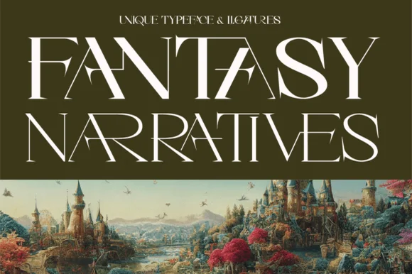
Sweeping ligature high-fantasy RPG & storybook serif
Fantasy Narratives is an enchanting high-contrast fantasy serif weaving dramatic diagonal 'FA', 'AN', 'NA', and 'AR' ligatures across kingdom titles!
Ideas for this font
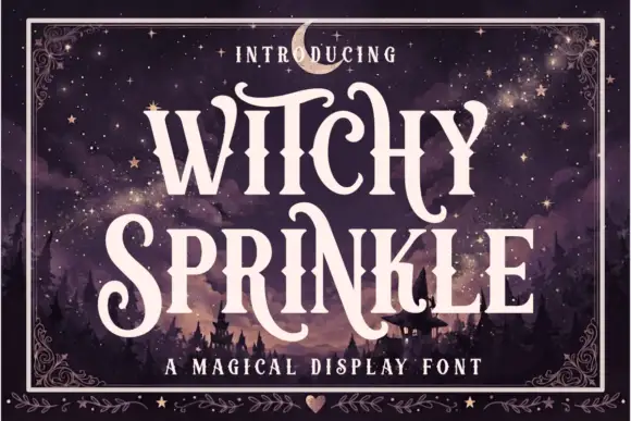
Magical display serif with elongated spurs and pointed curls
Witchy Sprinkle is a magical display serif in which the stems rise into elongated spurs, the terminals curl into points and the contrast stays high, so a two-word title reads as a hand-drawn storybook sign.
Ideas for this font
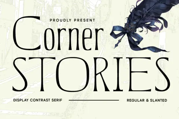
Narrow mixed case set above broad fine capitals in a contrast serif
Corner Stories is a contrast serif supplied in two proportions: a narrow mixed-case setting for running titles and a broad fine capital cut for display, so one page can carry both a subtitle and a wide masthead.
Ideas for this font
Same independent foundry
Allow optional Google Analytics to measure visits and catalogue actions. Your search words and notes are not included. Privacy & storage