Modern Grotesque Body

Moderica + Inkora
Creates crisp high-hierarchy contrast beneath Moderica headlines across menus, websites and labels.
Inspect Inkora specimenDisclosure: MakerFileHub may earn a commission from qualifying purchases via paid links on this page. How our links work.
Tall condensed serif with narrow curved bowls and heavy verticals
Moderica is a tall condensed serif in which the stems hold substantial weight, the bowls compress into narrow curves and the ratio between them runs steep, so a stacked title reads as an architectural editorial head.
Paid link
Get this fontProject & layout blueprintsAt-a-glance maker compatibility
Sturdy stroke walls and open counters weed cleanly on adhesive vinyl, HTV apparel film, and cut cardstock.
Visual anatomy & craft review
The M compresses its apexes into a tight block, the d rises on a heavy vertical, the i keeps a small square dot and the bowls of o and e narrow until they read as vertical ovals against the stems. The vertical rhythm is the character: a long word fits a narrow column without losing its contrast, which is why the sample stacks white letters over a blurred green field. Because the bowls are narrow, the face wants 20 pt before they stay open, and ligatures plus alternates allow awkward pairs to be swapped so the rhythm holds. The blurred field and the small caption are presentation; the white serif letters are the face.
Condensed · Editorial · Vertical
Two-font hierarchy recipes
Tested contrast partners — pairing Moderica with grounded secondary typography.
Moderica + Inkora
Creates crisp high-hierarchy contrast beneath Moderica headlines across menus, websites and labels.
Inspect Inkora specimen
Moderica + Wishful Women
Adds a warm human signature touch for 1-to-3-word callouts without competing against structured serif capitals.
Inspect Wishful Women specimenPractical applications
Concrete hierarchy, scale and production guidance tailored to Moderica’s stroke geometry.
The condensed stems let a long masthead sit in a narrow cover column, and the heavy verticals keep it legible at 64 pt on coated stock without losing the editorial tone.
Hierarchy & layout recipe
Print an A4 cover: set the masthead at 64 pt in a single column on the upper half, keep 20 mm of clear ground beneath it for the issue line, and keep 22 mm of margin at both sides of the page.
Pre-production check
Narrow bowls printed at 20 pt on uncoated stock close into slits; check the press proof and keep any small setting on a coated sheet or one weight heavier.
The compressed verticals give a studio name a structural look, and the heavy stems stay solid at 28 pt on a card where a wider serif would run across the trim.
Hierarchy & layout recipe
Print an 85 by 55 mm card: set the studio name at 28 pt on one line, set the discipline line at 7 pt in a neutral sans beneath, and keep 12 mm of clear space at the right edge so the last stem is not clipped.
Pre-production check
A condensed wordmark set at default tracking can look pinched; check the card and open the tracking slightly until the stems breathe.
The narrow serif suits a modern menu, and the heavy verticals keep a course heading distinct at 18 pt above the lighter dish lines on a tall page.
Hierarchy & layout recipe
Print a 105 by 210 mm menu: set the course headings at 18 pt, set the dishes at 10 pt in a neutral serif beneath each, and keep 14 mm of clear ground between the courses so the narrow bowls do not crowd the text.
Pre-production check
A condensed heading printed flush to a dish line reads as one block; check the proof and open the gap by 4 mm before the plates go out.
Technical & licence verification
Confirm included OTF/TTF/WOFF formats, full glyph tables and licence coverage on the live store page before batch production.
Closest visual alternatives
Matched across letterform anatomy, stroke behaviour and craft applications.
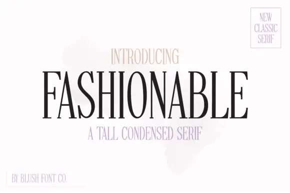
Tall condensed classic serif with narrow bowls and fine hairlines
Fashionable is a tall condensed serif in which the stems stretch upward, the bowls narrow and the hairlines stay fine, so a single word reads as a magazine masthead rather than as a title.
Ideas for this font
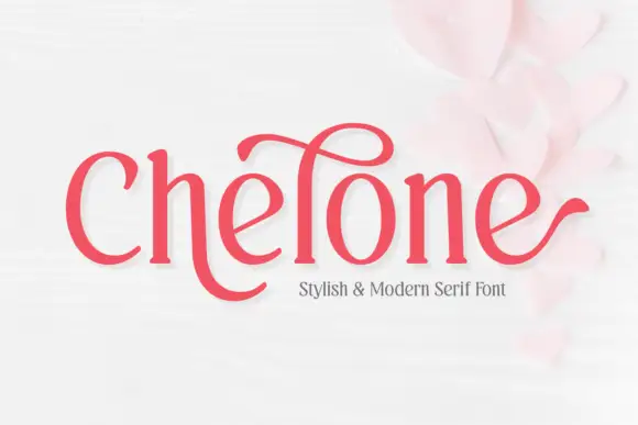
Soft narrow serif with a high looping ascender and outward terminal hooks
Chelone is a soft narrow serif in which the stems curve gently, the bowls stay open, one tall ascender carries a large loop above the word and the final e ends in a long outward hook, so a name reads as playful modern lettering.
Ideas for this font
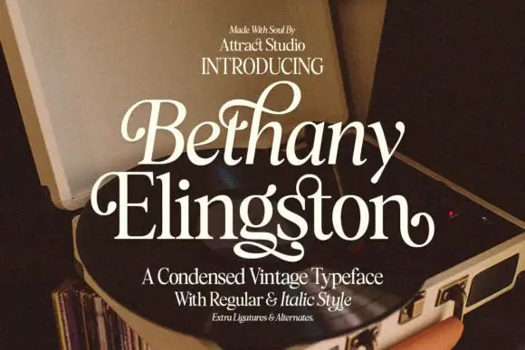
Condensed serif pairing with curled capitals and a looping g
Bethany Elingston shows pale mixed-case serif letters in a slanted upper row and a straighter lower row over an open record player, where curled B and E entries, a tall looped h and a low g extension make the compact stack ornamental, and the cover advertises regular, italic, ligatures and alternates.
Ideas for this font
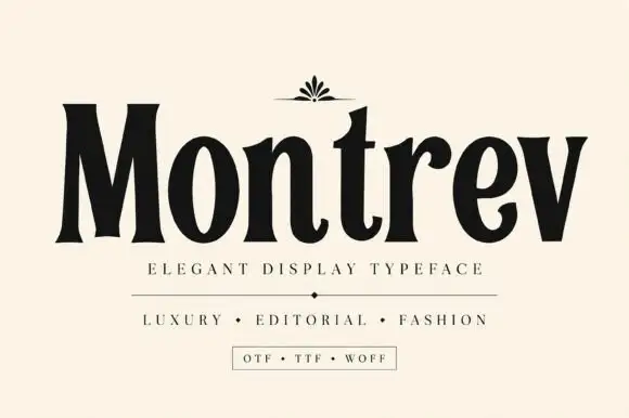
High-contrast condensed display serif
Montrev is an elegant display serif in black on cream: condensed caps and lowercase with very high contrast, narrow bracketed serifs, a tight waist on the stems and a small fleuron ornament above the word, so the name reads as a fashion masthead rather than a text serif.
Ideas for this font
Same independent foundry
Allow optional Google Analytics to measure visits and catalogue actions. Your search words and notes are not included. Privacy & storage