Modern Grotesque Body

Lovine + Headline
Creates crisp high-hierarchy contrast beneath Lovine headlines across menus, websites and labels.
Inspect Headline specimenDisclosure: MakerFileHub may earn a commission from qualifying purchases via paid links on this page. How our links work.
Contrasting capitals with a curled LO and long N tail
Lovine is a high-contrast capital face in which a thin loop winds through the L and O, the N diagonal drops below the final E and a diamond-like mark rises over the middle, so a name reads as linked monogram lettering.
Paid link
Get this fontProject & layout blueprintsAt-a-glance maker compatibility
Weld or Unite overlapping script joins into one continuous vector path before sending to the blade.
Visual anatomy & craft review
The L extends a hairline loop into the O, the N sends its diagonal below the baseline, the stems stay slender with a sharp thick-thin break and the small diamond mark sits above the centre. The linking loop is the character: it joins letters without making them a script, which is why the sample sets one word inside a pale arch. Because the loop travels, the layout needs 18 mm at each end from 26 pt, and the hairlines want coated stock. The arch and rules in the sample are layout; the dark capitals are the face.
High contrast · Curled · Linked
Two-font hierarchy recipes
Tested contrast partners — pairing Lovine with grounded secondary typography.
Lovine + Headline
Creates crisp high-hierarchy contrast beneath Lovine headlines across menus, websites and labels.
Inspect Headline specimen
Lovine + Bunglon
Adds a warm human signature touch for 1-to-3-word callouts without competing against structured serif capitals.
Inspect Bunglon specimenPractical applications
Concrete hierarchy, scale and production guidance tailored to Lovine’s stroke geometry.
The linking loop gives a formal suite its one flourish, and the high contrast keeps a pair of names elegant at 24 pt on heavy card. The loop should not touch the venue line.
Hierarchy & layout recipe
Print a 130 by 180 mm card: set the names at 24 pt in capitals, keep 22 mm of clear card at each end for the loop, and set the venue at 9 pt in a light serif beneath with 16 mm of clear ground.
Pre-production check
A hairline loop printed at 20 pt breaks at the join; check the proof and keep the names on a smooth coated stock.
The linked caps give a cover a single graphic gesture, and the fine contrast holds a one-word title at 68 pt on a coated cover. The loop reads as drawing rather than as type.
Hierarchy & layout recipe
Print an A4 cover: set the title at 68 pt in capitals, keep 26 mm of clear ground beneath for the N tail, and set the issue number at 8 pt in a sans in the upper corner. Keep the lower band clear of type.
Pre-production check
A long tail printed over a photograph edge loses its tip; check the cover and keep the title on the plain lower band.
The diamond mark suits a jeweller, and the fine capitals stay readable at 22 pt on a coated card in one ink. The mark also gives a plain name one point of interest.
Hierarchy & layout recipe
Print an 85 by 55 mm card: set the wordmark at 22 pt, keep 12 mm of clear ground beneath for the tail, and set the address in a 7 pt caps at the foot with 8 mm of clear space.
Pre-production check
Hairlines spread on an uncoated card at 18 pt; check the proof and keep the wordmark at 20 pt or above. A coated stock is the safer choice here.
Technical & licence verification
Confirm included OTF/TTF/WOFF formats, full glyph tables and licence coverage on the live store page before batch production.
Closest visual alternatives
Matched across letterform anatomy, stroke behaviour and craft applications.
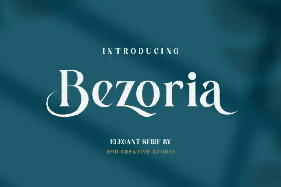
Elegant serif with calligraphic tails and a flowing lowercase
Bezoria is an elegant serif in which the lowercase carries calligraphic tails, the bowls flow into their stems and the serifs stay fine, so a single name reads as a piece of modern lettering rather than as a text face.
Ideas for this font
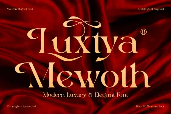
Luxury serif with ornamental flourishes
Luxtya Mewoth is a luxury serif in gold on deep red silk: high contrast, sharp thin serifs, and tall ribbon flourishes that rise from the L and the M and curl back over the following letters, with a small registered mark beside the first line.
Ideas for this font
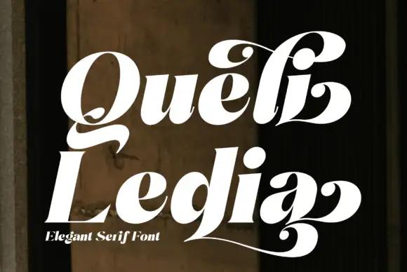
Heavy slanted swash serif
Queli Ledia is a heavy slanted serif in white on a dark weathered wall: fat stems with curled terminals, ball ends on the tails, a long low sweep that runs under the second word, and a small line beneath naming the style.
Ideas for this font
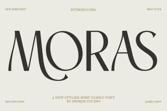
Stylish display serif family
Moras is a stylish serif family in near-black on pale stone: very high contrast, hairline stems and thin flat serifs, with a curling tail on the R, a swooping S and a ligature between the O and the R, set as one wide word with tracked corner notes.
Ideas for this font
Same independent foundry
Allow optional Google Analytics to measure visits and catalogue actions. Your search words and notes are not included. Privacy & storage