 #1 · Best Overall
Roastery Handmade
Warm café marker brush script with bonus coffee doodles
Get fontPaid link
Read review ↓Disclosure: MakerFileHub may earn a commission from qualifying purchases via paid links on this page. How our links work.
Letterpress wood type, café scripts & bag labels
Coffee branding borrows from two traditions: the wood-type letterpress of old grocery packaging and the hand-painted café window. Durlane and Roastery Handmade carry the script side, Letterpress, Frisco Press and Imprimo Letterpress supply the worn condensed sans that dominates specialty bags, and Cordoba adds a hand-carved family with alternates per glyph.
Quick verdict
Durlane is the most versatile café script, Imprimo Letterpress is the strongest bag label face, and Cordoba adds the hand-carved variation that keeps a range from repeating. Sunbeam covers the chunky cut-paper look.
Quick answer
Short on time? Start with our three highest-rated coffee shop, roastery & café branding standouts before scrolling the full breakdown.
#1 · Best OverallWarm café marker brush script with bonus coffee doodles
 #2 · Runner-Up Pick
 #3 · Editor's Choice
We kept 22 of 239 candidates after testing each on a 250 g kraft bag at 300 dpi. Weighted whether the press texture survives at 8 pt, how the script behaves on a curved cup, and whether a matching sans exists for roast notes and origin detail.
Side-by-side summary
Compare specimens, OpenType/PUA traits and primary project roles side by side.
| Rank & Font | Style & File Specs | Best Project Fit | Store Listing |
|---|---|---|---|
| ScriptAlternates & swashes | Small-batch coffee bag, café chalkboard & espresso mug | Get fontPaid link | |
| ScriptRetro | Café window decal, pastry box or tote bag | Get fontPaid link | |
| ScriptPUA encoded · Ligatures | LED neon wall-sign mockup, salon logo & vintage jacket | Get fontPaid link | |
| ScriptLigatures · Alternates & swashes | Barbershop window decal, Moto apparel & coffee tin | Get fontPaid link | |
| ScriptAlternates & swashes | Vintage antique-shop sign, coffee sleeve, apparel chest & mug | Get fontPaid link |
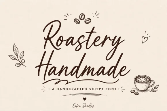
#1 · Best OverallRoastery Handmade is a lively, upright café brush script accompanied by charming hand-drawn coffee-bean, latte-cup, leaf, and heart doodles.
Roastery Handmade is a warm café marker brush script with a set of coffee doodles: a wet loaded stroke with visible marker texture, joined letters, a light slant and small flicked exits, plus drawn beans, cups and steam curls cut to the same weight. The doodles let a cup or a bag be decorated from the same file, and the marker edge is the finest element. The script needs roughly 22 mm and the doodles 20 mm for their detail to read, and both work in one warm ink on kraft.
Small-batch coffee bag, café chalkboard & espresso mug — Stack two bouncy script words centered beneath a 3-bean doodle icon, anchored by tracked sans roast specs below.
Sturdy upright marker thickness cuts and weeds cleanly on mug vinyl, apron HTV, and café window decals—weld script joins first!
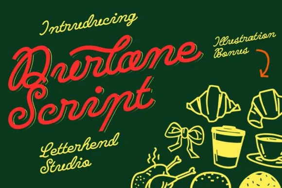
#2 · Runner-Up PickDurlane is a fat retro script in which the strokes swell, a thin inline runs along the middle of every stem and the joins stay heavy, so a name reads as a hand-painted bakery sign from the 1980s.
The D opens a heavy loop, the u keeps two thick stems, the r swells an arm, the l rises on a fat stem, the a closes a wide bowl and the e turns a heavy eye, all at a brush weight with an even slant and an inline drawn inside the thick strokes. The inline is the character: it splits each fat stroke into two bands, which is why the sample sets a single name at large size and lets it carry the whole image. It ships with a set of food illustrations, but the type stands alone. The dark green ground, the croissants, the coffee cup and the small script credits are presentation; the red display name is the face.
Café window decal, pastry box or tote bag — Angle headlines 6–8 degrees upward in warm cream, red or mustard tones.
Weld cursive joins before cutting window or sign vinyl.
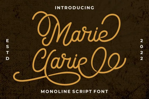
#3 · Editor's ChoiceMarie Clarie is a smooth, medium-fine monoline script featuring oversized vintage ribbon loops on capitals and spiraled terminal flourishes.
Marie Clarie is a vintage neon-sign and badge monoline script: an even tubular stroke that reads as bent glass, joined letters, a shallow slant and a badge frame of concentric rules around the word with small dots at the corners. The monoline is what lets it work as a neon tube, and the badge rules are the finest element. It needs roughly 28 mm for the tube and the badge rule to read, and it is best as a one-colour neon or vinyl job, or a flat two-colour print on a dark ground.
LED neon wall-sign mockup, salon logo & vintage jacket — Stack a two-word name tightly so the sweeping lower loop of the second capital nests beneath the first word.
Consistent monoline thickness cuts far cleaner on HTV and vinyl than high-contrast scripts—just weld all overlapping loops first.
 #4 · Top Maker Utility
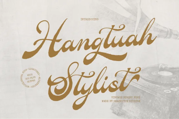
Hangtuah is a thick, slanted vintage sign-painter script featuring bold brush strokes, dynamic swash capitals, and retro underline tails.
Hangtuah is a bold retro sign-painter brush script with underline swashes: a heavy loaded stroke, a firm slant, connected letters and thick underline swashes that run beneath the word and turn up at the end. The underlines are the design and they fix the block's width, and the brush edge is the finest element. It needs roughly 30 mm for the underline and the brush edge to read, and it is best in one dense ink on a sanded board, or a flat two-colour print on uncoated stock.
Barbershop window decal, Moto apparel & coffee tin — Angle a 1-to-2-word brand name upward 7 degrees and anchor the empty lower-right space with a tapered underline tail alternate.
Weld all overlapping brush joins before cutting HTV or gold metallic sign vinyl; thick strokes weed smoothly at 1.2 in+.
 #5 · Standout Silhouette
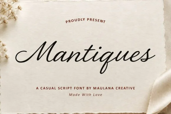
Mantiques is a smooth, slanted casual monoline script blending 1950s sign-painter grace with clean modern readability (plus swash alternates!).
Mantiques is a slanted casual monoline script that borrows 1950s sign-painter rhythm and adds swash alternates, so a name reads as painted quickly on a shop window rather than as calligraphy. The even monoline weight makes it predictable in vinyl and plotter work, and the swashes extend the word at both ends. It needs roughly 20 mm for the open lowercase to read, and it is best in ink black on warm paper or in one bright ink on a dark ground.
Vintage antique-shop sign, coffee sleeve, apparel chest & mug — Center 1 title-case word at 64–125 pt above clean tracked sans caps ('A CASUAL SCRIPT FONT').
Weld overlapping cursive joins in Design Space—cuts and weeds smoothly on Oracal 651, HTV, and embroidery templates down to 0.9 in!
 #6
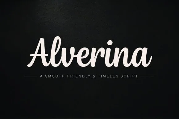
Alverina is a warm, bold-stroke handwritten script with upright rhythm and sturdy connectors that cut and weed cleanly on vinyl, HTV, and wood!
Alverina is a warm thick-ribbon script with an upright rhythm, tented A and plump connected lowercase, drawn with sturdy connectors so it cuts and weeds cleanly on vinyl, HTV and wood. The weight is bold and even, which keeps it legible at 14 mm and readable at 100 mm on a sign, and the upright stance stops a long word from drifting across a panel. It is a craft and sign-making face rather than a formal calligraphy, and it looks best in one solid colour on a matte ground.
Sweatshirt chest script, coffee mug decal & boutique bag — Center 1 title-case word at 64–125 pt in cream or gold above ruled spaced sans caps.
Weld overlapping cursive joins in Cricut Design Space—weeds in seconds on Oracal 651 and HTV down to 0.75 inches!
 #7
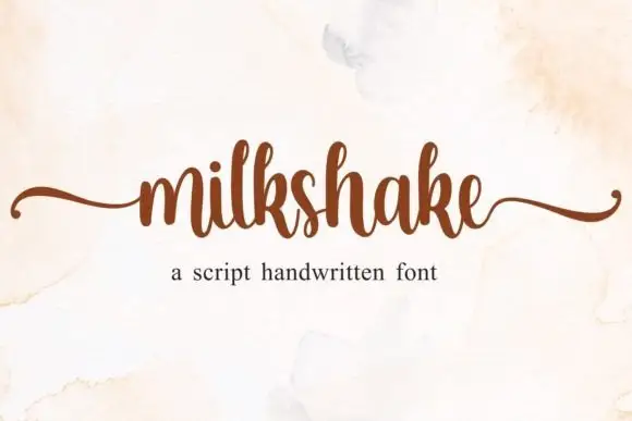
Milkshake is a compact handwritten script in which the lowercase body stays small, the ascenders rise narrow and tall and long horizontal tails leave the word at both ends without dropping into a deep lower loop.
The m keeps three even arches, the l lifts a thin ascender, the connectors run short and tight and the first and last letters send flat tails outward along the baseline. The side tails are the character: they bracket a word like quotation marks, which is why the sample sets one short name and nothing else. Because the tails travel sideways, a line needs 16 mm of clearance at both ends, and ligatures are encoded so common pairs can be swapped for a cleaner join. The pale ground and the small caption are presentation; the dark handwritten name is the face.
A cafe counter-heading study — Use one heading above a plain price list, keeping both side tails within the sign border.
Keep ingredients and prices legible in ordinary print.
 #8
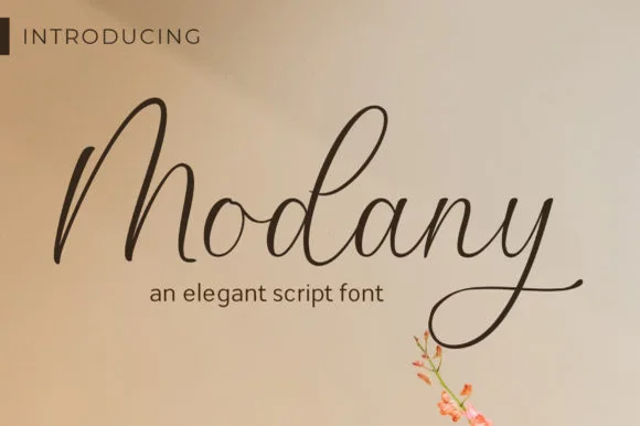
Modany is a graceful, thin-to-medium handwritten cursive script with tall peaked arches on capitals and long, airy ascenders.
Modany is a slender upright fountain-pen cursive script: a fine even stroke on a nearly vertical axis, small loops, joined letters and a light ink swell where the pen pauses, with very little contrast between thin and thick. The monoline character makes it legible at small sizes, and the fine stroke is what fails first on textured stock. It needs roughly 24 mm for the pen swell and the join to read, and it is best in one dark ink on smooth card, or a single warm ink on cream where the swell prints as a soft edge.
Minimalist save-the-date, envelope calligraphy & menu — Set single or paired names at 38–54 pt on warm cotton cardstock with generous breathing room above the tall 'M/d' peaks.
Fine pen weight excels in flat print, letterpress, and Foil Quill pen drawing; keep adhesive vinyl cuts above 1.8 in tall.
 #9
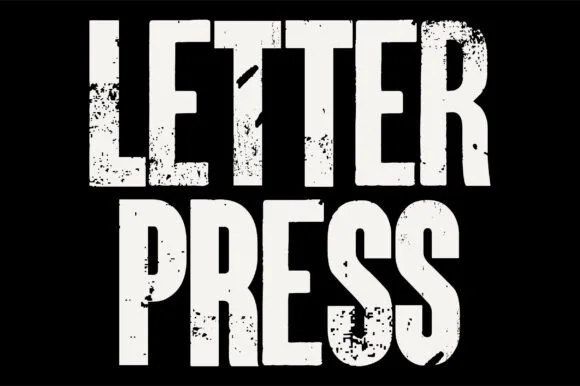
Letterpress is a tall, heavy condensed sans-display font stamped with authentic wood-type ink voids, chipped edges, and poster-press grit.
Letterpress is a heavy woodblock-grunge condensed grotesk: very narrow letters, an extremely heavy stem, small counters and a printed texture of chipped edges, ink squash and lighter patches inside the stroke. The condensation plus the weight means the counters are the first thing to close, and the texture is drawn so it survives one-colour printing. It needs roughly 32 mm for the counters and the chipped edge to read, and it is best in one dense black on newsprint and uncoated board.
Indie concert gig poster, documentary title & zine cover — Stack 2 all-caps words tight at 80–140 pt in off-white or newsprint yellow over matte black.
Hundreds of internal ink-grunge specks mean you should produce this via print, screen print, or DTF—never blade-cut vinyl.
 #10
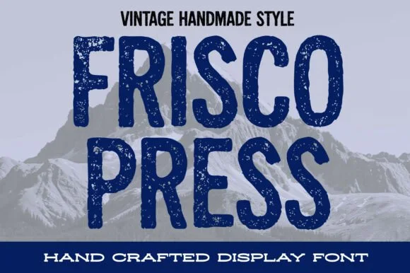
Frisco Press is a tall, heavy rounded sans-display font (not a slab serif) textured with authentic letterpress speckles and hand-carved warmth.
Frisco Press is a distressed woodblock-stamp condensed sans: narrow squared letters, a rough stamped contour with chipped edges, small ink voids inside the stems and a slightly uneven baseline that mimics hand-set type. The distress is drawn into the glyph rather than applied as a texture, so a one-colour print keeps the chips. It needs roughly 30 mm for the stamp chips to read as texture rather than dirt, and it is best in a single dense ink on kraft and newsprint, or black on a pale board.
Mountain brewery can, ski-lodge sweatshirt & roast-coffee bag — Stack 2 all-caps words centered at 64–110 pt between solid horizontal banner strips.
Fine interior press-speckle dots are built for print, DTF, sublimation, and screen print—Contour specks solid if cutting vinyl.
 #11
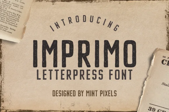
Imprimo Letterpress is a tall, condensed uppercase sans-display font stamped with subtle vintage ink grain and soft wood-type corners.
Imprimo Letterpress is a condensed uppercase sans drawn with the soft, slightly rounded corners a worn wood type sorts acquires after decades of printing, and the interior of each stem carries uneven ink mottling rather than a uniform grunge overlay. Vertical bars stay perfectly upright while the shoulders and junctions sit a fraction tight, which is what makes the face read as pressed into paper instead of printed on top of it. Because the fills are already uneven, the face needs a decent size to show its character, and it pairs naturally with a plain text serif for anything longer than a headline.
Vintage newspaper masthead, history podcast & zine cover — Stack centered uppercase headers beneath a gently arched intro eyebrow ('INTRODUCING') on cream or kraft stock.
Subtle internal ink-grain specks are built for print, digital graphics, and DTF—not small blade-weeded vinyl.
 #12
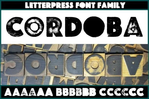
Cordoba is an authentic wood-carved letterpress display family digitized from real inked hardwood blocks with 6 contextual variants per letter.
Cordoba is a sans family built from real wood-carved and pressed letterpress blocks: softly rounded shoulders, a slightly uneven contour where the wood grain nicks the edge, and six alternates per glyph so a repeated letter never matches. The nicked contour and the alternates are the point, which means automatic repetition defeats the face. It needs roughly 26 mm for the grain nick to read, and it is best in one deep ink pressed into soft cotton stock rather than coated paper.
Printmaker exhibition poster, indie vinyl jacket & book cover — Set bold all-caps headlines at 60–120 pt in rich black ink on warm off-white cotton or newsprint stock.
Genuine woodgrain ink voids inside every block require print, screen print, or DTF—never blade-cut vinyl.
 #13
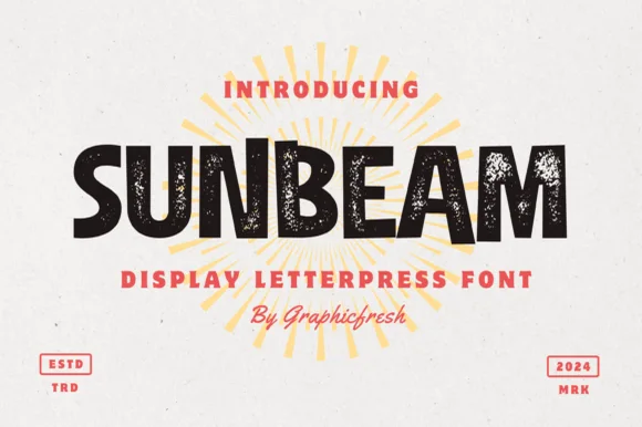
Sunbeam is a bold, wide-stance vintage sans display typeface pairing hand-carved organic contours with subtle letterpress speckle texture.
Sunbeam is a chunky hand-cut letterpress sans with an uneven contour: heavy squared stems, small blade nicks along the edge, blunt corners and a baseline that drifts by a fraction across the word. The cut marks are drawn, so a one-colour print keeps them, and the chunky weight holds a poster at arm's length. It needs roughly 28 mm for the nicks and the blunt corner to read, and it is best in one dense ink on a warm uncoated sheet, or white on a dark board where the nicks print as small lights.
Craft lemonade bottle, surf-camp tee & farmers-market sign — Center 1 uppercase hero word at 64–110 pt over golden sunburst rays, flanked at bottom corners by boxed 'ESTD / 2026' stamps.
Best in print, screen print, sublimation, and DTF; if cutting HTV or vinyl, Contour out the tiny interior press specks first.
 #14
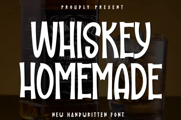
Whiskey Homemade is a tall, condensed handwritten print font built with sturdy marker strokes for craft bottles, chalkboards, and pantry jars.
Whiskey Homemade is a tall condensed handwritten print face built from sturdy marker strokes, with an even vertical rhythm, squared joins and slightly rounded stroke ends, so a word reads as a label written on a bar board rather than as a script. The condensed stance fits a long product name down a bottle, and the even weight keeps it legible at 8 mm on a lid. It needs roughly 20 mm for the marker edge to read as a stroke, and it is best in white on dark glass or in one dark ink on kraft.
Homemade vanilla-extract / infused-bourbon bottle & jar — Stack 2 centered uppercase lines at 48–88 pt in crisp white or kraft-gold over dark amber glass.
Sturdy, 100% disconnected strokes cut and weed fast on Cricut permanent vinyl and waterproof sticker paper down to 0.55 in!
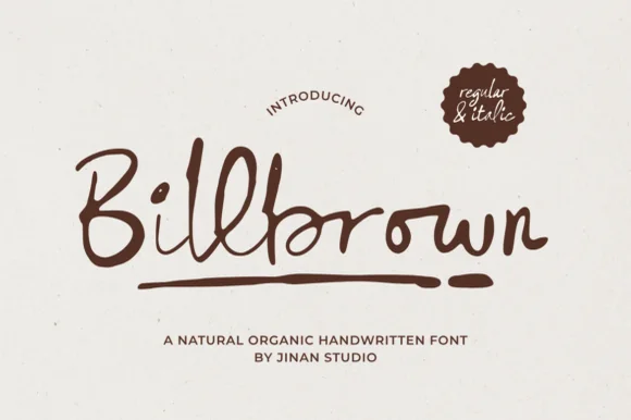 #15
Billbrown is a relaxed, slightly dry-edged felt-marker script family (Regular & Italic) with tall looped ascenders and hand-drawn warmth.
Billbrown is a warm textured felt-pen handwritten script in a regular and an italic: a soft broad-tip stroke with visible fibre texture along the edges, connected letters, a light slant in the regular and a steeper one in the italic. The fibre edge is the texture and it fills when the face is reversed or printed small. It needs roughly 22 mm for the fibre edge and the join to read, and it is best in one warm ink on a smooth card, or a single dark colour on kraft where the texture reads as bleed.
Artisan coffee bag, sourdough bakery box & soap belly-band — Set brand names at 36–54 pt in espresso or olive ink on unbleached kraft paper above tracked uppercase sans notes.
Medium marker thickness cuts well on 1.25 in+ adhesive vinyl and HTV once overlapping joins ('l-l-b') are welded.
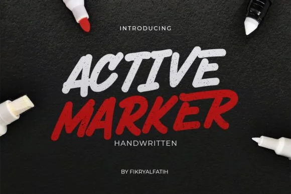 #16
Active Marker captures brisk, slanted broad-tip marker lettering with organic stroke tapers and natural double-letter ligatures.
Active Marker is a slanted chisel-tip whiteboard and chalkboard marker sans: even strokes with a visible chisel angle, blunt ends that read as a marker turned in the hand, a firm slant and open counters that stay clean on a board. The chisel angle is the design and it flattens when the face is reduced. It needs roughly 20 mm for the chisel angle and the blunt end to read, and it is best in one dry-erase or chalk ink on a board, or a single dense ink on uncoated stock where the chisel edge prints as a step.
Coffee-shop daily specials board & deli menu header — Highlight section headers ('ESPRESSO', 'FRESH BAKED') in bold white or red at 36–54 pt above clean tabular price columns.
Sturdy solid strokes cut smoothly on chalk-style matte vinyl at 0.8 in and taller with minimal weeding fuss.
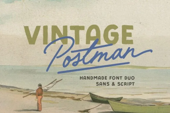 #17
Vintage Postman pairs a sturdy retro sans with the look of a soft rubber stamp and a brisk monoline brush script: the olive sans holds a solid horizontal line while the angled script cuts across the baseline with a hand-signed slant.
The sans cut keeps even stems, softly rounded corners and a slightly uneven impression, and the script cut draws a monoline stroke at a steady width with a sharp slant and quick connectors. The pairing of a grounded row and an angled line is the character: one gives structure and the other gives motion, which is why the sample sets the olive words above the blue signature. Because the script slants, keep 18 mm between the rows and 20 mm at the right for the exit; the sans stays readable from 0.35 inches of pen height.
Coffee bag label, travel poster or surf-shop tee — Set the geographical or brand noun in all-caps sans and overlap the descriptor in angled script.
Check light organic edge texture on the sans if cutting decals under 1.5 inches.
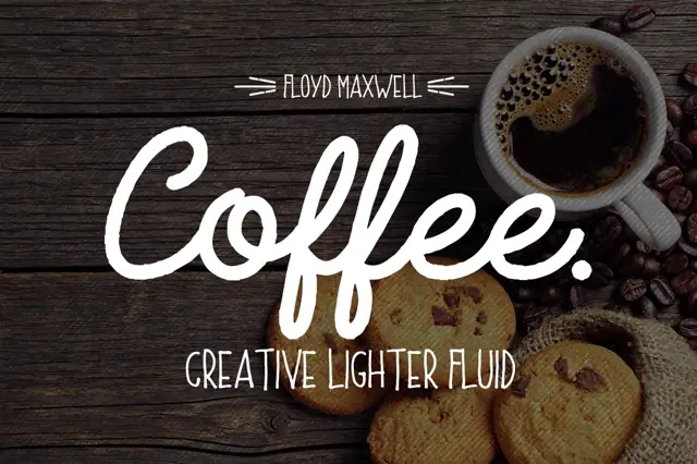 #18
Coffee Font + Extras pairs a heavy connected script with a light rounded uppercase sans, so a name can be carried loudly in script and supported quietly in caps beneath.
The script half is a fat connected hand with a rounded terminal on every stroke: the capital C opens as a broad crescent, the o and the f close tight bowls, the e loops back through its own counter and the second f repeats the shape, which is what gives the word its café-sign look. The sans half is a light rounded capital face with even strokes and wide letterfit, and in the sample it carries a supporting line at a size small enough to stay quiet under the script. The contrast between the heavy script and the light caps is the whole point of the pairing: one line announces, the other informs. The dark timber ground, the white inks, the coffee cup and the crumbed biscuits are presentation; the duo is the lettering.
A coffee-cart menu hierarchy — Use script at the top, short caps section labels below and prices in a plain aligned column.
Keep f loops away from labels and inspect the caps at menu size.
 #19
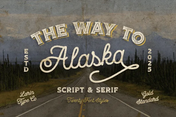
Way to Alaska is a monumental 20-font vintage signboard superfamily by Pasha Larin pairing heritage brush scripts with arched Western/signboard serifs!
Way to Alaska is a twenty-font vintage signboard superfamily built around a heritage script and a companion serif, with layered shadows, inlines, outlines and small ornaments that all share one skeleton. The size of the family means a whole shopfront can be built from one voice, but the layers must be picked deliberately or a panel turns into a stack of outlines. The script needs roughly 24 mm and the serif 20 mm for their detail to read, and two inks cover most of the family.
Craft distillery / brewery badge, coffee roaster & apparel line — Arch the vintage Serif ('THE WAY TO', 54 pt) above sweeping 'Alaska' Script (110 pt) flanked by vertical 'ESTD / 2026' stamps!
Use the clean solid styles for crisp Cricut HTV, Oracal 651 & laser engraving; use textured/inline styles for DTF, print & labels!
 #20
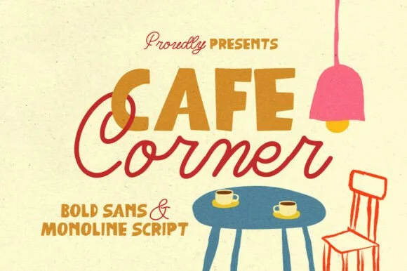
Cafe Corner pairs a warm, slightly tapered mid-century block sans with a smooth, connected monoline cursive script.
Cafe Corner pairs a chunky retro café sans with a smooth monoline script: the sans is a fat even-width block with a small x-height and soft corners for boards and cups, while the script is an even thin stroke with open loops and a relaxed slant. The pair is built for a shopfront, so the two voices have to survive a printed cup and a painted window with the same shapes. The monoline hairline is the finest element and it breaks first on a curved or porous surface. The sans needs roughly 24 mm and the script 28 mm for their detail to read.
Neighborhood coffee bag, pastry box & window decal — Set the primary shop or roast word in 2.5 in uppercase sans and overlap the script companion across its lower-left baseline.
Weld all lowercase script connectors before cutting window or mug vinyl, and keep script x-height above 0.5 in for clean weeding.
 #21
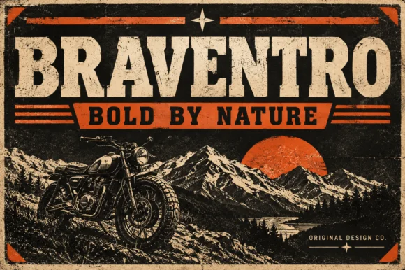
Braventro is a heavy heritage slab in which the brackets run broad, the counters stay compact and the stems carry sign-letter weight, so a two-word heading reads as a stencilled tin sign for an outdoor brand.
The B stacks two dense bowls, the R keeps a compact bowl over a heavy leg, the A carries a wide apex with a low crossbar and the V drops two thick diagonals into a narrow point, all at a sign weight with bracketed serifs and small counters. The density is the character: the letters sit close and the ink covers most of the box, which is why the sample sets a short phrase on a plain tin ground. Because the counters are small, the face wants 30 pt before they stay open, and it holds from three quarters of an inch of cap height on wood, acrylic or vinyl. The rivets, the rust texture and the small subline are presentation; the heavy slab words are the face.
Garage metal sign, craft beer label or leather hat patch — Pair with a ribbon banner subline in bold sans capitals.
OTF display font; solid bold edges cut cleanly on stencils and vinyl.
 #22
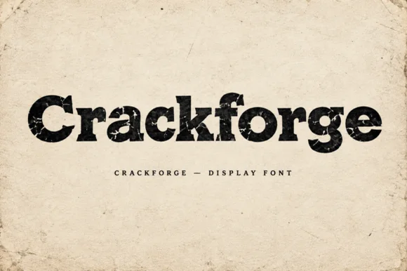
Crackforge is a heavy slab display alphabet in which the stems stay thick, the serifs turn square and the surface breaks into fine cracks, so a word reads as a cast metal plate that has been outdoors for years.
The C cuts a square crescent, the r turns a blunt arm, the a closes a small bowl on a heavy stem, the c repeats the square cut, the k splays two thick diagonals and the f carries a wide bar, all at a bold slab weight with square serifs and a cracked texture drawn into the fill. The crack pattern is the character: it sits inside the strokes rather than on the outline, which is why the sample sets mixed case on a plain ground and lets the surface do the work. Because the strokes are solid, the face reads from 30 pt and prints in one ink; the cracks disappear below that size. The aged paper ground, the torn edges and the small caps line beneath are presentation; the black display word is the face.
Hot-sauce bottle label, distressed band tee or pub poster — Print large in dark ink on kraft/cream paper or off-white ink on black shirts.
Internal crack fissures are built for DTF, screen printing and print — not blade vinyl cutting.
Practical buyer checklist
Key cutting, printing and pairing answers before choosing a coffee shop, roastery & café branding typeface.
Between 7 and 9 pt for origin and process detail, and 10 to 14 pt for the roast level. Below 7 pt on kraft the ink spreads and the letters close, so the bag becomes unreadable at arm's length.
Yes, with a slightly heavier weight than you would use on paper. The curve of the cup compresses the design at the edges, so keep the lettering short and centred, and avoid long horizontal tails.
The paper's fibres absorb ink unevenly and the font's own texture adds to it. That can look authentic at 24 pt and unreadable at 8 pt. Choose a cleaner weight for small text and keep the texture for headlines.
Most include digits plus a percent sign and slash, which covers origin and roast notation. Check for a proper degree or ampersand if the label uses one, since display sets sometimes omit them.
Keep exploring
Explore adjacent maker roundups or check our practical pre-production checklists.
28 curated fonts · Previews & pairings
15 curated fonts · Previews & pairings
20 curated fonts · Previews & pairings
25 curated fonts · Previews & pairings
Guides: Invitation font checklist · Vinyl & cutting checklist · How to pair script & sans fonts
Allow optional Google Analytics to measure visits and catalogue actions. Your search words and notes are not included. Privacy & storage