High-Contrast Display Serif

Cafe Corner + The Simple Editorial
Pairs sculptural editorial warmth with Cafe Corner's clean modern geometry.
Inspect The Simple Editorial specimenDisclosure: MakerFileHub may earn a commission from qualifying purchases via paid links on this page. How our links work.
Chunky retro café sans & smooth monoline script duo
Cafe Corner pairs a warm, slightly tapered mid-century block sans with a smooth, connected monoline cursive script.
Paid link
Get this fontProject & layout blueprintsAt-a-glance maker compatibility
Weld or Unite overlapping script joins into one continuous vector path before sending to the blade.
Visual anatomy & craft review
Cafe Corner pairs a chunky retro café sans with a smooth monoline script: the sans is a fat even-width block with a small x-height and soft corners for boards and cups, while the script is an even thin stroke with open loops and a relaxed slant. The pair is built for a shopfront, so the two voices have to survive a printed cup and a painted window with the same shapes. The monoline hairline is the finest element and it breaks first on a curved or porous surface. The sans needs roughly 24 mm and the script 28 mm for their detail to read.
Cozy · Mid-century · Welcoming
Two-font hierarchy recipes
Tested contrast partners — pairing Cafe Corner with grounded secondary typography.
Cafe Corner + The Simple Editorial
Pairs sculptural editorial warmth with Cafe Corner's clean modern geometry.
Inspect The Simple Editorial specimen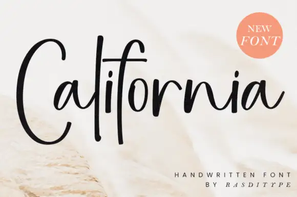
Cafe Corner + California
Introduces organic movement on pull-quotes, signatures and gift tags.
Inspect California specimenPractical applications
Concrete hierarchy, scale and production guidance tailored to Cafe Corner’s stroke geometry.
A chunky retro sans with a smooth monoline script reads as a shopfront painted by hand rather than a chain logo. The sans holds at 30 mm on a board, and the script signs the decal at 60 mm in the same order.
Hierarchy & layout recipe
Board 900 x 600 mm, sans 120 mm with 12 mm corner clearance, 25 mm margins. Cup print 70 x 50 mm, sans 18 mm, 5 mm margins. Decal 400 x 200 mm, script 60 mm, 25 mm margins.
Pre-production check
A 70 x 50 mm cup panel at 18 mm plugs the rounded counters and the name prints as a tile. Raise cup type to 26 mm, and check one printed cup before the order.
A warm retro pair gives an autumn menu the look of a printed café board rather than a modern flyer. The sans holds the headline at 40 mm, and the script signs the courses at 20 mm in the same ink.
Hierarchy & layout recipe
Menu 300 x 210 mm, sans 40 mm with 10 mm corner clearance, script 20 mm, items 9/12 pt, 16 mm margins. Table card 105 x 75 mm, script 18 mm, 5 mm margins. Bag label 90 x 50 mm, sans 18 mm, 5 mm margins.
Pre-production check
On a 90 x 50 mm bag label at 18 mm the script loops close into a bar and the name reads as a smear. Raise the label script to 24 mm, and print one label before the batch.
A fat retro sans with a monoline script reads as a painted terrace board rather than a printed sign. The sans holds at 120 mm on a board, and the script signs the tag at 30 mm in one pass.
Hierarchy & layout recipe
Board 900 x 600 mm, sans 120 mm with 12 mm corner clearance, 25 mm margins. Cup print 70 x 50 mm, sans 18 mm, 5 mm margins. Parasol tag 90 x 50 mm, script 24 mm, 5 mm margins.
Pre-production check
On a cup the printed panel sits across the taper and the script doubles at the seam. Keep the word inside the flat 60 mm centre band, and wrap one cup before the order.
Technical & licence verification
Confirm included OTF/TTF/WOFF formats, full glyph tables and licence coverage on the live store page before batch production.
Closest visual alternatives
Matched across letterform anatomy, stroke behaviour and craft applications.
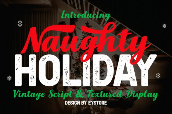
Brush script paired with textured display
Naughty Holiday is a festive pair: a hand-painted red brush script with a fat entry swash, set above a distressed white display in heavy caps, with a thin italic script and a tracked credit line beneath, so the sheet shows two faces working as a headline and a counterweight.
Ideas for this font
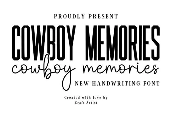
Bold condensed Western-poster sans + natural signature script duo
Cowboy Memories is a clean modern-country font duo pairing a tall, punchy condensed headline sans with an airy monoline handwritten script.
Ideas for this font
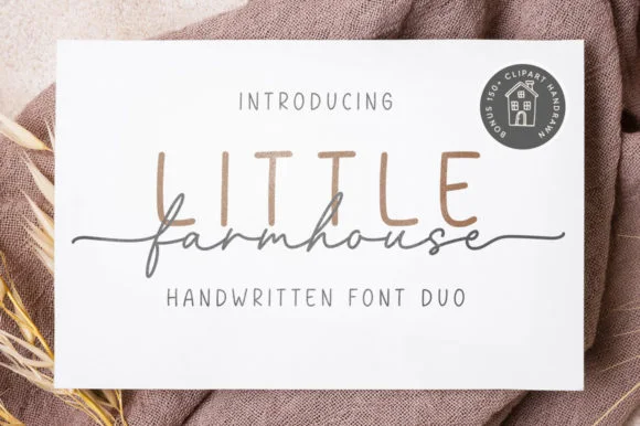
Tall minimalist sans & wide fine-line farmhouse script duo
Little Farmhouse pairs a tall, narrow rounded sans-serif with a delicate, wide-tracked monoline cursive.
Ideas for this font
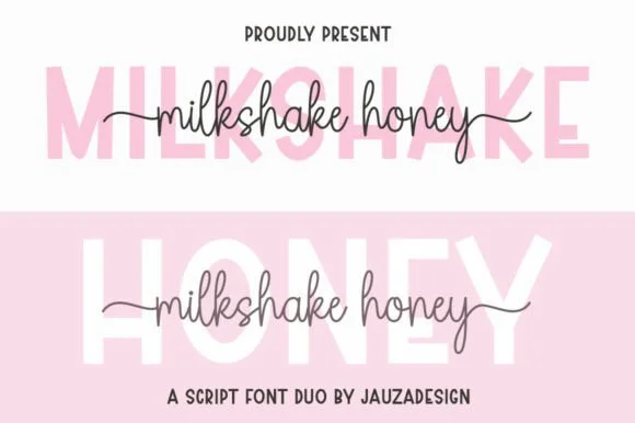
Clean geometric uppercase sans & tall-looped monoline script duo
Milkshakehoney pairs a crisp, wide-stance uppercase sans-serif with a tall, narrow-looped monoline cursive accented by straight side tails.
Ideas for this font
Same independent foundry
Allow optional Google Analytics to measure visits and catalogue actions. Your search words and notes are not included. Privacy & storage



